Play game
Otherdicely's itch.io pageResults
| Criteria | Rank | Score* | Raw Score |
| Presentation | #812 | 3.769 | 3.769 |
| Overall | #1507 | 3.231 | 3.231 |
| Creativity | #1952 | 3.154 | 3.154 |
| Enjoyment | #2232 | 2.769 | 2.769 |
Ranked from 26 ratings. Score is adjusted from raw score by the median number of ratings per game in the jam.
How does your game fit the theme?
it's using dice as game mechanic
Did your team create the vast majority of the art during the 48 hours?
Yes
We created the vast majority of the art during the game jam
Did your team create the vast majority of the music during the 48 hours?
Yes
We created the vast majority of the music during the game jam
Leave a comment
Log in with itch.io to leave a comment.



Comments
Cool ideas and nice handdrawn graphics, but I didn't fully get how it works, a bit more explanations would be nice. The game page does explain the items, which is nice, but not the combat itself.
(Josh)
I liked the art and audio. The mechanic of rolling dice and having to decide which slots to use them in was interesting, and I'd love to see more of it.
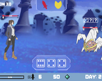
I had a lot of trouble finding the information I would've liked to have to make informed decisions. I didn't really know what the difference was between using sword and using shield, other than shield gave me some kind of defense stat which sometimes blocked part of the enemy damage. There was also no indication I could find as to how my damage and enemy damage was calculated. There was an attack stat that I could pay gems to increase, but it didn't seem to exactly correlate with the actual damage I was doing; I also couldn't tell why I was applying damage to some enemies on the field and not others. Likewise, there was no indication to tell me how much damage enemies got to do to me; the closest I could figure out was that beating all three of an enemy's dice prevented them from doing any damage. Overall, I think better explanation of what the mechanics were and better communication of what was happening and why would've made the game feel much better.
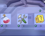
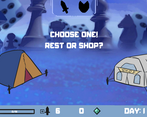
I also failed to see the point of giving me a rest/shop option at the start of the game, when I needed no healing and had no money. Also, the balance was such that I couldn't progress further than Day 9 before getting killed.
Overall, though, I really liked the idea. Good job!
Thank you for providing us your experience when playing our game! We will include these as a reference for our game's future update.
Game has nice visuals and audio, and the gameplay feels smooth. But it lacks information. I see images, but I don't quite understand them, you need confirmation. I couldn't grasp the mechanics, so I mostly blocked and even that seemed to hurt enemies so I went along with it. It felt pretty interesting, though. Also got to the shop, but buying was pretty blind since I didn't know what I was getting for my currency.
Little bit of tooltips and ux in general and the game is on solid ground.
Nice game, team!
Thanks for playing our game and for the feedback as well!
I didn't initially know what I was doing so I just kept using my sword attack, then the shield. Maybe some sort of tutorial or explanation could work. After a few tries I got the hang of it and it was quite fun. The visuals look nice and the SFX were good too.
Yes, we did realise the tutorial was lacking in terms of explanation. Will definitely improve that.
There is something nice here, but the mechanics definitely needed an explanation, even if it was just written down in the description.
I liked the art and audio
Good job on your game!
Thank you very much! We will make the tutorials explain better.
I will have to agree with Ryangatts's comment. My experience at first was me initially not knowing what to do. I was rolling the dice and couldn't figure out what was happening, but then I realized I had to balance it against the enemy's roll.
A better explanation on how the combat works would have been appropriate. All I focused on was on rolling big and just spammed all my spending on increased attack power.
I almost quit the game a few minutes in assuming that it was going to be the same combat encounter over and over again, but then I saw the tent and the shop. I realized I couldn't buy anything because I just kept upgrading my attack power. My remedy to fix this is to just in some way promise the player that something is going to change.
The dice mechanic is very nice and is creative in some way; it kind of reminds me of this minigame from that Bomberman game on Gamecube where you rolled which powers you used to fight against a creature.
The presentation is decent.
Thank you for the detailed feedback!
The art is impressive considering it was done in such a short amount of time. The gameplay was also pretty fun and interesting at first, but at one point I realized I could just choose to defend every time, which resulted in me winning every fight without even getting damaged, which made the game extremely easy.
Thank you for the feedback! We will look into it after the game jam.
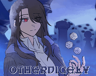
Hello! I am the artist of this game and I am very happy and grateful that you like our game visual presentation^^
eventho im dying with the artThe art attracted me to this game, but I think the gameplay was missing something. It's not that the combat mechanic is bad, I think it's the scaling and balancing that needed more tender loving care.
Thank you for the feedback! Yeah, we realise that there are still some imbalances. It'll be one of the things that will be improved after the game jam, hopefully.
Hello! I am the artist of this game and I am very happy and grateful that you like our game visual presentation^^
It's a fun, peaceful little game, could have used some more clear explanations in the tutorial, but I got the hang of it eventually. The art and music is really nice. Good job!
Thank you!
Hello! I am the artist of this game and I am very happy and grateful that you like our game visual presentation^^
The combat is simple yet effective and the art is super cool and simple too. overall great entry.
Thank you for the feedback!
Hello! I am the artist of this game and I am very happy and grateful that you like our game visual presentation^^
I enjoyed it a lot! Combat is simple yet challenging especially when faced with multiple enemies. One problem I ran into was that I would spend the XP points on stats before I knew they could be used in the shops.
All in all the game looks pretty for a Jam game and the idea feels worthwhile for further development! :)
Thanks for the feedback! As for the XP system, yeah, we ran out of time explaining their function into the tutorial, haha.
The presentation is nice, I like the bible accurate angel enemies we have to kill, very fun.
It does need a better introduction, as I spent a couple of minutes just moving the dice around asking why nothing was happening as the sword and shield icon wasn’t fully clear they were actually button I had to press.
Yeah, we originally wanted to explain every bits of the mechanics through the tutorial but we ran out of time! Thanks for the feedback!
Hello! I am the artist of this game and I am very happy and grateful that you like our game visual presentation^^ And for some reason mostly said the bible accurate angel is the cutest thing on the game \(TUT)/
Neat gameplay concept! Liked the character art too.
Thank you!
Hello! I am the artist of this game and I am very happy and grateful that you like our game visual presentation^^
consider starting the player with one health potion so that a run can survive a bumpy start or make mistakes learning how the systems work. And a single tutorial page on the main screen telling the player:
would go a long way to helping them find their footing and start feeling like they're playing the game.
Thank you for the feedback! We understand that it's currently impossible to understand without an in-depth tutorial about the mechanics. The enemy's damage is actually consistent, but the reason it's unpredictable because:
1. We do not show their levels
2. There are actually 3 types of enemies, but we ran out of time!
3. There is actually a damage bonus for each enemy's die wins.
We will take a look about these problems after the game jam and hopefully improve the gameplay.
I like the art, I couldn't get very far though.
It wasn't well communicated what the symbol next to the sword button does though, it takes away the enemy's defense?
also it sucks getting a bad roll, there's not much agency for the player in those situations.
Thank you for playing our game! Originally, we intended to explain every bits of the mechanics in a tutorial, but we ran out of time.
The symbol next to the sword button gives an option for player to defend themselves and gain shields. If you think that you get a bad roll, you can choose the defend option to increase your survivability!
Hello! I am the artist of this game and I am very happy and grateful that you like our game visual presentation^^