Play game
ARKABEAT's itch.io pageResults
| Criteria | Rank | Score* | Raw Score |
| Graphics | #9 | 4.368 | 4.368 |
| Audio | #24 | 3.526 | 3.526 |
| Overall | #24 | 3.702 | 3.702 |
| Controls | #25 | 3.684 | 3.684 |
| Theme | #27 | 3.842 | 3.842 |
| Fun | #28 | 3.474 | 3.474 |
| Originality | #55 | 3.316 | 3.316 |
Ranked from 19 ratings. Score is adjusted from raw score by the median number of ratings per game in the jam.
Godot Version
3.2.1
Wildcards Used
N/A
Game Description
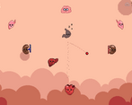
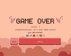
Heart-themed breakout clone
Source
https://github.com/dmitriy-shmilo/arkabeat
Discord Username
Dmitriy Shmilo#1196
Leave a comment
Log in with itch.io to leave a comment.


Comments
I like the idea, taking "Breakout" and using it to represent the mechanics of the body (the heart passing blood between organs). This is interesting. I like the presentation.
I didn't enjoy playing the game too much though. The heart shape didn't feel conducive to the Breakout formula. (it kept hitting the side)
This may have been because I was using keyboard instead of mouse.
The audio loop also became too repetitive. Perhaps if audio was linked to each organ? So hitting them could switch audio layers on/off?
Thank you for the feedback!
The presentation is very cute! I just wish the music weren't quite so repetitive.
Agreed. Thank you for the feedback!
Overall this is a very solid entry, so I just want to give two small pieces of criticism.
First: The foreground graphics feel, to me, like they aren't cohesive with the background graphics. I think this is because they are outlined and shaded while the background is flat.
Several of the pixel sizes also differ--that is, the point counter uses bigger pixels than most of the sprites. In my opinion using differing pixel sizes often makes graphics feel less like they fit together. This is of course largely down to personal aesthetic preferences; do whatever you like best.
Second: The music is probably too short--twelve seconds gets old within a couple minutes, in my opinion. That said, it is pretty good music.
I think that the game is overall very good. All of the gameplay seems very solid, and although I have my criticisms of the graphics and the sound, it still looks and sounds great. I like the little personalities that all of the organs are given; they are very cute. I also like the mechanic of generating and transporting resources between the organs.
Thank you, constructive criticism is always appreciated. I’ll try to address most of the issues post-jam if I find time.
This was fun. Cute graphics, nice music. Thanks for open-sourcing.
Thank you for feedback. Sources are a mess, though, I’m just learning godot.
I like the artstyle with those faces on everything XD plus a clever use of the theme into a classic of gameplay, yet i like the new spin you put on it with the different organs just resting a bit before being hittable again to score instead of the permanently destroyed brick of the classic formula.
The game also feels very polished overall with the themed UI and color palette, no particular issues for me when playing this so can't really add more.
Good job to you guys ^^
You made my evening with this review, thank you 😊
Haha well just sharing my thoughts on your game but glad to have made your day :)
A nice take on this classic genre :)
I especially love the artstyle, simple yet so effective thanks to this limited color palette !
The shape of the heart makes it sometimes hard to precisely control the ball, but I had a blast playing the game :)
Cheers & congrats on the game !
Thank you very much for your feedback!
This remember me something.. good job bro
Thank you!
The Menu UI is so satisfying to click and move around. The whole color pallet fits well and is consistent. Game-play was fun and addicting . Trying to get high score. I like how each organ has some effect.
A fun, polished game with a satisfying Menu UI. Good work!
Thank you, it means a lot.
This was really fun. I like how you had to make combos with hitting the organs with the right items to score more points along with them going on cooldown so there was not constant-bouncing. It was just hard trying to control the heart with the mouse, especially when I don't know the heart's collider and bounding box.
Yeah, I really screwed it up with controls, sorry.
Love the visuals and overall idea. Having the trails on the ball is such a nice little visual clue to where the ball is going.
Thank you very much! I love particles, so this was one of the first things I’ve done in the project.
Super cute! Really enjoyed playing, great art style! :D
Thank you!
Solid game! very original idea! loved your game my best was 83 lol
Git gud :D, mine is 120
Very cute organs and colour palette!
Solid, polished game!
(If only the Liver was not so evil )
Thanks! I’ll turn this liver into a real antagonist in one of my next games :).
Congratulations! Good work! I liked the originality of the game
Thank you very much!