Play game
Abysm of Avarice's itch.io pageResults
| Criteria | Rank | Score* | Raw Score |
| Graphics | #11 | 4.053 | 4.053 |
| Overall | #21 | 3.391 | 3.391 |
| Controls | #22 | 3.316 | 3.316 |
| Fun | #23 | 3.368 | 3.368 |
| Audio | #25 | 3.368 | 3.368 |
| Accessibility | #30 | 2.947 | 2.947 |
| Theme | #34 | 3.579 | 3.579 |
| Originality | #44 | 3.105 | 3.105 |
Ranked from 19 ratings. Score is adjusted from raw score by the median number of ratings per game in the jam.
Godot Version
v3.4.2.stable.mono.official [45eaa2daf]
Wildcards Used
Breathtaking, Deal with the devil
Game Description
Resist greed in an cursed enviornment.
How does your game tie into the theme?
The game takes place in an unsettling tunnel.
Source(s)
N/A
Discord Username
Grau#1985
Participation Level (GWJ Only)
4
Leave a comment
Log in with itch.io to leave a comment.


Comments
Grim retro visuals and music give the game a unique atmosphere, which I really enjoyed. The gameplay felt somewhat lacking, however. Enemies are mostly just annoying and pose no real challenge, and most power ups have no significant effect on the gameplay. I'd suggest adding a bit more depth to the game's fight system, for example by having smarter enemies with telegraphed and deflectable/blockable attacks or adding some extra dangers for the player to look out for such as projectile shooting traps.
I wish there was some power-ups! Very retro vibes, nice job
Hey, thanks for the comment. What do you mean? There are some power ups. In total more than 10 in this version. More will come in the update.
never got any playing 3 levels !
Strange. There should be one white item each level at least.
Thumbnail rocks!
I like all atmosphere, that you build up, but gameplay feels a little bit too slow for beginning.
I love the atmosphere, and it was very fun to play! Good Work!
Great game. The enemies felt a bit too tanky, and fighting them got a bit tedious, so I usually ended up running. Once I had the rapid-fire and “jump” upgrades it felt much more satisfying though. I liked how the upgrades changed your hands. I loved the character designs and overall aesthetic. Are the assets low-res? Did you render higher-res assets to a low-res viewport?
I love classic old style shooter aesthetic, the art is great, and the controls handle well! I felt the footsteps were a little too loud and the sounds could use some reverb. The enemies I also feel take way too many hits. Making the enemies movements more sporadic and their health lower would make it feel less bullet spongey.
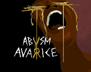
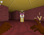
Very strong atmosphere - the music in particular is very brooding. I've got a soft spot for pixel art textures in 3D games, so I quite liked the aesthetic. Is the recurring use of gold intentional? On the enemies, the ceiling, the player's hands, and the tears on the walls; it makes the art feel very cohesive. The moment-to-moment gameplay could have used a bit of livening up, though; you move and shoot quite slowly, so it isn't all that satisfying to dodge and weave around enemies.
thank you very much for the detailed review. The recurring use of gold is intentional. The small lore that we built up for this game, is that this underground world is dominated by greed. Even the shopkeeper is greedy by taking parts of your health.
And the game needs definitely some tweaking. If you find three boot upgrades you will have no problems anymore to dodge. But to be fair that is not very likely to happen. :D
I really enjoyed the game! it was fun, the graphics are awesome, and the atmosphere consumed me!
one serious problem: object aren't rotated towards the player, so it's often impossible to tell is there's something coming, wich leads to taking damage from thin air.
dev-to-dev suggestion: line 'look_at(Vector2(player.global_position.x, global_position.y))' in every object's '_process' function should fix it
Thanks for the kind words. What do you mean by objects are not rotated towards the player? All objects should be Y-billboards and therefore rotate towards the player.
well, maybe it's just me, but they don't, i am using windows btw
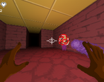
Fun entry! I really enjoyed having my attack become more and more powerful and having it change (won't spoil). The graphics were pixel art and I admittedly love pixel art! The way the hands were done were very impressive! I liked the overall setting and enemy designs. A really cool entry all around!
If I had to suggest some things that could be changed to improve the overall experience, 2 things come to mind: the sensitivity seemed to reset upon changing levels, and the levels themselves felt a bit too large.
Overall, fun entry! Thanks for participating!
Thanks for the feedback. I'm on it. I hope my level generator is stable enough to generate small levels. :D
wait, levels are generated procedurally?! Wow, that's impressive for a game jam entry
absolutely stunning! well done!
The head in the sword almost made me have a heart attack! Beside that, great game! xD
Great work on creating such a cohesive experience! I will have to go back and try again as I lost in the boss fight :(
Had a great time going through the labyrinth and becoming a glass cannon... but unfortunately I shattered!!
I really like the art style and the creepy atmosphere, cool mobs, I jumped a couple of times but I got to the final boss. Fun game.
Atmosphere is really creepy! In a good way. If it were a little darker it would be even more creepy I reckon. I made it through 4 levels before dying on my second playthrough. :) Nice work on a great submission.
Wow, the art style here is really fantastic! Love it!
Hey I think your art style is super cool and liked how far away areas were covered in shadows
I think the music was good too but needed some balancing with the sound of the footsteps
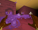
With your cool art style i'd love to see some nice enemy hit effects to really sell the power of the magic :)