Play game
The Structure of Time has changed's itch.io pageResults
| Criteria | Rank | Score* | Raw Score |
| Graphics | #7 | 3.933 | 3.933 |
| Accessibility | #8 | 3.000 | 3.000 |
| Controls | #13 | 3.267 | 3.267 |
| Overall | #16 | 3.057 | 3.057 |
| Fun | #17 | 2.800 | 2.800 |
| Originality | #18 | 3.000 | 3.000 |
| Audio | #18 | 3.067 | 3.067 |
| Theme | #34 | 2.333 | 2.333 |
Ranked from 15 ratings. Score is adjusted from raw score by the median number of ratings per game in the jam.
Godot Version
3.5.2
Wildcards Used
Uno, Mobius Loop, One Moment
Game Description
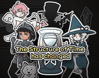
A Simple roguelite rpg with light deckbuilding elements.
How does your game tie into the theme?
The time itself is malfunctioning, causing distortions in structure of the building.
Source(s)
N/A
Discord Username
frousen, ararartti
Participation Level (GWJ Only)
2
My game has an export for Linux, Windows, & Mac and/or is playable through HTML5
name
description
Leave a comment
Log in with itch.io to leave a comment.


Comments
Wow
I really liked the animations and the art style. I enjoyed the way you spun the story and engaged the player.
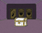
The game does become a bit repetitive after a while, and I think that maybe a stylized label that explained the room card would've been nice to have.
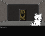
However, most importantly: I got to pet the dog. V●ᴥ●V
Thanks for sharing this game. :)
Thank you very much!
We did have plans for couple more non-combat rooms to add more variety, like a Monty Hall Problem room, but didn't end up having enough time to implement them.
Hey, I've played this for a bit but not sure I'm making progress. I keep trying rooms and defeating enemies but it seems repetitive. Is there an end goal I'm missing?
Ah I see, yes there is a set amount of rooms and then a last boss. Should have added some indicator for that now that you mention it.
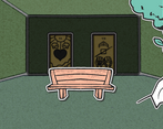
very unique art style!
I slowly became more proficient at the systems and learning the cards.
Love the storytelling and the cutscene work! Well done!
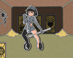
Thank you! This was first time I did non-pixel art for a jam. I tried to keep the art style very simple because I didn't know how fast I can draw.
It was quite fun. I couldn't quite figure out what the cards were doing until I realized the helpful tooltips that explained the effects. The music did feel a bit redundant, mostly since it requires some time to get the hang of.
Great submission.
Thanks for the feedback! I was wondering towards the end if the game needed a proper tutorial, but I ended up thinking the tooltips were enough and the rest was hinted by the dog. When it comes to music, it ended up being the part I had to rush the most, and ended up making mostly just simple 1 pattern loops, thinking it was okay as the bgm would change quite often.
The art and gameplay loop was great! at first I was a little lost on the weapon system, but seeing the stat page helped me understand what was one time use items vs weapons. Also I'm a big fan of this old school first person look :D
Thank you!
We kinda ended up hoping that signalling that the stats page was clickable with its design was enough instead of needing a tutorial, good to hear things worked out at least on your part.
Nice to hear you like the old school style as well!