Play game
Blackout: Antarctica's itch.io pageResults
| Criteria | Rank | Score* | Raw Score |
| Accessibility | #7 | 3.059 | 3.059 |
| Controls | #7 | 3.529 | 3.529 |
| Graphics | #8 | 3.824 | 3.824 |
| Fun | #10 | 3.118 | 3.118 |
| Theme | #11 | 3.647 | 3.647 |
| Overall | #12 | 3.261 | 3.261 |
| Originality | #16 | 3.118 | 3.118 |
| Audio | #30 | 2.529 | 2.529 |
Ranked from 17 ratings. Score is adjusted from raw score by the median number of ratings per game in the jam.
Godot Version
4.1
Wildcards Used
We used "One Moment - have a bench to sit on and relax".
Game Description
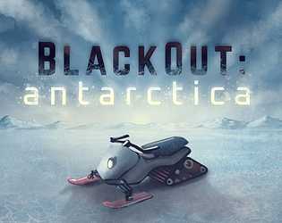
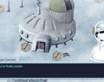
You wake up in an abandoned research station in Antarctica. Machines do not work as intended, and you need to fix them in order to stay alive and escape.
How does your game tie into the theme?
This game is a management game in which you have to deal with malfunctioning machines by repairing them with the resources they produce. The resources are limited, and not every machine is needed as another... Fixing and upgrading the correct modules will help you to survive and leave that freezing place.
Source(s)
N/A
Discord Username
We're cat.astro and Thoooze.
Participation Level (GWJ Only)
2 with this one
My game has an export for Linux, Windows, & Mac and/or is playable through HTML5
description
Leave a comment
Log in with itch.io to leave a comment.


Comments
I enjoyed this one! The art is definitely the highlight of the entry, and the writing is on point too - there's something about the UI and the placement of everything on the map that makes it all feel a bit real.
At the risk of being harsh: I'm afraid the music doesn't work at all. It's too short, and it doesn't convey any sort of mood that you might feel trying to survive in the antarctic. The sound effects are a little grating, too. But that's about the extent of my gripes - it's a really solid entry overall.
Here is my playthrough, great work!
I felt that everything was intuitive and fit the theme well. I feel like that's the hard part, making a game people can understand, so good job nailing that.
The music loop was pretty short, and got repetitive pretty fast however.
Also in my opinion, it should've been harder because I don't even know how you can lose. The lose condition should be more clear.
Also at a certain point, malfunctions are very easy to repair, and it was unclear if I would have any risks associated with not repairing the stations except for not being able to get the snowmobile.
Awesome resource-survival game :) I've managed to survive within 14 days and got 64 points.
Wow, congrats evilc00kie! I think you're basically ready for a trip to the South Pole :))
Jokes aside, thank you for having played our game! We're really glad you had fun with it, and it's nice to see the players post their score. In fact, I've never managed to escape in less than 14 days... But if you'll make it, come here and let me know! :)
Neat game!
I did have a little trouble getting into the game. In particular, I started by looking at all the buildings, such as the bench, which I learned gave me extra actions. But I couldn't figure out what number actually represented my number of actions. I considered that it might be the hand symbol, but I figured that couldn't be right, because the repair button for the home base was available and there were 0 hands available, so if I really had 0 actions I shouldn't be able to repair the home base.
I ultimately thought maybe the tutorial had said how many actions there were, and so I immediately refreshed the game to do the tutorial again. But nope... no mention of the number of actions.
I finally figured out that every repair option except for the home base required 1 hand, and so clearly I would have to repair the home base before doing anything else. The game is adamant enough about this that I think players will be forced to eventually figure this out. But it did take me longer than I think is necessary.
One thing that I think would help is just adding a hover-over effect that showed the name of each resource. This would also make it slightly easier to understand what each building does, as then you could just look at which resource it claimed to produce -- although from reading other comments, it sounds like there is a way to see what the building does in the UI before buying it, which I did not figure out when I played.
The other thing I want to mention is I feel like there were not very many malfunctions in my playthrough. Maybe 2 or 3 buildings broke while I was still using them, but ultimately this was not really a problem and I just breezed through most of the game. (For what it's worth: my final score was 36).
That said, there was an interesting moment early on where I got pretty low on fish because the greenhouse immediately broke. It actually seemed like I would never be able to stockpile fish, because I only had 2 left, it would take 3 to upgrade the greenhouse, and my fish/day was 0 ... but eventually I was able to locate the fishing building as well.
This does mean that the screen-scrolling provides at least one meaningful gameplay element: some sort of exploration. I literally thought I might be fish-soft-locked (?) because the greenhouse broke, but there was a sense of discovery when I located the fishing hole.
One other thing I wanted to mention that I appreciated was the sense of story cohesion in all the buildings. My gameplay experience was broadly: Hmm, I need X resource. What building sounded like it might produce X resource? And then I would repair/upgrade that building, and I was almost always right about which resources it produced. The way that the buildings are drawn and named makes it very intuitive to figure out what resources they produce, and this is a super cool property. It makes it easy to get into the flow of generating the correct resources.
I also think that, due to the relatively small number of malfunctions I experienced, the game feels like it invites optimization. And this makes a lot of sense, because there is a high score. I think the game does a good job of driving the player to potentially trying to leave as quickly as possible, and that fits very well with the story.
Overall, this game made solid use of the theme and created a compelling and intuitive gameplay loop. Good job!
EDIT: One last note, I thought the open/close building sound, and maybe some of the other sounds, were a bit loud compared to the music. I ended up turning the game down just because of how loud the close building sound was, but that made the music pretty hard to hear.
Hi Honey Poney, thank you so much for your valuable comment, this is exactly the kind of feedback we are looking for! :D
We are sorry that the first phase of your game was troubled... We thought to have it covered with the tutorial, but obviously we still have to work on the explanation. Your final guess about the actions is correct: they are represented by the hand symbol. In fact, we wanted to use the Research Station as a "toy example" to explain how machines should be repaired, but we hadn't considered the confusion we create with the concept of actions ("why can I repair the base if I have no actions available?"). Thanks for pointing that out!
Regarding the impact of malfunctions in the game: yes, they're not that disruptive at the moment. We preferred not to overdo it to avoid frustration, but perhaps this made the last phases of the game too easy.
However, the direction in which we wanted to ideally expand the game (...if the GWJ had lasted months) involves many more machines, scattered across the Antarctic wilderness. This idea lines up with what you said about the sense of exploration: if a fish-producing machine breaks down, there's another one that produces the same resource, that I need to discover. In this scenario, having more malfunctions would not cause soft-locks; instead, it would gently push that sense of exploration. Of course that's far from the actual game, but I'm happy that we still managed to convey a bit of that :)
Commenting your last paragraphs, in our conception the goal is (*should be) to escape from the base, not to build the most powerful production engine. That's the reason why the snowmobile is there from the beginning, and - as you correctly guessed - there's a high score that invites optimization :) Also because, having to include malfunctions in the gameplay, they could be perceived radically differently according to the game genre: a resource-management game in which production pipelines are randomly broken is just frustrating, whereas a survival game in which you cannot rely on your tools is accepted and -somewhat- expected ;)
Again, thank you so much for your comment. We deeply appreciated it and we'll make good use of your suggestions!
I had an enjoyable time playing this. The music is nice but the loop is too short so it can get a bit tiring after a while though it definitely has potential. A more ambient approach would work to fix that and to match the tone more, though, if the game had a bit more of a comical/light-hearted touch, the music might have suited more as well, I don't want to say it couldn't work for this scenario.
I liked that there was a malfunction during the night at random intervals as it meant I had to strategize more and stay on my toes, but a bit more clarity on what you get for each upgrade could have made it even better. Either way, it didn't feel frustrating or unfair so that's great.
I wish there was a way to zoom out to not have to wait so much and so I can just glance around to get an idea of what to click for what I need in the moment rather than go around searching for it.
The end was a little easy. Once I had a decent amount of upgrades it became pointless to upgrade more as simply sleeping and saving on the resources would be a faster way to get to the goal, even with malfunctions. Maybe only having 1 thing for each resource would've been better? It's hard to say and I'm no expert on these types of games but it's just a suggestion I think could work.
Regardless of my criticisms, I had fun and the game had me working more to get the needed resources than I expected. Well done!
Hi Paideia, thanks a lot for having played our game, we're happy to hear that you had fun with it! :D
Regarding the music, I definitely second your thoughts... The fact is that we both kinda suck at sound design, and music is usually the last thing we rush to put in the game ^^" But we're going to follow your precious suggestions for the future: for instance, I never thought about using an ambient background to match the tone, it's something new for me and that's exactly what we need from feedbacks! Thanks, really! :))
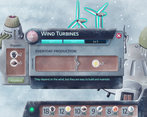
The information about what machines produce in the next levels is always accessible from the cards, by clicking on the text "Lv X"... However, we know that this possibility is not made clear in the tutorial, and every player misses it :( It's not your fault, we'll definitely improve the UI in the next update!
About the end, it's nice that you managed to escape with not so many difficulties. You're right: once the production engine has started, the game becomes pretty easy (...without malfunctions). We wanted to keep it affordable to everyone because it's our first attempt with "management" games, and balance is not immediate. However, one of the ideas for the future was to have more types of resources, making the machines unique in their production, exactly as you suggested. But that's for the another day :)
Again, thanks a lot for your helpful feedback, we really appreciated it!
It was my pleasure!
That's understandable. Making a game in a short period of time is stressful as it is, making music for it on top is something else so don't feel bad about it. And btw, the music was still nice on it's own, the problem was more so that it was a bit short and didn't quite fit the scenario/ mood. It also had a nice bit of variation but it was more rhythmic and textural if I recall properly. I'd say it's the tonal content that may be causing some fatigue. Either more variation or some gentle musical gestures/ arpeggios (things that the brain naturally tunes out after a while and sit more on the background) would work better, even being a short track. I'm glad to help! I'm sure you'll get really good in time. I offered some more suggestions just because it seems you are looking for that but that shouldn't seem like it was that big of a deal, you did great still!
Ohh ok, I imagined there could be something I missed, but it's good you're tweaking it.
Fair enough. I wouldn't know the best way to balance a game like this as it's not what I play most and it can definitely be a challenge, even to more experienced devs so, all in all, you did pretty well actually.
I like that idea, seems like it would be cool. Hope it goes well!
Of course! My pleasure.
Nice game, very polished and intro was very helpful. Being a completist I wanted to level up everything instead of collecting just the resources I need to fix the snowmobile, so took 14 days... But I did not die and had fun so win-win!
Thanks for submitting keep them coming
Thanks for playing and congrats on your win! I'm glad you enjoyed our game!
Thanks for the feedback. :D
Cool game. Like your last entry the graphics are really awesome and look very clean and polished. I failed a couple of times until I managed to win it. Had no issues in getting into the game and playing it, well done there. Small improvements could be, offer the settings also in game and WASD for camera control. Optional I wanted to zoom in and out the map. Good job!
Thank you for your kind feedback! (^=◕ᴥ◕=^)
We forgot to say it in the tutorial, but you have access to master volume and text speed. There's a collapsible (expandable?) card in the bottom left corner that works like the side cards in the building card. The ">" sign is a button that expands/collapses the menu. Thank you for pointing that out!
Zoom in and out would be quite nice too! Thanks for the ideas and feedback again. And kudos again for your game! (^=◕ᴥ◕=^)
Ah dmn I am blind. haha never mind! Well I was reducing sound volume after my first lose and had no further issues there anyway. But good to see I just missed it!
Awesome game with clean presentation and UI! Props to your graphic designer, this is good stuff! Intuitive and easy to understand! The audio was a bit meh, but other than that it's one of my favorite so far!
Thank you for feedback! I'm glad you liked our game!
Regarding the audio: you're right. Sound keeps getting pushed back to the last minute, and we always try to wing it. („• ֊ •„)
Should disclose off-the-bat that I have a hedonistic love for builders, and this base-building game with impressive graphics and UI design work found its way straight into my heart.
Useful onboarding / tutorial right away, and what's more the end goal of fixing the snowmobile is clearly established. It's really a boon to UX when the player has something to work towards that justifies the grind.
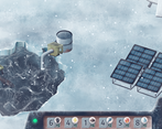
Gameplay is primarily a management system: repairing machines / buildings around the environment to obtain more resources, and accrues with turn-based replenishment. I love it.
There could be a couple of small improvements here or there. Wish there was a better way to move around the screen in addition to edge-scrolling (WASD or arrow keys, or click & drag), which could improve accessibility. The drum-thumping thirty-second loop of the background music also became a little grating.
Aside, I think the resource-gathering and upgrade systems were well-balanced for the purposes of a quick playthrough befitting the application here.
All-in-all, I enjoyed Blackout: Antarctica, and it was a pleasure to see a turn-based builder in this game jam.
Thank you for your feedback! I'm happy that our game found its way into your heart.(ノ◕ヮ◕)ノ*:・゚✧
You guessed it right: part of the reason why we decided to put the snowmobile there was to give a goal to the player and to offer some sort of closure (?). Besides, snowmobiles are kind of cool, aren't they? :D
I love your suggestion to add WASD for edge scrolling to improve accessibility. Thanks!
the game was fun but the screen was to big for my computer so i had to scroll to do anything.
Hi Jebus Crust, thanks for playing our game! We're sorry that you cannot see the screen properly, have you tried to play fullscreen? Usually this way scales the window to the proper size. Anyway, we reduced the preview in the game's page according to your suggestion. If you want to give it a second chance, we'd be happy :)
Thanks again for the feedback!
I enjoyed this! I ended up with a score of 57 after escaping, which I don't know whether that's good or bad lol. This is a solid management game, I think there are a few little UI tweaks you can make to help with overall clarity (Like showing what resources a building will consume when you upgrade it, or letting the player know that they're going to die at the end of the day if they don't gather more of a certain resource).
I think you could have also probably gotten away with showing all of the buildings on screen at once instead of having the player pan around if you resized/adjusted things a bit. It feels a little bad to have to slowly scroll from one corner to another to check on things. Although maybe just having a menu on the side that lets you quickly pick each building would accomplish the same thing.
Other than that I have very few complaints! The game was intuitive and complex enough to require strategizing. Great job!
Thanks for your feedback! I'm glad you liked our game!
We noticed that a few reviews pointed out the lack of upgrade consumption/production. This should be found by clicking on the buttons with "Lv. X". We're sorry that the tutorial did not explain it very well.
Initially, we wanted to keep everything on the same screen, but we were afraid that it would've turned out too crowded. We didn't think to let the player modify the scroll speed this time, but next time we'll certainly try to add it. A collapsible and scrollable side menu that lets the player select the building is also a wonderful solution to the problem! We'll definitely keep it in mind for future works. (☆^ー^☆)
Thanks again for the amazing feedback!
Oh okay, that makes sense. Maybe having the consumption/production upgrades show up when you hover over the upgrade button itself (Or be part of that panel somehow) would make things a little clearer/harder to miss. That way the player doesn't have to click a separate part of the UI for that info. Just an idea though, having it called out better in the tutorial would probably be fine lol.
That's fair on the crowding, you'd probably have to zoom out a bit (or make some of the drawings smaller) to get it to fit, which may not have been what you wanted. Having to scroll definitely makes the game area feel bigger and more open (which is fitting in the Antarctic).
Thank you so much for all the ideas you keep giving us on how we could improve! Showing a card on hover sounds cool!
You guessed it right: we did want to give off the feeling that the game area was bigger and open.
Thanks again for all your feedbacks. (☆^ー^☆)
I add just one thing to my colleague's answer: as a rule of thumbs, from what we could see during playtesting, every score above 50 is a good score! So congrats, you're basically ready for a trip to Antarctica :D
Anyway, thanks again for playing our game and for the detailed and helpful feedback, we did appreciate it a lot!
Pretty good game! The graphics were good, sound was decent (although I didn't care too much for the music as I didn't think it fit the game). The biggest problem I had with the game, is that the tutorial leaves out key pieces of information, which is that: You will die if you end the day with zero of any resources.
Also, the buildings should show you what exactly they will produce and consume before you repair/upgrade them, otherwise it's just trial and error to figure out what you need to repair/upgrade.
Overall, fun game, but I docked some points on Accessibility because of those mentioned issues.
Thanks for your feedback.
We didn't point it out, but you die if you consume more than you have. For example, if your net electricity production is "-3" and you have 1x Electricity, you die at the end of the turn.
You can preview the production for all levels by clicking on the level button:
Probably, it was not explained very well in the tutorial. Regarding sound, I'm sorry to hear that you didn't like it too much.
Thanks again for the feedback. Next time, we'll try to be more critical with the tutorial not to miss any key information. (シ. .)シ
Ah ok, another suggestion is to make sure that if it is a button, that it looks like a button. Anyways, again, good game.
I lasted 3 days, I probably should have paid more attention to the instructions! I was a bit true to the male stereotype and skim-read them only.
Anyway, what to say, a very strong polished entry. This has all the elements of a game and the only minor complaint was the slow speed of scrolling around the map. Other than that everything is well put together.
Thank you for your feedback! I'm glad you enjoyed the game. We didn't think about customising the scrolling speed, so thanks again for pointing it out! We'll definitely try to add a menu option for this in future works if needed! (☆^ー^☆)