Play game
Doomsday Defender's itch.io pageResults
| Criteria | Rank | Score* | Raw Score |
| Controls | #13 | 2.959 | 3.091 |
| Audio | #15 | 2.959 | 3.091 |
| Accessibility | #16 | 2.611 | 2.727 |
| Fun | #17 | 2.872 | 3.000 |
| Graphics | #18 | 3.133 | 3.273 |
| Overall | #24 | 2.748 | 2.870 |
| Theme | #35 | 2.611 | 2.727 |
| Originality | #49 | 2.089 | 2.182 |
Ranked from 11 ratings. Score is adjusted from raw score by the median number of ratings per game in the jam.
Godot Version
Godot 4.1.1 - C#
Wildcards Used
CSharp, Icarus as theme inspiration
Game Description
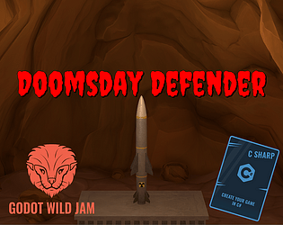
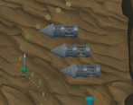
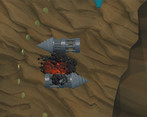
Highscore Action-Game where you Ascend with a Nuclear Missile to defeat Aliens.
How does your game tie into the theme?
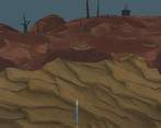
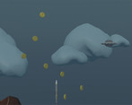
You ascend quite literally with your rocket from the deepest caves to outer space.
Source(s)
N/A
Discord Username(s)
N/A
Participation Level (GWJ Only)
1
Leave a comment
Log in with itch.io to leave a comment.


Comments
Funky beats for a game starting out with a nuke on-screen!
That's not a unique gameplay concept for sure, but it's well-executed here. Some levels were a bit too unforgiving, but I guess that's the genre :p
Nice job on a first submission. Game was difficult but thanks for well placed checkpoints I was able to nuke those damn aliens.
Really liked the graphics and sound although the music did feel a little too peaceful, maybe a change up at the end would have been nice.
As some others have noted the missile felt a little to rigid and lack of animation/fading of collecting the coins/gems hurt the game a little.
But overall great submission, keep them coming.
Thanks for the feedback!
The "lack of animation/fading of collecting the coins/gems" sounds a bit like a bug because when you collect an item, its supposed to expand its size and slowly become transparent, did that not happen for you? If so, on what OS where you playing?
It's funny how sometimes the simplest game designs end up being the most fun.
Thought I was doing really well in this autoscroller until I veered towards the blue collectible, and an oncoming boulder—much like life—smashed my efforts at ambition. Laughed when it was an unforgiving loss condition.
I thought the level design was very well laid out and forced you to quickly consider which of the two routes to take, if not just chancing it and hoping for the best.
This game design can definitely be expanded upon. Like passing each level could require a certain score, or you could shoot boulders at the expense of score. But the fundamentals are built well, and it wrapped all the way around for a fun little play. I was rather impressed with the 3D graphics and visual effects as well.
This is a solid Godot Wild Jam debut, and really what an early project should look like. Hope to see you again in future jams!
Thanks :)
Yea, I chose to go with a very simple concept for this jam.
For one, this is my first finished 3d game (with 2d gameplay though), so there were lots of things I still had to learn and I needed to plan in enough time for that.
Also, I participated in 2 GMTK game jams in the past and in both, i had vague puzzle idea in mind that didnt work out in the end. One was so badly working that i couldnt even submit it. So I chose to go for something that works for sure for my first jam here :) (Thats why i'm very impressed when I see puzzle games like yours in such a short jam that work so well from a game design perspective!)
But yea, the gameplay could be expanded quite a lot, I decided against being able to shoot, though that would also be fun. And I had an entire fourth level inside the alien spaceship with cool new enemies prototyped but had no time to actually make it :(
And yes, I will be back for more jams if I find the time!
This is not bad! A pretty nice audio track on the main menu - which also has a nice animation. When the game starts it's pretty easy to pick up and play. But I really wish the rocket rotated a little when changing directions. It would just make it feel a bit more responsive and less static.
I notice this is a first game jam entry for GWJ so massive congrats to you for submitting!
One more comment, I think the collectables needed a little emission in their materials to make them "pop" a little visually. That and or some lights attached. The rest of the graphics including the 3D modelling and rendering is really nice
Hey ^^ thanks for the feedback!
I just added some emission to all items and lights to the emeralds and diamonds for the post-jam version, that helped their visibility a lot and makes them look even more attractive to collect!
Also, I already experimented with rocket rotation in the past, but I'm not sure if that would work well for this game. If you tilt the rocket sideways (and the hitboxes shift accordingly), the movement becomes surprisingly unpredictable and complex. So it would have to be a very subtle tilt to the side that doesnt affect hitboxes, i'll give that another try :)
emission plus glow = wow factor!
yeah even a tiny 5 degree rotation might be enough to sell the movement
Very nice game. Got score of 443 points.
I appreciate that restarting moves you back to beginning of level, and not all the way back to the start of the game. Although the "Try again" button does not explain that clearly :)
Assets and polish look great and the transition from underground to the sky in lvl 2 was amazing. And the big planet in last level... Great, immersive music too.
Although I usually don't care about scores in games, you made collecting coins and gems so satisfying that I tried to collect as many as possible - often resulting in death :D - great job there.
Cheers!
Heyy thanks for the feedback ^^
Thats a very high score, nice! I was starting to get worried that no one reaches the end :)
Yes, I noticed the confusing "Try again" text too, I already changed it to "Restart from Checkpoint" (and will add a "Checkpoint" text that pops up when a level starts) for the post-jam version.
Nice game, it's remind me a bit of Bionicles, the first one, 3D graphics in a 2d environment with a simple but solid mechanics, are the coins 3D or did you render the sprites?
Thanks :)
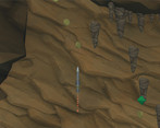
Actually, everything except the gameplay is 3D. The cave is just really flat on purpose so that its not too confusing where the walls are actually dangerous and where they are just deco in the background. It becomes more obvious when you get out of the cave ^^
Great effort!
Hi!
Classical game here :) I think you found nice music to go with the game! Would have loved a volume slider in the esc-menu though!
Sometimes it was hard to know what was coming up ahead. Maybe some very limited boost or some warning could have given me some time to react?
It felt good to pick up the coins.
I reached 118, so I got nothing on you :D
Well done with the game!
Ah, damn. 183, the drills came REALLY in packs there =)
Thanks for the feedback!
Yea, I was thinking about how to make it easier to know whats in front of the camera. Some temporary-time-slow item or powerup to destroy obstacles for a while might work. Or at least small indicator symbols that warn you that an enemy is approaching barely outside the screen. I'll definitely add something like that in a post jam version :)