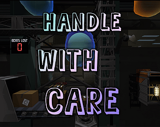
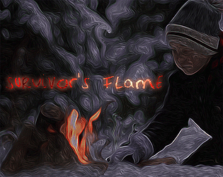
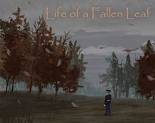
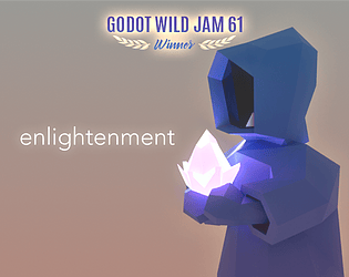
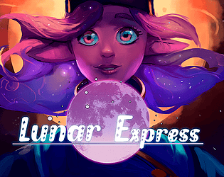
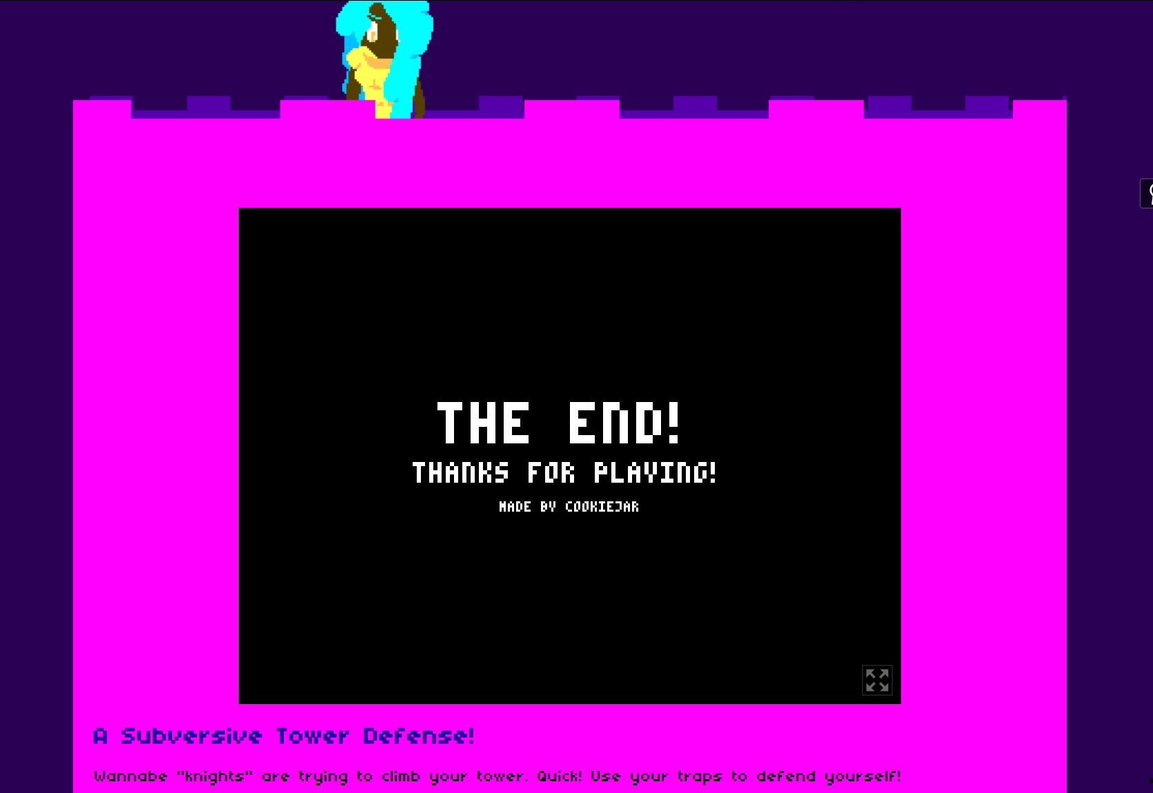
Style points all around: art, sound, menu / UI. Fun game design and mechanics! Something I would've wanted to play on my Game Boy Color back in the day. Nice one, friends!
Ricky Leone
Creator of
Recent community posts
A nice little navigational puzzler with a cool art style and some fun dialogue (got a chuckle out of me). Love the scene transition and the smoothness of the mechanics. The character model impressive as hell, and the hand-drawn 2D art lends so much style to the game. BGM appropriately funky as well (though be sure to loop it!). Great job, team!
Wow, interesting! VR great for short-form, first-person experiences (sad to say I haven't tried VR since the Virtual Boy days, but I fear if I do, it'll be hard to go back to computer monitors!). Will keep an eye out for your future submissions via the sub feed. They always leave an impression in the mind.
Our last submission was in September, but we liked the game so much that we decided to build it out with a story, progression design, and five times as many levels / environments in hopes for a commercial release. But of course, larger scope projects have their own set of challenges, so we're doing our best to navigate through that. May take a "break month" though and do a jam in the middle. :)
Exactly what I was looking for from an Anonymyst title. These are always the most unique entries with their esotericness and freethinking. Found the central portal into other worlds to give parables about the seven sins fascinating (though the audio in general seemed to be too low to really hear the soundbites; set it all to maximum beforehand). Sadly broke the game after I was ejected from an environment, landed outside of it, and fell into an infinite skybox. But perhaps that made the dreamlike experience all-the-more lasting.

If I could get my only criticism out of the way, the bland title did not do this incredible submission justice, and it flew under the radar when it should've been the most popular game.
It's amazing the standard that's constantly being risen jam-after-jam, showing how much can actually be achieved in nine days by a team of exceptionally talented developers. That opening cinematic was incredible. UI and art gorgeous from the beginning, and maybe one of the best main menus I've seen in a jam.
The simulated dialogue effect was very cute. Complimented well the enchanting music and wonderful atmosphere. Point-and-click mechanics solid, though the big struggle with these types of games is being unsure what part of the screen is functional, so a lot of the gameplay is random clicking all over, hoping something will interact (the hint system: a great UX addition to help with this!).
A lovely entry that if I had a child, I'd want them to play since the aesthetic would be pleasing to them and it would hone their problem-solving ability. (Though, it took me forever to find the light to the first room too!).
A criminally underrated submission. Maybe the best in the competition, and the perfect one for me to conclude on for this stacked jam. Excellent contribution from this team!
Art and animations are a big "wow." Geez Louise at that opening cinematic sequence! Mechanics functional enough (with special praise to the precision of the sprite on ledges), but I wish the level design was more inspired and befitting the amazing atmosphere the art and music provided to the environment. The HUD could use some work (an ascending timer not needed unless it's functional somehow).
So some of the style is there, provided by the amazing illustrated work, but other areas were not able to catch up. Still a great effort, however. Good job!
Love the overall style and presentation of Poker Tower (though the music, albeit nice, feels a little inconsistent with the rest of the aesthetic). Wasn't quite sure what the game loop was other than trying to construct the best poker hand and seeing how many points it would give you. Ended up at floor four where after doing so, new cards didn't spawn, and playing the remaining three cards led to a loss condition, which was a hard reset to floor one.
Much praise to be given to the amazing art, animations, and logic programming of this card game. Nice work team!
I liked it? LOL. Music super-chill. Aesthetically it could use some upgrades (like any texture on the plane), but even if it was a happy accident, playing Were They a True Hero? made me opine how much I actually love being overpowered in a game. Loved watching my gold count go up as I relatively did nothing except plop down easily affordable towers, and watching the chaos of suppressing whatever revolution was happening. Good experience!
Very cool and consistent style greets a player upon entering Dethrown. The arcade-ish gameplay is simple and enchants a '90s kid with its 16-bit Super Nintendo-style graphics. Art, animations, and UI: gorgeous.
Very fun and funny ideas all around; wasn't initially sure what to do with the hanging damsels, but once I found out you're doing them a "benefit" by freeing them, chuckles were to be had.
Mechanically very sound; wish there was an ability to leap ahead as the kicking function paused the upward climb enough that I hit the bottom deathzone a couple of times.
But a very complete package, Dethrown, and perhaps the most polished entry I've played this jam. Awesome!
Nice pixel art and music to this top-down adventure. Cleanse the Tower reminded me a bit of The Legend of Zelda, right down to receiving a reward for clearing each room, but with way better combat mechanics.
On the web version, some of the HUD is spilled outside of the game resolution (was it anchored top-right?), so was unsure some of the time what abilities I was gaining. Was also not aware there was a health tracker somewhere until reading (half) of the reward text. Would've preferred if the "Use" function was near WASD since it could've made the game single-handed for improved accessibility, and having "Shift" as the attack-spam key also brought up the Sticky Keys prompt frequently on Windows on almost every level (sometimes twice per level).
The levels also got repetitive without much indication of progression. I know this excellent developer is capable of better, but can understand the time limitations of the jam requiring sacrifices, especially for a solo development. The effort is much appreciated.
The feature set in this tower defense game is impressive and builds the foundations for what seems like a larger game coming up. A lot of tools to customize the particular tower setup the player wants, and strategize how to best defend the flag.
Enemy logic on-point. Initially preferred the turn-based system of planning your tower defense design first, and then taking a deep breath and executing the autoplay function to see if it worked, but as the waves went on, did find myself wanting to have some autonomy on which enemies the towers would shoot.
Very much liked the economy system to purchase additional defense tools (like more towers / walls), and the RPG system of upgrading your tools. As mentioned, it's a wide-featured game.
The in-game tutorial and tooltips much-needed and appreciated to onboard the player in understanding the UI and gameplay system. Scene transition effect: amazing.
Constructive feedback for the expansion into mobile: I think art and sound could be upgraded (even just a better grass texture and a skybox). Usually I like fade-in / fade-out animations on UI, but for a game like this where one learns quickly from the enemy interactions and wants to build fast to counter them, the menu feels a little bit slow to keep up with the player's impulses.
All things considered, an ambitious entry befitting Anonymyst's high reputation. Fantastic. #Chapter15.
A unique gameplay experience. Chill music is the perfect backdrop to this surreal three-dimensional puzzle. Very impressive UI-wise (the escape menu effect: fantastic!), with a lot of features to customize the playthrough.
The ambition of this level design is unbelievable, or rather the mechanics in making the tower. I imagine this must've been procedurally generated, and if so (since confirmed by reading the description), to build such a feature and have the environment remain so functional is an achievement. Further to the mechanics, a game like this needs a formidable jump function, and the one here completely delivers in that regard. Very fluid, parkour-like movement that is reliable and fully actualizes where the player is intending to land.
Constructive criticisms or areas to add / improve, hmm... Tiny, if any. I couldn't really figure out what the in-game props did (if anything; otherwise I imagine there would've been a UI tooltip on them), but couldn't help but to think that a game with this scale of three-dimensional height could've benefited from a checkpoint system using props. Not sure if one is there, and I missed it, since I too had to cap my playtime to around an hour so I could test other jam games. Also initially thought the black doors / windows were teleporters. With a height meter showing how far up the player is, and what the goal height is, objective-tracking would improve UX and seems like an essential addition in further development. But all things considered, the amazing movement mechanics, level design, and atmosphere put together a wonderful package anyway.
Being a Montrealer myself, I was very taken by the inspiration behind this game and am amazed that a solo developer was able to realize the intended game design. One of the standout games of this jam. Excellent.
A narrative-centered title thrives on the quality of writing, and Keeper's Curse delivers in strides.
Tying in basic survival mechanics enhance the interactivity of this visual novel. The survival is not so much in food, water, and supplies, but rather the loss of sanity as one falls prey to isolation. How much is indeed a figment of an ignored imagination, or is reality presenting additional terror to an already fragile mind? The occult begin to encircle, and the player is tasked with deciding how they wish to navigate around a closing tide.
The mechanics of scene-switching provide a solid foundation for this story to be explored, and there are attention-to-details like the symbolic text (though, I feel including those in the branching options made it an obligatory selection), the tempered rate of animation, and so forth that provided dynamic visuals on the screen when the easiest thing to do would've been to leave it static like most VNs.
I undoubtedly have to give special credit to the art and sound that complimented the story, drastically immersing the player into this far world. Failing atmosphere, and the story takes a hit, even one written with this mature level of prose. The aesthetic is a portfolio-shiner. Gorgeous. Considering how complete the whole package is, this is the type of game a developer points to and says, "Yeah, I made that."
A fantastic effort by all on this team. Take a bow, lighthouse keepers. #PraiseToTheOutsider
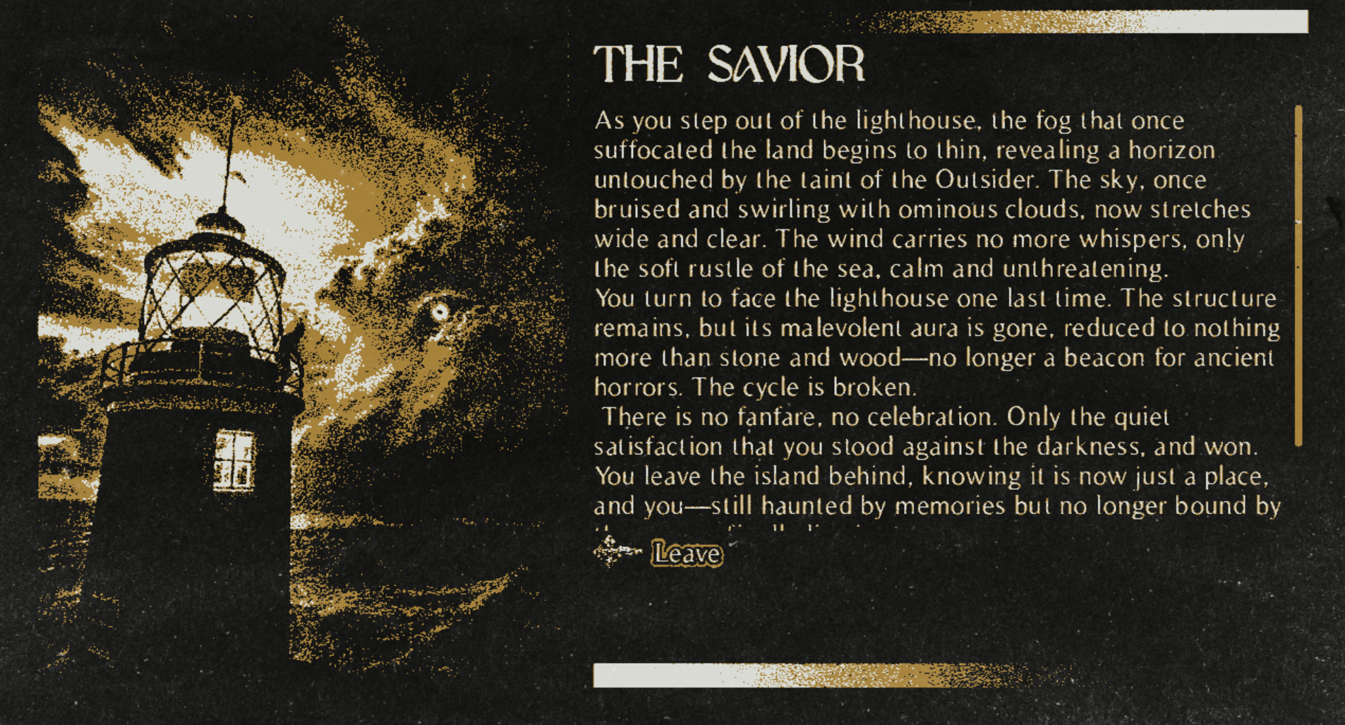
Nice and simple platformer that transports me to when I was four years old and played Super Mario Land the first time on the Game Boy.
Felt the level design and enemy logic was reasonably challenging, and really appreciated the save-of-progress of leaving previous enemy spawners destroyed after the player dies (otherwise, it would've been too unforgiving; there are some points where the player is swarmed!). Also hadn't realized about the shoot function until some time in when I realized there must've been something in order to get past / destroy the spawners. But once I figured it all out, it was a fun playthrough trying to get to the top.
All-in-all, a very functional game with nice pixel art fitting within the theme of the jam. Good work, devs!
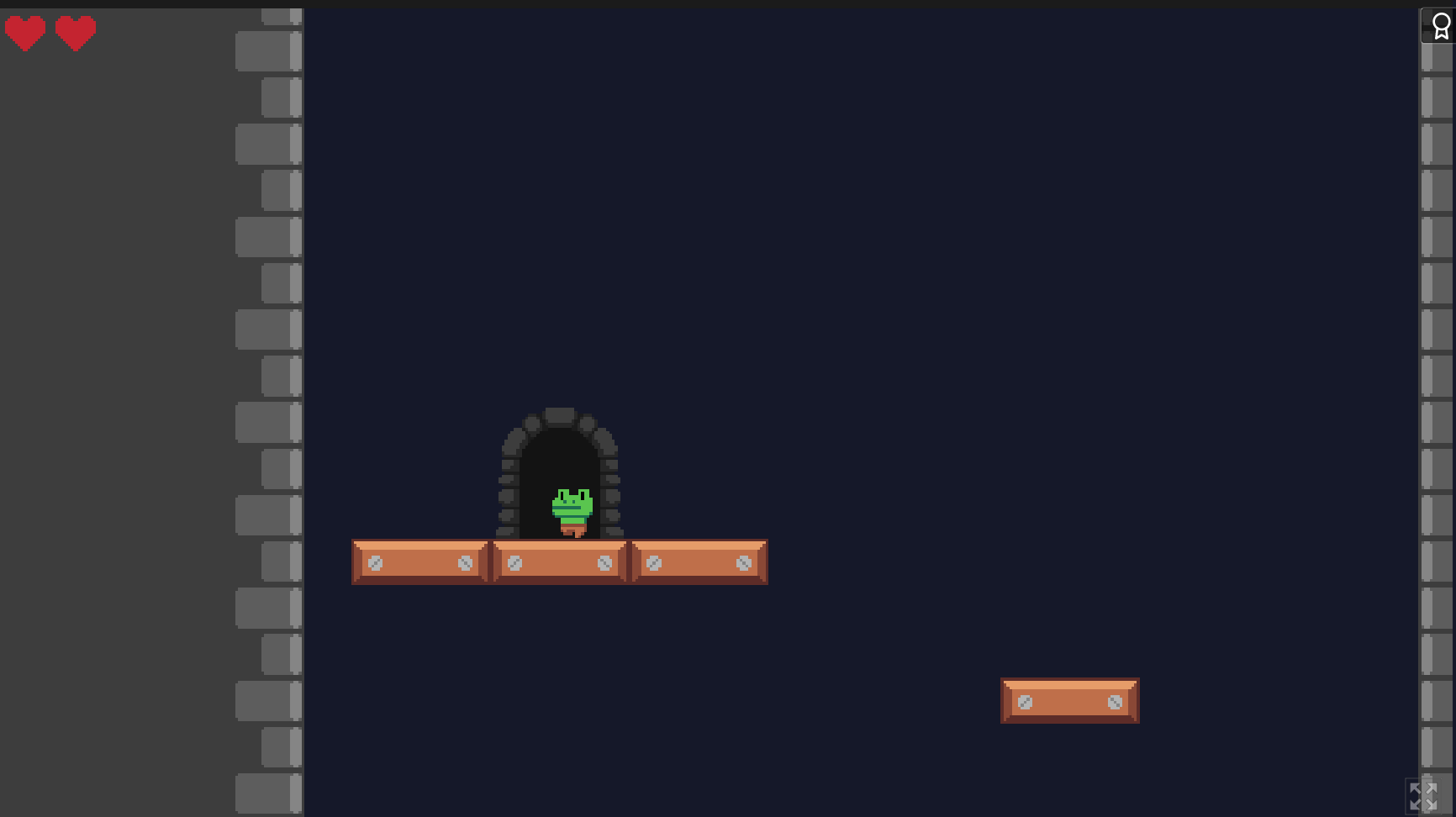
A beautiful mess. Take it from the previous developer comments that this is a work-in-progress, but often the hardest thing to get right is style, and this one has it. I think this could be the start to a more refined development and ultimately a fun game within the unique genre you've found.
Controls I'd agree could use an overhaul (maybe even conforming to WASD, and using the charge-up to allow the player to boost across a few platforms at once—at their risk), but otherwise, I like the artistic direction and accompanying music.
Congrats to those of you who remained on the development and submitted something on your first outing in Godot Wild Jam. Survival is the biggest victory. :)
One of the most mechanically sound games this jam, and when great mechanics meet thoughtful level design, a lot of fun can be had. Also love the style of font / animation / UI, giving the game a frantic touch that matches the sound design and difficulty of levels. Given the frequency of switch between tools in sandbox mode, would've preferred if each tool was rather assigned a number key rather than a left / right scrollthrough, but a tiny criticism in light of the many, many things done beautifully in this game. Great job, friends!
A phenomenal take on the tower defense genre, with a beautiful colour palette over crisp pixel art and appropriate 8-bit sounds / music.
Had an initial speedbump learning the game / controls, but once I was able to figure out which on-screen elements were interactable, I was better able to narrow down the controls and begin building.
The level designs of each wave are very well-thought out and present a high, but not insurmountable, challenge. The enemy types are creative, and one must balance swift-thinking with speed-building in order to survive the threats to the damsel.
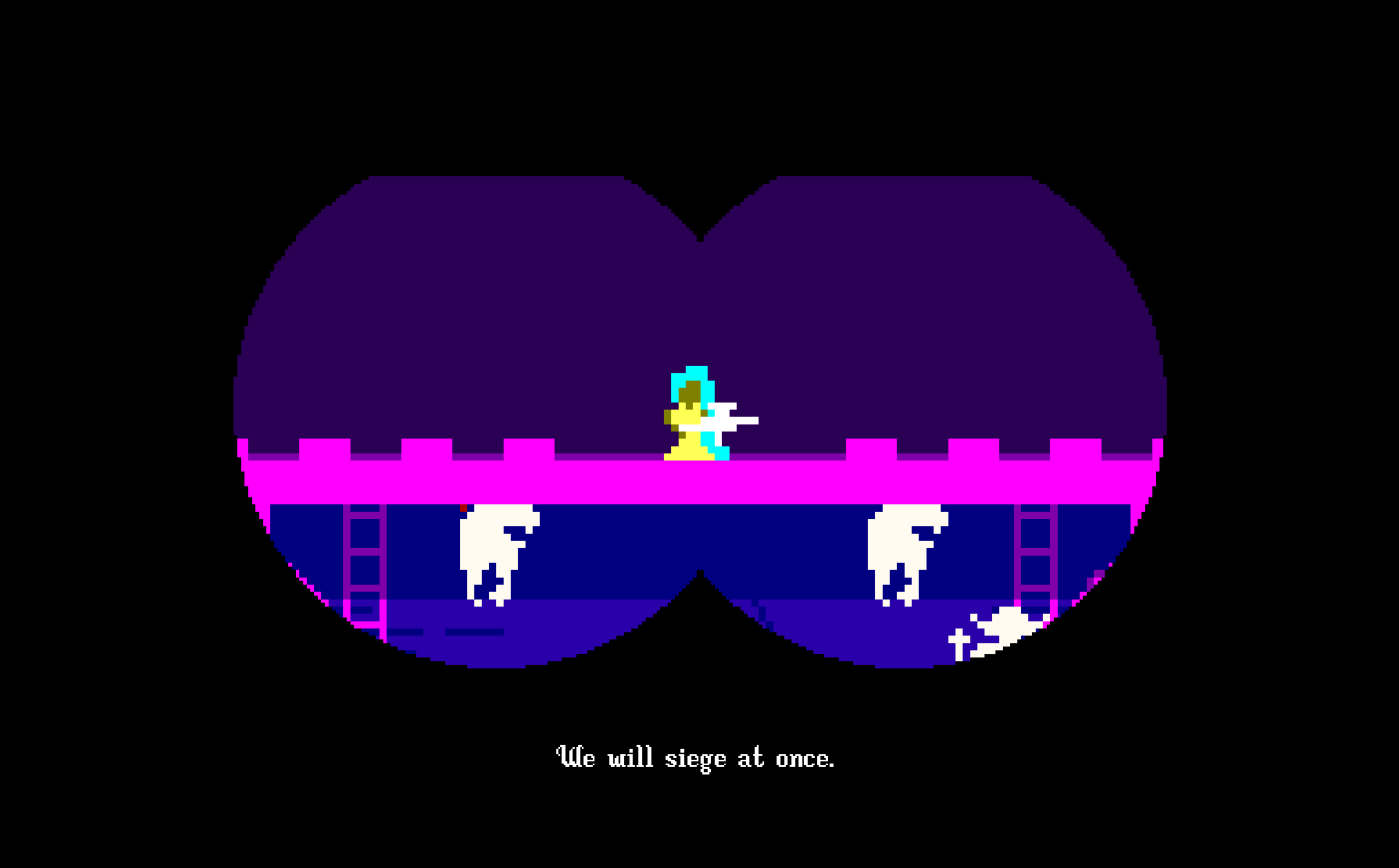
The narrative / cinematic sequences between each phase add to the polished quality of the game. I know they tried to re-launch the Atari a few years ago, but this is the type of "throwback aesthetic meets modern game design" type of game those guys should've found and licensed. Incredible entry by this solo developer.
(Also, despite being an all-time horrible gamer, proud to say I won!)
Exceptionally creative idea with tons of charm and personal touches that make up the overall presentation. Art—inclusive of the colourful 2D graphics, animations and matching 3D environment / models—was obviously mindbogglingly attractive. UI very well done as well.
Likewise had trouble controlling the tower, though understand that's precisely what the challenge is supposed to be, but a couple of levels the tower ended up outside the screen and I was unable to bring it back, so I think given the difficulty curve of the tower as is, a screen-limiter could help smooth the gameplay.
A super-cute game that delivers an original take on theme, and is one of the most polished entries in the jam. Well done team!
Bring lightly salted water to a boil in a large pot, throw the pasta in for eight minutes to achieve al dente status, drain pasta in a strainer in the sink, pour in a couple of tablespoons of extra-virgin olive oil in the now-empty pot, throw in your pre-cut sliced mushrooms, minced onions, and peppers and sautée for a few minutes, pour in tomato sauce and mix. Then slowly mix in the fully drained pasta and stir in additional pasta sauce over minimum heat. Stir, stir, stir, and if you have spices / garnishes, now would be the time. Stir again, and now scoop onto plates. Top off with parsley, or parmesan, or whatever you like, and enjoy.
All things considered, the physics and imagination of this one are on point, and I look at it more as an artistic tool. I feel like I created a Jean-Michel Basquiat-like masterpiece with my final creation:
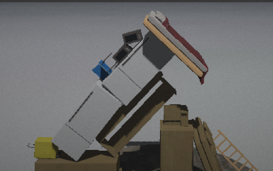
The triangle represents the three contrary points of existence: survival, purpose, and security. The objects within are the material objects representing the regularities of our lives, undeterred by our suffering. The lack of gravity is our wandering thoughts, floating through the space-time continuum.
Thank you for helping me achieve this self-realization. #CommunismIsTheCure
If there was ever a game that required having a nearby washing machine and multiple pairs of underwear on standby, this one is it.
- Holy cow at the narrative sequence!
- Cannot say enough good things about the pixelized 3D graphics. What a look, what an environment.
- Really cool Disney / early-90s vibes. Reminds me of some concoction of Aladdin (1993) for the Sega Genesis, and Super Mario 64 (1996). This would've made for a great title for the N64.
- The vertical level design is incredible, if not terrifying. Felt that if I would've fallen at any point, the loss of progress would've been so much that it would've been playthrough-breaking. As such, it never happened, since the level design was very reliably spaced out.
- A couple of the angled "black connectors" cause a total stop in movement, and require jumps on the beams to get past. Not sure if intentional, but adds an extra layer of challenge.
- Didn't realize until the end of my playthrough that the books could be "turned in" to the attic (that's my fault, skimmed over that in the game instructions). Otherwise felt the loss of books after making required jumps and necessity to go back downwards was too much loss-of-progress, and it was challenging enough collecting the books.
- The added abilities affecting the player character's movement are incredible enhancements on the base, especially considering the limitations on time during the jam. I feel I only survived the level because the mechanics are so solid and fine-tuned. Otherwise a shaky player like myself is sure to lose his footing!
- Character animations: perfect.
- Music and sound adds to the wonder of this magical world. UI on point as well. What a complete package.
Really enjoyed this entry. Congratulations team—I think you guys are going to do very well!
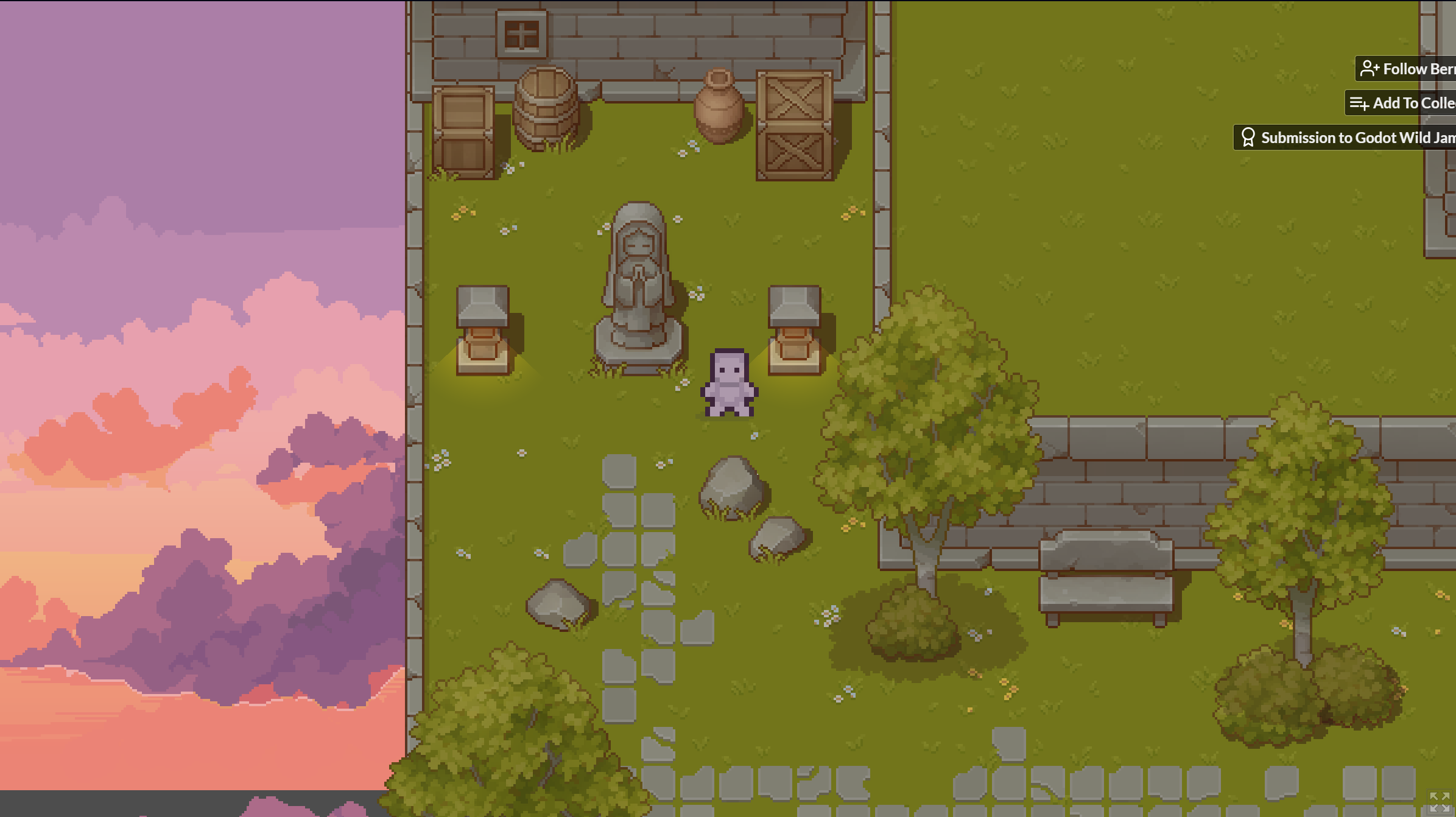
A gorgeous aesthetic with crisp pixel art and evoking colour palettes, with lively passive sound effects, transport the player into a whole different world. The idea of using musical notes to teleport the player is a wonderful one. I also had trouble with learning the notes and playing them on WASD, but this is an area where I think even showing what notes are being played on the UI popup, it would be challenging enough to memorize them all the way to the teleporter and could make for smoother gameplay.
Was nonetheless very impressed with how cohesive this game was mechanically, and the level of potential from a solo developer making their debut on a fantastic submission like this. Amazing work! (And please add some a cover / screenshots to the Itch profile; more bees should be drawn to this honey!)
Usually when the submission list goes up on the Sunday of every Godot Wild Jam, I scan for what appears like the most ambitious titles, and this was the one of the few this edition that felt like it belonged on that list.
- I like the low-poly look and it communicated well enough the office tower setting.
- Mouse movement sensitivity feels really low, and often I have to lift my mouse and recenter it on my pad to continue a camera pan.
- Level design is interesting, because on the starting floor, all of the rooms except the Break Room don't really serve a function, so it reduces the gameplay effectively to a walking simulator. Nothing wrong with that, but walking sims usually need something else to keep interest levels at a median level (IE: music, ambience, narration, collectibles, etc.). This is something that I've since noted is realized in later levels.
- Using findable notes to tell a story is a good method, and I feel the text was succinct enough to be accessible to most players. Strong story about the seduction of biological enhancement leading to the unfortunate destruction of a scientific work environment. Reminiscent of Fallout's shelters; very well-written.
- Second level improves on objective-finding and becomes quite challenging to figure out where the nameplates go. It's here one must really begin to pay attention to what's being said in the notes. I appreciated the clink if the nameplates were on the right desk, but would've desired a more explicit way to illustrate the player is advancing successfully (like an objective tracker on a HUD, or quest markers in the environment). After placing all the nameplates successfully, nothing was happening, so I picked each one up again and re-placed them on or around the same spot on the desk, and finally heard the "Going Down" elevator soundbite.
- Level three surprise: freaky-deeky! Easy enough stage to get past, though it's here I realized I must've missed the password on level two.
- Level four evolves to full-blown horror, and the atmosphere and level design is the perfect terrifying climax to a well-developed story. As with level 2, wasn't clear what to do with the collected body parts, and I heard the clink for the legs in the first (engineering) room, and the clink for the head by the door of the executive's office. Couldn't find the clink for the torso, and when I inspected the executive office one more time holding the body part, I got clipped into the corner bookshelf and wasn't able to get out—effectively ending my hour-plus playthrough. Bugs like that are understandable for 3D games, however. It's where an escape menu / restart function can help.
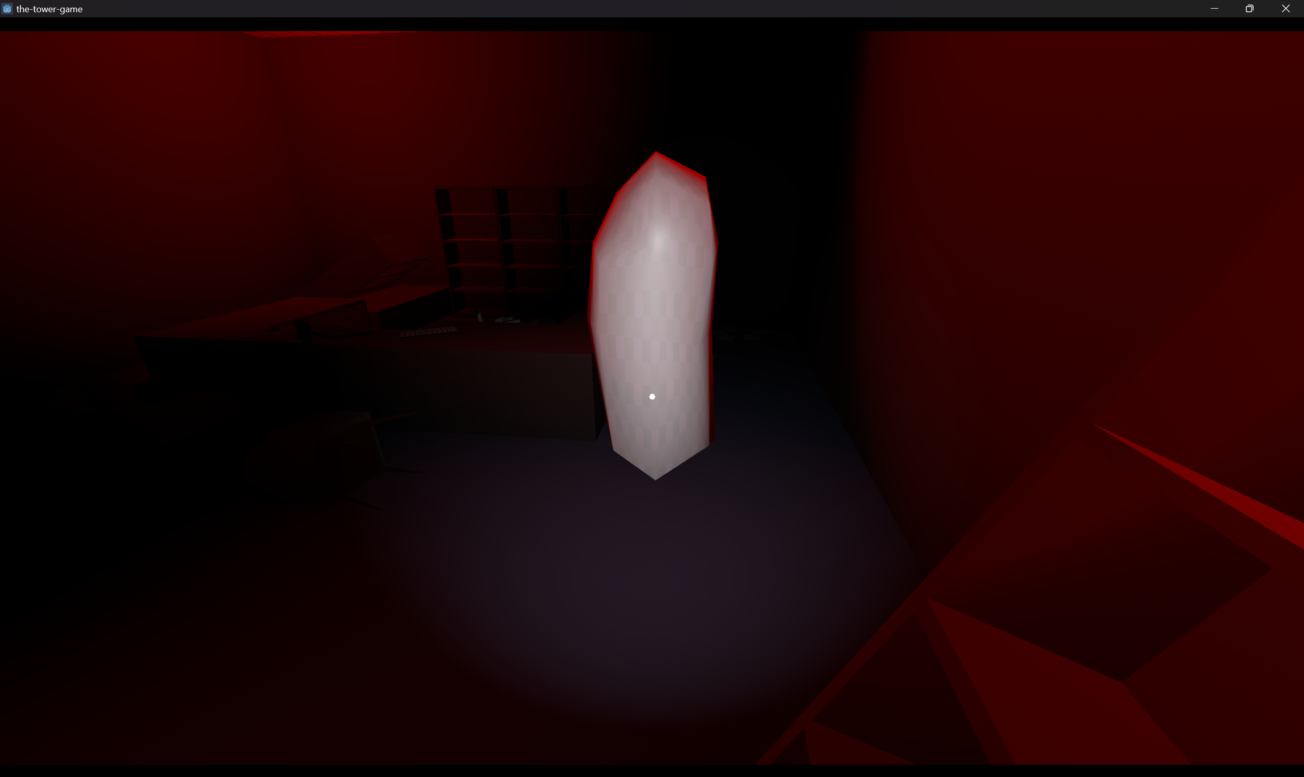
I think I was close to the conclusion, and was impressed by Paragon Tower. There's usually the one game (and oftentimes horror) that you play in these jams and feel, "Wow, this could absolutely be expanded out to a full commercial game," and this feels like that title. This was a noteworthy project by everyone who collaborated on it, and you all should be commended for tackling and completing a 3D story-based horror in such a short development window. Congratulations!
Sometimes the biggest accomplishment is surviving the difficult tides of development cycles and actually reaching the other side, when failure is otherwise the likelier option given trying circumstances (like team issues). There were 650+ sign-ups to this jam, and you guys are part of the few 153 who completed. When you all eventually release a game you're proud of, it'll be because of your work ethic, skills accrued, and persistence that you showed on Cell Tower. Hang your heads high—this game was an achievement!
Initial thoughts were "wow" at the ambition of this submission. Rare to see in a jam a functional business sim with a full city environment!
- Smooth edge-scrolling / zooms makes for easy navigation around a city scene like this.
- Like the narrative intro and the ability to input a business name at the beginning. Personalizes the playing experience and adds that touch of a "full game" feel.
- UI very well done and shows pertinent info.
- Perfect length for a jam submission. Lost my first playthrough with a 39% market share. But learned valuable lessons (mainly to always bid $5000 and buy the $10,000 large tower) and came back strong to rebuild my business empire. I feel I'm prepared to take on the real world and put Comcast out of business. Will report back!
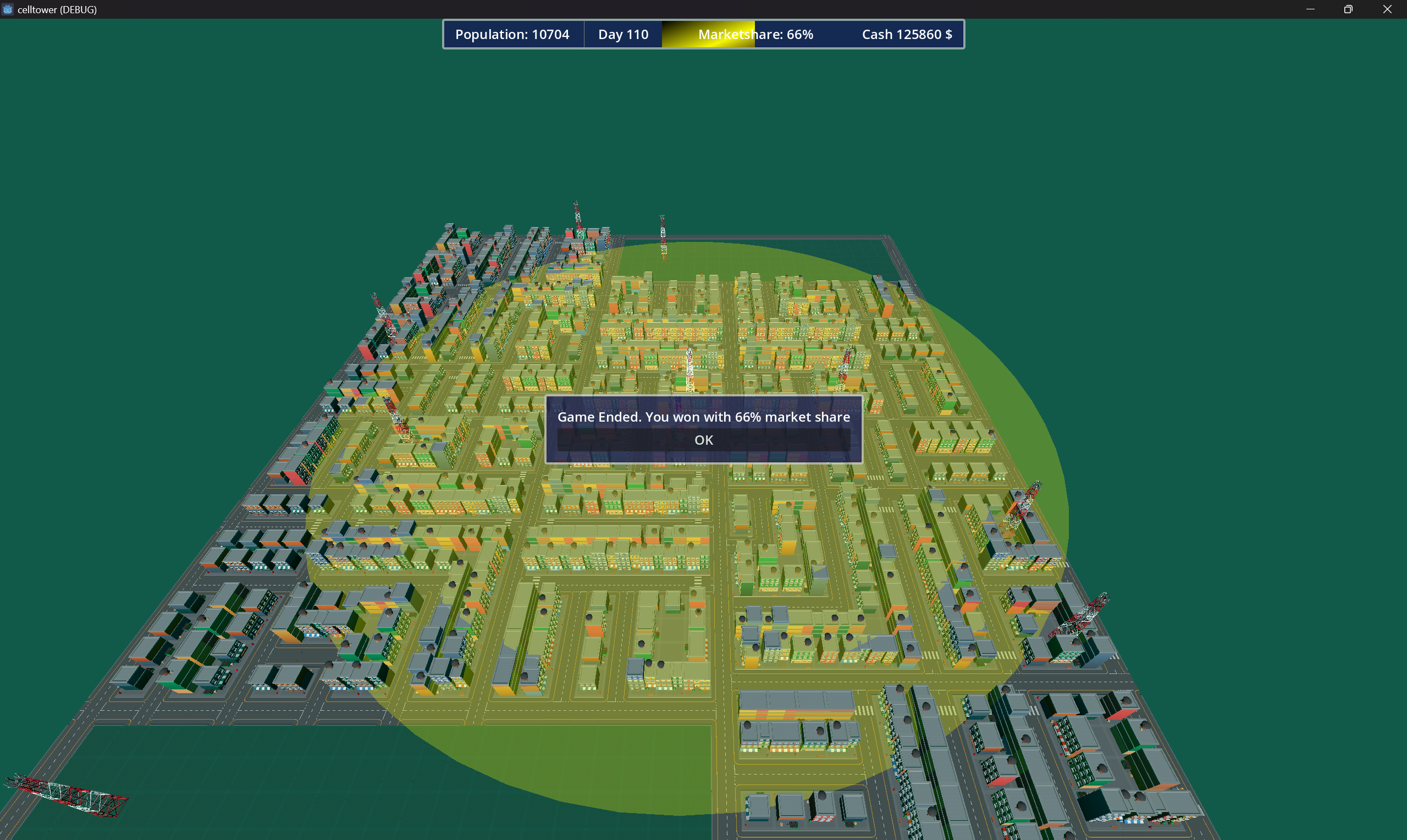
This was a two-person collaboration? Holy cow. These devs are ones to watch!
Alwin! A million thanks for giving us our first review (we'd otherwise begun to slump our heads in the Discord server)! Our team in the past has made moody story-based games, so when our lead dev suggested something based entirely around an exciting gameplay loop, we all went for it. Glad to hear the fun factor resonated most with you, and your playthrough was as wild as we'd hoped!
Very cool game design and atmosphere! The metrics of hull damage, power -> light -> sonar, and oxygen worked well in tandem, and made the descent challenging. The story snippets along the way were a great addition to keep player motivation alive. Art was gorgeous and gave this world a lot of authenticity.
Died early in my first run due to low oxygen as I didn't know there were collectibles along the way, but learned so by reading the comments below. Second run, made it to 268m, which given by the intensity of the story notes, seemed like it was close to the win condition.
There have been a lot of promising debuts this GWJ, but with only three months of collective experience, you cats did absolutely fantastic! Well done. :)
Oooooofff, you could jump during the Pac-Man maze?! Why didn't I think of that?
Echoing statements of previous players: super-gorgeous and homely isometric art style, lovely animations, matching sounds / atmosphere, well-guided tutorials, and all-around a neat little world you created here. Wwwaaasss about to criticize that the default speed of the enemies were too difficult, and the slower speed was indeed too easy, but now will have to put jumping to the test.
Was surprised the game ended after the maze; thought it was a stopgap between the tutorial and the rest of the game, but can totally understand the limitations of nine days of dev time, and I think the art, UI / UX, sound, and other polishes were a worthy tradeoff. Do hope you get a chance to build on this after the jam ends!
It isn't a proper Godot Wild Jam without an Anonymyst submission, because it's usually the most unique entry with experimental features and ideas applied to true-and-tested mechanics, and makes for a memorable experience. I still remember how Chapter 2: Smoke and Iron took pieces of my soul.
In Into the Void, one of the experiments lie in the unique click + hold method of player movement, and automatic bullet shooting. I like the latter, not too sure about the former, but would agree that traditional mechanics of mouse movement to move + click to shoot would've been too "regular."
The bullet hell occurs when multiple enemies or boss characters appear on the screen, and avoiding their red circles is challenging, requiring the player to stay focused on their own sprite at all times. This difficulty is offset by features like a protective shield that gives you invincibility frames for a few seconds, which concurrently allows you to move anywhere on the screen during that time and get to a better position. There definitely is some strategic thinking required to survive the space-hell.
I did try to reach for the thunder icon a few times to kill all red circles (died a couple of times in the process), but wasn't sure if I was ever able to activate it. It could use a hover graphic, or it's perhaps better assigned to an input (right-click?).
Would've liked to have seen a progression system of sorts that made it more apparent how much closer a player is getting to the end, or even a copyrighted Anonymyst story as those also are unique ideas into a foreign universe that I crave for.
Excellent music, 2D sprites, and top-notch particle work make this game a whole different world. I love the fact that the difficulty is acknowledged by the developer, who balances it with unlimited tries without too much loss of progress. Fun and challenging. My only disappointment is that this isn't titled Chapter 11: Ship Ton of Bullets.
What a way to close out the night; appreciate the kind words, Anonymyst! My UI contributions were limited to the splash screen, main menu, and HUD this time around, so very much grateful for our lead developer's placeholder work that I wasn't able to get to due to limited availability around writing / producing the dialogue. Our guy Pete was the glue that filled in all the holes. 🛠️ (I spent twelve minutes looking for a glue emoji before realizing it doesn't exist)
Can't wait to play your entry this weekend!
Really liked the game design of adding mass to explode a star and create a black hole, as well as the introduction which clearly explained the backstory, goal, and control scheme. Agree with the consensus that the player character is difficult to see (rather, differentiate from the rocks) and control. But for a first-ever game, this is a promising debut. Hope to see your ideas develop and refine in future jams!


