Play game
[Game Jam] Cast The Light's itch.io pageResults
| Criteria | Rank | Score* | Raw Score |
| Fun | #18 | 3.846 | 3.846 |
| Originality | #20 | 4.077 | 4.077 |
| Theme | #21 | 4.000 | 4.000 |
| Overall | #21 | 3.747 | 3.747 |
| Controls | #23 | 3.615 | 3.615 |
| Graphics | #24 | 4.154 | 4.154 |
| Accessibility | #33 | 3.231 | 3.231 |
| Audio | #59 | 3.308 | 3.308 |
Ranked from 13 ratings. Score is adjusted from raw score by the median number of ratings per game in the jam.
Godot Version
4.2.1
Wildcards Used
Easter Egg
Game Description
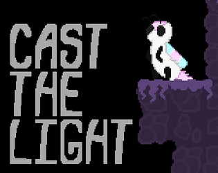
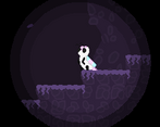
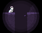
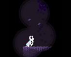
Slowly make your way through the dark caverns and cast your light to make your way to the totem.
How does your game tie into the theme?
Void as in absence of light, Casting lights around helps you light the way and see.
Source(s)
No
Discord Username(s)
@quazarcreachure
Participation Level (GWJ Only)
This is my first time participating
Leave a comment
Log in with itch.io to leave a comment.


Comments
Very cool!
well done for a first entry!
is it me or is there a little coyote time? if yes, bravo for having thought of it
I like everything except the light. Playing in the void is the main mechanic, but I think It could be a bit better handled.
hahaa yis!!! I did add Coyote Time! along with Buffer Jumps too!
I've dabbled in already making a few platformers (I have one indev rn) and I learned a bit from games like Hollow Knight & Celeste (especially Celeste its a very very very good game big reccomend, Hollow Knight too, but I cant have this comment just be me rambing about games... except my game >->) on how to make good feeling controls. Well in theory at least, still gotta make games to get good at it in practice.
Yeah the lights seems to be my greatest weakness so far, good notes for future projects.
Thanks for the feedback & playing!
This is an amazing game, I have very few complaints. I think it would be better to make the cast lights a little bigger. The game could've also used another song but considering the time limit it's great you made one at all. Other than you hit all the key points, nice art, some music and good level design. I like Nioe's design, very cute character. That full bright mode was also a cool inclusion very nice going through the game again but being able to see the full level. I can't wait to see what you publish next.
Eeee! very glad you enjoyed.
I really did try to add as much as I could but with the time constrains I could only add so much and had to focus on whats importain, good notes for next Game Jams, to which im already in another one right now, so I'll be making plenty of little games & have some bigger games planned too.
I really like Nioe too. I designed her loosely based off the "rosy maple moth" but with pink & cyan & white instead of the standard pink & yellow.
Yesyes! Love adding little post-game stuff at the end. Figured it would fit being able too see everything as a fun little addition so ppl could see stuff they havent before and what not. Happy its being interacted with.
Thanks for the feedback & playing!
Cute game you got going on~! I'm really bad at platformers, and was honestly super impressed with the difficulty progression in this (had no real issues and even got to the end). Each level felt perfectly tuned. The gliding mechanic was a perfect addition to the game as well. The idea of gliding into the darkness and "hoping for the best" felt very rewarding when it paid off. Will say, having to reset my lights was a big chore. I kind of wished I could pick which lights to get back.
Regardless, I really enjoyed your game, and congrats on your first GWJ!
- S. "Essay"
Oh yes yes! I love platformer games. but creating platformers was a whole different thing. ur the second comment to point out the difficulty curve which is good cuz I put in a bit of effort to make the levels not seem too boring and just right, mostly using what I call "the Formula". Mostly introducing somthing to the player where they can get used to it before ramping it up.
Yeah the casting & reeling mechanic was difficult to create, good notes for my future games!
Thanks for the feedback & playing!
Really entertaining and beautifully done.
I had a lot of fun :D
Good Game . Fun playing and died many times
The amounts of levels you made in just 9 days is impressive! The difficulty curve felt just right.
I liked how the lights would pulse. But placing them felt like a chore. Maybe if RMB only removed the last light, it would help that? I liked the flying mechanic, but when it was introduced, I had some trouble figuring it out because I thought the flying pickup was a mouse icon telling me to click. Crisp pixel art!
All in all, a very fun game! Thanks for sharing!
Was technically 8 since I submitted it on Saturday.
Yeah casting lights and reeling them was one of the most tricky things to create, and the wings do look the same as the cursor icon.
Thanks for the feedback & playing!
Excelent game. Was fun running through the full bright version as fast as I could after completing it, would be cool if it kept track of how long it took to complete in each version and gave you a comparison at the end :)
Glad someone enjoyed the "full-bright" mode, Im a big fan of adding little fun post-game stuffs.
Yeah also a big fan of speedrunning, more watching than doin. didnt come across my mind that someone would wanna speedrun my little game.