Play game
Little Fox's itch.io pageResults
| Criteria | Rank | Score* | Raw Score |
| Graphics | #13 | 4.292 | 4.292 |
| Theme | #32 | 4.208 | 4.208 |
| Controls | #46 | 3.375 | 3.375 |
| Accessibilty | #51 | 2.875 | 2.875 |
| Overall | #51 | 3.345 | 3.345 |
| Originality | #87 | 3.250 | 3.250 |
| Audio | #87 | 2.750 | 2.750 |
| Fun | #94 | 2.667 | 2.667 |
Ranked from 24 ratings. Score is adjusted from raw score by the median number of ratings per game in the jam.
Godot Version
3.5 Mono
Wildcards Used
Dynamic Perspective / What the duck
Game Description
Just our first game ^^
How does your game tie into the theme?
Light and darkness as opposites of good and evil
Source(s)
N/A
Discord Username(s)
glowson, schprrottnya
Participation Level (GWJ Only)
First time
Leave a comment
Log in with itch.io to leave a comment.


Comments
The introduction is top-notch!
I really like the idea of using the flashlight as a weapon to kill enemies (à la Alan Wake)! Love it!!!
The controls are smooth and polished, and the spooky atmosphere you created in the level is fantastic.
Although the level design is great, I found it a bit too big, and I had trouble finding all the toys.
Overall, this is a very impressive first jam entry—congratulations!
Cheers! :D
Thanks a lot ^^ Probably the level seems big because the player's visibility is limited by the light of a flashlight, when we collected the level we thought it was too small xd
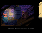
Really cute intro cinematic! Once the game started I couldn't quite figure out what to do. Lots of toys weren't interactable, so it was frustrating trying to figure out which ones needed to be picked up. The way you use the flashlight against the enemies is really cool though
Made it to the finish: let there be light! Poor little fox is really tiny compared to the stuff in his room, including the room itself. I wonder how he could hear his mom from that distance haha. Jokes aside, this got one of the best drawn graphics I’ve seen in the three Godot Wild Jams I joined.
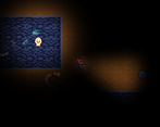
I'm so glad, thank you for the comment. We tried to show that in the dark, the little fox's perception of the world is different. And his safe world became larger for him.
Level was larger than desired, and it was unclear what toys I actually cared about as some had collision, but I couldn't interact. It was also unclear when you died that you reset, though I am pretty sure that is what happened. Loved the opening sequence and concept for the game though.
Very cute and surprisingly scary game! No wonder the kid is scared at nights, I would be too if my room was the size of the village. The atmosphere was amazing and made fascinating combination of both very cute but also creepy feel. Great job!
Thank God that candle extinguished, it was reeking of fire hazard, being so close to those papers and all...
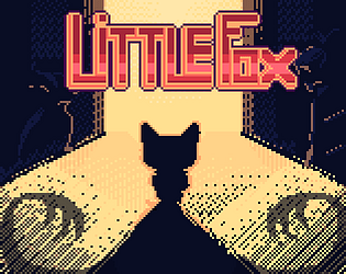
Jokes aside, I loved the opening art and music. As soon as I openned the game, I stoped to wonder how much time was spent drawing the menu art. And then the same thing happened when I saw the opening sequence (which was also really pretty).
For the gameplay itself, as some pointed out, the map is a little too big for my taste. I had trouble finding the toys and sometimes kept reseting out of nowhere (which I think was because I died?). I think some sounds when being hit and a death screen would have helped.
Overall, very nice first game. Keep up with the gourgeus art and you guys will go far :)
Thank you 😊 👍
Very great game, tho the level was a bit big so i couldn't find all the toys.
Hi, thanks.
To be honest, I couldn't find all the toys too. Ha-ha.
The game is really cute. I was only able to find a few of the toys.. I am not sure if the map is super huge or I was just walking around in circles xD
Ha-ha 。◕‿◕。
Walking in circles is the typical behavior in the dark. I have something similar irl :'(
I had trouble making progress because the level was so big and I got disoriented very quickly. That being said, the concept is great, the artwork is lovely, and I think you did a great job. Excellent use of the theme!
I found 2 of the toys but got too spooked to continue, which I think is a great compliment !
Great experience, flows well, looks great !! I'll just say the difference between interactable items and decor wasn't clear, and I kept hoping for a second permanent light.
I love the creepiness, you've really perfected the vibe you're going for and the art is very pleasing to look at
Thanks ^^
Really love your cover art here looks very professional, Game wise controls are pretty snappy and easy to grasp. Art style is superb. The stage is pretty big and finding the other light source can get a little tedious quickly.
Congrats on your first game! Cheers!