Play game
Into The Light's itch.io pageResults
| Criteria | Rank | Score* | Raw Score |
| Theme | #39 | 4.100 | 4.300 |
| Graphics | #56 | 3.528 | 3.700 |
| Fun | #66 | 3.051 | 3.200 |
| Originality | #67 | 3.432 | 3.600 |
| Controls | #77 | 2.956 | 3.100 |
| Overall | #92 | 2.928 | 3.071 |
| Accessibilty | #113 | 2.193 | 2.300 |
| Audio | #142 | 1.240 | 1.300 |
Ranked from 10 ratings. Score is adjusted from raw score by the median number of ratings per game in the jam.
Godot Version
Godot 4.3
Wildcards Used
Duck
Game Description
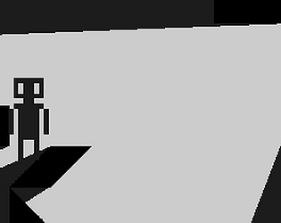
A game where you must never enter the darkness
How does your game tie into the theme?
the player lives in light and dies in dark
Source(s)
N/A
Discord Username(s)
renderinguser
Participation Level (GWJ Only)
two jams before. #37 and #65
Leave a comment
Log in with itch.io to leave a comment.


Comments
I like where this is going. I think having the light ease in on the main menu would be nice; you have a super cool effect but having the light flash moving between button was a bit jarring. Definitely interested in seeing more levels, keep it up!
i was using whats basically blender’s color ramp as a shader in godot. thats why its very pixleated. i was using hard cutoff. i could actually change it up a bit if i add a slight gradient i assume
Cool concept and visuals!
I really like the concept of this, I totally get running out of time to implement more levels. Something that I think this game would greatly benefit from would be coyote time. Look it up if you don't know what it is, it's a great way to help platformers to feel better.
i didnt have enough time to implement coyote time and jump buffering. the movement code is literally a slightly modified version of the charachterbody2d template code lol
I loved the main menu for this one, very creative. That being said, I don't know if this was an error on my side, but some of the buttons did nothing.
Anyways, I like the concept and the visuals, but the controls and character movement felt a little slippery, making it harder to stay in the light sometimes. It is a little short, but can become a good full game. Good job :)
ty
the only buttons that work, are left, right and space
I can sense a good horror game idea from it. Funny how we both have exact opposite titles lol.
Very cool concept. I could see this as a full game.
Always love seeing the light creating shadows like that in game. Great use of it and great work. Great to see :)
This concept is really great… took me a minute to figure out what killed you… but I did in the end… you love to see this grow into a more complete game!