Indie game storeFree gamesFun gamesHorror games
Game developmentAssetsComics
SalesBundles
Jobs
TagsGame Engines
A jam submission

The Secret of Inari Desert ManorView game page

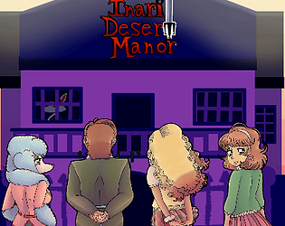
A prowling kitsune awaits...
Rated by 8 people so far
Add to collection

Play game

The Secret of Inari Desert Manor's itch.io page

Rate this game

Sign up with an itch.io account to rate and leave comments.

Which Theme(s)/Horror Genre(s) did you use for your game?
B-Movie Schlocky, a little cosmic horror

What challenge(s) did you decide to add, if any?
"Who the Fuck do you think you are?!" Said by the main heroine Erika.

Leave a comment

Log in with itch.io to leave a comment.

Comments

Host(+1)

I feel like the plot was kind of all over the place, and maybe this was a bit rushed. However, the art was top-notch, and it was enjoyable to play.

Submitted(+1)

All right, Honeynut. What I like most about this is your art style. It's definitely unique and I always love to see what designs you come up with. However, now I understand why you were so worried about being rushed to get this through. I wouldn't say the writing is bad, but for a story like this, there needs to be more of a build-up to everything that's going on here. There also needs to be a bit more character development; everything went by so quickly that I didn't actually have a chance to know the characters or get any particular feelings for them. This felt so at-odds with your other games that it was actually jarring. Pacing-wise, I think the problem is that there's no time for the story to actually unfold. It's like watching a hectic day happen at 2x speed. You can see a lot happening but you can't grasp what's happening because everything is moving too quickly.

I also think you need to re-tweak the chase scenes. The first one was so quick that I had no time to actually read any of the lore, and I was caught no matter where I went. The second and third were similar. My advice is to turn down the movement speed for the chasers, because even with dash on, it's hard to not get a game over the first time. You might also want to consider condensing the maps a bit. It felt a bit too vast and empty, and with chase scenes, I found myself running into dead ends because I just couldn't see what I was doing, nor did I have time to stop and look. I understand that you wanted to give the player enough space to run, but I think maybe having narrower corridors might have been better than huge areas that had no clear direction.

Overall, I know this game could be a banger. It's clear that you were rushed to get it completed. I think you just need to take more time with the story. Have a little bit in between some of the major events so that the player can be acclimated to the manor. Personally, I would have loved to investigate some of the events that DID happen, and I think the game could lend itself insanely well to a horror mystery. :) I'll definitely follow to see what updates you've got planned.

Developer

Thanks so much for your input Dora! Glad you shared your suggestions as well.

This was truly an experience.

I feel like the writting needs a TON of work, and the chase sequences are very annoying because everything just goes waaay too fast. The sprites also need work, the shading on them make them look plastic and the anatomy is very off, i recommend using a symmetry tool for the foward facing bodies.

Apart from the lacking sound design, annoying controls and weird looking sprites (not in the good way), I will say that the idea of the story could be fun and all of the 8-bit art looked very good! I especially liked the kitsune 8-bit design when she turns into a monster.

PS. Sirius is definetly gay, i think he just doesn´t realize. I feel you guys could use inspo from Hatoge since they have a similar vibe to what you guys are trying to do (at least in my opinion).

Developer (2 edits) (+1)

Honestly this game managed to be a rush job so in the writing department I get what you mean. 

As for the character bust art, I tend to use traditional lineart. My art style tends to be very hit-or-miss because of that; So using a symmetry tool might give it the opposite effect since I find perfect symmetry to look less natural and uncanny. The shading I could work on more, I just need advice on it (but a lot of people tend to like it). 

The sprites are actually 16-bit. I am glad that Hto's sprites are to your liking as well. I am just sorry the rest of your game isn't up to your standards. And Hatoge? I am not quite familiar with it. 

Edit: Found Hatoge's page (it's best to mention if they are a user or not since English is a tricky language.) I'll definitely check them out since their art is cute and like you said, it looks right up our alley. 

Yeah, i guess the artstyle thing is more of a difference in likes and dislikes! I would love to see what you do in the future!

Developer(+1)

Definitely. If you want to see another type of artstyle I do, check out Cannibal Mermaids Trench and Ava's Spiritual Guidance (the winner of last year's HawkTober Game Jam) - both of those games do use digital lineart and happen to be my most viewed games. 

i thoroughly enjoy the art, there is no reason to critique the art except if your intention is rudeness. keep it up honeynut and stick to your style, it is what makes you unique!

I´m sorry if it came off as rude, I wasn´t criticising the artstyle, just the technical aspects and anatomy. As an artist myself, I don´t think that visual art should be excluded from critism! And I don´t think is inherently rude to comment about it either.