Play game
Cash Bot's itch.io pageResults
| Criteria | Rank | Score* | Raw Score |
| Looking Good | #7 | 3.538 | 4.333 |
| Sounding Good | #9 | 3.266 | 4.000 |
| Fun To Play | #13 | 2.722 | 3.333 |
| Theme Relevance | #14 | 3.130 | 3.833 |
Ranked from 6 ratings. Score is adjusted from raw score by the median number of ratings per game in the jam.
Leave a comment
Log in with itch.io to leave a comment.


Comments
Nice simple game. I was able to get to the end without problem. I think the camera system could be reworked a little. It was hard to see where I needed to go.
Good job! Fun mechanics & nice visuals :)
Robot could move a bit faster (maybe give option to upgrade it with coins?)
Hurray!
Change is necessary, but so too are bills.
I don't want to rehash what other people have said already, so I'll try to focus more on other things with my comments.
Firstly, I like the idea (and the name) of Cashbot. I feel systems where you earn currency to buy upgrades is a strong way to keep a player invested (puns!) in a game. The gameplay itself is simple, which is totally fine for a gamejam. I'm not generally a fan of point and click movement, but that's definitely a personal preference.
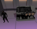
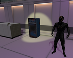
The text explanations at the start don't necessarily look the best but they're very useful for guiding the player. And the spotlights on the upgrade terminals are useful to draw attention to them, in most cases. The one time this wasn't the case is when those two things conflicted:
At the start of the game the player is being guided by text, but there's no text near the first upgrade station, just the spotlight, and so I actually missed it the first time through. I was being conditioned to look for and follow text, so a simple highlight wasn't enough to tell me that the upgrade machine was something I could interact with and that it was very important. I learned about cash but not where to use it. The second upgrade machine was much more obvious, there were no text explanations on screen to distract from it and it was displayed prominently in the player's path.
(Though going directly to that machine also gets the player into aggro range of two enemies further up the screen, which is especially troublesome when the upgrade screen takes up a large area and doesn't pause what's going on.)
Speaking to the upgrades themselves, I always prioritized movement upgrades over combat ones. Since I missed the first movement upgrade which increases range the movement speed upgrade felt lacklustre, I was travelling very quickly to a very short distance, and the cooldown on movement meant I was ultimately travelling at the same speed as before, but with a much more stop and go pace. While that would have been alleviated by noticing and using the first upgrade machine, it's also possible that a player would have used their cash to increase their health instead and run into the same sort of situation.
Outside of the speed upgrade, the movement cooldown reduction and the range extension upgrades felt very good. Again I didn't put much into attack speed and strength, finding them ultimately unnecessary as long as I was careful about engaging enemies. The final foe I could easily run away from and regenerate health as necessary once I was nice and speedy.
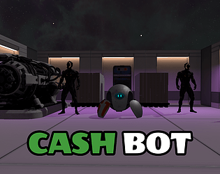
Graphically most everything is nice. While the floating text and simple menu buttons wouldn't be appropriate for a fully released game, they're entirely fine for a jam game. There is a stark contrast between the UI for the upgrade machines and the 3D world of the game, though again that's perfectly alright when working in such a tight deadline.
The one thing that stands out is the sections of wall that are only visible from one side. Since the camera is fixed to a single perspective I think it's possible to flip some of them to help hide that they're one-way facing, which may not have been as obvious when building the level in the game editor. Perhaps they don't properly fit together in such a configuration, though?
The music is nice and sounds appropriate for the style of game, the laser sound effect is appropriately laser-y.
And I'm sure I've rambled on enough! I hope this doesn't sound like I'm nitpicking things, I think the game is generally very well done!. :)
Thanks for playing and the feedback! Glad you managed to make it to the end. Those are all really useful comments. If I ever update the game these will be first on my list. It's interesting you favoured speed because I tended to favour attack in my tests. Maybe that's why its not as balanced. Although if you invest only in attack it gets overpowered quickly haha
looking at this image at game end screen, is ther a typo err in code, schould it not be: https://smurpy02.itch.io #some of us play only without install, sorry for that, but keep playing our game is webgl than rate it
Nice job on the pathfinding. Controlling the robot the first few times felt great.
As has been said below, the gameplay pace was too slow, and the range i could click was short(which would have made it a little better.
I also hit the reset button a few times which was super frustrating aha.
Visually though it looked awesome and its clear a lot of work went into it.
This feels like a jam you would have learned a lot on.
Great job,
Thanks! Yes definitely learnt a lot. I actually had the same issue with the reset button in testing but couldn't think of a better way to fix it. Thanks for the feedback!!
I think it's a great entry! The pathfinding looks awesome, and the animations are very well done-- I find it tough to get them right.
However, I have mixed feelings about the gameplay pace. It feels like a slow-paced real-time game, that, in my opinion, isn't very engaging. I think it could be more enjoyable if we either shift to a turn-based system, where you can manage stats, defense, and attacks, or by making it fast-paced with more action.
But I get it, Jams have limited time, and I also suffered from it.
Thanks for the feedback! Yeah, pacing definitely could've been better. Think I spent too much time on the mechanics and didn't have time for balancing them
That was something I learned on my last Jam, doing a tower defense.
Balancing feels like more work then the development!
Bro that pathfinding was so smooth that it took me a while to notice that was there haha
Controlling the robot also felt satisfying :D
Glad you liked it! I really wanted to make controlling the robot not feel repetitive so that's good