Indie game storeFree gamesFun gamesHorror games
Game developmentAssetsComics
SalesBundles
Jobs
TagsGame Engines

Satinel

664
Posts
2
Topics
36
Followers
35
Following
A member registered Dec 26, 2021 · View creator page →

Creator of

Recent community posts

The description is currently "icons of axes" rather than books, too.

Great art as always! :)

Thank you for playing, I'm glad you found it fun! I think everyone has gotten a bad ending on their first attempt... the good ending can definitely be achieved!

Thank you for giving it a try! The design probably isn't as complex as the explanation made it seem, I should have used short and to the point instructions.

I had a few setbacks on the way.

I appreciated the change in backgrounds as well as the music for them, and that the song choice felt appropriate for the current season.

The concept is simple but definitely becomes more difficult as more and more characters (or bugs, I guess?) are included.

One thing to note is that, since characters only move left or right, when there are several of them in a line it's safe to ignore the ones in the middle since they have no where to move to. In a more fleshed out version of this type of game, I'd suggest adding vertical movement possibilities to help alleviate that and to make things just a bit more complex.

Thank you for playing! Building a trading game has been on my mind for a while now, this jam was a great excuse motivation for me to create one. :)

It was a bit arduous but we got there in the end.


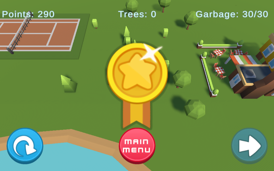
I appreciate the motivation to teach children about recycling. It would be helpful if the information on which bin is for which item was present during the levels rather than only available on the main menu. There are also some items which are indistinct, for example a 'ketchup bottle' in this game is assumed to always be plastic, but isn't labelled as such.

It would be a nice quality of life upgrade for the recycling bins to be in the center of the level so no trips feel especially long. The tank controls are also probably not ideal for the target audience of younger players. Though I suppose it does accurately depict that picking up trash is a bit of a chore. :)

Having different types of trees to plant is nice for variety, however it's a bit odd when the Main Tree disappears once its saplings are depleted. While I understand it's to make the player use an equal amount of each type, it gives an impression that the original trees have been sacrificed.

The music sounds nice... for a while. It does take some time to complete the later levels and the repetitiveness gets quite noticeable after a few minutes. Sound effects for correct or incorrect garbage placement would be nice, to make correct choices feel more rewarding and incorrect ones to be called attention to.

Since the player is teleported when straying toward the edge of the world, it would be nice if the outside area was visually fenced off rather than revealing the skybox.
(1 edit)

I really like the scene transition, which appears like a mouth chomping down! The music in the title screen is nice, though it does call attention to the fact that there's no music during the levels.

As mentioned by others, I also had the problem that damage does not reset between attempts, so once the damage bar is full every reload immediately ends in failure.

I got to level 5 before this happened, and up to that point the concept of changing only appeared once, when turning into a telephone. Which is a neat idea, except the only purpose of turning into a telephone appears to be that you must then turn back to the usual flower vase to progress to the exit.

Speaking of the exit, as has also been noted by others, there's a problem where the collider(s) do not match up with the visuals. It's entirely possible to do what appears to be a safe landing only to explode immediately. I'm not sure why the sides of the exit are as lethal as the moving obstacles and was very surprised when, at one point, I was able to land on the regular ground with only a bit of damage instead of instant death.

From what I've seen of the first five levels, they're all very similar in design. This could actually be advantageous giving the concept of controlling a shapeshifting object, if only that was leveraged earlier on. For example:

Begin the first level as a flower vase as is the case right now. That's fun and a bit weird and perhaps a little bit of a reference. Then, in the second level, start as a different object like the telephone. (This gives the player the feeling of "Oh, this is different!" instead of "Oh no, not again!") In the third level, start as a larger object (ideally not the same object from either of the first two levels) and shift to a smaller one when encountering a narrow gap. This way, rather than starting as the desired shape and being forced to switch back and forth, you can show off how shape changing is beneficial to the player rather than detrimental.

Structuring the levels this way can give a sense of progression through more complex gameplay, as well as increasing difficulty. Since the game is called Polymorph and the concept is shape changing, introduce that very early and show how it makes your game unique. :)

Unlike the other comments I didn't have any trouble with the camera, but I think I was lucky enough to get the fixed version. :)

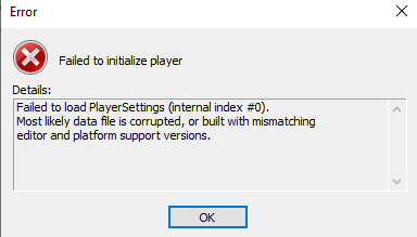
I also tried downloading the game was was recommended, but when trying to run it I got this error:

The WebGL version gave me no troubles, though!

It wasn't immediately obvious to me where to look to find out how much change to give. Now, that probably says more about me than the game, but I did send two or three customers through with no change before I saw the part of the screen telling me what to give them.

In any case, once I learned how to read it was pretty simple to get 99-100% S rank scores. :)

I completed the first four days normally and then on the fifth day I sent every customer through without change the moment they showed up, just to see what would happen. I have not yet been fired. Am I right in believing that customers will arrive non-stop until 22:00 regardless of how many or how few you deal with?

This is the best I can do for now


A good use of the theme and a simple but fun game. I found moving the player to be difficult, there's noticeable pause between pushing in a direction and heading there. As well, the background seems to move at the same time to a degree which doesn't help to give a sense of responsiveness

Auto-fire is appreciated! There's no reason to ever stop shooting, so it's a benefit that the player doesn't need to hold down a button to do so. The random change to how the ship fires keeps things interesting but, since it's unpredictable as far as I can tell, doesn't change up the core mechanic of facing at the block you want to destroy most.

Most of the challenge (for me at least) is remembering which ship colour destroys which enemy colour. I think it's better this way than to have the red ship destroying red blocks, but it would be nice to have the information onscreen, perhaps using arrows in the section which shows which colour your ship presently is. (That display as it is feels a bit redundant since your ship itself is also changing colour.)

It might also be interesting if the ship didn't take damage from certain colours as a certain colour. For example red blocks won't cause a game over if the player's ship is red when they collide. It might also not be interesting, just a random thought. :)

What was the motivation to split the levels up into two versions of the game?

You were able to make something and submit it for a jam, those are steps in the right direction. :)

And in all fairness, the bricks do look very nice!

Finally, a game I'm good at!

(Though, actually, I picked up too many coins the first time.)

As has been said, the intro cutscene is nicely done and helps to call attention to the instructions on the side of the bus shelter. It might also be useful for the player to start at the shelter, so they know where it is and can also double check the fare cost if they need to. :)

I appreciated the sprint button, the player can run so fast I'm not sure they need a bus. :D

Thanks so much for playing! There's another game in the jam which involves giving direct change in much the same way, so I was perhaps not as unique as I was hoping to be. :D

Sorry for any confusion you had while playing. I did put a lot of time into the tutorial, but definitely feel it could have been better at actually explaining the important things.

Hurray!

Change is necessary, but so too are bills.

I don't want to rehash what other people have said already, so I'll try to focus more on other things with my comments.

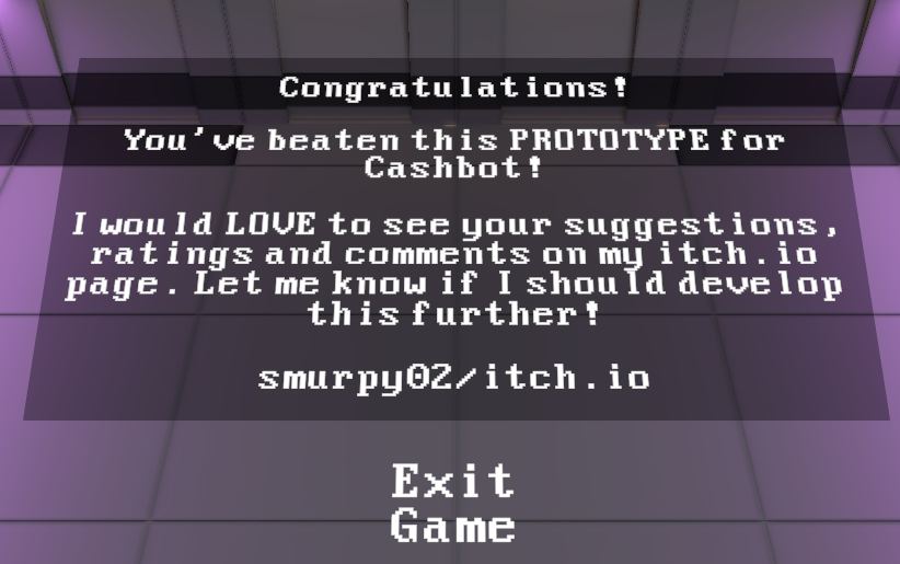
Firstly, I like the idea (and the name) of Cashbot. I feel systems where you earn currency to buy upgrades is a strong way to keep a player invested (puns!) in a game. The gameplay itself is simple, which is totally fine for a gamejam. I'm not generally a fan of point and click movement, but that's definitely a personal preference.

The text explanations at the start don't necessarily look the best but they're very useful for guiding the player. And the spotlights on the upgrade terminals are useful to draw attention to them, in most cases. The one time this wasn't the case is when those two things conflicted:

At the start of the game the player is being guided by text, but there's no text near the first upgrade station, just the spotlight, and so I actually missed it the first time through. I was being conditioned to look for and follow text, so a simple highlight wasn't enough to tell me that the upgrade machine was something I could interact with and that it was very important. I learned about cash but not where to use it. The second upgrade machine was much more obvious, there were no text explanations on screen to distract from it and it was displayed prominently in the player's path.

(Though going directly to that machine also gets the player into aggro range of two enemies further up the screen, which is especially troublesome when the upgrade screen takes up a large area and doesn't pause what's going on.)

Speaking to the upgrades themselves, I always prioritized movement upgrades over combat ones. Since I missed the first movement upgrade which increases range the movement speed upgrade felt lacklustre, I was travelling very quickly to a very short distance, and the cooldown on movement meant I was ultimately travelling at the same speed as before, but with a much more stop and go pace. While that would have been alleviated by noticing and using the first upgrade machine, it's also possible that a player would have used their cash to increase their health instead and run into the same sort of situation.

Outside of the speed upgrade, the movement cooldown reduction and the range extension upgrades felt very good. Again I didn't put much into attack speed and strength, finding them ultimately unnecessary as long as I was careful about engaging enemies. The final foe I could easily run away from and regenerate health as necessary once I was nice and speedy.

Graphically most everything is nice. While the floating text and simple menu buttons wouldn't be appropriate for a fully released game, they're entirely fine for a jam game. There is a stark contrast between the UI for the upgrade machines and the 3D world of the game, though again that's perfectly alright when working in such a tight deadline.

The one thing that stands out is the sections of wall that are only visible from one side. Since the camera is fixed to a single perspective I think it's possible to flip some of them to help hide that they're one-way facing, which may not have been as obvious when building the level in the game editor. Perhaps they don't properly fit together in such a configuration, though?

The music is nice and sounds appropriate for the style of game, the laser sound effect is appropriately laser-y.

And I'm sure I've rambled on enough! I hope this doesn't sound like I'm nitpicking things, I think the game is generally very well done!. :)

Thank you for playing and the feedback! The tutorial seems like it was a lot more trouble than it was worth... I should have found a way to show how things work rather than tell in a convoluted way.

I'm really bad at this one! (Like a lot of games in this jam, I'm finding...)

I didn't notice the instructions on the side immediately, and I think I actually did better when I wasn't actively using space.

One thing to note, the player also loses points/bounces/attempts when the ball hits the sides of the catcher. This may be by design, but given it can knock into both sides before being collected it feels a little bit like being punished for succeeding.

A nice concept! It's fun to jump between times in order to navigate obstacles that may or may not exist in both periods.

The action is pretty zoomed out, which is a gameplay benefit since the laser seems to have unlimited range, but it does also detract a bit from the feel of being part of the action. I felt I was mostly watching a tiny robot take down swarms of zombies and erratic automatons rather than being the tiny robot. It also made it difficult, at times, to notice small gaps in the fence needed to get to some of the artifacts.

The music is pretty cheery for a game about dealing with two desperate post-apocalyptic settings! The laser sound was comparatively quiet, which is perhaps a benefit since I chose to leave it firing most of the time. :D

Some of the trouble I had in earlier attempts was refusing to fire employees (unless it meant going into debt) or hire outside experts, because I saw that those were things listed under optional difficulty settings. :) I did have to end up using those functions for my one victory, in the end.

I had no idea experts could be put back into their slots, since I only used them in a couple playthroughs I guess I didn't experiment much with them.

I also wasn't clear on how training worked, or rather, that the fee was the same for one slot as it was for others. I assumed that higher level employees would cost more to train than lower level ones, but didn't experiment much with that either since the high level ones were in such demand.

I did catch on that over-qualified employees reduced a project's output. What I'm not sure how to do is anticipate which levels will be needed from one turn to the next. I didn't like the idea of keeping a level 0 employee around just in case a slot for them opened up in a future project, when I could instead send them to train. (Of course I could fire them and hire a new level 0 instead, but...)

Having higher level employees increase the skills of those they work with sounds great, and would definitely have helped me a lot. What I'd really been hoping for was some sort of 'experience' system where the more projects an employee did, the more skilled they could become. Not as the same rate as dedicated training but to keep them from stagnating later on. I suppose that's counter to the theme, though! :D

Thank you for playing! Sorry it was confusing, I feel I could have improved the tutorial a lot if I'd focused more on explaining things and less on writing some weird accent. 😅

Very nice, feel good game!

I do especially like that the blocked up river is actually cleared up. It would have been easy enough to just have characters say it was cleared without taking the trouble to graphically do so. :)

The villagers come off as just a little bit lazy, since a single grandson is able to do everything that they couldn't find the energy for. I know, I know, they're disheartened and overwhelmed by the situation, but it wasn't that hard to pick up litter and milk the cows! Well it sounds like they got back into the swing of things afterward. :D

I feel like I should definitely not run a business.

Generally I couldn't even reach the end, and this one time I did it was with far less money than I started out with.

I'm sure there are ways to make it through with better results, but I don't know what they are. It felt like the required numbers went up much faster than I could possibly train employees.

Anyway, it's very nicely made and designed. Intuitive UI and gameplay (but not so intuitive how to play well!)

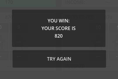
The best I could manage was $6.26 which is a long way off from the goal. No concert for me. :(

I had the same idea of giving exact change for my jam submission! Getting quarters at the arcade is fine, but I'm not sure what to do about getting more of the smaller coins, I ran out of pennies quicker than anything.

I didn't know kids in the 80s had five o'clock shadows at 8am :D

I like the gameplay, but the time constraints definitely feel too tough. Especially since it ticks down in menus. I did also have to fight with the camera to be able to interact with customers and shops, which wouldn't have felt too bad if it wasn't using up precious seconds.

Thank you for playing! I'm glad you enjoyed it. :)


I'm in there somewhere, honestly.

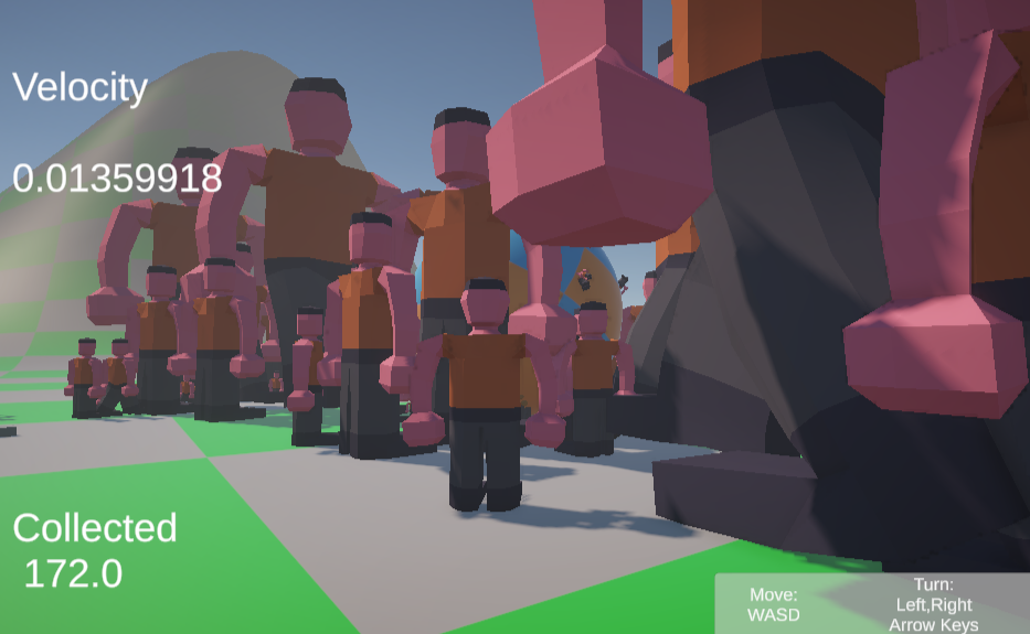
Fun idea! I was never able to build up much momentum, so most of the time I was stuck between all sorts of skydivers, like in the picture above, waiting for them to shrink down.

I think it might help if the game started out without any skydivers, letting the player collect rocks and grow to a larger size before introducing them.

A solid concept! Technically it feels a bit more like 'change is recommended' than is necessary, I was able to get through the course without needing to use the transformation platforms after a few tries. :)

I do like the idea, getting a denser form to push things, a lighter form to be lifted into the air and the base form to... well it doesn't seem like the base form has direct advantages over the other two? It might actually be better if there were just a light and heavy form to swap between. The player could start as the light form which can't push the boulders at all, switch to heavy form for that, then need to switch again for the updraft near the end.

Anyway, it's a good start for a game as it is! It's a shame you didn't have time to implement more levels but that's the way game jams go.

I'm learning today that I'm really bad with geometric shapes. This was my best, and most attempts weren't even close.

The challenge is definitely in lining up with the opening rather than picking the right shape (I really only think to mention this because I just played another similar game where I had the opposite problem.)

Judging whether I'm going to hit the side of the wall or not is far more difficult than I feel like it should be, but I know that's a problem with my skills and not the game.

Aesthetically everything is very, very grey. Which certainly works for a dystopian monochronistic world, but perhaps the player could have more colours since they're the last remnants of the older, more creative world. Each shape could be their own hue. :)

(1 edit)

This feels kind of embarrassing, but my max score is only 7.


Anything with more sides than a hexagon left me guessing and I usually guessed wrong. I think there are plenty of children who would be better at this than I am. :D

The UI looks very nice. The graphics in general are simple and clean. One thing I'd note is that the player's shape quickly obscures the bottom portion of the incoming shape, making it much tougher to match them up. (Or I might be making excuses for myself.)

It would also be nice, I think, if the final size of the incoming shape and the player's shape were exactly the same, I think that would make for a more satisfying visual if they were perfectly aligned, and give a greater sense of 'fitting through' the challenge.

The music sounds good, but the repetitiveness of it did start to grate on me after a while.

It's really impressive you made this in the time constraints without using a game engine!

It looks nice considering everything is just a rectangle and the player's health being how bright they are is pretty intuitive. The patterns of the obstacles can get pretty mesmerizing, in a good way.

To be honest I found it was much easier to hold down space and remain as a small cube in the center of the screen than to use the advantage of the larger cube's speed at any point. Perhaps if there were 'walls' of obstacles at times which took up large chunks of the screen it would force the player to rush to one area, rather than always being able to weave in between singular blocks. (Well, maybe that does happen later? But I survived for what felt like a fairly long time.)

I can confirm that Chrome ran it about twice as fast, so I was able to get to this point before it choked too much. :D

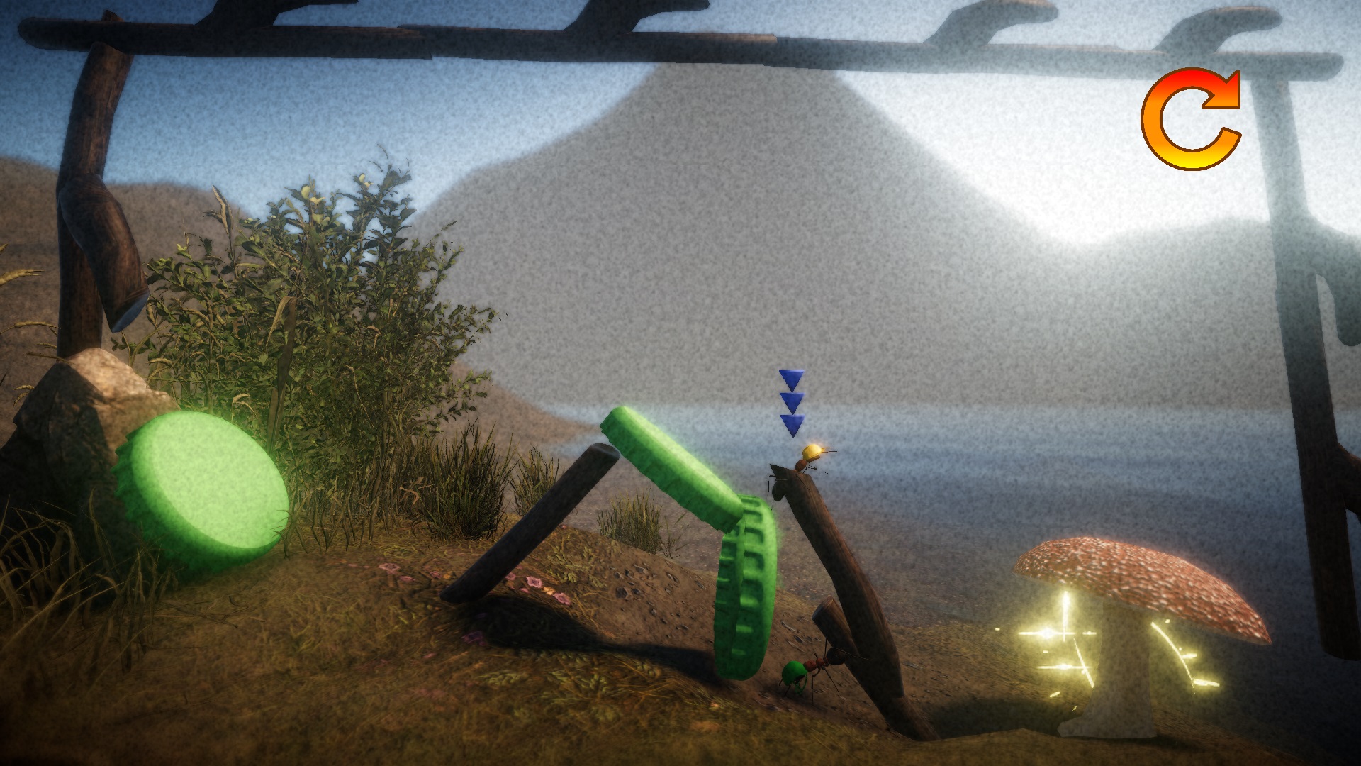
I got this far and became stuck. (Like, literally stuck, I couldn't get off the stick to get to the mushroom.)


I did try a ton of times but that was the closest I managed!

Really cleverly done puzzles and a nifty idea! The music is also delightfully intense! In a full, non-jam, version I'd expect that I'd need to get every ant from the start to the end in order to complete a level, rather than just one of them.

Being able to walk along the underside of the sticks, like real ants can, was unexpected and a neat twist. Though, for me, also pretty difficult to accomplish.

Great job overall!

Thank you for playing! And sticking through the tutorial! I should have kept it shorter and to the point.

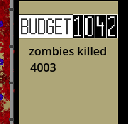
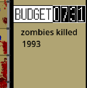
I got to this point before the game was slowed to an absolute crawl, otherwise I'd definitely have kept going! (I'm using Firefox, if another browser might work better let me know!)

I feel like a large part of the game should be building barriers to create a maze with killboxes and things, which would be really fun. Unfortunately the first tier of wall (or sandbags?) seem to do nothing to impede the hordes, and I found that the higher tier walls are effective but cost too much to justify. Massing turrets along the back wall was the only way I found to survive the first wave, and the increase in budget after each wave all went to even more turrets as a result.

Really neat, though! If I could get the game to run better I'd love to see if I could try strategies using barriers.

Thank you for playing, and commenting! And also playing through to the end!

Getting a bad ending is probably more a reflection on my poor tutorialization than your trading abilities! :)

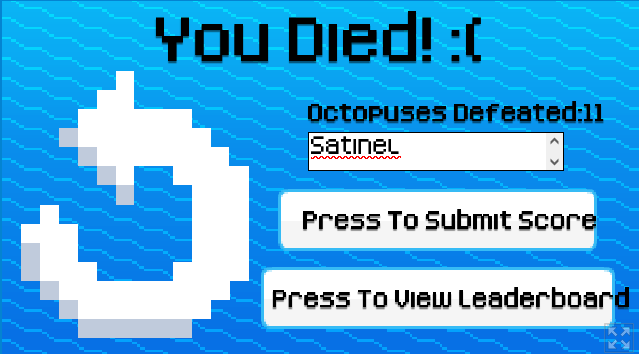
The leaderboard didn't seem to want to load for me, but I defeated 11 octopuses:

I saw this entry back near the start of the jam, it's impressive you were able to make something in that really short time frame. At the time there weren't instructions on how to use the dice, so I'm glad to see that's been added to the description.

The best strategy seems to be sticking to the middle of the screen, and not getting lured away by the candies, so that you have time to react to an attack from either direction. All the more so since I don't know what the candies do, they don't appear as a counter on the score screen.

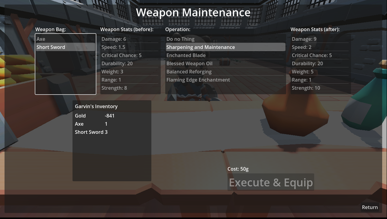
I got myself into a slight pickle by mashing the Execute & Equip button... -841 gold!

I like the concept of the game a lot! A full game with lots of adventurers seems like it would pretty fun. :)

Sometimes Garvin comes back on his own after a fight or two, other times he'll go until his health depletes, I'm not sure what influences this. He also seems to be immortal!

As it is right now, it takes a really long time to afford the first upgrade. Many trips walking in one door and to the counter, just to be sent out to the dungeon without any improvements. Aside from how grindy this is, the cheapest upgrade of Sharpening and Maintenance doesn't actually change the results; rats always die in a single hit, everything else will still need at least two hits outside of a critical strike. Which means grinding twice as long until the second weakest enemy can be defeated in one hit. This might be bearable if there wasn't so much time waiting to move from the left door to the right.

As I said, though, I do enjoy the idea of the game a lot! If the first upgrade could be bought after one trip to the dungeon, and that upgrade allowed for the next trip to the dungeon to be more profitable, then you'd have an addictive gameloop. (Maybe with less walking, though.)

I really, really appreciate this!

Glad to hear using the keyboard works well, I still end up clicking most of the time through force of habit. (If the chickens are getting scarier they're doing it of their own accord.🐥🔪)

When I first started working on the game I had dreams of making a lot of synergy items so players could specialize each character if they wanted to. I wasn't able to add any of that during the jam, the shield and helmet combination was the easiest concept like that to test out. I'm glad it's a viable option at the very least.

I'd definitely prefer for it to be too easy than too difficult. You're also very good at games in general from what I've seen (I tried so many times to do even half as well in Dracs After Dusk...) so I'm not too worried about the difficulty just yet. :)

Again, thank you so much for the invaluable feedback! :D

Thank you for taking an interesting in the updates!

Please let me know if you have any thoughts about the changes. Or in general, your feedback has been great!

Thank you so much! Really! I can't express how much I appreciate it, but I did make my first ever youtube comment on your video.

Ah, great job! Sticking to the bottom level and firing up seems like the way to do it. I usually tried climbing to the top, which is way too difficult in the final phase. For me, anyway. :)

Every game that Rick and Grant played made me want to try them out, they jumped around so quickly (or got trapped in a single room...)

I look forward to watching your video! I saw the first one, were you able to finish Tutorial? I spent a ton of time trying but the final phase was too much for me.