Play game
Duck Can't Swim's itch.io pageResults
| Criteria | Rank | Score* | Raw Score |
| Fun | #5 | 3.300 | 3.300 |
| User Interface (UI/UX) | #7 | 2.900 | 2.900 |
| Overall | #9 | 3.100 | 3.100 |
| Sound/Audio | #10 | 3.000 | 3.000 |
| Visuals(Graphics) | #18 | 2.800 | 2.800 |
Ranked from 10 ratings. Score is adjusted from raw score by the median number of ratings per game in the jam.
DevLog Link
https://wolfheat.itch.io/duck-cant-swim/devlog/363655/duck-cant-swim-improve-my-gam-jam-20
Leave a comment
Log in with itch.io to leave a comment.


Comments
This is a fun puzzle game, I'm sad I only managed to make it to the 4th level before I threw in the towel. Maybe I shouldn't rate jam games on days I don't feel 100% lol.
The controls are nice and moving blocks is easy, I did try first person mode for a second but the instant turn and FOV made it not ideal for any of the first 4 levels. Maybe its more useful later on but I didn't get that far.
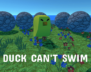
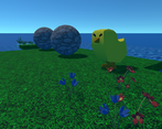
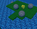
The graphics are a bit crude, but its enough to get the concept across and the mechanics and rather chill nature of the game kinda balances it out.
I liked the background music, was fitting for a rather relaxing but also confusing game lol.
I don't know if this was intentional or not, but pressing "E" spawned a bunch of boulders on the map and pressing it repeatedly filled the map with boulders so much I couldn't even move. I'm guessing this is a debug feature that didn't get cut in time. I'm sympathetic to this issue, because I once left a debug key in a game that caused every NPC in the map to ragdoll. That was a fun one to find.
Overall though, great work! This is a good base to expand on for more levels.
Thanks for your evaluation!
The first person view were initially implemented when I made the game for the Creative Core Pathway as it stated that we needed to have different cameras. I'm well aware that though this feature is a bit cool it doesn't add any benefit to gameplay instead the opposit.
Graphics is also one thing that I didnt put that much effort into, just wanted everything to work. But I will have to rework it later. Same goes for leveldesign and difficulty curve.
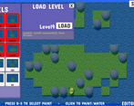
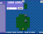
Nice that you found the "E" button. It was added as an debug feature and there is also a skip to next level if you press "T" which I dont think anyone mentioned they found...
Fun block pushing puzzle game! The levels scale in difficulty well, although I'm not great with these types of puzzles so I didn't get too far!
If you continue this project it would be cool to have some sort of hint option or system. Great job!
Thank you for trying the game!
I will continue this project but not sure when. Im trying to focus on other Jams to get more games into my portfolio. I have thought of making a hint system and I might put that in game later!
I liked this. One thing I could say is I noticed a clipping with the duck's turning, this is only a game jam version and as well it doesn't hinder game progress so I'd say don't worry about it too much.
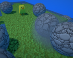
One thing I loved was the option to go into first person and that feature kinda gave me Baba Is You vibes.
All in all, this game is really fun and I can't really say there way anything left out of the puzzle game atmosphere!
Thank you for the review.
Im not sure what you mean by the clipping when turning. It is animated movements even though they are pretty fast. I just learned more about fixing stuttering issues so Ill add that to the duck, maybe it will fix the issue.
I'm glad that you liked the first person view. I kinda think its an unnesserary feature for this kind of game. However it was implemented because different camera angles were in the assignment when I made this for the Unity Creatinve Core Pathway and I kept it cause its kinda cool. But it do make the game far more difficult. Maybe I could have players do normal overhead view for some levels and have others only playable in first person mode.
It has been a fun and intense journey for me with Unity and this was my first gamejam. I started learning it in beginning of february and I've spent alot of time with it since then. I did work on some flash games back in the days but I havent programmed much in the last 5 years. My goal now is to do some gamejams to get something into my portfolio and hopefully I could do this for a living.
Game is very good. But with my stupid brain I cant play it, I stuck on 7 level.
Puzzles complicated, but intuitive. Graphics simple, but you can improve it.
Thank you! Yes I know the difficulty curve needs some rework along with general level design. So far I think its only 10 levels and Ill make that alot more later on. Graphics is also on the todo list.
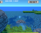
This feels like a very complete, if simple, game. One thing that I would suggest to improve the game would be to have some animation for the rocks falling into the water rather than just teleporting and playing some particles.
Thank you!
Better animations like that will prob be one of the next implementations I'll make for this game.
The puzzle design is pretty cool, although i think a rollback button with some steps limit might help in the later levels, i mistakenly pushed some rocks and had to restart all over :(.
I like how you set the funny tone of the overall game, little details like the rock bounces and the music. The levels have good difficulty, i suggest you should add a twist in the push mechanic. By level 8, the novelty gets away if you only see more rocks on the screen.
I tested the mobile port and it runs well and the controls are responsive :)
Thanks! I thought of making a rollback button or backstep but didn't think it was needed. Now you have to be more careful before making inputs. Maybe I'll add it as a feature in the next version though.
For twists in puching mechanics I'm thinking of making solid Rocks/Trees that cant be pushed as well as maybe have other objects that behaves differently, heavier rocks, logs/objects/boxes that only move one tile at a time. Along with that there is alot to tweek when it comes to level design and difficulty curve etc. Maybe just adding different grass and water tiles that animates the scene etc.
Thanks for testing out the mobile port! Im fairly satisfied with it, but I myselfe keep missing the input pads sometimes so maybe some tweeking there is needed as well.
Puzzle design is very good, although a little too tricky for me in some of the later stages, but to be fair I've never been great at spatial puzzles!
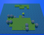
I'm not a huge fan of the textures used for the grass and particularly the water, where the joins between tiles are especially apparent. That being said, everything reads well, and there's some really good polish with regards to response to player input. I really liked the little bounce the rocks made when I tried to push them when they were blocked.
The music is charming, and really suits the tone of the game.
Thanks!
I spent most of the time just polishing code and making it port to android. Kinda saw this as an oportunity to learn the process of making mobile games with touch inputs etc. I would prob want to replace the textures entirely and change some of the audio as well apart from doing some more leveldesign and better difficulty curve.
I'm glad you liked the player input system. I myselfe think its really important that the game feels responsive and I try to realize that into all my games. I would prob prefer a game with responsive inputs and bad graphics to one with good graphics with unresponsive input or at least that would make me aggro some...
If you are curious, I solved the response thing by storing the players input separately and then just executing it in order.
Just gave the Android build a try - works really well on my phone :)
I was curious on how you handled player input! Thanks for providing details, always intrigued by people's approach, and this seems like a really logical way to deal with it
Thanks for playing it on Android. That was my main focus. Did you also try the First person camera. Doesnt make much sense to play in that mode, but its a bit cool.
I didn't see the first person mode! I love it, not the easiest way to solve puzzles but it's really cool to have as an option :)
Hi again.
The textures are kinda like placeholders for the game. I didn't spend alot of time on them, just took something that looked -ish like the thing I wanted. That will certainly be updated in the future.
Well designed puzzle game! It quickly gets hard so maybe some more easier levels to start with would be an idea?
Thanks for trying out my game! I will remake most of the levels and make a better difficulty curve later on.