Interesting concept. I included it in my Love Jam compilation video series, if you’d like to take a look. :)
Play terrible game
LöveFM's itch.io pageResults
| Criteria | Rank | Score* | Raw Score |
| Graphics | #18 | 3.136 | 3.136 |
| Mood | #21 | 3.000 | 3.000 |
| Overall | #31 | 2.420 | 2.420 |
| Gameplay | #32 | 2.455 | 2.455 |
| Sound | #37 | 1.091 | 1.091 |
Ranked from 22 ratings. Score is adjusted from raw score by the median number of ratings per game in the jam.
Comments
Well I have little to say, the fact that you managed to do all this in just a few hours is amazing.
People have already detailed the problems which are the same I had, when does the song end? What’s on the deck? Feedback is really needed, same with the calls I picked them up but if there were requests and such I didn’t get to read them due to the pace of the game, it doesn’t give you much time.
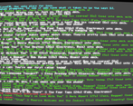
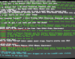
Graphics wise it’s really fun as a CLI, I would love to see how you could provide that feedback I asked for above.
AND PLEASE ADD SOUND! This would be so good with real music haha.
And again thanks for participating! Good job on this speed entry haha
Awesome visuals! But Some of the text seemed to go off screen. Was a bit disappointed there was no sound for a radio game, but a cool concept! Grab real random song data from some music database and some sound, and could be a fun way to learn about new music you like while having fun and also practising your keyboard skills!
Love the visuals. The text went by a bit too fast for me to really have any chance at not being fired. :-)
Cool idea, really fit the theme. Would have been nice to have a bit more than the command line for interface, it was very difficult to tell what was going on when you had to look back up through the text to find it. Maybe just a list on the side with what songs were coming up or something.
Other than that, sound would have been cool.
Haha, fun idea. Sometimes the text would go off-screen so I couldn't see what key to press. Plus points for "Close To You" by The Carpenters.
Interesting simulation! The monitor effect fits the immersion too. It would be cool if there was more feedback eg. when a song ends and the tapedeck is empty
The only problem i have with this is the lack of sound and the text overflowing to the right side of the window but otherwise, it's pretty good.


Leave a comment
Log in with itch.io to leave a comment.