Play game
YHWH's itch.io pageResults
| Criteria | Rank | Score* | Raw Score |
| Graphics | #98 | 3.889 | 3.889 |
| Authenticity (use of resolution) | #118 | 4.500 | 4.500 |
| Audio | #143 | 3.333 | 3.333 |
| Overall | #156 | 3.514 | 3.514 |
| Gameplay | #272 | 2.333 | 2.333 |
Ranked from 18 ratings. Score is adjusted from raw score by the median number of ratings per game in the jam.
Did you work in a team?
2 members. one60hp did art, I did the programming and script
Was the resolution a challenge?
No, it was great
What did you learn?
Don't leave things until the last minute.
Leave a comment
Log in with itch.io to leave a comment.


Comments
A bit too text intensive for the resolution, but text is really well planned for it. It’s a bit tedious going through so much text until the actual first choice. The plot kind of got me vibes from “The World Ends With You” or “Devil Survivor” with the use of the phones and all… not completed it yet, so keeping this for later. Very ambitious and very polished. Great job
I have to admit, the beginning was a bit of a chore for me to play through because of the lack of choices. But once I was able to reverse time I actually thought the game was really interesting!
By the way in one of my runs after reversing time, I got a "ch" string on a blank screen, followed by a bunch of coloured rectangles, after that I couldn't do anything anymore. Was that a bug or another clever puzzle?
That's a bug, though it sounds like a very cool one. The rewind stuff was a bit of a mess to code and I thought I had managed to get it be fairly solid, but it wouldn't surprise me if there's still problems there - I will try to figure out the cause of this one. I had a lot of stuff in mind for interesting puzzles to do with rewind, though not much is in there later. Since a particular item can only exist at one point you take stuff from people just by having it yourself, although that means a lot of special conditions to check for to make things make sense.
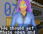
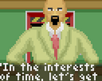
Wow, this seems very ambitious! A visual novel is not something I expected in a low rez jam, given fitting text on the screen is a common issue, but this worked well. The backgrounds and characters are well drawn, and I like the use of music. It's shame a there isn't a proper ending, but I enjoyed what there was. Like others, I wish there was some more interactivity.
There's a lot more interaction planned for the rest of the game, but unfortunately it only goes a bit past the introduction in what was created in the jam's time frame. I'm glad you liked the graphics. It's all "pixel art" made from scratch.
Nice graphics & sounds. Really lacking of more interactive elements but really nice experience overall. Good job!
Not a bad game. I'm sure this genre has its fans, but still I would like more interactivity, perhaps a choice of dialogues or moving around the location. I also want to note that the pixels are blurry, which makes it difficult to focus on reading the text. I liked the music.
More interactivity would be for a future game. We opted to use the format of the most basic type of visual novel because neither of us have experience creating them. My collaborator had to figure out how to write a script and I had to learn how to draw the appropriate graphics. Sorry about the text. It appears something broke when we expanded the screen size. I'm aware that even other fans of the genre won't have much to rate on gameplay. That's fine. This is mainly an experiment to see if we could.
Nice art and music! At start plot reminds Zero Ecsape )
This was a little more of a movie than a game but the plot was nice and the ui and art were awesome.
By the way, I made some after submission updates to the game UI. Mostly just QoL improvements to the game system, nothing that should affect the ratings, but if in doubt, give the game a Graphics score based on the in-game sprites and backgrounds, not the UI.
Some more gameplay elements would have been good up-front but I clicked straight through the story anyway and enjoyed it a lot. I don't mind one bit that it's not finished. It's enough to set up the situation, the stakes and the characters - stay tuned for the next thrilling instalment! Good work and I hope you continue it.
Also, "37 seconds before the deadline" 😂
You should put the game in 640x640 in itch.io, this way is bigger and easier to see but you dont lose the 64x64 resolution.
Thanks for the recommendation, I have done so (also changed to 'crisp-edges' in CSS to make it more pixelly.)
We just got the sword and it ended ToT great idea, too bad you ran out of time.
One thing I would have hoped for in a finished version was access to the map being drawn, some of the explanations of parallel corridors and opposite sides got me all flipped round and a map showing it would have helped a lot. great story! :)
Wonderful and attention grabbing story! The art was nice and the honestly at the end about running out of time was appreciated. I can relate to that feeling for sure. :)
Art is great and you really nailed that 999-esque escape vibe, especially with the music you chose. Obviously would've loved to see more overall, and more and sooner choices, but I know how jams go!
Maybe there will be more. Drawing at this size is fun.
I would give you 5 stars if I could.
This game kind of reminds me of the "Don't Escape" series, here a link to it : https://armor-games-studios.itch.io/dont-escape-4-days-to-survive