Play game
Get Back Home!'s itch.io pageResults
| Criteria | Rank | Score* | Raw Score |
| Implementation (rate the game's overall stability and functionality) | #182 | 2.114 | 2.114 |
| Theme (how well does the game fit the challenge theme?) | #186 | 1.971 | 1.971 |
| Creativity (how unique or innovative was this experience?) | #205 | 1.829 | 1.829 |
| Overall | #207 | 1.851 | 1.851 |
| Gameplay (how good was the user experience, game design, narrative, etc?) | #218 | 1.629 | 1.629 |
| Presentation (rate its art, animations, sfx, music, and aesthetic appeal) | #226 | 1.714 | 1.714 |
Ranked from 35 ratings. Score is adjusted from raw score by the median number of ratings per game in the jam.
List the Itch usernames of all official team members.
angrybomb101
How does your game fit the theme?
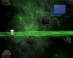
the player character has to take deep breaths in an oxygen zone to survive
Leave a comment
Log in with itch.io to leave a comment.


Comments
I like the design and the movement actually kind of made sense
Good job for submitting! Movement was a bit challenging, having a character visualized as rocket or spaceship could help orienting the player. 3D meteors looked nice in space. Well done for the jam
Thanks! I do agree with what your wrote perhaps I should update the game.
If you are still early in your developer career, I would recommend doing more jams and short projects instead of working on a single project. Often it is also easier to build new instead of edit old
Ah, the default capsule. 🏆 - Here is a trophy for keeping the default mesh alive!😂
Art style looks like old browser games so if that's what you were going for. It does that well. But you should really match art styles man!
Controls are confusing to me as well.
Was actually trying to go for that browser game feel so hearing someone say that made me happy. Also art, not my cup of tea, I'll try and learn more about it for next time.
That dragon was funny, congrats for the game!
found the controls very confusing...since you are moving up and down on the screen, it feels like the controls should be more 'w' and 's' instead of A & D? I would have expected the player capsule (?) to be heading INTO the direction you are moving instead of rotated sideways...maybe this is just because I've played too many basic games with capsule player characters where the top of the character is the ...top, not the side like in this game...
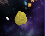
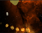
The art is a very mixed bag, crazy detailed monster that chases you, but you are just a default Unity capsule...there are a mix of super low poly rocks and higher-detailed ones etc...
Consistency in the art is pretty important. I like the chiptunes fwiw ;P
Thank you for your input. I'll try to fix these issues in my next jam, Although I honestly thought the game was a bit too easy, I guess this is what happens when you don't get someone to beta test the game first
Maybe you could add more oxigen zones? ;)
Noted