Play game
Size&Shape's itch.io pageResults
| Criteria | Rank | Score* | Raw Score |
| Topic | #18 | 3.950 | 3.950 |
| Design | #20 | 3.500 | 3.500 |
| Originality | #29 | 3.700 | 3.700 |
| Overall | #29 | 3.550 | 3.550 |
| Audio | #32 | 3.200 | 3.200 |
| Graphics | #33 | 3.550 | 3.550 |
| Fun | #42 | 3.100 | 3.100 |
Ranked from 20 ratings. Score is adjusted from raw score by the median number of ratings per game in the jam.
Leave a comment
Log in with itch.io to leave a comment.


Comments
Great idea, well executed! Needs more constant player feedback in the form of visuals and audio to give that fun feeling!
Thank you for playing! We will look into ways to improve that :D
I had no idea what the game was supposed to be looking at the screen shots and boy was it a fun experience. I really love the way the game plays, really simple to understand but challenging when it comes to execution.
haha that's how it felt making it too! So easy and then oh, so challenging
Good submission. Put almost all 5s, but lowered a bit Design and Fun. After some levels it becomes too monotonous. Also, from my POV, it is too hard to properly rotate the shape with mouse (too quick) and it is not intuitive (perhaps a bug? It continued rotating even after I stopped moving with RMB). Also, it often does not allow to place a new point of shape for unknown reason. I love your graphic style, but I would recommend to make the shapes more "expressive", perhaps highlight the borders of holes and the shape itself, or maybe make the shapes themselves more visible - they are blending too much into the whole screen. But GJ anyway! :) Wish you GL!
Thank you for playing!
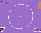
I will say rotation is whether the mouse is left or right of the dot that is placed when you click. We wish it was done differently but you know, priorities haha. Points must be placed in clockwise order around the central dot, this is so that the shape can be drawn correctly by the program.
Really liked this one! Fun original idea. The only thing I would say is that I really struggled with the holes because it was hard to tell where the hole would end up. I understand that's the challenge of the game but personally I couldn't do it.
The download helps a bit with the shadows since the web version has some weird issues with the shadows. Regardless, thank you for playing :D
Downloaded it and can confirm, with the shadow the game becomes a whole lot easier and more fun to play. My rating has gone up!
haha yea, I have been trying to fix it so much but I think i need to rework the system later. Thank you for downloading!
The game reminds me of the Japanese TV format Brain Wall. Was it a source of inspiration? Simple graphics and calming music creates a pleasant atmosphere. Especially i liked wobling text and shapes :)
After we began working on it we realized how similar it was haha.
The concept of the game is really good, i liked the graphics and the music, good work
Thank you for playing!
The ascetics of the game were very nice, though I believe that it might've of been a bit hard. Also in the 3d bit some odd black lines would appear! Still good entry
The download has no black lines, I have been trying to solve that for the web build but thats the best ive been able to get it. Thanks though :)
I enjoyed it. Loved graphics and sound. Played a few levels and read it has a max score, would be interesting to see it run endlessly, as in procedural generate the shapes of the wall. It's a nice game.
you have no clue how badly we wanted procedural walls 😂 the biggest issue was making the colliders for everything.
why does the art look so effortless yet really beautiful, i love how everything moves. i was confused at first but once i figured it out i really had fun with this game, but i understand why someone would quit in confusion but i'm personally really happy i stuck with it, great job.
Thank you :D The art was more effort than it looks to make sure it looks good but definitely less effort than standard 3D modeling. Thank you for playing!
Great game! Matching the shapes was not easy. The music was serene and made me want to keep playing. I like how the shapes and text are animated/scribbled. Thanks for sharing!
Thank you for playing :D
Art and audio really fit the game! I didn't understand how to place the little circles, so I couldn't draw the shapes properly.
You have to place the circles clockwise around the center dot. This is how the engine draws the shape correctly. Thank you for playing!
Great concept, nice artistical choice! I had some trouble in the shape making level (like i would click and it simply wouldn't let me make the shape) but it's really cool
Were you clicking 3 points going clockwise to create a triangle?
I've read the other comments and the problem was that i wasn't making them around the center of the circle, ops! Maybe it would be useful to left a little note about that on that screen :)
Gotcha, thanks!
I love the animations you have made! The concept is good, and goes with the theme.
Thank you!
Wow! I am really impressed! The concept is well realized, and the theme is utilized pretty well. The art is minimalistic, yet amazing. (Those transitions!). My only real complaint is that it's not explained very well, I had trouble figuring out what was going on, even with the how to play. Great work!
Thank you! Would you recommend adjusting the how to play or did you understand after the first round?
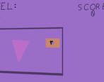
I understood after the first round, I would just recommend making it clear that there are two phases, the shape making, and the shape positioning, because I was trying to move my shape around while building it.
gotcha, Ill look into that!