Play game
Sam Hill's itch.io pageResults
| Criteria | Rank | Score* | Raw Score |
| Enjoyment | #7 | 3.611 | 3.611 |
| Execution | #7 | 3.833 | 3.833 |
| Overall | #12 | 3.578 | 3.578 |
| Metroidvania | #18 | 3.333 | 3.333 |
| Relevance to the theme picked | #19 | 3.778 | 3.778 |
| Sensory | #19 | 3.333 | 3.333 |
Ranked from 18 ratings. Score is adjusted from raw score by the median number of ratings per game in the jam.
Theme Chosen
Cozy, Hell
Engine
TIC-80
Team/Developer
Tech3599, Wizbird, dinkst
Prizes eligibility
PlusMusic, Azecy
Reference info
tech3599@protonmail.com
Leave a comment
Log in with itch.io to leave a comment.


Comments
Nice little game... the graphics were really nice and the mechanics were all sound.... it felt a bit more like a maze then a game due to the lack of any peril.. but I hope you keep going with this and maybe add an enemy or two, as you have the basis of a great game here!
Nice. The art , level design and music all work well together. I also submitted my first ever game to this jam, so really great to see someone else in the same boat.
Some little nitpicks:
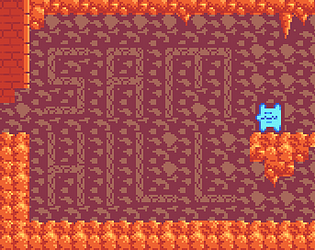
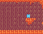
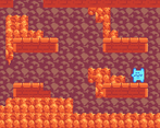
- I think there's some kind of purple box around the character. I think it would look a little better for it to be transparent. Either that or the background is playing tricks on my eyes.
- You probably could hide the mouse in game so it's not on the screen when not being used.
- I'm sure you know what you want to add, but enemies and obstacles could make it more engaging.
Good job!
There is a purple box around the character sprite. :) I couldn't figure out if I could even make parts of a sprite transparent, so I just made that space the same color as part of the background and hoped no one would care. xd
Also, I'm not sure I could hide the mouse cursor at all since that's probably just part of the engine, but I'll look into it.
Pretty fun game, felt awfully linear for a metroidvania though - I felt less like I was exploring and more like I was following a linear path that happened to have a few upgrades along the way.
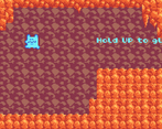
Excellent work! Especially for your FIRST game?!?! The level design was really intuitive and just felt good to play - you telegraphed what abilities are used where extremely well, and the controls felt very smooth and responsive.
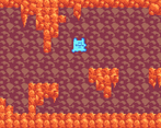
The art direction was stellar, having the player be such a strong contrasting color helped me track my movement so easily, esp against the muted background. Seriously, stellar work on this!
The True Ending was very very fun!
Thank you so much! I'm very stoked to hear it and I really appreciate the kind words. :)
TRUE ENDING!!!! very nice little game
I always appreciate it when folks make games in fantasy consoles like this, it's a great way to show your skills and bring some familiar-yet-unfamiliar retro vibes!
I think the Metroidvania aspect exists but is still lacking; while the backtracking and skill-gating were there and done well, the game flow was otherwise fully linear; you need to obtain everything to make it to the next area and there isn't any room for non-linear routing (taking alternate paths, optional upgrades, etc.). But there's definitely a lot of potential to develop what you already have into something big for SMVM.
Keep up the good work!
Great work for a first game! The platforming felt very nice, the abilities felt like a nice series of progressions, and the aesthetic was very cute with lost of old-school atmosphere. I would love to see how the game develops with more time, more branching paths, and more secrets to find!
For a game jam, this is top tier. I'm sure with more time, the art and experience could offer more challenges and opportunities, but for a game jam, this was fun, well-tuned, and tested!
I don't know how others feel, but I think this is a really solid entry due to its simplicity. This is the only game I played before the jam started so I gave it another go just to see what might have been changed.
Theme-wise and sensory-wise, I think you did well with the joint theme of "cozy" and "hell". While you did have so darker colors, the majority were lighter which did give me a sense cozy, while still clearly communicating the Hell aspect.
Metroidvania-wise, you did well in the sense that it was perfectly clear the paths you had to take and the places you notice you can't reach yet. You don't even need a map. Kudos.
The only thing that sticks out negatively is the background. In my opinion, thats needs a bit of work or be a solid color.
I highly recommend continuing this project for the SMVM. I feel like you have a solid leaping off point to pivot to a whole different game or plenty of time to expand this entry. Great job!
"True End!"