Play game
Colorless Castle's itch.io pageResults
| Criteria | Rank | Score* | Raw Score |
| Presentation | #27 | 4.138 | 4.138 |
| Enjoyment | #43 | 3.862 | 3.862 |
| Overall | #103 | 3.448 | 3.448 |
| Concept | #113 | 3.586 | 3.586 |
| Use of the Limitation | #254 | 2.207 | 2.207 |
Ranked from 29 ratings. Score is adjusted from raw score by the median number of ratings per game in the jam.
Team members
HmanHere - Programmer PepperBoi - Designer
Software used
GameMaker2
Use of the limitation
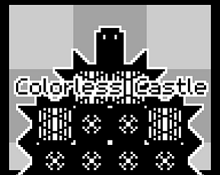
You play as a evil king who is trying to get rid of all the color from his castle
Cookies eaten
2.5
Leave a comment
Log in with itch.io to leave a comment.


Comments
unique artstyle that fits the theme perfectly :D
Very nice concept, and neat graphic style, good job indeed !
Its so good
Doesn’t really fit the limitation but a fun little puzzle game. The sound effects seem to desync from the enemy shooting on occasion. Not the most original game concept but a great execution on it. The shaders and effects look nice, the chiptunes are plucky and fun, and the sprites have personality. Overall, really nice work for a handful of days. I’d play more of this, would enjoy a more fleshed out and polished version in the future. Great job!
Great game. Completely loved it.
The art, the music and the games mechanic were great. Maybe just a lack of use of the limitation. Everything else is great though.
Very cool concept and execution. I loved the interplay of the colour mechanics with the crate pushing and bouncers. Led to a lot of aha moments, which is exactly what you want from a puzzle game.
I experienced some framerate drop in some of the levels, which messed with timing a bit, but that might have just been me?
The puzzle design was fantastic, and I enjoyed the simple aesthetics as well. All around a solid game with fun gameplay. Well done!
This was really cool, I liked the level design!
I think it looks really fantastic and plays great. The puzzles are interesting and you did a great job of tutorializing all the different gameplay mechanics. You did a lot of cool stuff with this short game jam!
Cool puzzle! but the multi-colored shit quickly killed my eyes!
I enjoyed it a lot! The art and concept was cool
Great game for 72 hours, loved the visuals and you had some sound and music which is always a good thing. While this feels like a puzzle platformer, I often felt like the puzzle part was too easy making it just the execution of the platforming, so great concept though with could be executed better. Overall a very solid game.
Very unique visual style, I like it!
This game has a very cool set of mechanics, with the bouncers and switching colors. Although, I think you tell the player too much through text. Some of the best introductions to mechanics I think are shown through example, especially when the player doesn't realize it. So this could benefit from some "mechanic introduction" levels, like a singular level with a wall too high to jump with a bouncer at the bottom, showing the player it boosts you up. And then a later level where you need to push the bouncer there, since the player knows that they'll need one.
I think that having the levels already colored in some fashion, and then when you get to the portal it drains all the color within the level would be a cool visual feature. Showing you getting rid of all of the color. Maybe it could even effect the main title screen, so only once you've beaten all the levels, the title screen is black and white.
Having the crates fall straight down I think would help with player intention, since sometimes I would push a crate too far off a ledge when I wanted it to just drop down. Yes, you do use this mechanic to bounce crates over gaps, but I think that could be implemented while still keeping player intention intact.
Some of the tiles looked like spikes, which I think should be adjusted. And some levels seemed to just have lag to them?
Overall nice game!
Thank you so much for playing and yeah I started to work on a system where it would be colored and then the portal would take the colors away but ran out of time. If I had more time I think I would of changed a lot visually to match more. Ty for helpful message!
Was pretty fun, nice game!
The limitation is in the storyline, but I felt like it should’ve been in the gameplay. However, the game was really nice, and I liked the artstyle and puzzles.
Super fun game. Great artstyle, great soundtrack, great puzzles, literally everything is great. Only comment I would have to make, is that the limitation could’ve been implemented a little more, but other than that, fun game.
The art style was really good and the puzzles were fun to play with, interesting interpretation of limitation, I think it's on the story
Good puzzle mechanics and fantastic level design!
I had a blast going through all the levels. :)
Nice puzzle platformer. Though I will say the limitation is more "You are 'the' enemy" and less "You are 'your own' enemy."
although little bits aren't perfect, we dis only have a weekend so that's really fair! I really enjoyed the concept and playing this game- keep it up!!!
Solid puzzle-platformer really nicely presented :)
I think maybe it could have made a bit more use of the limitation; but I had fun, so :)