Play game
The Cooler Hangman Game's itch.io pageResults
| Criteria | Rank | Score* | Raw Score |
| Enjoyment | #18 | 3.130 | 3.130 |
| Presentation | #19 | 3.348 | 3.348 |
| Concept | #24 | 3.174 | 3.174 |
| Overall | #26 | 2.967 | 2.967 |
| Use of the Limitation | #40 | 2.217 | 2.217 |
Ranked from 23 ratings. Score is adjusted from raw score by the median number of ratings per game in the jam.
Team members
biscuitcrow
Software used
Unity, Photoshop for art
Use of the limitation
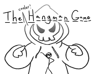
I made the game concept centred around hangman, which I felt was thematically appropriate. You begin the game just having been saved from near-death! And in the final level, you lose body parts instead of dying immediately.
Cookies eaten
0, unfortunately
Leave a comment
Log in with itch.io to leave a comment.


Comments
I absolutely can't believe that this was your first game! Great mechanics, really cool stick style art, funny story and writing, and an overall quality game that I really enjoyed playing! Great job!
Aw thank you so much! I really poured my effort into it haha :)
Amazing game.
1, I think the Extreme obstacles are a bit too Extreme.
2, I thought that fire would kill me.
Besides these, Amazing game.
I would be very happy if you would play my game.
Thank you for playing and the feedback!
Very good artstyle! The hangman theme really shines through. The gameplay itself could have lasted a little longer, but it's good that it doesn't last too long too. Short and sweet, so to say.
Thank you so much! I did think about adding maybe just one more platformer level, but the short jam time decided against that for me haha
This was awesome!!! I love the humor!!! The payoff after defeating him was awesome too -love that victory art xD Fantastic creative game!! :D
Thank you! I'm really glad you enjoyed it :D
Liked the concept! It's great that no pixels! Stylish art! Who wrote the music?
Thank you so much! Here's the attribution for the music:
Voxel Revolution by Kevin MacLeod
Link: https://incompetech.filmmusic.io/song/7017-voxel-revolution
License: https://filmmusic.io/standard-license
Really cool concept and art style, and the music was groovy! I had a really hard time progressing because sometimes when I tried to jump, he would kind of just "stutter" and fall off the edge. I initially thought maybe you had coded it for varying jump heights (so you can tap the spacebar for a short jump, and hold the spacebar for a high jump), but it didn't seem to make any difference. Figure that one issue out and I think you've got a great game, definitely awesome for your first game.
Thank you for playing and for the feedback! I'll definitely have to find a way to code a better jump mechanic haha
The game has really good style is really well writen, but the window of the web version was to small so I couldn't see the left part of the text boxes.
Thank you so much! I think I've fixed the textboxes now so hopefully these issues won't persist.
Cool entry with lovely art, really good stuff for a first jam game.
There was a few things that could be improved that should be noted, the text was all over the place, if your using unity there is a option in the UI canvas to make UI scale with screen size. That would have helped alot here I think. Jumping felt... bizarre too it almost felt like I had negative coyote time (Coyote time being a time after you fall off a platform where you can still input a jump).
Again the art and concept was great, but it has some things that could be improved. For a first jam entry this seemed really ambitious and its honestly impressive how much you did. Fantastic work! keep it up.
Thank you for your kind comments! And the UI thing: I toggled that scaling on and I think it got fixed. Negative coyote time made me laugh that is a good way of putting it. Will improve in future :)
you should put a full screen button in the game page! other than that, i really liked the idea of removing body parts when receiving damage. Good job! (p.s. , put a white background under the letters, or they will mix with the background)
I actually reduced the viewport size at the start because I didn't like the look of that bottom bar with the full screen button but I guess playability is more important so I've put it back after your feedback! Thank you for playing!
Hey! this games v neat its got a rly clear art style to it and i think the concept is super inventive, i also really liked the final level, the fact that your last body part is the cool sunglasses made me laugh. I think other people have pointed out the issues but yeah the early platformer is kinda hard, a friend who watched me play pointed out it might be related to the fact that its random, i kinda had to wait for a turn where it was easier. Also there are some issue with cropping in the browser.
I'm glad you got some enjoyment out of it! Maybe in future, I'll try enemies with set movement patterns and spawning, instead of the random thing going on here which really isn't working the best. Think I've fixed the cropping issue though. Thanks for the feedback!
Okay so we all know the platforming is impossible, but I think the visuals and the plot has charm to it. The boss fight at the end made up for the problems at the start. The text boxes were somewhat out of frame, but we all suffer from it time to time.
Thank you for playing and the feedback! :)
Okay that was actually very fun! Good job on your first game, the concept has potential but be careful as the Text box seems to go out of the screen preventing me to read most of what npcs say :'(
Thank you so much! Sorry about that bug, did you play the game in browser or one of the downloadable builds?
No problem! I played the browser version.
Okay, admittedly I have no clue why it's like that because it appears fine on my end oh no.
The screenshot was very helpful I managed to reproduce the problem now I just have to fix it thanks!
Glad I could help :D
Really great game! nice visuals! nothing really bad that i can tell about it.. however the jumping was a little delayed and a jump buffer would have been nice!
Thanks for playing and the feedback! I didn't know about jump buffers so I'll be sure to check that out!
its basically a timer that checks whether the player is not on the floor and lets the player jump after a few seconds of hitting space but not on a platform.. that was a really bad explanation but just check it out, it makes the game movement a lot better, also known as coyote jump
Awesome thank you so much! I'll definitely search around and try to learn how to do it
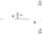
I had a real hard time with this one, the theme was really neat but the platformer wrecked me. I must have died at least 30 times around the first A I made it kinda far a few times but I noticed sometimes when I'm moving I'd press space and not jump. Also got stuck on a fireball a few times and couldn't get back up not sure if that was intentional.
Pretty cool game tho!
Thanks for letting me know about the jump, I'll have to work on a better jumping system next time haha! As for the fireball... sometimes you can step on them to get back up but sometimes you're just kind of doomed. The platformer can be tricky so thank you for persisting!