Nice graphics, fun maze! I included it in my PowerPoint Jam compilation video series, if you’d like to take a look. :)
Play game
Untitled Maze Project's itch.io pageResults
| Criteria | Rank | Score* | Raw Score |
| Best Graphics | #13 | 3.867 | 3.867 |
| Best Game Design | #27 | 2.667 | 2.667 |
| Best Story | #30 | 1.733 | 1.733 |
| Best Use of Theme | #33 | 1.867 | 1.867 |
| Most Comedic | #35 | 1.333 | 1.333 |
Ranked from 15 ratings. Score is adjusted from raw score by the median number of ratings per game in the jam.
Comments
Hey man,
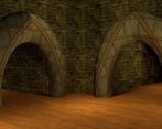
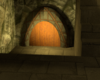
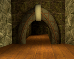
I played it myself, and I feel that this was a great idea/concept that was poorly executed. While I appreciate the Myst-esque charm and effort you put into the 3D renders, I spent most of the game wondering if I'm making any progress at all, as many of the screens and images repeat over and over again, up until the endgame content. I felt lost, and I felt as though I was going in circles, and most of the experience was hindered as a result.
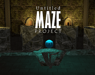
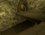
Having said that, the renders are great looking, with nice use of warm colors contrasting with the UI.
Edit: tl;dr pretty much what everyone else said.
Thanks for your feedback!
I've already made v1.1 (Easier Update). But I can't release it, because itch.io doesn't allow submissions during voting. So I'll release it after the jam. Walls will have marks in this update. It will make the maze easier to complete.
Have you tried to complete some puzzles? Have you seen Demo Mode?
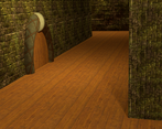
I love the feel. I like the look of it when I went in; but the problem I have is the same images are used over and over between puzzles. Even later on, the same ones with slight variations. It's only near the end do things get really visually diverse.
There's no visual feedback in the images in order for the player to be able to gain context for their location, direction or placement in the maze. Which changes it from being a cerebral adventure to having to click randomly and hope you end up in the right location.
Love the Myst style, great ambient sound, nice puzzles but i'm disappointed with the execution. I think a lot of people will get frustrated and give up before they reach even the first puzzle.
Really cool graphics and ambience! Too confusing for my tiny brain jajajaja but I can see some potential here with some more polishing!
You definitely have some great graphics, and so far your game is the only one with audio in it, so it has a great atmosphere that makes it rise above the rest. Unfortunately, I have no idea what I'm doing or where I'm going. Looking through you slides, it looks like there are a lot of rooms that look exactly like one another, and I got to say that's pretty bad design. Each room needs to be unique, otherwise the player will quickly get lost. Even something small like adding a candelabra or changing the camera angle would help the player orient themselves better - "have I passed through this room before? No, that had a sconce in it and this one has a set of armor."
The graphics and style are cool!
As other said the gameplay is confusing, not knowing when I'm looping or going to a new place (slide). At some point I started thinking in slides instead of being in a maze to be able to progress.
I wasn't sure if the room with the boxes was a good end. At some point I decided I had seen everything and that was the win screen. Overall the communication with the player is poor (and that does not mean adding more text necessarily!)
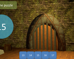
Then I had a look at the slides inside ppt and found there are some cool puzzles. I tried a bit with the last one playing from that slide. But the motivation was gone and I wasn't sure if I was missing some information to solve it.
The navigation part and the puzzles feel a bit disconnected. The puzzles by themselves with a simpler maze (not reusing images) could have worked really great on me. The atmosphere really fits with these myst-like puzzles and the clues embedded in the graphics (like the carved stones).
This was really confusing, it felt like I just kept looping between a few slides. Maybe i'm not smart enough aha. Love the art style and the audio, though.
Try and make the paths more apparent so the player know if they are going backwards or not, like "Go back the way you came". Something to tell the player if they have made progress or if they are just going back and fourth :)
Oh man, that's exactly what it says on the tin :p
I think it's well done and looks different from the other ppt games, but the concept is not something that appeals to me. I don't find mazes to be very interesting, and it doesn't help that it's not entirely clear what you can click on to go to another path, or which door you just came from.
Interesting entry! Sadly just not something for me.
The game has a very confusing element to it where I would go around in circles but it is what it is, a maze-style point-and-click puzzle game.
3/10 - Gameplay
8/10 - Design
4/10 - Story
5/10 - Comedic Value
~~~~~~~~~~~~~~~~~~~~~~
5/10 - Overall Score


Leave a comment
Log in with itch.io to leave a comment.