Play game
Crimson Catacombs (Roguelike Platformer)'s itch.io pageResults
| Criteria | Rank | Score* | Raw Score |
| Controls | #11 | 3.467 | 3.846 |
| Fun | #12 | 3.120 | 3.462 |
| Overall | #15 | 3.190 | 3.538 |
| Audio Design | #20 | 2.774 | 3.077 |
| Overall | #22 | 3.039 | 3.372 |
| Era "Feel" | #23 | 2.982 | 3.308 |
| Graphical Presentation | #24 | 2.704 | 3.000 |
Ranked from 13 ratings. Score is adjusted from raw score by the median number of ratings per game in the jam.
Leave a comment
Log in with itch.io to leave a comment.


Comments
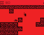
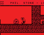
I'm impressed by the procedural generation, first off. Was not expecting to see that in this jam. The visual presentation, while very stark and appealing, also makes it kind of hard to tell what things are. Especially the HUD which is nearly invisible at nearly all times, which makes it hard to tell how much health you have left. Like others I couldn't figure out what a lot of the mechanics were, and I also had a hard time with combat, takes a lot of care to fight enemies without taking a hit.
I liked the music, and I like the idea and would love to see you develop it further!
Good game, I liked te random map every try. Some form to show the hud more clearly would be good
Great game ! I love how the levels are randomly generated, it made me restart the game quite a few times. Really cool entry !
A very shiny little action game!
I wasn't terribly sure of all the mechanics (what is with the sarcophagus anyways?) but it seems like things were thought out. And yeah I can see what others are saying about Spelunky vibes, though I do wish I knocked enemies back a little on hit, haha.
My only major complaint is I think you should render an outline around the text, kinda hard to see your health when it's up against a wall.
I'm a sucker for the 1-bit art-style, and you've got some nice assets and animation here (the blob animation especially looks really nice). In terms of looks I think you've done really well. The controls are tight and responsive, and the game is surprisingly fast-paced as a result (the coyote jumping was also appreciated). I liked playing through the randomly generated levels each time I died (which was often!) as it gives the game a sense of exploration. Overall, solid game dude.
Getting some distinct Spelunky vibes here with the short range attack and randomized levels leading downwards. I found myself more often in flight mode than fight mode, as the sword attack is tough to land on the slimes. The two-tone palette feels like a game boy game, I think it works well.
Nice limited palette color usage!
The mechanics works very well too. You realy make a good game with a lot puted limitations. It's mindblowing how much you can make only with 2 colors.
Congrats for the great work! I have a nice experience with your game.
I like the simple, bold visual style, and the extremely simple premise. Get the key, get the hi-score, get out.
It's like a souped-up Atari 2600 game.
Controls well.