Thank you so much, I'm glad you enjoyed it :)
Daikon Games
Creator of
Recent community posts
This one needs more ratings, just suffering presumably because of the placeholder/programmer art in the screenshots. The animations in the actual game though are quite good, though obviously un-rendered at this point. The game plays decently, though it's pretty damn hard. But the idea of a roguelike beat-em-up is legit and playing it a few rounds showed me that it could really work.
This one is under-baked but I think it's got a good recipe. Keep at it!
Yep, it's a jigsaw puzzle haha. Those are inherently entertaining, so it did hold my attention for a while. The only major quality-of-life improvement I'd make is swapping two pieces if you drop one where another already exists. As it is, you have to let go of the piece you have, move the one that's in the way, and then pick the one you wanted to move back up.
If you wanted to make it "video gameier" you could add stuff like time limits, more special effects, etc, but that would all just be bonus
This was a pretty fun and competent shoot-em-up! The screen shake made the attacks feel juicy, I liked the variety in the enemies and how they fly in formations galaga style. The boss was a little easy but fun. Art/music aren't really super reminiscent of a retro shmup, but overall I just had a good time playing it, good job!
Playing the game in the tiny browser window is not really workable especially on a high-res monitor. And rendering the game at NES resolution doesn't make the game have NES style graphics, the art is still much too high fidelity to match a retro era. Drag-and-drop controls is also strange, the lack of much audio, and basic gameplay are my other complaints.
Aesthetically it's pretty dang cool though. Love the colors
I think a medieval style one-vs-one fighter is a great idea. This one needs some work unfortunately. I think the biggest single thing stopping it from feeling good to play is the fact that you need to hold the button to make all your animations play out. In other words, all actions can be instantly cancelled, even though you start dealing damage from your sword swing right away. So you can just run up to the other player, spam the sword button and win.
Aesthetically it has the core of being appealing, but it doesn't really match any specific retro look, with mixed sized sprites and large screen resolution.
I think you could have the bones of a good idea here, keep working on your skills and give it some love!
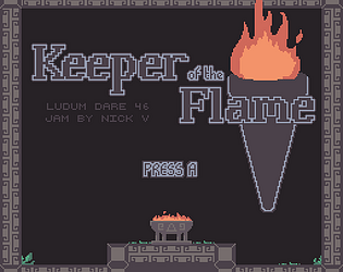
When the lava first started rising I thought it was a very cheap death, as I didn't know there was going to be danger so I was taking my time reading the notes and looking around. Anyway, the second time since I knew that I had no problem with the rest of the platforming challenges, which I thought there was a nice variety to.
I'm not sure if the dialog/theme of the game is supposed to be pro-suicide? That is the message I took away from it, which is a bit upsetting to say the least.
Visually it's very simple but the CRT effect adds a nice retro flare to it. I couldn't say that it particularly reminded me of any specific era of gaming though.
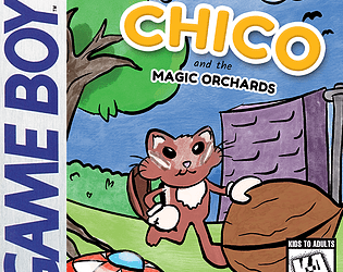
This is my favorite entry of the jam so far. It is such a faithful little GameBoy action/platformer! My only complaint is the controls feel almost "too good" with some subpixel precision and smoothness that is slightly jarring. But that is easy to overlook when everything else about it is this good.
You've got many types of enemies, you've got multiple sub-weapon powerups, you've got different levels with different aesthetics and killer chiptune music! You made a freakin instruction booklet which is something I've always wanted to do for this jam and never had time for.
Great work all around, top marks for Era Feel, love it, followed you, can't wait to see more of what you do
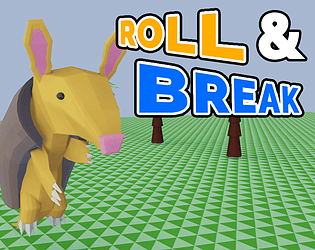
The retro era this actually most specifically reminds me of is early 2000s Flash games, which was a huge part of my gaming upbringing haha. The SFX are way too loud/repetitive, the art is unfortunately blurry rather than pixel-sharp. Controls are responsive which is nice. A simple thing that would probably increase the polish level would be scrolling the background vertically to give the illusion of flying rather than hovering.
All in all it could be improved but it's definitely a playable arcade-style game!
I love a good Zelda clone, this one has the feel of Zelda 1 dungeons with the addition of magic is a nice touch. Visually it's a little disjointed with mixed pixel sizes, and audibly I'd have loved to hear just some basic sound effects even. It is hard to tell when you've been hit or when you hit an enemy with no visual or audible feedback. The controls felt good, and I liked music. I saw in your devlog that unexpected life stuff ended up scaling back your ambitions but keep at it!
Cute little game, I like the premise and the aesthetic. Isometric is always fun to see! I wish there was a little more depth to the gameplay, or new wrenches that get thrown into the mix to add to your decision-making process, but that is all stuff that can be added with time.
In terms of era-feel, the art and especially the music didn't really feel very 90s-y to me, a little too high fidelity (maybe 90's era CD-ROM game for the music I suppose).
Overall it's a nice entry though! Hope it gets more ratings like it deserves
Very cute, links awakening clone with raccoons. It plays well, looks nice, sounds great. I enjoyed the dungeon, and the boss was perfect (pulling the tongue out with the hookshot was fantastic).
Some minor presentation issues (HUD covered top portion of gameplay area on my screen resolution (I have a widescreen monitor), and dialog box pixels seemed off somehow.
But overall I really enjoyed it, good work
For all its primitive appearance this is a deceptively fun little game. On my first run I died quite soon, on my second run I realized I could pick up a rock and equip it to attack the snakes, on my third run I realized I could craft a sharp rock. I managed to survive for a while and explore the area.
Cool ideas, great super minimal survival game!
I am pretty impressed that with the severe limitations you imposed on yourself you were still able to create something that kinda feels like Castlevania! It controls well, and the art is good given the restrictions. The audio is pretty tough on the ears, though it certainly brings Nokia phones to mind as you said.
Overall, not bad work.
This one has a lot going for it. The visuals are gorgeous, the story development as you solve puzzles is great, I love puzzle games which dole out story as a reward for puzzling. I like that you have multiple control schemes (when I discovered accidentally that I could move with the mouse it was a nice surprise).
Some of the puzzles are a little obtuse, but some are quite clever and satisfying. The long maze sections to get between rooms can be a little tedious, especially with the character getting caught on corners, etc.
But overall I think it's a very creative entry and I like what you're doing with it!
I dig the vibe, it definitely brings to mind some of the "hardcore" Sega Genesis era games. A platformer where you can only move while in midair is an interesting concept. The difficulty here is pretty high, you have to really give a lot of thought not just to avoiding the current obstacle, but where to land your jump so you're positioned well for the next one.
All-in-all a pretty cool and original entry, good job!
This is great, love the art, music, and gameplay. Wish you could quickly switch which unit you were selecting rather than slowly moving the cursor between each one. Definitely some good strategy, though I would have liked to see things get more varied. Also it was a little hard to tell what would be interactable, so I ended up wasting turns moving towards something that I thought was a door/switch to find out that it was not.
Overall though it's a great entry. You should feel proud of it
The visual presentation is really nice, the music absolutely slaps. The controls feel good and the (seemingly) procedurally generated stages work well and never produced something broken.
Alas I am a scrub and despite many attempts I could never defeat enough enemies to use the custom powerups, but I think it's a really cool idea!
Seems like a good foundation to a game, I like that there is a downward and a sideways attack and they're used for different purposes. The visual presentation is not very consistent, but some of the art is nice. The controls are very floaty, and you can get stuck on the edges of platforms when jumping. It doesn't really replicate a retro feel very closely, but I appreciate the effort that was put into it.
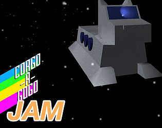
I like the concept of this, and it has glimmers of promise. The art is nice, the music and sound design is good. There are way too many enemies, and they can hurt you from too far away. I was able to survive for a while, but it was always a losing battle. I think with some tweaking and fine-tuning the fun-level could be turned way up on this. Repairing a space-station and trying to survive while waiting for evac could definitely be a recipe for a tense and rewarding game!
This game held my attention really well. The short runs make you keep wanting to upgrade and just do a little bit better next time. I also was a big fan of the music. It definitely captures that old gameboy era with simple tunes that just need to be earworms to work.
My only complaints were probably with the jittery camera when descending. It got more tolerable with pickaxe upgrades, but I probably would have kept the character bouncing upwards but made the camera only go downwards.
The scrolling back up to reveal your path down once your time runs out is a nice touch too, but once you start digging pretty deep it ends up taking a while to get back to the top.
Overall, really nice solid entry. Great work!
I thought this was a cool little platformer. I also appreciate the mechanic of "stuff changes when you jump", it was used to good effect in certain areas like making you go against your instincts and jump right towards thorns that you know are going to disappear.
I felt that the hitboxes on the thorns were a little unforgiving and I would have liked to see some checkpoints.
In terms of "era-feel" you say you were targeting Gameboy screen resolution, but it doesn't really read as a gameboy game visually in any other sense, and there are mixed pixel sizes around that definitely ruin any illusion that this was made for retro hardware.
Overall it's a good game, especially given that you say its the first game jam you've done and the first game you've made period. Excellent effort!
Nice little game, like if super-meat-boy-esque platformers had existed in the gameboy era. The visual presentation left me a little confused at times, I kept mistaking the flamethrowers for springs and accidentally torching myself. I also thought the audio mixing was off, the SFX were annoyingly loud and the music was too quiet.
All that said, I did beat the game (on normal mode, is hard mode even possible??? I'd love to see a video playthrough of that), and had a good time, so good job!


