Play game
Mancer's itch.io pageResults
Criteria | Rank | Score* | Raw Score |
Controls | #9 | 3.625 | 3.625 |
Fun | #12 | 3.000 | 3.000 |
Era "Feel" | #17 | 3.250 | 3.250 |
Overall | #21 | 3.025 | 3.025 |
Sound Design | #24 | 2.313 | 2.313 |
Graphical Presentation | #25 | 2.938 | 2.938 |
Ranked from 16 ratings. Score is adjusted from raw score by the median number of ratings per game in the jam.
What style of retro game were you going for? (Year/Era/Console/etc)
NES
Leave a comment
Log in with itch.io to leave a comment.
Comments
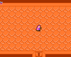
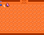
I love what you have here-- the room transitions are very smooth, the controls are nice, and the mechanics are easy to understand.
I'm a little bit thrown off by the mismatched pixel sizes amongst your assets, and I think a little more audio feedback from the attacks and enemies would do wonders for the atmosphere and immersion. But that's really anything there is to gripe about-- small things with aesthetics.
The game itself is wonderful! I'd love to see more enemies, more puzzles, more... all of it! If you continue to work on it, I think you have a very strong base for a great Zelda-style dungeon crawler! Keep it up!
Good job, I won't repeat the mentioned stuff below. but hopefully you'll get chance to rework it!
It's got some cool potential.
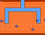
I love a good Zelda clone, this one has the feel of Zelda 1 dungeons with the addition of magic is a nice touch. Visually it's a little disjointed with mixed pixel sizes, and audibly I'd have loved to hear just some basic sound effects even. It is hard to tell when you've been hit or when you hit an enemy with no visual or audible feedback. The controls felt good, and I liked music. I saw in your devlog that unexpected life stuff ended up scaling back your ambitions but keep at it!
I basically addressed all of these in the last two replies so I won't repeat myself too much here lol. Pixel sizes are going to be the first thing I fix for the next version, and I'll definitely be adding sound effects. I actually realized later that I had some sound effects I'd made lying around and was upset I didn't use them. Glad you liked the controls and music. Thanks for playing and thanks for your feedback!
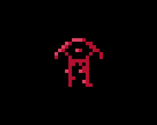
i liked the art a lot, the main character sprite is really cute, and i think the key for the boss room looks dope. i would've def liked to see some sound effects added, even something simple like a short noise sample for hitting enemies would do a lot for game feel i think. it's a good start, it just needs more time put into fleshing things out and adding things like different enemies and new spells for the player to use
My one regret is not adding some sound effects. Probably wouldn't have even taken very long. Definitely had ideas for other enemies but in the end didn't really have the time to make them.
As far as the spells go, my idea is this is probably the most spells you would get within one dungeon, although the fireball would probably come from a mini-boss so that you can open the vine walls and progress to the final boss, and then there would ideally be a mechanic that required using the fireball spell to beat it. Likewise I tried to make it so the boss incentivized staying away and using the ranged spell. Originally planned on programming the boss to stay away from the player, but ended up just using the same random logic as the bats and then having the fireballs aim for the player, meaning if you're closer to the boss, it's harder to dodge.
I'm definitely going to be going back to this one soon. I plan on restructuring a lot of it, mainly because I realized too late that my rooms were going to be asymmetrical with the doors off-center. Hope you check it out when I've released a new version (I'll be leaving this version up as a jam version for posterity's sake.)
Thanks for playing and thanks for your feedback :)
My main complaint with this one is that it doesn't feel too much like an NES game, with the sprites being at different resolutions and using more colors than would be possible. Other than that, your character controls well, and I like the concept of finding different spells inside the dungeon to progress deeper into it.
Yeah, the sprite scaling was my workaround to getting things the right size when I hadn't decided that while making them. And then, of course, when I needed a last-minute boss. I used an NES palette in Aseprite to limit my color options so I'm not sure that's an issue, though they might be more vibrant than necessary. Glad you like the character controls because that was my main priority while making it. Thanks for playing!
I think the art is a good start, but I would very much say try to make sure your pixel resolutions are consistent in the future! It kind of ruins the "NES" feel you said you were going for with the some stuff being big pixels and others being small pixels.
I realized that a little late lol. I was trying to keep things consistent but then I had an issue with things needing different scaling and decided it would be too much of a time sink to try and fix that before the end of the jam. Thanks for the feedback :)
it was kind of fun when I died and my character could one squirm o the ground as the enemies kept hitting her. that's the worse way to die in a game, it didn't even restart the game, I could only see my character suffer. Nice try tho, make the combat more juicy and give the game a proper gameover system and it would be a decent game. I had some fun tho, I played it twice.
Thanks for playing! Yeah, the lack of game over is an issue, I know. Included a note about that on the game page that you have to refresh to play again. Had an emergency come up during the week so I prioritized getting the game working and almost didn't have any kind of death state in fact. I think the last thing I added was being able to knock back the enemies, and that was the extent of the juice unfortunately.
Glad you had fun :)
Oh, sorry to hear that, keep it up!