Cute take on a track building game. I think one thing that might add a bit to the challenge is to give the player a set number of each type of track they can place per level. And maybe don't start the train until the first track is placed -- I lost a few times just because I was looking ahead at the level and thinking of what I should do lol. A few levels really made me think, which is a good sign for a puzzle game. Good work!
HalcyonDash
Creator of
Recent community posts
I really like the aesthetics of this one with the hand drawn chalk figures and everything. The puzzles make you think out your next moves which is great, and the mushroom powerup was a nice touch. I thought you were supposed to avoid it until I realized it's necessary for solving some puzzles. Reminds me a little of Baba is You too. Great work!
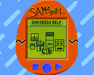
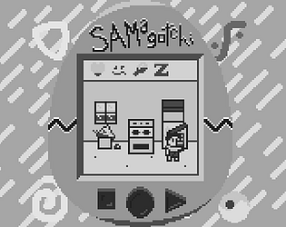
Woohoo glad you like the buttons! I couldn't decide if they would be a gimmick or an aid to immersion. Maybe it's both lol. The thing about Sam feeding himself, yeah... I needed to sleep when I submitted this and I was trying to balance it, but didn't realize it's really hard to get the fail state now. On my end I've fixed it with a single line of code, but I can't add that to the jam unfortunately. Thanks for playing!
What an addictive little game. The difficulty curve makes the game feel manageable, and could maybe even be a little faster. It feels incredibly slow to have to start over once you've got a decent number of upgrades. Visually, the aesthetics feel like they're from 3-4 different games: It's a cute little choo choo roaming around a Zelda II overworld shooting guns at chibi demon puffballs lol. That said, I'm sure you intended on adding more weapon types to justify buying wagons and turrets separately, and the gameplay itself is a lot of fun!
This is a decently polished start! I think the thing that sells the feel of the era for me is the slightly meticulous controls that require you to manually pick each of your units to see what they can do before moving on, etc.
A few things would make this pretty perfect in my eyes:
- An action counter above each unit's head, or maybe just make their sprite dim when they're out of actions.
- Show the range of the enemies, either passively or when you cursor over them.
- A toggle button to switch between units instead of clicking on each one manually.
- Better indication of where the doors/buttons are. I got stuck in the second level because I didn't realize that one tile to the right would turn on the light and let me progress.
- End turn automatically when all friendly units are out of actions.
Like I said, this is really good, otherwise I don't think I would be able to distill down my suggestions so briefly lol.
Oh hey there's a game here now. Decent start. The attacks feel relatively good when you land them. Highlighting the enemies you hit and slowing down time is a nice touch, makes it feel weighty. That difficulty spike, though lol. I got through fighting three guys at once without taking damage and then in the next one I was swarmed. Some kind of dodge roll might help with those kinds of situations. Otherwise, good work so far.
So this is what taking acid is like... lol In all seriousness though, I like this as a concept of "previously undiscovered game from a bygone era." Kind of like the idea behind Petscop (though that's not a real game) except it's more of an Earthbound/Yume Nikki kind of game. Really interesting. I only got the bad ending and the "good ending... I think" but I'll have to revisit it and see what I missed, since your preview shows something I didn't experience. Good work!
I basically addressed all of these in the last two replies so I won't repeat myself too much here lol. Pixel sizes are going to be the first thing I fix for the next version, and I'll definitely be adding sound effects. I actually realized later that I had some sound effects I'd made lying around and was upset I didn't use them. Glad you liked the controls and music. Thanks for playing and thanks for your feedback!
My one regret is not adding some sound effects. Probably wouldn't have even taken very long. Definitely had ideas for other enemies but in the end didn't really have the time to make them.
As far as the spells go, my idea is this is probably the most spells you would get within one dungeon, although the fireball would probably come from a mini-boss so that you can open the vine walls and progress to the final boss, and then there would ideally be a mechanic that required using the fireball spell to beat it. Likewise I tried to make it so the boss incentivized staying away and using the ranged spell. Originally planned on programming the boss to stay away from the player, but ended up just using the same random logic as the bats and then having the fireballs aim for the player, meaning if you're closer to the boss, it's harder to dodge.
I'm definitely going to be going back to this one soon. I plan on restructuring a lot of it, mainly because I realized too late that my rooms were going to be asymmetrical with the doors off-center. Hope you check it out when I've released a new version (I'll be leaving this version up as a jam version for posterity's sake.)
Thanks for playing and thanks for your feedback :)
Yeah, the sprite scaling was my workaround to getting things the right size when I hadn't decided that while making them. And then, of course, when I needed a last-minute boss. I used an NES palette in Aseprite to limit my color options so I'm not sure that's an issue, though they might be more vibrant than necessary. Glad you like the character controls because that was my main priority while making it. Thanks for playing!
Decent start. However the wall jumping seems inconsistent and the spikes change on weird timing and I got frustrated and stuck at the beginning of the second area as a result. I do like the concept of the level changing every time you jump. I've seen that before in areas of games but never for an entire game, so it could be a cool idea to explore.
This game got unfair pretty quickly. I wasn't able to attack most things until they were attacking me, and I didn't see the controls listed anywhere until the game over screen. The game looks okay, but I'm not really sure what I'm supposed to be doing, and it's frustrating when I get swarmed and can't really progress anymore.
Okay, I want to like this one. It looks great, and I love the colors. I don't know if you meant for the one puzzle with the blocks to be able to be interacted with, but I feel like that would make it more fun. I was able to figure it out with context cues and just kind of tracking what I could figure out from what I could see. That puzzle would be fine if it can be rearranged as I was tempted to take it into an art program to manipulate it. I have an issue with the Morse code puzzle as it requires outside knowledge/resources, when I feel like the game should give you what you need to solve its puzzles. Finally, I could not sort out what the other puzzle was doing. It didn't look like a word unscramble and a cipher didn't work, so I'm lost without something to go on. It's a good start, and maybe what I've shared are just personal gripes or I'm missing something.
This is really difficult. Once I started realizing there was going to be some character building, I stopped to read the notes, but then I died to lava, so I ignored them going forward. Eventually died to the rising lava after I figured out what the objective was and I started opening doors, but the controls on climbing the ropes seemed inconsistent. All that said, I really like how you tried emulating the old school CRT TV look with like the convergence being warped and the static. Really nice touch.
Feels super authentic with unforgiving and sometimes even frustrating controls, as well as the way the enemies spawn and how they can respawn if you just pan the camera over and back again. Really good job. I wish I were better at these kinds of games to give better feedback, but the gameplay seems solid. And you included a manual. That hit me right in the nostalgia.
I was going to play this with someone to see how it plays in two-player, but I think I can make some judgments without that. As far as the era goes, it's definitely a stretch. The screen is practically 1080p-ish with very small tiles. I use Godot as well, and if you want to have a smaller resolution but a bigger window, you need to turn the scaling up in the project settings. Should also remember to set textures to "nearest" for pixel art so it doesn't get blurry.
The game itself is largely unfinished in that you can still attack and move when you've lost (and I wasn't able to land a "finishing blow") and you can still defeat the other player when you've been defeated. Aside from that, adding some knockback at least would be a great start to giving the game a better feel with more feedback for the player.
Finally I think the controls could be reconsidered for the keyboard. Since you have WASD for player 1, you could do IJKL for player 2, and then you could have attack controls similar for both players. And not everyone has a tenkey keypad.
Otherwise, it's a decent start, and reminds me a little of Nidhogg, though not yet fully realized. Good work :)
This is really unique and so well done. Feels almost complete. I ended up getting frozen somehow where I couldn't move. I don't know if maybe I had "died" at that point, even though I'd lost all my HP long ago. All I could do was get on and off the Osmu. Found another bug where the Osmu can slide into the cave and then you can't get on it without leaving the cave and calling it. Still, there's a lot going on here so a few things here and there are inevitable. Really, really good job!
What a happy little victory screen! I totally get what you were going for with the GBC port idea, because it reminds me of when I played Donkey Kong Country on GBC. Good going on that. The spikes kinda gave me flashbacks to raging at Sonic because I always felt it went against the idea of the game, which was to go fast, and I always felt like the games should flow better and not jumpscare you with spikes. That said, this is fairly forgiving once you start to anticipate them, and being able to adjust while you're on the water is nice. The one thing I think would really elevate this is some indication of how many cartons you need to pick up to win, or at least a graphic for how many lives you have. Still fun though. Good work :)
This is an all right start. The textures seemed a bit fuzzy on my screen, either as a result of how they were imported or because it was forced to full screen. There's a little lack of variety in the gameplay and I discovered you can get pretty far by just locking your plane to the lower left and holding the fire button, maybe occasionally having to dodge a missile.
The sound design is pretty good though and is a nice touch for giving feedback when you hit or get hit. Good work :)
What a fun representation of incompetent management! It took me until my second try to realize that walking and fixing servers was filling my sleep gauge. I thought it was just on a timer at first (which felt unfair, since that would mean you would inevitably lose every time at the same time.) Eventually got a score of 2480. Got easier when I realized (though probably unintentional) that you could fix multiple servers at the same time. Good work!
Thanks for playing! Yeah, the lack of game over is an issue, I know. Included a note about that on the game page that you have to refresh to play again. Had an emergency come up during the week so I prioritized getting the game working and almost didn't have any kind of death state in fact. I think the last thing I added was being able to knock back the enemies, and that was the extent of the juice unfortunately.
Glad you had fun :)
Very cool, good art, good music. I was one of the lucky ones to get a solvable slide puzzle too.
I will say I'm not a fan of the controls. It's difficult to grab with G and move with WASD so I had to switch to using arrows. I feel like making the grab a toggle could have solved this.
Otherwise, that's just a small gripe for a great game. Good work!


