Play game
Let Them Come!'s itch.io pageResults
| Criteria | Rank | Score* | Raw Score |
| Aesthetics | #9 | 4.063 | 4.063 |
| Sound | #21 | 3.000 | 3.000 |
| Overall | #22 | 3.297 | 3.297 |
| Theme | #22 | 3.438 | 3.438 |
| Gameplay | #38 | 2.688 | 2.688 |
Ranked from 16 ratings. Score is adjusted from raw score by the median number of ratings per game in the jam.
Leave a comment
Log in with itch.io to leave a comment.


Comments
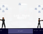
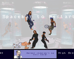
Everything works well together: the graphics, the concept, the theme, but the controls are too difficult. I had to physically turn the keyboard around to get anything done, but I understand the intention behind it and it would work great if we weren't limited to wasd and arrow keys (I can see this concept of game in an arcade with custom buttons?).
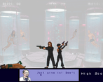
Presentation-wise, this game is pretty huge (especially given the timespan). However, I found the aiming/shooting controls to be rather unintuitive (was this intended to be played by 2 people rather than just 1?).
As others have said, not a big fan of the controls, I was able to see some logic in it, but I think it would've been better to keep something like W for up, S for down, A for forward (right arrow for arrow keys).
Besides that awesome submission, love the art especially!
Always appreciate jam games that have a story to them, even if you're just there to beat the scores. Though, I felt like the controls were confusing to start with. I like the idea of having almost a "cloned" control scheme too, fits the theme in two ways technically heh. Good stuff!
thank you! I'm definitely seeing that the controls are an issue. glad you picked up on the 'coned' control scheme. I was thinking of both agents as two sides of the same coin. one creature. I wish I had made it more intuitive, or opted for an automatic shot when changing angle instead of needing to press a button to shoot.
Nice story and cool that you can skip if you just want to beat a score :). The controls were a bit confusing, but I like the art and story.
I'm glad you liked the vibe, even if the controls were a little funky! Sometimes when you're playing the same game for hours on end, you lose sight of what it's like to play it for the first time. that's me and jam games.
oh man. I know what you mean. The same happend to me :)
The art was really nice and the idea is nice and simple.
The controls were really hard to get used to especially with the two characters simultaneously.
maybe as coop it would be a lot nicer but couldn't get myself to last long, playing by myself.
nevertheless, cool idea.
I appreciate it! Next time I'll try and remember that unintuitive controls aren't the same thing as challenging controls. I'm just glad you gave it a chance.
Great game that works single and coop :) The art work is really great!
You know what? I never really thought about it as co-op, but it would work. Would be a lot easier to handle 4 buttons than 8.
Really lovely graphics, and the concept is really nice, but the controls really hold back this game, they're very confusing. After like 6 tries I still couldn't wrap my head around them. Still, really nice plot and aesthetics. Really solid entry.
I played the game so much that I just got used to the controls. I thought it added to the challenge. Now I'm seeing that while it added to the challenge, the control scheme also subtracted from the experience. Thank you for giving it 6 tries though haha. To be fair, even I start having a HARD time after about 45 seconds.
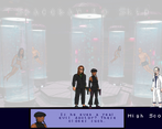
The art was amazing and the cutscene decision to add that dialogue was great as it made stick with the characters even though game was so challenging.
I'm all about the 'feel'. The difficulty was a little high, but I'm stoked you still enjoyed some of the other aspects of the game. Easier to change a control scheme and enemy variables than to start over with a completely new concept!
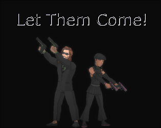
Wow, so many different versions of the two characters! Crazy amount of good looking art. Great story use of the theme!
Sadly I couldn't really get into the controls, W/S and Up/Down to aim and A and Right to shoot would have been way more intuitive in my mind. Couldn't really get used to it so playing was pretty frustrating.
I'm hearing you. Initially there wasn't even a shoot button. W was up, S was down and A was middle. Up was Up, Down was Down and Right was mid. What you're saying is spot-on. Thanks for giving it a chance and taking the time to leave thoughtful criticism!
I love that, you have scenario, story of the game, doctor and other things, I think some contrast and more action animations (They really too smooth, example guy that jumps, shoud be fast or give player some slow-mo effect). Lil sad that controls complicated, but with 1-3 attempts you will get used to it
We learn a little bit more every time we make a game. The things that you mentioned are things I will absolutely keep in mind for the next time. Sometimes it's hard to see outside of your own project, because you're so focused on it. Glad you enjoyed the vibe.