Play game
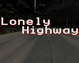
Lonely Highway's itch.io pageResults
| Criteria | Rank | Score* | Raw Score |
| Sound Design | #64 | 3.500 | 3.500 |
| Story | #89 | 3.167 | 3.167 |
| Horror | #167 | 2.833 | 2.833 |
| Aesthetics | #219 | 3.083 | 3.083 |
| Enjoyment (Best Game) | #242 | 2.583 | 2.583 |
Ranked from 12 ratings. Score is adjusted from raw score by the median number of ratings per game in the jam.
Leave a comment
Log in with itch.io to leave a comment.


Comments
Just as scary as a 3am drive alone :o
Thanks for playing! I don't know how to take that though because I used to work nights and drove at 3AM every day, so that was "just another Monday" for me.
idk mannn just something about how dark the back seat was always got me :o
You nailed the PS1 survival game aesthetics and art direction with the fixed camera angles and everything. I especiallt like the cutscenes. It's a shame that the game is very short though but it's though create a meaty content in 7 days as i experienced the same thing myself. Good job and good luck!!
PS: What are the options in the main menu: Farm, School, Asylum. Are those difficulty levels?
Thanks for playing! Appreciate the feedback. The menu options are 3 different levels we were planning on making. The School is a separate scenario. The idea was that the old man that picks up the girl is telling her a horror story. We wanted to give some replay value so we wanted to do multiple games within the same game. The Asylum didn't get done, so that one is currently broken but the school and the farm both work.
The atmosphere and visuals are amazing, great entry.
Thank you! I'm happy you enjoyed it.
Love the aesthetic and atmosphere very fun and polished game.
Thanks! Glad you enjoyed it.
This is an incredibly ambitious project, especially for a game jam as short as this one, so I'm super impressed with how far you got with the project. This must've been a lot of work, even for a small team.
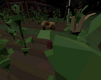
The aesthetics are especially cool. I've seen the "haunted PSX" thing before, but this is rather fresh take on it, with the deliberately low-poly models and all. I quite like it, this could become something very cool if you want to keep working on it.
Thanks for including a Linux build too, that's always nice to see.
Thanks for trying out our game. I appreciate your comment.
Thanks for playing! I ran Slackware, Debian and FreeBSD. I actually didn't have Windows for about a decade. Once I got back into gaming when Diablo 3 came out, I got Windows again in order to play. I worked as a Linux Admin for a while and still run a few servers. I'd compile a Mac build if I could play or test it, but I'm not an Apple guy. Tux Blood runs deep haha, I always try to incorporate a GNU/Linux Build.
I like the retro Aesthetics! Good job :)
Thanks! Glad you liked it.
Thanks for playing. We wanted to try to get it very PSX looking, and that caused most of our roadblocks/headaches. It's still not 100% where we wanted it, but we just ran out of time.
I appreciate the ambition here
The sound design was excellent and set a consistently creepy mood. I digged the ending scenarios with the creatures, the opening cutscene, and I really liked the use of the fixed camera in those monster sequences - enough that I think future versions of this project could benefit from going straight fixed-camera, like older Resi games. I think it would help with the small adjustment I had to go through with the controls in the barn - free move and fixed cameras don't play super well together
Thanks for playing. We actually ended up leaving out a lot of the sounds we were planning, but yeah the camera in the barn was supposed to be like Resident Evil. I wanted to fix the controls and make sure the character was visible 100% of the time, but the playstation shader made it difficult to preview. I do agree that the fixed camera would have been a lot better, especially to make sure that the user sees the things we want them to see.
I agree with J, the school is definitely the creepier setting - but I feel like that's likely because it had more work put into it? If there's one thing you nailed, it's the sound design, that was great. I feel like the indoor areas could of done with some distance fog, but as a fellow Godot developer, I understand that the basic Z-fogging has become so much harder to use in recent versions (no idea *why* they made that decision, but alas it's one we have to live with for now).
It does feel weird, however, that you've got this lovely narrative intro (great job on that, by the way!) - and then you have a choice of three settings for the next part. It feels like you bit off more than you could chew, or at least that you gave yourself a way bigger workload than you needed to? On top of that, the genre you picked - again, not the easiest thing for a one week game jam, but you clearly love the genre and wanted it represented here. I picked collect-a-thon because I thought it'd be easier than something like this. But I can respect the ambition! Good job :D
Thanks for playing. Yeah we got a bit overambitious with this one. I'm not sure if it comes across, but the different scenarios are supposed to be different possible stories that he tells you about the missing people.
Oh the atmosphere got me good in this one. To be honest, I found the school more scarier than the farm, but that is just personal bias, I can't handle schools at night lol. It was effective! Respect for the cutscenes too, that extra effort is always nice to see ^^
I guess if I had to offer improvements, it would be letting be little more dark (personal preference though) and improving the tank controls at times, I tell you, I was stuck in the farm's barn for a considerable time spinning in circles before I suddenly activated the end-scene ^^;
Good work! It would be nice to see this expanded though!
Thanks for playing! I wanted it darker as well, but we ran into issues with the lighting where you couldn't see at all in some cases. We were planning on "fixing it during polish" but those 7 days flew by. I'd like to fix the barn scene for sure. I was trying to keep the view obfuscated a bit to pay homage to Resident Evil.
Oh ye the obfuscated view was neat, I really liked it and it was well executed, same with the final scene in the shcool :D I just had personal trouble with the controls hehe.