I was half-tempted to set up my dance pad to play this. I definitely wasn’t expecting a rhythm game.
Play game
Battle Booba!'s itch.io pageResults
| Criteria | Rank | Score* | Raw Score |
| Horny | #5 | 3.795 | 3.929 |
| Aesthetic | #11 | 3.933 | 4.071 |
| Sound | #16 | 3.381 | 3.500 |
| Overall | #20 | 2.937 | 3.040 |
| Play | #22 | 3.036 | 3.143 |
| Narrative | #22 | 2.760 | 2.857 |
| Kink | #28 | 2.553 | 2.643 |
| Harmony | #29 | 2.898 | 3.000 |
| Novelty | #32 | 2.829 | 2.929 |
| Stealth | #46 | 1.242 | 1.286 |
Ranked from 14 ratings. Score is adjusted from raw score by the median number of ratings per game in the jam.
Comments
Surprisingly difficult. I'd call it unfair if not for the unlimited retries- the fast arrows are just unpredictable, and the way they can overlap each other? At first, I thought this was a rhythm game, but there's no rhythm to speak of here, it's just a 'quicktime' game I guess.
I have to score it low in harmony, but the art is great, and the cheesy dialogue integer overflows back into entertaining lol
Haha, thank you.
No, it's not a rhythm game. The basic idea kind of started as one, but due to having such a limited time to work with the project and being very new to coding, I simply couldn't manage such in time, so it turned into a game of quick time events instead. It's got some annoying quirks, due to the limitations of the system I used to code the game with, but mostly because of hasty development period. The overlapping arrows thing, for example, is a symptom of that.
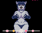
Art is great, the character is very expressive. You get to see what you're fighting for in fully animated glory at all times. The interface is clean and everything looks really good with the limited color palette and black background. There's a wide variety of responsive sounds and good background music, the whole game feels surprisingly polished for a first project!
A bit clunky mechanically. From what I can tell the attacks come in sequences and only your first miss counts as a failure, but only when it goes offscreen after which you can't interact with or take penalties from any other arrows. This is actually a good system that keeps players from failing too quickly, but definitely not something that anyone will expect in a rhythm game. You may need to show it better by graying out the non-responsive arrows. The game is hard, but the checkpoints are frequent and the requirements low, so even slow players like me can eventually limp to the finish line, which I really appreciate. Overlapping the arrows at different speeds is a poor choice for increasing the difficulty in my opinion. You may also want to include a dedicated key for quitting, it's easy to accidently choose "quit" instead of "continue" in the menu after button mashing.
What an amazing first game to make! There are very few people out there can say that they made something this competent as their first ever coding project, I sure wish I could!
Thank you, that's very kind of you to give the game such a positive review!
The game is a little clunky, I agree. It's very short and ends very abruptly due to time constraints. I wanted to include a lot more animations and what not, but the amount of sprite space in Pico-8 is very limited and the boss sprite took so much space with all the different parts that I simply had no room for more fancy sets with the amount of time I could put into the game.
You're almost correct with how the game works. When you miss a symbol, either due to a badly timed/wrong button press or letting a symbol slip all the way to the edge of the screen, you take a hit, get 2 whole seconds of invulnerability time where you can't mess up again or lose any hits. But you can still score correct button presses and rank up the hidden score value to progress towards the next stage in the "story."
The game tracks your score value, and if you let a symbol slip past the activation zone in the middle, you don't lose a hit unless your score is at the minimum value possible for the particular stage of the game you're in, you instead lose a point from your score. I thought this would be a fine buffer for if the game decides to get really annoying with the symbol randomisation. Gives the player a small safety net, especially since I didn't have the time to fix the overlapping symbols part you mentioned. Originally there were supposed to be symbols coming from either side of the screen in arranged sets, but since I'm such a code-newbie I didn't manage to get it work the way I wanted before the submission time was up.
In hindsight I should have probably picked up a different program for the game, such as GDevelop or maybe Godot. But I found Pico-8 very fun to work with. Especially since it contains all the tools you need to make sounds, music and art in one tiny package. Well, that and also Lua felt like the easiest language to try and learn as quickly as possible so I could participate.
Giving the players some invulnerability and safety is a great choice, they just need to see it to make use of it. It felt like the game periodically became unresponsive to inputs when I started playing due to the invulnerability states and conditions being hidden. I don't think the mechanics are wrong by design, they just need to be clearly shown.
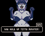
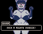
Didn't mention the dialogue in my first comment, but I thought that you've done a good job with making it have good impact while keeping it light and short. Some parts like the instructions feel like you're stretching them over too big an area, so maybe those can have a bigger window, but the writing was funny and gave some good short breaks between the levels.
You've done a great job and should feel proud, you've started off really strong as a developer and I'll be very interested to see where you go from here!
It's got booba, it's got battle, and it's got squeezing. Just as advertised!
A few calibration hiccups here and there, but overall a fun little game. Simple, yet enjoyable.



Leave a comment
Log in with itch.io to leave a comment.