Play simulator
Meritocracy: A Tengu Society Simulator's itch.io pageResults
Criteria | Rank | Score* | Raw Score |
Concept | #4 | 4.239 | 4.239 |
Story / Writing | #8 | 3.717 | 3.717 |
Visuals | #12 | 4.109 | 4.109 |
Challenge | #31 | 2.652 | 2.652 |
Overall | #35 | 3.065 | 3.065 |
Gameplay | #38 | 2.609 | 2.609 |
Audio / Music | #41 | 2.457 | 2.457 |
Use of Theme | #41 | 2.783 | 2.783 |
Ranked from 46 ratings. Score is adjusted from raw score by the median number of ratings per game in the jam.
Team Members
junejijo, MiracleMira, Mollynncy, Saishoo, Tristepin222
Streaming Permission
Yes
Leave a comment
Log in with itch.io to leave a comment.
Comments
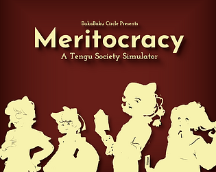
I love the monopoly-esque cards especially the angry chimata one , I'm sorry chimata!!! I don't know how capitalism works.
Also I got trapped by a kokoro doki doki card, had no resources and could no longer progress or quit. Definitely coming back to this one to figure out a strategy.
Wait IS THAT HANA!?!?!?whoa!!!!!
Thanks for playing! We're working on a post-Jam update which should hopefully squash all the bugs. I'll write an update when that's available!
Good catch on the Monopoly cards; that was purposeful. Lol
Couldn't get far, but I dig the concept. It reminds me of "life".
so many cards. this thing would work printed
i remember you!
Our original plan was to try and make a digital game and go for a physical one if it didn't work out, so I'm glad you caught on to that!
I do wonder if we could do it that way for people...
Thank you for playing! I do admit it's a very complex game, but once we have all the bugs fixed, it will all make a lot more sense structure-wise.
The basic object is to get through all the events long enough to win Megumu's favor. I'm glad you enjoyed the art. I think this game is probably one of my favorites I've ever had a hand in based on looks alone; Molly really nailed the art.
Way too bugged in its current state but I'm eager to try it again when it gets fixed.
I am very sorry about the state of the game, but I am happy to hear you're eager to play it. We are hoping to fix the major issues this weekend.
ion understand how the game works at all...i played in the web version but ill come back to this later lmao
Hey there Jam, I would suggest playing the executable as it is a lot smoother of an experience. We're hoping to update the file this weekend.
👍 but Whos Jam
Solid game! The cards are well written and the game was stratigic enough where was fun but quite challenging if you stumbled through it (a good ballance). as other's have said the doki doki card is a bit broken but otherwise a nice experience.
Thank you! I'm glad you enjoyed playing the game. We did want it to be a pretty good balance of tough and fun so it;s a relief to hear that is the case.
Like the concept a lot. The art and music are so nice and reminds me of 50s or so cartoony art. The 1.0 web version is kinda unplayable but the executable is much better. The gameplay reminds me of that Reigns game on mobile which has a similar concept of managing your resources through decision making cards. Although there seemed to still be some bugs in the 2.2 version. in the doki doki reaction event i couldnt take the +1 star option despite not being greyed out. Also pressing the middle option (which was empty) during it changed it to a different doki doki reaction event with different choices? The option on its right was also similarly not choosable. I had negative triangles and stars during it. I also got to a point where i got negative triangles that caused me to get a loop of many repeat sentry event that eventually caused me to lose. If the bugs concerning how the cards are chosen are fixed along with more fine tuning on the resources gained from each event then this would definitely be a solid game.
Heya, composer here, the music was made in the image of the early-mid 1900s, so glad to see I got the desired effect-
Going about emulating that vintage, staticky and worn-down audio was tricky at first, but thankfully sound effects saved the day- it was achieved by grabbing a rotary sfx, applying it on the grand piano lead melody, and applying stereo delay when needed.
Hey there, thanks for playing the game!
I'm a little sad the Doki-Doki event seems to be broken, we thought it had been patched out in the updates. I'll have to see if it can be revisited.
I'm glad you seemed to enjoy it otherwise!
The art is so endearing. With the textured background, and the narrative writing, it feels a bit like I'm playing on a prophesized tapestry.
I had quite a bit of trouble getting the hang of what the gameplay was, and probably didn't fully understand it, but it was fun to imagine the events as they unfolded nevertheless.
Possible bug report: The cream-colored-cloth screen, where the events are displayed, went white for me after a while.
Thank for playing! That bug comes up in the browser version of the game, which is the original Jam piece.
The downloadable executable (2.2) should clear that issue up and have a tutorial to go with it!
The art and music are great! I love the cards, they remind me of Monopoly Chance/Community Chest cards.
The strengths and weaknesses don't seem to do anything? There also doesn't seem to be any way to preview the cards you're allowed to discard, so I don't know whether it's a good idea to discard them. Also, sometimes "exchange 1 X for 1 Y" gives you one X and takes away one Y instead of the other way around, which is confusing and inconsistent. I stopped playing when I got to a card that wouldn't let me click anything, but I liked the idea behind the game. The web version seems out-of-date to the downloadable version as well.
Thanks for playing the game!
The idea behind the discard option is just that-- an option. As you play the game more, you'll know what is good and what is bad. Due to limitations, we couldn't do a full preview of each card so this was the best we could do. Sorry about that.
We have also been trying to iron out bugs, but there may still be a few out there we don't know about yet. Thanks for letting us know!
Dope ressource management concept, despite of the game being half-playable right now.
Also digging the 50s toon artstyle. 👍
Maybe the "character select screen" clusters too much stuff in one screen. Even at 1080p fullscreen, it's hard to read the descriptions. IMO, just showing one card with bigger text, and just switching/swiping between the cards would have been OK.
Thanks for your feedback! The 2.2 executable should be more fully formed with the game's rules and the like. As for the text, that's a full "my bad" in the creative process.
Might be better in fullscreen though!