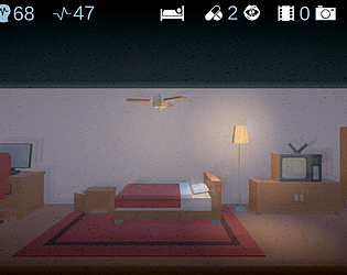
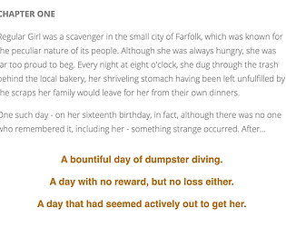
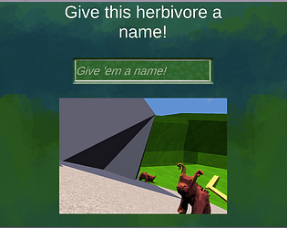
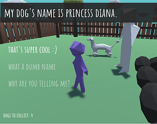
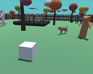
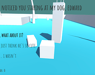
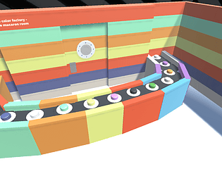
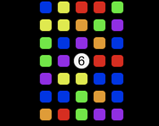
at some points, it felt like some of the text was overlapping in a way that made it difficult to read, but in general navigating the space was pretty intuitive! Sometimes when the text was on the floor it was also kinda hard to read as well, just because of the weird angle. I think that the conversation could benefit from being a little more drawn out - the space itself is easy to understand, but the way the text is feels a little claustrophobic (which is fine if that's what you're going for, but it is a little harder to understand).
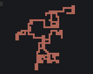
The idea of making choices using movement is really interesting and I think could be investigated even deeper if you wanted to, but it was fun being able to explore the rooms at the end. It feels like there's an opportunity to take more advantage of how nonlinear this form is, but I'm not sure exactly what that would mean! maybe more of an emphasis on free exploration? but i think that might be what you're going for toward the end anyway with the rooms. excited to see what you choose to do with this!


