Here's a hint: try striking a balance between picking and not picking.
Anders R. Mattson
Creator of
Recent community posts
Hey thanks for the thorough review! You hit the nail on the head for pretty much everything :). I loved playtesting this game with some friends, as some of them were very turned off by the whole idea. AND YET THEY STILL PICKED!!
Hope you try for the "Soft Ending." Would be curious to hear what you think.
Wow, I enjoyed this game. I've been planning on experimenting with Ink, and your game has solidified that plan. I love how the story moves through these simple descriptions of the flat and the surroundings; I was really able to dive into the setting. I also loved how the colors complimented the story, particularly as the paranoia sets in (regarding the shadow). I have just a few minor comments/recommendations:
1. I liked how many of the choices seemed to be filling in sentences. But I think that would be extended by having them actually do that in the text, instead of having a paragraph break where they continue. Think the first choice I made had this.
2. There are a few places where you can cut repetitive words that won't alter the story. One that drew my attention was, "My finances are a mess and this place is the only place anywhere near my..." I would cut the first "place" as it is unnecessary. I also saw a few missing periods ("They must have seen me They must be here to do something to me"), but again these are incredibly minor.
3. While I did like the color changing, I got to a point where it changed to purple, but all the text was the same from before. Is there a way to make it more seamless? I ended up just rereading all of that text as I was unsure if I was missing something.
But as I mentioned, these are all very minor in contrast to the excellent story you have created. I thank you for letting me play/read it and thank you for sharing it!
I was very spooked by this game! You did a great job finding a balance between scares and this unnerving hunt for the cans. The music was also exceptional, and I enjoyed the player sprite's movement. I agree with a lot of the comments below (size of the space / the volume of the monster's scream), but I also had one small comment as well. A few times I spawned near the outer edge and had a hard time finding what was and what wasn't the out of bounds zone for the game. I think this had to do with the same ground tile across the entire map. Maybe having some sort of visual cue for the out of bounds (maybe a fence, or a wall of trees) would help. But I had a lot of fun playing and thank you for sharing your game!
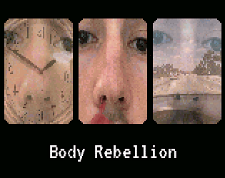
Thank you so much for the reply and positive response. You nailed pretty much all of my goals with this game / my general philosophy regarding the themes (and the fact that you were picking your nose after writing is hilarious). Regarding feedback I could definitely ramp things up and add more to the animations. They were very fun to make, and can see myself experimenting further with the style / this specific project (used Aseprite to mix real life images with additional pixel graphics).
Thanks again for checking it out and hosting, this has been my first Game Jam and has been a really fun / engaging opportunity.
I loved your game! As others have mentioned, the art style is gorgeous, the music fits incredibly well (very spooky), and the story was enjoyable. I particularly liked how the environment subtly changed, from the upstairs bedroom door disappearing, to other smaller touches. The game also reminded me a lot of Mother 3 (particularly the castle infiltration level, if you've played), but did not feel derivative due to the unique story. I also liked the staticky black effect around the game.
I have just a couple suggestions after playing:
1. As others have mentioned, the beautiful character portraits contrasted a little bit with the sprites. I think by just adding a few more touches to each would help (especially Rachel's face, which seemed almost eerily flat).
2. A few instances of dialogue felt a little awkward and out of place. One that stood out to me was when Officer Duane said: "I can't promise that she's okay, but we'll figure out what's going on." This was troubling, and almost felt out of character for a 9/11 responder. I would look over your script for similar occurrences.
3. This one is super minor, but I would find a different way of getting the player to enter the archive room. It felt weird that I used Lahey's key, when he would have needed it to enter the archive and lock the door.
But overall, this game was a real treat, and I thank you for sharing it.
I really liked the visual style of this game! It sort of reminded me of Myst? Also the sound work was wonderful, and put me on edge (in a good way).
I would work on having a consistent tense for the narrator, as it shifted quite a bit. Here is an example:
"After a short walk down the road you come across the old bridge, it's schedule to be demolished next month but it should be fine to cross since your not in a car."
I would make all of this past tense / clean it up a little bit like so:
After a short walk down the road, you came across the old bridge, which is scheduled to be demolished next month. But it should be fine to cross by foot.
I think there were a few places where you flipped between ending with a period and ending without. I would try and be consistent.
Enjoyed my playthrough and thank you for sharing!
I was genuinely surprised by the robot behind the stack of canisters right before the gate needing the key! Nice placement. Have a few comments / suggestions after playing:
1. The style of the assets are somewhat inconsistent, which was distracting. Particularly the main character, who has an anime aesthetic, while the rest of the environment has a gritty, realistic look. Is this on purpose? Or were these assets made for this project? Would be helpful to have that information (or credits to the author) for clarity.
2. There were a few instances where I popped in and out of the environment. One moment I noticed was right before the Alice Zun corpse.
3. Do you plan to include falling damage? I was able to grab the key on the roof then easily escape the robot by just falling down.
4. Adding a little more context in the opening would be helpful. As the character felt a little out of place (design wise) they also did as a character in this world. Why were they in this place? What do they have to fight for? Some questions worth thinking about.
But I enjoyed playing your game and thank you for sharing!
I liked the idea of a crafting system, and was really interested in seeing where the game was going in regards to world / story. I also found the enemies to be interesting, and liked when I died that I sort of rebooted (was a nice touch). From what I was able to experience I think some rebalancing would help. After my first encounter I had only 12 health, and not enough items to craft anything beneficial. Nevertheless thank you for sharing your game, and I enjoyed playing it!
The visuals were exceptional in this game! You did some amazing work on the backgrounds, which really stood out, and a few instances I had a hard time focusing as I would watch them sway and move. I also found the use of lightning to be stellar.
I have just a few minor suggestions:
1. Charlemagne's model is really cool, but the size changing was very distracting for me. I wonder if you could shift the perspective to being up close, so we can better see the sprite, would work. Also found the other characters being in the way to be a little distracting as well.
2. Mandy's comments about Robbie behind the bush seemed very out of character / how she was set up beforehand. If you want her to come off rude I would add a little sarcasm at the wack a mole game to her dialogue.
3. My game ended abruptly after you reached the fortune teller machine with the old man. Not sure if that is a bug, but I was unsure if it was over at first.
4. Would be helpful to quickly flash the controls on the screen once you were able to move. I waited for a few moments, unsure if the game was going to pick up.
Really enjoyed this and thank you for sharing!
I really liked this games aesthetic qualities / the narrative as a whole. Although I didn't find it too "scary," I walked away from it feeling unnerved as I should from a psychological horror game. The music was also really great, and loved its atmospheric qualities. I really did feel like I was in Michael's head. Have just a few suggestions:
1. I found that the memories had a pattern, where the furthest away were always the most negative memories. Because of this I paid less attention to the last one, as I sort of knew what they were going to be saying. One way to alleviate that would be randomizing the order.
2. I was a little unsure what to do once I listened to each memory, so just wandered around. Only after interacting with them a second time did I realize I could also consume them with "Z." I think having a separate consume key (maybe "X") would make this more clear that I can both interact and consume each memory.
3. For the most part I could read the letters / words (and liked how you designed them). But, I had a hard time reading "soul."
Thank you for sharing your game!
Hi all,
Sharing my new game I just published called Presto & the Three Cycles.
You are a quirky college student working at a bookstore over your summer break. Can you survive wacky retail antics and uncover the secrets of Presto Books?
Presto & the Three Cycles is a fever dream, inspired by my four-month binge of Hatoful Boyfriend, Shin Megami Tensei, Skull-face Bookseller Honda-san and the works of Haruki Murakami. Sprinkled atop these influences are my own experiences as a bookseller and all the woes of retail.
Any feedback is welcome, thanks for checking it out!
Hi Fia,
Thanks for playing, and glad you enjoyed it! I was totally inspired by 80's animated films (that I was definitely too young to watch on my own) so glad to hear you reference those. Really appreciate you taking the time. Definitely wanting to add a new cover, working on that now. All the best to you.


