

New stuff:
- two new pickups
- two new boss fights
- one new athletic theme
- one new boss theme
First of all, the artstyle is wonderful, and unlike some games with higher resolution art, the fact the environment is based on grid tiles was never too jarring. The game itself plays well, and the character designs are interesting. However, there were a few things I think could be improved upon. This is obviously inspired by Zelda 1, but I think it wears that on its sleeve a bit too much. Having the map and enemy designs be so similar makes me feel like I'm playing the same game at times. I think having different enemies that play differently from Z1 in particular would be a huge improvement. I think the walking sound effect doesn't match up with the actual walk very well, if you had it sound like a single small step was happening instead, it would sound much much better. The tarot card tutorials were extremely neat, but I feel like having that kind of information dump on the player at the very start is too much, and the tutorial you have built-in to the house is much more intuitive. I hope you can repurpose those card graphics somehow, or keep them under a controls option in a menu. I think you have a solid foundation though, and I hope to see the game improve and iterate upon itself in the future.
A bunch of other people have left comments, so I'll keep mine brief. The only real complaints I have are that the ground art doesn't feel like it fits in so well with the rest of your assets, and that grinding feels a little inconsistent to me. Maybe I'm bad at grinding, but I think the controls for keeping the grind going should at least be a little more lenient if not tweaked. Other than that, I have nothing to say that everyone else already has. The game is solid, good, soulful, and a blast to play. Great job!
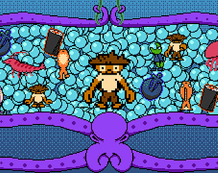
I love the underwater theming, and there's a lot of good juice to your game. It's well-designed, well-programmed, the music is great, and most importantly, it's fun. The wall tiles and quite a bit of the graphics clash with the type of artstyle you're going for though, so I hope that gets touched up on in the future. I also feel like the Boost UI could be changed so it appears above or around the player, since this game is faster paced. Excellent work!
Upon replaying the tutorial, with the knowledge of being able to zoom in and out, I had no issues with seeing the blocks. However, even when zoomed in, the particles on the fans can be really hard to see still. Maybe my monitor just has bad color output though. As for the zoom in/out, since it didn't work outside welding mode, I never figured to try it when in welding mode. I think if you add a a blurb about it in the welding mode hint in the tutorial, it could clear things up better.
Sorry for being vague mate! I was referring to regular jumps, though the walljumps may be imprecise due to how fast the player is during a walljump. Horizontal movement during jumps, and moving in general, should have at least a few frames of momentum until you reach max speed. Maybe I just had bad coordination today, but making small jumps from one block to the next could lead to me overshooting or undershooting just a tiny bit.
I think if you slow the jump and wallslide down a little, and add a little bit of momentum to horizontal movement, your game will feel perfectly fine. I noticed it was made in GMS2, so I would recommend using an Approach script for horizontal speed as a super quick fix.
I'm not one for Zachtronics-type games, but this was really interesting. I only played the tutorial since I'm a brainlet with the genre, but I still managed to have fun. Here's what I would change based on what I played:
-The background being grey-blue makes it difficult to make out the blocks on screen. I'd make the sky a different color or shade.
-The game is too zoomed-out at times. I think it would really benefit from allowing the player to zoom in and out.
-The part with the hole leading to destroyers was skippable by spamming blocks and jumping across them before they fell. Not sure if there's anything to do about it considering the mechanics of the game, but I thought I should mention it.
-I think the first puzzle with the extractor and destroyers should have some more explanation to it, I wasn't too sure what to do there.
-The sound effects were solid, it made every interaction feel good.
-The art, while simple, made everything instantly recognizable which is a big plus for a game like this.
-The scroll bar in the pause menu being a machine is a really nice touch, more things like that in the UI would be really neat if it doesn't distract too much.
-All the options you have in the pause menu are great, it's always nice to see so many options.
I think you have a solid foundation, great job mate! I hope more people check it out!
This was a simple, yet fun puzzle platformer! I played through 9 levels (plus tutorial of course), and got the extra collectable on all but 1, 7, and 9. I feel like the wallslide is a bit too fast and the jumping can be slightly imprecise, so I found myself relying on the hover to correct myself a lot. I know someone else had mentioned a problem with their window, and I also wanted to report that I had an issue as well, where it filled up my main monitor, and covered up about half of my other monitor. I'd recommend adding screen resolution options if possible. I also wasn't sure what the Progress option was in the menu - it showed a clock with some different things on it, but I couldn't make heads or tails of what it was for. That all said, it was a fun time! The characters were fun, the premise is interesting, and the level design was really solid for the most part! You introduced new mechanics seamlessly, so every addition felt natural to experience the first time around; it was easily the game's strongest aspect. I hope to see more next Demo Day!
I'd suggest changing the arrow keys and backspace controls, since the player's right hand will be over the mouse instead and can be difficult to mentally swap from mouse to keyboard then back to mouse.
I think some of your movement could be based on the weapons themselves if you're not a fan of giving the player direct movement options. I'm not sure if this would wreck the balance of the game or go against your design doc, but having two guns on you at a time and swapping between them could lead to interesting movement. Something that came to mind while playing was using the shotgun to gain a lot of air, then swapping to the pistols to sustain yourself at the peak of the jump. I think a system like that could encourage players to experiment with all the weapons you add, since each combo has the potential to be really unique.
Even with more limited movement though, this is still a really fun demo, and I can't wait to see more and see how you develop the levels and mechanics.
This is such a fun idea for a game! Essentially taking the exploits and meta mechanics of older FPS games and turning that into a 3D Platformer is genius. The physics work well, and I'm a fan of that city background on the second map - it reminds me of older N64 games. I know a lot of people have mentioned this, so I won't go in-depth, but there is a really steep learning curve to the controls that I feel makes playing this game a little unintuitive. I think I remember you saying you wanted the platforming emphasis to be on using the weapons, but I do think the jump could be a bit higher and maybe have something akin to Mario's Long Jump if the levels are going to have stretches of flat land. The last real nitpick I have with it so far is that I couldn't really find a use for the dual pistols, since they didn't give me much air. If you have something else planned for them, then disregard my nitpick. This is fun at its core, so I hope to see you iron it out and make a big hit!
Changelog:
Thanks for playing, and thank you to everyone who's given me feedback so far! I feel like the game has improved so much over just the past day.
Controls:
WASD - move in the four directions
J/Space - attack
ESC - pause
1 and 2 - volume down and up (Music)
3 and 4 - volume down and up (SFX)
Controller support was added, but not tested, so play with controller at your own risk. If you want to play with keyboard and have a controller plugged in, you will need to unplug the controller.
Thank you so much for the detailed feedback! I put the controls on the itch.io page, so I guess I should put them as a comment on this page too. I'll try to push out a new version with some of your proposed fixes today, since a lot of these can be really quickly done. I'll respond with all the fixes I make, too. Again, thank you so much, I probably would have never caught on to these myself.
This game reminds me a lot of Environmental Station Alpha, which is entirely a good thing. The graphics are nice, the playing field is easily visible and defined despite the limited palette, and the game plays well. I particularly like how as far as powerups go, you got the double jump first.
I'm a big fan of the Observer boss. Really fun and intuitive. Despite it being a bit challenging, I was able to beat it on my first try since it was a natural evolution of the mechanics I had just learned. I love it when games do that. My only complaint I have from my time playing is that the flies in the second area can be a bit much at first since they're small yet come in such big numbers. I'd either make their hurtbox just a bit larger, or maybe decrease their numbers slightly. Great work!
Let me preface this by noting that I'm pretty bad at TD games, since most of my experience comes from the Bloons series.
I think your gameplay is really solid. The towers you do have are all distinct and have their own niche uses. The enemies as well have good variety, which forces me to rethink my defense layout. My only issue is that not enough money is rewarded from killing enemies. I think upping the amount per enemy by just one or two gold should be enough, since at the end of every round I find myself only able to maybe place one new tower down. I hope to see more from you mate, good stuff.
Thank you so much man, I appreciate the feedback. I can't believe I didn't think to add a "Press Spacebar to begin" text on the title screen! I'll definitely add that.
As for the movement being hold rather than tap, I do plan to add an option to tap a direction to be queued so you don't need to hold a direction the whole time, so hopefully later builds will feel more comfortable to play! Cheers mate!
Wow, amazing. I can definitely see the Earthbound inspiration, yet unlike many other games that try to take notes from it, Mirrored Soul still feels distinct and stands tall on its own. I don't know if this is your first game you've ever made, but if it is, you have real talent. If not, then you have incredible discipline with this medium. Earlier someone mentioned that the game is really difficult, and I agree to an extent. I think a good way to decide starting difficulty could be to change up the beginning option to take the knife from the drawer: perhaps there's multiple small weapons in there and you can only take one or nothing at all, which could let players decide the difficulty on their own. The last thing I want to mention is that the music is brilliant. I particularly love the first boss theme, starting with the baseball jingle was an excellent touch. Great work mate.
This game is great. The weapons feel great to use, the enemy designs are fun and can range from hilarious to creepy, and the secrets feel well-hidden enough to feel fun to discover, without feeling cryptic or anything. I feel like there could/should be checkpoints here or there, but I suppose that's also what the save and load feature is for. The one thing I would suggest changing for sure, however, is the weapon switching. I feel like scrolling the mouse wheel, or cycling through them one-by-one with Q or E would feel better than trying to reach out for the number keys. Cheers mate.
Just finished World 1. Your mechanics are fun and interesting, though I have an issue with how you chose to roll out content. I like how there's so much variety level-to-level, but with the first world being, well, the first world, I expected any level gimmicks and hazards to further establish the rules of Bokube. One of the first enemies, being the pigs who chase you, break the rules of the grid, which would be perfectly fine later in the game, but for it being around the second to third level, feels really out of place. The cannons are a nice level gimmick, but I think they should be introduced later on, or have one appear as a way to end a level or something before being introduced proper. I could go on, but I don't want to bombard with negative criticism, since this is a solid game. I'm particularly fond of the boss, which would be an absolutely perfect first boss if your level design in the first world led up to it mechanically. Keep up the good work Boku.
Interesting game. The ambience is really well done, the music is top notch, and I like the player sprite. I feel like the enemies are a bit too small compared to the player though, and the player's dead sprite is really huge. This could be a really good Hotline Miami-like game with some more development time though. I hope to see more.
I love Zelda 1, so this game really interested me, and it's made in GameMaker, so I also wanted to support a fellow GMS dev. Despite being a huge fan of some really hard games, I have to admit this one was a little too difficult due to enemies' unpredictable attacks and a lack of patterns. The player is a bit too slow to deal with some enemy attacks, so I struggled a lot, especially early on. Aside from that, this game is great. Nice NES-style graphics that remind me of games that came out around '87, great sound effects and music, the enemy designs were cool and fun (again, despite their attacks being a bit too quick and unpredictable), the list at the top that tells you what you've done and where you've been, and I like the Estus-like healing system. Solid game mate.
Hahaha, the player being way too fast was actually only for debug purposes, which I accidentally left in. I reuploaded the game with the player moving much slower. The accidental original build had the player move 4 pixels per frame, now it moves 1 pixel per frame, with the sushi being able to bring you up to 2 pixels per frame. Hope that fix makes it better, but if you do prefer the faster movement, I'll add it back in.
As for enemies, I have over 4 more already fully implemented, and I should have more enemies, powerups, and even a boss level or two added in the final release version. I'm shooting for at least 30-50 levels come release.
Thanks so much for playing mate, I'm glad you liked it!
One of the coolest games here. Interesting character writeups, immediately recognizable artstyle despite everything being basic shapes and colors, tons of characters, options, etc. I think some of the movements feel a little floaty and some attacks could be a bit more snappy, but that's really my only nitpick. Quality work.
