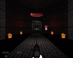
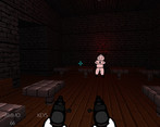
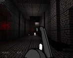
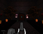
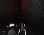
God damn, that cult death scream is the funniest goddamn thing I've heard in a long while.
Couple of things. Liked the weighty controls, good departure from the usual 2.5D shooter weightless everything without going full Citadel. Acceleration on stopping was a little slippery, though, for that speed.
Art style is actually pretty nice and works, although could use some more assets. You don't need full animations - not for this artstyle - but playing into the physical comedy of these slightly pathetic cultists would do some wonders. I think you've established that you're pretty miserable doing art, but it's pretty endearing. Weapons generally felt pretty good.
Don't be afraid of a little repetition for levels. Demo level seemed like it was in a rush to introduce new elements, themes, enemies and such - generally, oldschool shooters do that on a per-level basis (per chapter, in the case of Duke3D), not 8-times-per-level.
But yeah, had fun from start to end. The secrets in particular were exceptionally fun to find. That jerkoff closet will haunt me for a while, and isn't that the purpose of art?
Thanks a million for the feedback, and I'm glad you enjoyed it. The JO closet is my favourite part of that level for sure. God bless the anon who made the lewd edit of the leg enemy.
More animations and art assets are on the way! Just coming along super slowly due to wrist injuries + my distaste for making art. Slipperiness will be reduced for the next demo for sure. I hadn't thought about the fear of repetition with my level creation ""process"", but it's definitely there. I appreciate you pointing it out to me - seems to be a common problem I run into when I start learning new skills.
Wow the shotgun felt amazing to shoot and the knockback was amazing. I thought the layout was good and the "tutorial" posters were a great touch. The only thing I would consider adding is ui for current weapon and how to switch weapons. Very nice shooter and great enemies!
Thank you for the feedback, and I'm glad you liked it! I'll definitely be adding some additional UI/HUD elements to show your weapons & ammo soon. Thanks for playing!
Thanks for the feedback! I'll definitely be reducing the slipperiness of the movement when I get off of my eternal slack vacation. I appreciate the heads up on the big guy being bugged, I'll add an AI fix to the endless list of things to do. Pressing ESC again from the ESC menu will close it, but now that you mention it, I realize what a terrible job I did with it. I'll change the in-game menu to be transparent and have the level music continue playing rather than switching to the main menu music, so hopefully it'll be more clear that it's just paused. Regarding the UI... holy fug, I didn't realize how much of a broken mess the UI is right now at lower resolutions, so thank you for sharing that! And yeah, I can definitely hear some similarities between the level theme and Inflexible Determination. It was actually inspired by Lee Jackson's work on Duke Nukem 3D's OST, but it might actually be more similar to Inflexible Determination, lol. ;_;
Fun game! I think this might actually be the first boomer shooter iv ever played, lol.
Like the an designs and the shotgun looks really nice when shooting it. Not sure I like the face with two leg guys, the idea of something like that coming up to you and biting your crouch off is rather unpleasant =P
Maybe this is just how boomer shooters are, but could the kick attack not be bound to its own button instead of being a weapon you switch to?
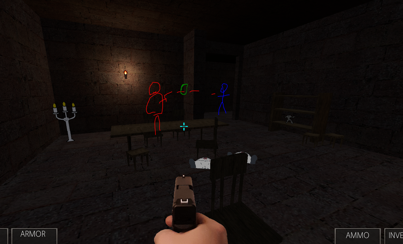
Ran into a glitch. I was covering in the hallway here, me drawn in blue. And the big guy (first one you meet) was standing where at the wall, drawn in red. The wall was between us but his gun stuck out of the wall and he could shoot me.
Thank you for the feedback, and I'm glad you liked it! I'll definitely be adding a dedicated kick button in the near future so you don't need to switch off of your current weapon in order to use it. Thank you for the bug report as well, that will (thankfully) be an easy fix.
I had a lot of fun playing! I quite like the enemy designs, and the voice of the larger enemies is a very charming choice. I think this is a good first impression and look forward to seeing more!
Thank you for the kind words! I'm glad you liked the enemy designs. I've got a lot more planned for the future, so hopefully next DD I'll be able to show off a few more.
This game was an absolute delight to play. Really nailed the boomer shooter vibe. It's amazing how a game like this can feel more gritty and uneasy and graphic than much more realistic, modern games with AAA graphics and budget. Incredible. The leg enemies are terrifying!
The propaganda posters that act as tutorials are an awesome touch, too.
Just a heads-up -- right after the blue door, if you jump up the ramp to the very top and then crouch through the gap, you get soft-locked ;)
Super happy to hear you liked it! The legs enemies are my personal favourite, so I'm glad you enjoyed them too. There are a lot more fun, funny and sometimes creepy enemies planned. Thank you for the bug report too, I'll fix that ASAP and push a fixed build. Really appreciate it.
Appreciate the feedback! Glad you liked the tutorial posters and the shotgun. I've put a ton of effort into tuning the shotgun and trying to make it perfect, so I'm really happy to hear you found it satisfying. The other guns still need some love, but all in due time. In regards to the weapon switching - I actually completely forgot that was a thing... oops. I'll add that in for the next demo build. Blood and bullet decals are on the way.
I liked the demo overall, however, the movement feels off/slippery for me. I found myself falling off the platform section when turning turn to shoot at certain guys. When you stop actively moving, you slow down to a stop; if you turn during this slow down period, you will continue to move in whatever direction your turn is. I'm not sure the best way to address that, but I thought I would let you know.
Greatly appreciate the feedback! I honestly never really noticed just how slippery the movement was until you and another person mentioned it here in the comments. I'll make some adjustments to the movement and deceleration/directional control while decelerating, if I keep it. Might just remove it entirely to give more precision control over movement.
Thanks for the feedback, and I'm glad you enjoyed it! I'm still kind of figuring out what "works" and what doesn't when it comes to level design, so I'm glad that little section was a highlight. The execution scene is still being worked on, but I decided to cut it for this demo. Needs more time in the oven I think. Also will be working on/reworking the slippery movement, thanks for bringing that up.
I love the speed of this game, and I love feeling invincible just running and gunning like a madman. Cute touch with the poster under the water, the painting of a crab, and the ‘I’m not a gn-elf…” audio.
This game is great. The weapons feel great to use, the enemy designs are fun and can range from hilarious to creepy, and the secrets feel well-hidden enough to feel fun to discover, without feeling cryptic or anything. I feel like there could/should be checkpoints here or there, but I suppose that's also what the save and load feature is for. The one thing I would suggest changing for sure, however, is the weapon switching. I feel like scrolling the mouse wheel, or cycling through them one-by-one with Q or E would feel better than trying to reach out for the number keys. Cheers mate.
Thank you for the kind words and feedback! I somehow completely forgot about scroll wheel weapon switching, so I'll be adding that very soon, as well as Q and E cycling. Once I get saving/loading implemented properly I'll add in some autosave checkpoints throughout each level, as well.
Save/load menu doesn't work, I forgot to remove it. Sorry!
WASD to move, space to jump, ctrl to crouch, left click to fire, right-click to alt-fire (only one weapon currently has an alt-fire mode - you'll probably know which if you find it), E to open doors/activate switches/etc.
Comments
God damn, that cult death scream is the funniest goddamn thing I've heard in a long while.
Couple of things. Liked the weighty controls, good departure from the usual 2.5D shooter weightless everything without going full Citadel. Acceleration on stopping was a little slippery, though, for that speed.
Art style is actually pretty nice and works, although could use some more assets. You don't need full animations - not for this artstyle - but playing into the physical comedy of these slightly pathetic cultists would do some wonders. I think you've established that you're pretty miserable doing art, but it's pretty endearing. Weapons generally felt pretty good.
Don't be afraid of a little repetition for levels. Demo level seemed like it was in a rush to introduce new elements, themes, enemies and such - generally, oldschool shooters do that on a per-level basis (per chapter, in the case of Duke3D), not 8-times-per-level.
But yeah, had fun from start to end. The secrets in particular were exceptionally fun to find. That jerkoff closet will haunt me for a while, and isn't that the purpose of art?
Thanks a million for the feedback, and I'm glad you enjoyed it. The JO closet is my favourite part of that level for sure. God bless the anon who made the lewd edit of the leg enemy.
More animations and art assets are on the way! Just coming along super slowly due to wrist injuries + my distaste for making art. Slipperiness will be reduced for the next demo for sure. I hadn't thought about the fear of repetition with my level creation ""process"", but it's definitely there. I appreciate you pointing it out to me - seems to be a common problem I run into when I start learning new skills.
Wow the shotgun felt amazing to shoot and the knockback was amazing. I thought the layout was good and the "tutorial" posters were a great touch. The only thing I would consider adding is ui for current weapon and how to switch weapons. Very nice shooter and great enemies!
Thank you for the feedback, and I'm glad you liked it! I'll definitely be adding some additional UI/HUD elements to show your weapons & ammo soon. Thanks for playing!
Thanks for the feedback! I'll definitely be reducing the slipperiness of the movement when I get off of my eternal slack vacation. I appreciate the heads up on the big guy being bugged, I'll add an AI fix to the endless list of things to do. Pressing ESC again from the ESC menu will close it, but now that you mention it, I realize what a terrible job I did with it. I'll change the in-game menu to be transparent and have the level music continue playing rather than switching to the main menu music, so hopefully it'll be more clear that it's just paused. Regarding the UI... holy fug, I didn't realize how much of a broken mess the UI is right now at lower resolutions, so thank you for sharing that! And yeah, I can definitely hear some similarities between the level theme and Inflexible Determination. It was actually inspired by Lee Jackson's work on Duke Nukem 3D's OST, but it might actually be more similar to Inflexible Determination, lol. ;_;
Fun game! I think this might actually be the first boomer shooter iv ever played, lol.
Like the an designs and the shotgun looks really nice when shooting it. Not sure I like the face with two leg guys, the idea of something like that coming up to you and biting your crouch off is rather unpleasant =P
Maybe this is just how boomer shooters are, but could the kick attack not be bound to its own button instead of being a weapon you switch to?
Ran into a glitch. I was covering in the hallway here, me drawn in blue. And the big guy (first one you meet) was standing where at the wall, drawn in red. The wall was between us but his gun stuck out of the wall and he could shoot me.
Fun demo, can wait to see more work on the game!
Thank you for the feedback, and I'm glad you liked it! I'll definitely be adding a dedicated kick button in the near future so you don't need to switch off of your current weapon in order to use it. Thank you for the bug report as well, that will (thankfully) be an easy fix.
I had a lot of fun playing! I quite like the enemy designs, and the voice of the larger enemies is a very charming choice. I think this is a good first impression and look forward to seeing more!
Thank you for the kind words! I'm glad you liked the enemy designs. I've got a lot more planned for the future, so hopefully next DD I'll be able to show off a few more.
This game was an absolute delight to play. Really nailed the boomer shooter vibe. It's amazing how a game like this can feel more gritty and uneasy and graphic than much more realistic, modern games with AAA graphics and budget. Incredible. The leg enemies are terrifying!
The propaganda posters that act as tutorials are an awesome touch, too.
Just a heads-up -- right after the blue door, if you jump up the ramp to the very top and then crouch through the gap, you get soft-locked ;)
Super happy to hear you liked it! The legs enemies are my personal favourite, so I'm glad you enjoyed them too. There are a lot more fun, funny and sometimes creepy enemies planned. Thank you for the bug report too, I'll fix that ASAP and push a fixed build. Really appreciate it.
Any chance you could keep it in and add a secret, along with an exit? It felt pretty cozy in that room 🙂
i like it, movement and combat is nice and fluid just like the thing that inspires it!
i'm sure it will really come into its own as the art continues to develop, i like the cute posters that serve as tutorials
also satisfying shotgun, rare to see these days
when a weapon runs dry it would be nice if it switched out to another automatically however, also some blood/bullet decals would be cool
keep up the good work!
Appreciate the feedback! Glad you liked the tutorial posters and the shotgun. I've put a ton of effort into tuning the shotgun and trying to make it perfect, so I'm really happy to hear you found it satisfying. The other guns still need some love, but all in due time. In regards to the weapon switching - I actually completely forgot that was a thing... oops. I'll add that in for the next demo build. Blood and bullet decals are on the way.
I liked the demo overall, however, the movement feels off/slippery for me. I found myself falling off the platform section when turning turn to shoot at certain guys. When you stop actively moving, you slow down to a stop; if you turn during this slow down period, you will continue to move in whatever direction your turn is. I'm not sure the best way to address that, but I thought I would let you know.
Greatly appreciate the feedback! I honestly never really noticed just how slippery the movement was until you and another person mentioned it here in the comments. I'll make some adjustments to the movement and deceleration/directional control while decelerating, if I keep it. Might just remove it entirely to give more precision control over movement.
Thanks for the feedback, and I'm glad you enjoyed it! I'm still kind of figuring out what "works" and what doesn't when it comes to level design, so I'm glad that little section was a highlight. The execution scene is still being worked on, but I decided to cut it for this demo. Needs more time in the oven I think. Also will be working on/reworking the slippery movement, thanks for bringing that up.
Cult of Damascus:
I love the speed of this game, and I love feeling invincible just running and gunning like a madman. Cute touch with the poster under the water, the painting of a crab, and the ‘I’m not a gn-elf…” audio.
Thanks for the feedback, and glad you enjoyed it. The crab painting is probably my favourite easter egg right now, so I'm glad you liked it.
This game is great. The weapons feel great to use, the enemy designs are fun and can range from hilarious to creepy, and the secrets feel well-hidden enough to feel fun to discover, without feeling cryptic or anything. I feel like there could/should be checkpoints here or there, but I suppose that's also what the save and load feature is for. The one thing I would suggest changing for sure, however, is the weapon switching. I feel like scrolling the mouse wheel, or cycling through them one-by-one with Q or E would feel better than trying to reach out for the number keys. Cheers mate.
Thank you for the kind words and feedback! I somehow completely forgot about scroll wheel weapon switching, so I'll be adding that very soon, as well as Q and E cycling. Once I get saving/loading implemented properly I'll add in some autosave checkpoints throughout each level, as well.
Awesome, can't wait to see those changes then, and to see what else you have in store with your game mate. Great work so far!
Please forgive me in advance for the awful level.
Save/load menu doesn't work, I forgot to remove it. Sorry!
WASD to move, space to jump, ctrl to crouch, left click to fire, right-click to alt-fire (only one weapon currently has an alt-fire mode - you'll probably know which if you find it), E to open doors/activate switches/etc.