I agree it needed more playtesting and a more finely-tuned difficulty curve. Thank you very much for your feedback!
Dóczi Dominik
Creator of
Recent community posts
Thank You for playing our game! I completely agree: the tool system needed more time to be fleshed out.
The end goal was to feature multiple tools with different movement mechanics and statistics, which player needed to master as each crate is necessary for survival - but also bestows a random weapon. We wanted the player to carefully consider whether they want to took the risk of skipping a crate to keep their weapon of choice or whether they are fine with giving up their tool in order for guaranteed survival.
In reality, due to time constraints only two tools were implemented and even they were not very thought-out, so apologies for that!
Thank You once again for trying our game, it made our day! :D
Thank You for the kind words!
You need to aim for the crates to get a new random tool, which also refills your durability counter. Moreover, getting new tools adds +1 to the maximum durability you have, so aiming for crates is important early game.
It seems that due to miscommunication, this mechanic was left out of the description by one of our team members, I’ll update the description!
Thank You again for trying our game, it really means the world to us! :D
Hi, I deeply understand your concern but unfortunately we were not able to build a web version. :(
The game is built using Love2D, which does not run on web natively. We used the distribution method listed on the official documentation: https://love2d.org/wiki/Game_Distribution
If you want, I can upload a .love file, which you can run if you install Love2D yourself from the official site and then drag the .love file on top of the Love2D executable or shortcut.
Also, I’ve ran a VirusTotal scan for you if that makes a difference: https://www.virustotal.com/gui/file/0227895088a773f9f666dead84ebcec582cff53b740e6f6613ac313ffbc01446/summary
This project was an exercise for a university student group I organize, so I wanted to choose a game framwework that I was comfortable in and which was easy to learn and use for the others - finding one with a web build was less of a priority.
I hope you understand and decide to try our game. If you have any questions or need more proof, please let me know! :)
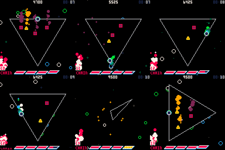
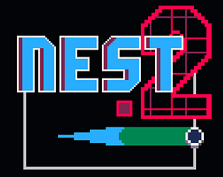
NEST 2 is a simple, but intense abstract arcade game for the PICO-8 fantasy console. Rotate and dash all around the grid, nullifying enemies quickly to increase your CHAIN while avoiding spikes on a mission as old as time itself: beating your high score!
More details on the game page: https://doczi-dominik.itch.io/nest-2
If you have any questions, feel free to ask them. Constructive criticism is welcome too, of course! :)
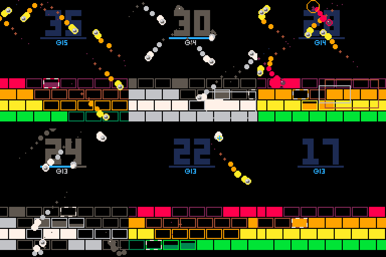
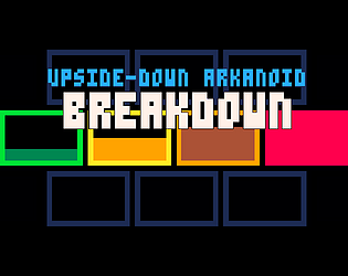
Hey guys! I've just released my game ever, BREAKDOWN!
It's a new take on Breakout, where instead of bouncing back balls to destroy blocks,
you have to frantically build blocks to defend against a barrage of balls.
Check it out: https://doczi-dominik.itch.io/breakdown
The presentation is good and the gameplay is incredibly fun!! My only complaint is that you could make the hitbox of the hook bigger (or make it snap to nearby objects).
I don't think you intention was to make pixel perfect clicks judging by the enemy and level design, I see it as more of a click decision making, and when the plan is made, it shouldn't fail because I missed I tiny pixel on a fast moving foe.
Syllabus Games, I couldn't have said it better. You are required to nail perfect jumps with a hookshot that swings you around a lot. The first 2 levels were fine, because the level design was loose enough to let you soar through the air very fast, but the level with the pit and the spikes made me put the game down for good.
This could work, you just need to design levels around a loose hookshot!
This is a very nice idea! It's quick and fun, not very polished but it can be improved upon.
However, I find that Skills are basically useless, as 3-4 perks already guarantee you the kill. Also, even when I picked skills, it was not obvious when and how I used them, I just spammed the button. There could be a visual indicator or a sound fx when you activate a skills.
An interesting idea and I really like the art style, but it's hard to play.
I only kept my eye on the left half of my screen, and it was a bit headache inducing. The game forces you into a defensive playstyle, and that would be fine if I could get a good idea where I'm going, because no matter which direction I want to go in, I get confused and walk into an enemy.
I think this concept could work better for some kind of abstract puzzle game like Portal or Antichamber.
Thanks for playing! :)
You are right, I will remove the moving background, it really disrupts the flow of gameplay.
I understand your problem with the controls, and I can see how they can be confusing, but if the directions reversed after dashing (the first version) then you could just hold the X button while pressing Right/Left to dash on every pixel and clear a stage instantly.
I'm no game design god, maybe I should add a cooldown to the dash? We'll see...


