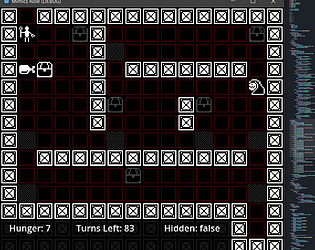
Pretty good; the negative scalling thrown me for a spin when it glitched the whole level, but overall GG
ZeroGaunaZX
Creator of
Recent community posts
I keep overshooting the size of it for so little... Great game, doubles as something to help with measurement by eye skills.
Also, found out that if you keep clicking the fit after fitting the square enough, it will shrink out of screen. Some more and it eventually fills the screen. Guess that even the glitch makes a perfect fit.
GG
Currently the fields end being [seconds vs seconds] or [hours vs minutes] with each betting one card from their side; A functional variation could be two spots for the same value (like minutes) against 1 of her spot;
Would look something like [minutes minutes vs hours] or even [days vs seconds weeks]
I imagine it would take more work to adjust something like that, but it's an idea. Hope to have explained myself better
Poor Alice just wants some company and maybe a few human organs; I'll be sure to bring some trinkets and books for her next time.
Silly gameplay suggestions, if ya care:
- The total amount of time is a bit too condensed, visually, which makes it a bit hard to read it at a glance - If there were some distance between the numbers and/or a lil label, would be nice.
- Removing or adding a field (like day, hour) between rounds when she adds extra rules could spice things up - or two fields affect the result of another
- This is more thematic, but the times where she most speaks about hearts, would be interesting to see the following round to only have the card suit's be heart
- Or, more practical, the heart suit cards could have more value then other cards
- The time going even during the dialog is very nice for thematic tension, but if the idea were to pressure more the player with it, then making a time skip between rounds would add even more pressure. The dialog takes seconds, losing the round has it's own timely consequence, but then a time skip? That's some interesting difficulty scaling (ba dum tzz)
GG
I liked a lot your take on the concept. However, since some objects aren't controllable in some levels while others are, could be helpful if there were some indicators to it.
Since I smartn't, didn't manage to finish it all the way thru - but pretty neat.
Edit: On a second note, affected objects could be a bit more consistent between levels - Since it's weird that in some levels the flag isn't controllable and that the score is in others.


