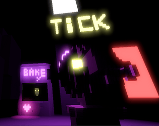
Gaps in the exposition are by design, with different endings answering different questions.
For example, the answer to the door question is most clearly given by the cat ending, the answer for location is given by ice cream ending, and the same ending answers what happens when you hit and who is left alive.
The radio is used by narrator, whose other attributes are to be uncovered.
The goodness or badness of endings are up to you, but they are all emotional in some way.
All together, it creates progression, but not in numbers or scores or unlockable achievements, but in player's head, as the narrative is stitched together.
This is only a second game in which i employ this design, so some hiccups are expected, i will try to finetune in future titles.
Small stars - ah, rng range needs to start higher than zero so they are reasonably sized. ok.
@houkime@translunar.academy
Creator of
Recent community posts
As a simulator, it is simple enough to quickly develop some intuition about effects. I did not need instructions to make profit. Good.
UI-wise, the weakest point is cashout screen. Readability could be better on this one.
Otherwise, just by clicking cashout you can earn 5 pounds per cashout. If you want to illustrate pump-n-dump, start with 0.
This desk is mainly to ask for help and guidance.
Main talk is at https://matrix.to/#/#fedijam:m.wfr.moe
For people new to Matrix: you can choose both which server is to hold your account info and which client you want to use. The above matrix.to link offers some options. Registering on some servers (like m.wfr.moe) does not require email.
Servers are interconnected, you can join our room from any.
You can also follow the news on #fedijam tag (it is not twitter, but mastodon).
If you want an acc to write posts, it follows the same route - find a server, register, and you can access all of the network.
There is a nice site to help you choose https://joinmastodon.org/
(Disclaimer: none of this is complete, exhaustive, or even very accurate. Fediverse is a complex social and technical phenomenon. The rabbit hole is deep, and we... we are on a cut budget.)
Kinda funny. Not-really-flappy-bird with FrogFractions potential.
It seems very short and tad too cryptic, especially at the start (partially because of lack of UI giving you feedback).
Can be made deeper, richer, and less one-sided. Even if one just wants to convey a particular message, showing different aspects makes the narrative stronger (and sometimes more terrifying).
Does not really use the theme.
Was able to play it through.
Music and artstyle are cool.
Plot have not progressed much. Maybe was not the focus of development. A pity.
I lost some 5 restarts because E (default interaction button in some First-Person games) and Q cause player to go through the floor. This was annoying.
Also mouse sensitivity could be better.
Now when i think of it, the sfx is sort of what i would expect as a child long time ago downloading a commercial 'match-3' tier of game.
It is standard, it is how i remembered those games. It could feel nostalgic if i actually enjoyed these genres maybe. ^_^ Something that does not aspire to be artsy or avant-garde, something very vanilla, getting the job done. Cozy if you are into it, but otherwise heavily associated with lack of imagination, money-first incentives and user disrespect because of the decades of commercial overexploitation.
But i get into too high talk for my own creative level.
I have made maybe a single game that has managed to receive some praise specifically for audio feedback sfx.
Putting a timer into a vn seems like a potent idea, even though there apparently was not enough... time to thoroughly exercise the concept in this novel ^_^.
Considering time vs art quality tradeoff, you might want to look at my submission. All of the art there (except for main menu, this one was made earlier) was done by me in 4 hours in Krita (which is free and opensource).
Great design ^_^
Liked using the lighthouse to guide player home.
Liked nice physics when crashing into rocks.
Liked a bit of a challenging area farther into the pond.
Nitpicking (Jam version):
* The fact that the crane is immovable and one does not need to search/recheck for extra control for it could be conveyed elegantly.
For example if it were a horizonal woden rod DUCKtaped to the roof in an obviously inadjustable manner.
* Camera control locking and unlocking (after delay!) with movement makes it a bit annoying to adjust the view.
* Ducks submerge and reemerge from water in too desynchronised manner, making them harder to collect. They are light and cannot desync that much irl -> it feels like a bug. Consider making the phase of the wave deterministically calculatable or probe-able for ducks. If the hardship is intended, consider making an in-narrative reason for this and align the behavior with this reason.
* Seeing the mountains so soon makes it feel like a lake, not an ocean. Consider limiting view distance more or making it an in-narrative lake. The later might be preferred since we do not have a compass, and good view distance helps navigation.
* Combinable with the previous, some simple landmarks on the shores could be nice, to both improve navigation and to make shores participate in narrative delivery.
* The message in the end is blunt and feels on a x10 less narrative mastery level than the game itself.
Art: splendid.
UI and audiovisual feedback: +-
Hindered by the small resolution with no scaling. Numbers of this scale are not possible to read while concentrated. Small ball is hard to track at times.
Exploding duplicated balls that are nonessential (and not fatal to lose) feel like false alarms.
Gameplay: Convoluted and unintuitive. There are some dropped things, and balls explode, change color and duplicate, but the meaning of all of this is not conveyed clearly through gameplay even after a few repetitions.
Consistent aesthetics, clear sound design, intuitive gameplay.
A minor issue: when playing fullscreen, since everything is bnw it can be hard to understand where is an in-game void and where is the outside of drawable area. This makes it hard to understand where you can go through the side to the next xcreen and where you will just fall.
Suggested mitigation: detect fullscreen and draw a white frame.
Nitpicking: battle system feels completely detached from the non-battle system, but that would not be such a problem if the game were longer to build up more creative connections between the 2 (undertale style).
Great soundwork.
I challenged myself with playing without looking at the page, and it was still intuitive enough to understand how this plays out apart from some controls like changing tha type of nest (i tried clicking, tab and numbers).
Cons:
Having four sides to manage feels like excessive repetition.
Liked the library and the overall feel. ^__^
A note on playability:
The eyes on the portals should be more obviously invalid and uninformative.
Otherwise it is very easy to think that you make portals work via correctly positioning eyes.
Or even better, they need to be informative.
I understand that eyes are needed to preserve the frame, but if they are there anyway might as well use them.
Self-reference usage seems to be via math recursion. It is ok, but I wonder if it can be explored deeper so that it is not purely mathematical. Narrative may not include words but still touch human things.
Thx for playing. ^_^
Shmik actually does have a different shape in the next loop ('fluffy curves'), but yep, i thought about actual per-run randomization.
It can be prolonged after first loop.
The player can be awoken on various sites and in various bodies, but i wonder what the bigger story ark should be about. ^_^
Wow! Thanks for playing!
Hope it wasn't too confusing.
I will share the link around, though idk if watches via invidious count for youtube.
https://mastodon.technology/@houkimenator/107317151187262784


