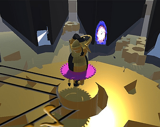
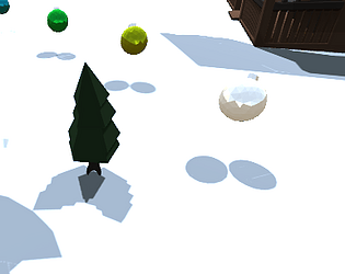
Being a slow reader it was kind of hard to keep track as the automatic slides was pretty fast, a manual next would of been much more preferred but it might of been just me, overall the story was decent and the theme's were well implemented.
Pale
Creator of
Recent community posts
Simple idea in a reasonable package I enjoyed my time with this one although the movement felt somewhat ridged and I thought the dodge would used my velocity instead of straight forward but overall quite simple little project with a clear objective and okay difficulty, some of the encounters felt more difficult than others but I could be mistaken.
This was actually super well done and I really enjoyed the various puzzles and the length of it in general was pretty impressive for the short duration.
Not sure if it was a bug fixed in the post-jam build but the ending didn't seem to trigger once I collected everything and tried to interact with the centrepiece. Overall very polished and great presentation.
For being a game which is aimed for a more narration/story approach this game has got a lot going for it. Although I did run into a few bugs with tracks looping, falling out of the world without a reset and kinda clueless to what the crouch mechanic was intended for. But other than that the game is quite complaint free and to-the-point.
Quite a good job for a solo project I was kinda wishing for a more indication at the end to which cube was enlightenment as I also got possessed at the end instead of being enlightened.
What a unique and fun game, With a good soundtrack and great lighting. There were a few but not too many bugs in my playtime however some abilities didn't seem as polished as others. And some could of used more indication on how they work. However the game is quite well polished (besides a few bugs) and I have very few complaints (mostly visual-queue related) but overall great work.
I really liked the movement and gameplay in this one, the song choice at first seemed sort of odd but it grew on me quite well.
My only problems with the game was i wanted to keep playing in the arena to see how much points i could score before failing and I didn't really find see the "possession" theme
However it was quite a blast to play and the mechanics are never explained but it was quite discoverable and gameplay was smooth.
Thanks for the feedback, we do kinda know the lack of direction is very off putting but I assumed most people would go mine some trees and figure out stuff on their own pretty fast, I'll be sure to add more player guidance in the next update.
Animation issues are pretty bad however all our animators weren't as avalible as we wanted them to be during the past 2 days of the jam so not alot of animations got fixed, thank you for playing our game and please stick around for any new updates or news on the game.
thank you for the feedback, the game was kinda rushed as our team was kinda all over the place, the way you're meant to obtain more crystals is by mining other things as there is a chance system, however you can also obtain higher tier ones by trading multiple crystals of the lower tier to get a higher one, it mentions this in a tooltip when the player is using the fabricator you press ctrl to make the buttons appear, I understand that the solution I chose the problem was not great as I know now that not everyone is going to read everything on the screen.
After mining about 20 greens gives you enough to trade up for 5 blues to buy a HP scan from the shop which was an indication of how much hp an object has left, this isn't really explained as I had 10min left although I wanted to add more to the players multi-tool tool tip.
Thanks for the amazing feedback and please stay tuned for any updates as I do plan to fix everything you have addressed.
Oh boy Apocalypse101 , This was a very amazing game and a good idea and twist on the theme i believe as most other people went for more demons and bio hazardous situations, to start of the art style is very well done and Declan has done an amazing job on almost all of the sprites and i say almost all because although they are all very well done there is some inconsistencies with the thickness of some of some line which makes the drill look much more modern pixel art compared to some of the gray buildings which use much more thicker borders.
Next up the sound design, its very well done although sometimes the game can feel kinda empty, (probably from the slow start to the grind). All of the small sounds and little attentions to detail go along way and that includes the little things such as lights on a gun all turning green when ready to fire another round. With all of the amazing parts about this game I really wanted to enjoy it for its killer art style and seemingly amazing gameplay, i just feel the start grind is a bit too rough to start out and the player maybe should start off with a bit more money to buy upgrades and weapons. Amazing game however i just can't shake off the feelings that there wasn't much here besides a sort of rotate the planet and blow up buildings. (if there is more to it than that please let me know and i will give the game another look).
A Journey To The End in words of the author is simple and it movement systems are quite polished which makes some hard jumps still fair but challenging, lots of the time i died i normally always knew it going to be the way it was going to be.
The simple but consistent art style is also a great bonus to see as the characters do in fact all look very artistically similar and like they all belong in the same work, this includes the background and some sprites (as some such as the lighting seem to be broken and pop way larger than all of the other attacks). It is noted that lots of the game is broken such as enemies and projectiles although it works out all fine as some of the platforming works fine on its own, given the leaps of faith you have to do to go from level to level it really can feel sometimes like a teeth biting situation.
Although it is said by the developer the game is fundamentally broken in some parts it would be much nicer to see some of these elements working in practice as it would add more layers of game play and challenge to the game. Good Job, Love the killer retro art style.
At first Accelerant was a kinda confusing game and although its sudden change from 2d platformer to more of a 3d maze kinda game. The platforming design in the first half was kinda fun in some jumps i had to clutch my hardware not thinking ill make it until i realize that i in fact do make it. However the maze half was kinda fun to go through although after dying twice it really becomes a test of remembering where you went and knowing where the enemies are. Besides dying and learning from that the maze is kinda dull as the only obstacles are slow moving enemies that you can even jump over or use to jump onto the walls of the map.
Some areas which could of had more detail or attention would definitely start with some more attention to models, I understand this project is a solo project and i am not a great modeler myself although given the other areas which have much more detail such as the skybox it is clear there is more talent in the 2d department which is why i would then ask why you didn't just do most of the characters on planes and then thicken their z axis to give them more thickness to their look if they aren't facing the player directly.
Seeing it is a first solo jam this definitely isn't a project to scoff at as there is a lot of work that a team would easily chew up on when working in a team, however this project being solo and a first time it is excusable for secondary or tertiary skills to not be up to scratch with some of the more primary skills of the developer. Nice game although some sound choices were a bit of for me and i would of liked a more complete user interface/experience.
Falling Survival almost instantly grabbed me with how unique its controls and mechanics where, the multi tasking elements of needing to gather materials to build your little base as well as trying to keep your hunger from dropping was not as challenging as it could of been, although it does bring in some possibilities of strategic routes to take for the best back and forth without wasting too much time not grabbing anything.
Due to the low camera FOV sometimes it felt like i was just nowhere and nothing was dropping near me, maybe increasing the FOV could help with this although it would be fair as well to simply pull the borders in a bit tighter, the falling controls and gliding back up felt somewhat natural like i was actually falling and it took longer to go up then it does to go back down due to the air forces yatta yatta yatta.
The art direction is a strong point of falling survival and i wonder if all of these sprites were made for the game or simply used from another project. the UI and sound design was somewhat basic and it would of been cooler to have some more sounds or realistic pitch variation based on the speed of your fall and other sound effects to add more layers of detail, although understanding the time frame given to work with Falling Survival is a wonderful game given its somehow simple but unique design and sort of disappointing player interface. Great work!
Stuck in the center was a great submission with lots of level design and a twist middle of the way with the ability oi a double jump, after getting the jet-boots i was unsure where i had to go next and i traveled all around the map trying to find out where i had to go to continue the game.
The strong points would have to be the level design and placement of enemies and platforms, the platforming was frustrating at times as some jumps i had to move then jump and other jumps you have to start by standing still then move while you are airborne which was a little inconsistent and kinda bothersome (especially with a certain jump where you bonked your head and it as hard to get past).
Some areas that could use some improvements would be the monster designs, some were really cool and interesting, although it did seem kinda like they were just imported from an asset pack (same with the jet-boots) as in they didn't look as if they belong in the world that was created, i think is mainly a color pallet issue with the player using more true tones with the environment with the enemies standing out like a sour thumbs at times.
Although from the ups and downs stuck in the center was a very okay game with some places which could use some more revision before some final decisions, Great game, could use more polish in the controls and more things to look at.
Hey everyone, I'm not particularly new to itch but i;m kinda wondering about ideas for games and expanding a recent gamejam submission i made into a more blown up game. I have genuinely always done game jams because the stress helps me work harder and I'm curious if anyone thinks that the idea/concept for my latest release would be good enough to put more time in. The following .gif explains alot and i would do my best to summaries.
(Crashing Down) https://itsmepale.itch.io/crashing-down
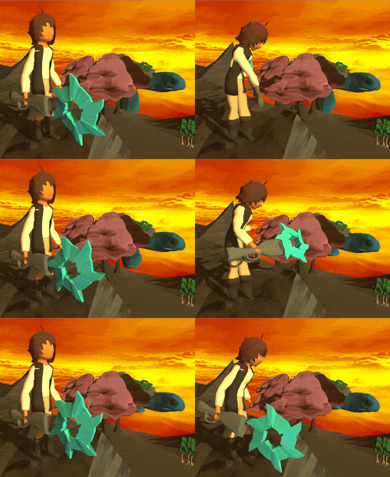
Try to think of this more fleshed out to have wacky and crazy weapons like ratchet and clank with a full open world with the ability to climb supersized animals and use them as part of the level design, kinda how the level design in xenoblade 2 works. I'm happy to chat with anyone about explaining things further, I had a very wide scope for this jam and i think there could be potential to make this game more than just a quick dev fix. Please let me know what you think :D
If none of that discussion interests you can you consider giving my latest release a try and let me know what you think and maybe offer any solutions to problems you are having. I have been programming in c# for about 2yrs now in unity and i have been told I genuinely do things the "long way".
Thanks to any replies in advanced.
This game had very good controls and mechanics the physics however where floor when touching 2 blocks in a certian scenario in which it boosted the players velocity which made some jumps much easier than others. This game implemented the theme almost seemlessly as the whole game's mechanic revolved around it. Amazing work!
The art style for some sprites really stuck out as great art so i congratulate the artist and the game is somewhat dull with not too much to do besides walking side to side and clicking. The sound design was pretty okay as the bar isn't amazingly high for audio design but the sampled death scream was always a good chuckle
Enemies seem to deal damage soon as you're in range which can be a little off seeing as you would always go into an encounter and take instant damage, which lead to unpreventable death as there seems no way to recover health.
This game is very well done the level design really shines and it really display the theme for the game jam very well, its quite nice how the level design compensates for the last section incase you do fall down.
Very little UI and no sound with this one but the level design very well makes up for it. Great work!
Good idea for a game, it has potential for a start of something greater however there isn't much direction in what im suppost to be doing and it feels like im just aimlessly flying around which isn't amazing however the sound design works well and the feeling of being high in the sky really works which is great. Seeing as lots of effort went into other areas besides mechanics this submission is fine however for a jam more based on the limits of one script i was expecting more gameplay features.
However great submission the story touch is nice although im not always big stories its good to see you have that in here.
Overall the game is very pretty and there is some very nice touches here and there for a start seeing the players feet and player model in general was very impressive and there was lots of detail on the player its quite hard to belive the player model was done within the time for the jam. The game feels very well polished to start off with an intro and everything,
My experience with this game was very stylish and i could feel alot of time has went into directing the player and reminding them that the world they are in is real, having somenoe speak to you while the game was being progressed was a fresh touch although it does bring me to wonder where the theme was being implmended a i didn't really seem to find a connection with the submission.
it's very hard for me to not be biased here (as i normaly hate most implemendations of 0g movement) but the movement can't help but feel like you're always floating and in some areas was just so hard to manage it was hard to progress through some sections. the world is very large and its quite nice to see how much is here and how much isn't its clear most submissions lack something due to the time being alotted to work on another aspect and in this game its clear that models and sound really do shine through, although somethings that are missing like more fleshed out UI and more featured gameplay my experience with Kardashev Station was quite pleasent. and it would be cool to see how much more could come out of this world if there was more time allowed for it.
Very fast moving gameplay and i say that as it seems like it take forever to rotate the planet sometimes like it takes too long to do the actions i want to do, it feels very polished and the endless nature of the game makes it feel somewhat lacking, the game's controls being varied gave me some confusing with the ground defence being activated with space and the air defense being left click.
i can somewhat see the theme in this game although not too sure of its presentation as i think you're intention was the leaving behind was the leaving the planet behind although i could be wrong.
The game however in the end of the day is very well polished with a very simple tutorial, however i would wish for a more interactive one or a simple overview of the controlls as there is a bit too many slides. Greatwork tho as the game seems very well designed and there is a few systems i can see that are working under the hood.
Overall the game is very pretty and there is some very nice touches here and there for a start seeing the players feet and player model in general was very impressive and there was lots of detail on the player its quite hard to belive the player model was done within the time for the jam. The game feels very well polished to start off with an intro and everything,
My experience with this game was very stylish and i could feel alot of time has went into directing the player and reminding them that the world they are in is real, having somenoe speak to you while the game was being progressed was a fresh touch although it does bring me to wonder where the theme was being implmended a i didn't really seem to find a connection with the submission.
it's very hard for me to not be biased here (as i normaly hate most implemendations of 0g movement) but the movement can't help but feel like you're always floating and in some areas was just so hard to manage it was hard to progress through some sections. the world is very large and its quite nice to see how much is here and how much isn't its clear most submissions lack something due to the time being alotted to work on another aspect and in this game its clear that models and sound really do shine through, although somethings that are missing like more fleshed out UI and more featured gameplay my experience with Kardashev Station was quite pleasent. and it would be cool to see how much more could come out of this world if there was more time allowed for it.
This game really is a nice idea and i like how the game only got harder and harder overtime, however it feels very much unfinished as you've said the movement feels pretty bare and the game kinda is impossible when you're left with only 1 movement option, would love to see this mechanic fleshed out more tho as the concept is very sweet.
The game however as a game is clearly unfinished so it would be tough to compare this with more feature full submissions. i would like to see this project continued tho with the jam 1 script nature and see how things might turn out. very well done. very impressed its all 1 script
This game is very fast moving and i say that as it seems like it take forever to rotate the planet sometimes like it takes too long to do the actions i want to do, it feels very polished and the endless nature of the game makes it feel somewhat lacking, the game's controls being varied gave me some confusing with the ground defence being activated with space and the air defense being left click.
i can somewhat see the theme in this game although not too sure of its presentation as i think you're intention was the leaving behind was the leaving the planet behind although i could be wrong.
The game however in the end of the day is very well polished with a very simple tutorial, however i would wish for a more interactive one or a simple overview of the controlls as there is a bit too many slides. Greatwork tho as the game seems very well designed and there is a few systems i can see that are working under the hood.
The game is pretty smart and it really does shine with the theme the puzzle nature is very nicely, however the difficulty of becoming something diffrent with every breakage of the cube makes the controlls feel funkier everytime which leads to diffrent results with the feel of the game, while i had 3 blocks on the ground things such as slopes were fun however when i had 2 or 1 block on a slop i always slumpped over which resuled in some sections be frustrating.
There was a particular section in level 2 where you would need to go up a slope and if you slopped back it would show the level segment, but instead it would show a diffrent level segment which is confusing and leads the player to not see their character which led me to restart plenty of times :(.
The concept of the game is very well looked at and im pretty impressed with some of the level design choices and how you've managed to make the puzzles restrict some shapes which require you to cut some ties to make it through,
Very well done, this submission really fits the jam well and im quite impressed with the end product. however some of the level design decisions could use some review. great work :)
This game had very good controls and mechanics the physics however where floor when touching 2 blocks in a certian scenario in which it boosted the players velocity which made some jumps much easier than others. This game implemented the theme almost seemlessly as the whole game's mechanic revolved around it. Amazing work!


