I'm glad you liked it!
Jay Kozatt
Creator of
Recent community posts
I absolutely adore your suggestion about 3x3 tile groups for some advanced plays. That's bound to add some nice depth, and a higher skill ceiling.
I'm a little unsure about the "rotating tiles" idea. But not because it's a bad idea, rather because it's a little challenging for me to do. However, I can look into it. It might a nice addition.
About the audio and SFX... I was just lazy, to be honest, hahaha.
Been having a lot on my plate lately, so I didn't bother to add sounds, animations, and VFX in general. I figured that as a prototype it got the idea across well enough for me to get feedback (and on that front, it has been pretty successful).
I'm really glad you enjoyed our game!
The overall feedback has been so great, that I'll definitely turn this game into a full release at some point in the future.
Yeah, the game needs rebalancing.
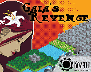
While I'm reluctant to remove the exponential growth of the humans, as it is very thematically appropriate, I could definitely do some things to curtail how rapidly they are able to expand towards resources. Which in turn should slow down their early stages of exponential growth.
Also, I'll play around some more with the side-effects of the natural features.
Originally, the rivers were supposed to be more powerful, allowing for them to be placed over any occupied human tiles by "flooding" said spaces. That would have put them on par with the mountains in power and usefulness. But the time limitation from the GTMK game jam prevented me from getting it working before the deadline. And honestly, I had kinda forgotten that that was planned, hahaha. So thanks for reminding me indirectly.
Regardless, I'm glad you enjoyed the game!
Thanks for playing!
I run Opera GX. But I think the performance issues are a lot more on my end. The browser sometimes gets visual glitches even when rendering normal pages (I get white squares that hide sections of the screen). It isn't related to your game, it's just something I have to deal with from time to time.
I also tend to run like a million open tabs at the same time, so perhaps that has to do with the visual glitches (maybe the browser runs out of memory or something).
That's why I'm thinking of running it on Edge, as a single tab, so that all of my machine's resources can be focused on that.
Oh yeah, the fog definitely would help a lot with the initial information overload. That seems like a winner idea. So I hope you manage to make it work without that much of a performance penalty.
Btw, any chance we could get a bit of "zoom-in" function to help with focus?
That along with the fog would probably help ease players into the game's systems at a more digestible pace.
I saw the "YOU" text out of the corner of my eye. But since I was so overwhelmed taking in all the information, figuring out where I was supposed to go, and what the cards were, it kinda went over my head.
Also, suddenly noticing that meanwhile the clock had kept ticking sent me into a bit of panic, haha. So I started rushing a little and eventually got myself killed on the western-most settlement after having spent a ton of my resources fighting rats while searching a house.
Gosh, it's tons of fun.
Let me know if you figure out how to package it into a downloadable file. I'd love to play it again.
Maybe I'll give it a try on Edge and see if it's more stable/smoother.
Thanks for developing it!
It was a nice game.
Nothing awe-inspiring, but it definitely was a pretty good first jam entry.
The music fits. It was a good choice, and it helps with concentration.
The concept is simple enough and easily understandable. Though it is almost impossible to plan the route before starting the level, since you can't easily discern in which direction the boxes will move.
The visuals are definitely its weakest aspect at the moment. But they convey most of the necessary information. Meaning: they work, but could sure use some improvements.
Umm... I'd have hoped to avoid opening with a negative, but...
That camera bobbing is making me feel way too nauseous. It is immersion-breaking. I can't feel scared or unsettled because all I'm thinking about is how dizzy I am.
I am sure there's probably a nice experience under all that, but I just couldn't manage to persevere through the dizziness enough to enjoy it.
Sorry, man...
Let me know if you update it, and I'll give it another go.
This is a really solid game.
It is a little unforgiving in the start since time keeps passing despite you not knowing what the heck is going on and what you should be doing. But once you start soaking in the information, and look around for a bit, you then begin to understand all of the game's systems.
I don't really have any meaningful criticisms, except that you could probably make it clearer on the map where you're currently at. The map dot is too subtle.
Besides that... would it be possible to get a downloadable version of the game?
My browser wasn't able to handle it very well, and I'd really like to dive deeper into the game. It looks really interesting, and I really liked it.
To be honest, I went into this with low expectations since the premise isn't really anything that sounds too impressive or particularly creative.
HOWEVER, I was pleasantly surprised when I discovered myself having fun with it.
I must praise the use of the first level controlling the snake, since it serves as a good tutorial level to get the basic movement down. It's a good tutorial level because it feels invisible. And that right there is good design.
The game overall is challenging, but has an adequate balance in my opinion. The apples are really useful as a difficulty modulator, since if you find yourself having too much trouble on a level, you can make use of those to give you a bit of an edge to make manageable.
Saving other mice serves as an excellent incentive to push players into tricky situations. And making them optional means that the player can avoid that optional objective if it proves too much for them.
It might be case that the premise isn't something too awe inspiring, but execution of the idea is superb. As long as a prototype goes, this is a good one.
All of that said, the aesthetics could use some love, and the sound kinda gets annoying after a while.
But besides that, it is a pretty solid entry.
I really liked the music in this game. It really fits with the game. And the sounds match quite nicely as well.
Movement, as you say, is really slippery and very difficult to control. I could suggest using an animation curve to map how the acceleration behaves, and tweak linear drag to control deceleration rate.
Knocking objects to take out mice feels pretty fun, and thematically appropriate, but there are way too few objects for it to be that meaningful. So I'd suggest adding many more objects, since there seems to lie the core gameplay loop of this game (You jump, maneuver, and push objects to take out mice). Because, otherwise, it's just a pretty bare-bones platformer in which you run around. (No disrespect intended)
So... yeah, this has potential as a simple, nice minigame. Just lean further into the "knock over" verb, and this could turn into something pretty fun.
Side-note: I really love the cat's sprite. It's animated beautifully!
Thanks!
Personally, I kinda like those times when you manage to fully contain the humans, and are left to fill the remaining tiles by yourself. For me, on that moment the game kinda turns into a "sandbox" in which I can focus on creating an aesthetically pleasing map. Though I don't know if that side-feature will be appreciated by all types of players.
Perhaps, I could offer the option to skip that process for players that don't really care about that, and are only in it for the puzzle/strategy aspect of it.
What do you think?
Yes. Sorry that this is not explained in-game at the moment.
Forests get turned into cities when humans manage to place 2 cities adjacent to them. So placing forest tiles with flanks exposed can quickly lead to a chain reaction in which whole groups of forests get flipped to cities in a single move. Forests are like a phalanx. They hold the line, but if they get flanked, it can quickly lead to a complete rout.
Mines and Farms each provide one extra move to the humans on their next turn, and can be placed within 2 tiles of another human tile. So a chain of mountains can rapidly be covered by mines, and a river with farms.
Perhaps I should nerf the humans' ability to place mines and farms so that mines and farms don't count as cities for the purpose of placing additional mines or farms.
Thanks for the feedback!
Yeah, I've been thinking about it, and perhaps indicating what the next human turn will be (like in "Into The Breach") could help with reducing the sensation and influence of the randomness.
I also understand that currently the rules followed by humans are poorly communicated. I should do something about it as well.
Though, overall, I really enjoyed creating this experiment. And I believe the idea holds some pretty nice potential for the future.
I'll probably be working on it as a full release at some point in the future.
Hi there!!
Yeah, the game currently has no sound, nor animations at the moment. It is a very early prototype that I made in roughly 48h for the GMTK Game Jam that took place a couple weeks ago.
I do intend to revisit this game at some point in the future, as I realise it has some really nice potential.
Hope I don't make you wait too long 😉
For me, I'm simply committing to fixing the AI of the game I made for the GMTK Game Jam.
It was fully broken right up to the last hour before submission deadline, and barely managed to get it into a "semi-broken" working state just before the deadline. However, we still didn't manage to submit on time. We missed the window by literal seconds.
Besides that, I guess I'll just have to pull my arse off of my seat and commit to creating cover art for the game (which might take quite some effort).
I can't really do much more as I have a lot on my plate right now with negotiations with a publisher for another game I've been working on.
I see what you meant when we talked last weekend. That bug makes the game significantly harder.
Regarding the game... It definitely was a pretty ambitious idea. Personally, I wouldn't have dared to attempt a rogue-lite deckbuilder for a 48h jam, haha. So considering that, what you managed to achieve in such a short time-span is remarkable.
Balance is kinda wack, but that's to be expected given the timeframe. And UI could really use some work in order to make the game's initial barrier to entry lower. As right now it is kinda intimidating at the beginning, until you finally figure out what's what.
Despite all that, the idea was pretty creative overall! Not a bad entry into this year's jam.
Yeah, the end message recontextualised things quite a bit, and changed my opinion on some points (which is reflected on my comment above).
That said, I know that on these jams people tend to be a bit apprehensive about being critical of people's games, due to fear of being rated poorly in turn. But since I know you like things said straight, and I'm not in this one to win it (specially since my own game was pretty bad this time around by my personal standards, lol), I choose to give it to you straight then. We grow better that way.
Not gonna lie, this is actually impressively smooth as an experience, despite you not being a programmer. So I applaud you for it.
I don't think I found anything you could call a bug at all. And you chose assets that all fit pretty well together, so overall on those fronts the game was solid.
Great work indeed! :D
Hey, Dread. Just today I managed to get my internet running again. It was quite the hassle, haha. So now I'm going around on a sprint, playing the games of the people that dropped me a comment over the past weeks.
So let's get straight to your game then.
First things first... your sound clips are, no doubt, quite high quality (as is your standard).
Sadly, I found that the atmosphere of the game didn't really put me on edge all that much. But anyway, let me just do a quick recap of everything as I experienced it:
- The monster was the biggest weak point in my opinion.
- I found the monster's behaviour quite predictable once I studied it a bit. And a monster you can understand, loses a lot of its edge from a psychological standpoint.
- Your monster was very human in nature, in the sense that it had very human limitations in its capacity to move and hunt you. So I could very easily tell the direction where it would come from.
- And quickly realized I could keep it in check just by looking in its general direction. So, once I realised it was turning itself into traffic cones and such, he became that much less threatening.
- Therefore, I felt too empowered to control this monster for him to have an effect on me.
- However, these comments have the caveat that the game ran kinda laggy on my PC, so I most likely had a lot more time to study behaviour than intended.
- Now, things you definitely did well:
- The bustling of the city actually relaxed me (but I don't know if this effect was intended). However, the occasional creepy sounds did bring the tension back up.
- I definitely appreciate your use of lighting to guide my path, since roaming aimlessly would have led me to assume that there wasn't anything else to see and drop the game halfway before its actual end.
- The voiceover lines do keep you on edge, as long as you don't fully understand what the monster is doing.
- And the use of darkness to keep you on your toes was also proper.
- The bustling of the city actually relaxed me (but I don't know if this effect was intended). However, the occasional creepy sounds did bring the tension back up.
- Another point also related to the lag in my PC, is that the camera felt kinda slippery and difficult to control, but that's definitely due to my system's performance.
In summary, I feel like this was a very "by-the-book" horror game. It didn't really push that many boundaries of what is expected from the genre.
Though I'm definitely grateful for it deviating from the "jumpscare doctrine" that plagues the genre since the last decade. A horror experience centered around the use of tension, rather than shock, was a breath of fresh air.
This game has top notch presentation! From the menu animations, to the sonar effect, it is all superb.
The concept is pretty good too! So much in fact that it made me jump from my seat first time that I died from running my sonar.
Now, sound design-wise, it has the seedling of an exceptional work to round off the overall experience. But for a game that is so reliant on sound, it needs a bit more of polish, since it is really hard to hear the growls that are supposed to indicate the 'hunter'.
I also heard the submarine make some sound upon moving, though it is comparatively a lot quieter than the sonar, to the point where I only noticed once I turned the volume up trying to listen for the growls (which I never heard). Also I think I understood that you were supposed to be able to tell distance from a wall by hearing, but I really wasn't able to echolocate that well, so... yeah... The sound mix overall needs work.
Despite all of that, I am completely certain that once the jam ends, fixing those audio issues should be trivial, and would turn this tense experience with rough edges into quite a gem of this site, ready to be discovered by the general public.
I really liked this one. It really has tons of potential.
Oh yeah! You bring up a pretty good suggestion.
I came up with those numbers on a whim, and without much deep thought. Initially I based those numbers upon the Prisoner's Dilemma; but later revised them a bit, mostly the penalties due to betrayals as to make it kinda symmetric.
Though, certainly those numbers could have used more thought.
Regardless... Thanks for playing! Glad you liked it.
Oh hey, Dread!
Yeah, this was a pain to put together xD I attempted a bunch of new things all at once (first 3D project, first contact with 'Ink' the narrative scripting language, and above all... first attempt at the horror genre which isn't a genre I normally enjoy) so I wasn't expecting that great of a result.
But it was a cool experience, and I expanded my toolset quite a bit as a result. Still have a long road ahead of me, though.
However, horror still seems more like your thing than mine (hence your name, hehe).
I'll check out your game once my internet service gets restored (currently using mobile data to access the site)
Hahaha, glad you liked it. This was a MASSIVE challenge for us, since none of us was that well versed with the horror genre.
During the jam (and even now) I lost complete internet service, which made it a lot harder to reference documentation and make steadier progress. Literally had to make the submission through my phone. A bad 'roll of the dice' if you will, haha.
I also didn't get to playtest it at all, so bugs were totally expected. Considering how much trouble we had, I'm happy with what we got, haha.
I'll hopefully have time left to check out yours once my internet service gets restored.


