WOW great game
Play game
9 Dayz's itch.io pageResults
| Criteria | Rank | Score* | Raw Score |
| Graphics | #17 | 4.083 | 4.083 |
| Overall | #20 | 3.771 | 3.771 |
| Audio | #21 | 3.667 | 3.667 |
| Gameplay/Design | #24 | 3.833 | 3.833 |
| Fun | #27 | 3.500 | 3.500 |
Ranked from 12 ratings. Score is adjusted from raw score by the median number of ratings per game in the jam.
What would you like feedback on?
Gameplay, Battle, Difficulty
Ideas, Improvements - don't hold back
Bugs
What did you update?
https://humane-tiger.itch.io/9-dayz/devlog/561270/devlog-post-jam-jam-7
Name of updated upload (if downloadable)
Browser-playable version
Comments
Having already played this once for GDM, I was expecting to breeze through this game and rate it out of politeness, but it was honestly utterly brutal. I think it literally took me hours because there were so many attempts that ended in failure. It felt like no matter what I tried, no matter what items I got, the game would screw me over one way or another. Despite this, I still persevered because I simply didn't believe it was impossible, and eventually I got lucky enough to clutch a win (and I've got the screenshot to prove it). I suppose my feelings of determination in the face of hopelessness and overwhelming odds are apropos for the zombie apocalypse setting, but I'd imagine some people might not have that level of patience (especially given how many commenters said they didn't know what they were doing).
Overall, while most things about the game were well-done, my main problem was that victory seemed to be based more on luck than skill. I'm not entirely sure how I'd "fix" that, but I think having the game's overall RNG be slightly more in the player's favor would help mitigate the issue. Also, I don't know if you made it so that stronger zombies more frequently get you better items when you beat them, but I think doing something like that would make it more worth going after them, so that the reward matches the risk. As is, I'd often ignore things because I didn't think they'd be worth the trouble. 
Hey! Another winner! My congratiulations and also many thanks for showing the patience and perseverance to get to that point!
Yeah, the game is supposed to be unforgiving and brutal. I see it in line with games like Project Zomboid or The Long Dark. I am deeply familiar with the history of TLD - played it since the very early alpha release and still playing it today. Players (including me) were outraging back then how harsh, brutal, unfair (add any unconvient attribute here) this game was. But many kept playing, gave feedback - and what a great game it became! Always walking close to the abysse, always balancing on a knife's edge... that's my ideal survival and exploration game experience - but it is so hard to achieve!
In that sense, I really welcome your feedback. Winning the game, with all the flaws it still has, is a true achievement.
What I will introduce in one of the next releases is a tutorial battle. When players choose tutorial mode, a zombie will stand close o the starting place - clearly showing "I am a tutorial - attack me to learn how to fight.". Everything regarding fighting enemies then will tought in this tutorial. Players won't loose their items after tutorial is over, but will be warned, that from now on this will be the consequnce of fighting "real" zombies. What you think about this? It's my best idea for now of how to teach this important part of the game.
And so many thanks for "stronger zombies more frequently get you better items when you beat them". This is a huge idea, and I will implement that for sure! My thoughts were circling around something like this, without getting to your point. Makes me so happy !
Oooooooh! Loved how unique and fun this one was!!
Some suggestions:
1. I was never able to get an axe, and this seemed like a pretty critical item, so I wished the tutorial would have guided me to getting one.
2. I wish the actions didn't cause delays. I wanted to search all the trees instantly but had to wait a bit. I'm not sure if this waiting is an important mechanic later, but if not, it'd be nice if everything was instant.
This was a nice experience! Although I will say that I ran into some visual bugs the first time I tried playing it - the menus and my character dot would disappear and only appear briefly when hovering over other interactible items. I was playing using the itch.io sandboxed app, in case that helps at all.
Most of my feedback mirrors what Jakub & Jay already posted, but I have a few other things to mention:
- I found it a bit difficult to select specific cards that were sorted on the right side of the pile, and it also felt pretty claustrophobic with all the cards visible at once, at least at the size they currently are. Have you considered adjusting the card layout so only one is maximized at once, with the rest shrunk down or pushed out of the way a bit? I think getting that UX just right will help a lot especially with the very packed areas of the game. You might even be able to do something completely different, like having miniaturized cards hovering above the objects they represent instead of all stacked in a pile.
- I'm not a huge fan of having a real time counter that ticks down while also having turn-based mechanics that eat up time from the same pool - I would prefer only going with one system or the other. I could see the gameplay becoming more strategic if it's all turn-based, or possibly more hectic/manic if it's all in real time. If you do narrow it down to just one system, I think you should really lean into it!
- A nice to have feature would be dynamic aspect ratio scaling; I played on an ultrawide monitor, and it would be really great to see more of the map or at least some simple decorations on the sides rather than darkness.
- I think it would be nice to have the option to run away from a battle (probably at a cost), or have some basic 'struggle' attack that kicks in when you're out of weapons, like in Pokemon. Early on, I didn't know what I was doing and died after only doing a bit of damage to a zombie, so I had to wait quite a while for my character to die while standing around doing nothing.
- Minor spelling error: I noticed on the game page that there is a section titled "Scounting, Rest & Sleep", but I assume it should be "Scouting".
Great job on this game!
Hello Samuel! Another great feedback giver - oh man, my hopes and expectations for people playing my game and giving me feedback in this Jam have so fully come true thanks to folks like you -Tiger haz some great times here!
I will check the disappearing images. It happended during your first playthrough, right? I built a rudimentary image preloading system, but it only preloads the images it knows about - the latest ones I forgot to add.
- "I found it a bit difficult to select specific cards" -- Card interactions in these dense places also annoy me, to be honest. Who was doing this %&$ ?! Oh, wait - it's me :-D haha Yeah, the whole thing has to be more dynamic, I am afraid. Your idea of "pushing the other cards aside" is pointing into a good direction - I will try harder here and think about the math needed for that, do some experiments etc..
- "I'm not a huge fan of having a real time counter that ticks down while also having turn-based mechanics that eat up time from the same pool" -- This is an interesting point I also heard before. Interesting because there isn't really anything else than the time counter ticking down. When an actions says "30 min" the character just will keep doing this action for a little longer - roughly until this amount of time has gone by. I am speeding up time during sleep (maybe also when resting?) but just to prevent longer waiting times. And when the turn based battle starts, I hope(!) I am stopping the time - have to check that. Can you please help me to understand better your point? It is an interesting one, but I can't really grasp it.
- The nice-to-have pattern is totally understandable - will take car of that.
- "I think it would be nice to have [...] some basic 'struggle' attack that kicks in when you're out of weapons, like in Pokemon." -- Sounds interesting. Do you maybe have a link that shows this kind of attack? I was searching for another Pokemon feature before (someone said, it has a nice in-game tutorial for learning how to fight), but couldn't find that on either. Never played that game.
- Will take care of the spelling error - thanks for finding it. Should rename myself to Typo Tiger or something... it happens so often...
Thank you so much!
Sorry about some of the ambiguity and confusion in my last feedback!
- So I noticed the image flickering issue was the worst the first time I loaded the game up, but when I refreshed the page it was totally fixed. However, when I went to relaunch the game today, it was back, but only the menus were affected. I then tried relaunching multiple times and couldn't replicate the issue again.
- Regarding the time mechanics, I think I was partially confused when I played the game initially, because I was treating it only as a turn-based game with my decision making. In those kinds of games, you would expect to be able to take your time and make more strategic choices with a lot of thought put into them, and the card-based action system that you have lends itself well to that kind of gameplay IMO. With (I believe) minor adjustments, you could make your game work that way entirely.
Right now you have the real-time countdown, but I think there needs to be more to it for it to be a valuable feature. As you said, it just ticks down the time - it doesn't tie into the gameplay loop beyond that (unless I missed something). If you decide you want to keep it, I think it would make sense for your hunger, thirst, and energy stats to go down over time, zombies might wander around automatically, and other world events should happen automatically too, wherever it would make sense. Your cards could still have an indication of how much time an action would take, but with it being real-time, you might have the option to cancel certain actions midway through. Longer actions like sleeping could still be greatly sped up to avoid too much idle time. I would also consider making the timer update in increments of 1 minute instead of 10 so you get more immediate feedback and thus feel more pressure to make quick choices. - Here's a video that shows the Pokemon struggle mechanic I'm referring to: Normally each of your Pokemon has up to 4 moves, each with a certain number of 'Power Points' that determine how many times that move can be used in battle. When every single move has no points left but you still choose to attack, your Pokemon uses the move 'struggle' and deals a small amount of damage.
You are showing no mercy with the scaling ;-) But tbh, me not either - prepared the border already in a way, that it can also be applied to the portrait scaling. Being just a little scared to start on this one. The expected responsive behavior is pretty obvious, but under the hood a lot of bolts and nuts have to fit perfectly to scale and position everything into the right place.
Totally understand! I saw on your website that you were using a (custom?) non-canvas web stack for this project, and being experienced with professional web dev myself I get how that could be a real challenge. I'm using the Godot engine for my projects which thankfully has many built-in options for handling window scaling, so it's something I occasionally take for granted.
(Btw I can highly recommend Godot as a general purpose game engine, it has some pretty good platform export options, although Godot 4's default web export has a WebGL 2.0 dependency which can cause issues with some browsers, mainly on Macs. It's free & open source, has a great, growing community, and there are a lot of great learning resources available! Maybe something to check out for future projects if that is of interest to you.)
Hello,
what a game. I really like the idea, mechanics, and visuals. The idea of cards is really cool. I was actually playing it for quite a long time and I enjoyed it, although I was not able to completely finish it.
A few things, that would make the game even more enjoyable for me:
- It takes a lot of time to understand the mechanics. Even with the tutorial, it took me several runs to fully understand, what is going on. Especially with fighting. The fighting mechanic is very interesting, but it took me a long time to figure out, what is going on and what each number means. I think, that the best way would be a step-by-step fighting tutorial at the beginning of the game (e.g. the player collects things from the trees, always gets something useful for fighting, and is forced to fight with one easy zombie).
- There are a lot of things inside the inventory, but the order of some items looks quite random to me. 1. is there really a need for so many different items? (I guess, it makes the game more interesting) 2. If so, why not show only items, that are inside the inventory?
- When I have the inventory open and I click inside the map, I would expect the inventory to close.
- I had a hard time figuring out, which key to press to move in some cases (usually the diagonals).
One last question - do the explore and map buttons do anything?
I hope to get back to this game when I have more time :)
Hallo Jakub! Thank so so much for your encouraging words, for sharing your valuable insides and recommendations. This makes me so happy!
For the things you mention:
- It takes a lot of time to understand the mechanics. - The step-by-step tutorial is already on my list. But nontheless, getting this critique for a second time now reassures me that something has to be done here. I will try as you advise and introduce one "tutorial zombie" - a Tutombie! A card will recommend attacking this guy to learn how to fight. It will take some shuffling of the existing buildings/places in that area, but that's totally okay. When the tutorial fight starts, each element and number will be introduced, as well as the rules. Noted.
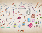
- There are a lot of things inside the inventory. - Yes, that's true. Your guess is right - it's to make things interesting AND to allow more crafting options in the future (players will be able to improve their weapons through slots - e. g. making it more durable and more powerful). For that, some of these items will get a "meaning" soon. See below the picture of all the items I was drawing ;-) With that in mind, only a "small" selection of them has made it into the game :-D
- When I click inside the map, I would expect the inventory to close. - I have to check if there are any side effects because of this, but I can't see any for now. In general this is a good idea. Noted.
- I had a hard time figuring out, which key to press to move in some cases. - Ja ja ja. I know... The original idea of how to move your player was a different one, but the keys made more sense. Unfortunately this is coming exactly with this strange effect you describe. I have to check the logic again - these diagonals are really tricky, even though sometimes it seems so obvious where the character should move to.
Explore and Map buttons don't work for now - but very soon. It's on my "next" list, shouldn't take long. I hope I can combine it with some other map related improvements (bringing back the fog of war, maybe a zoom). Let's see how this goes...
Again thank you so much for sharing your thoughts - really appriciated!
The picture of all tools :-D (brace yourself...)
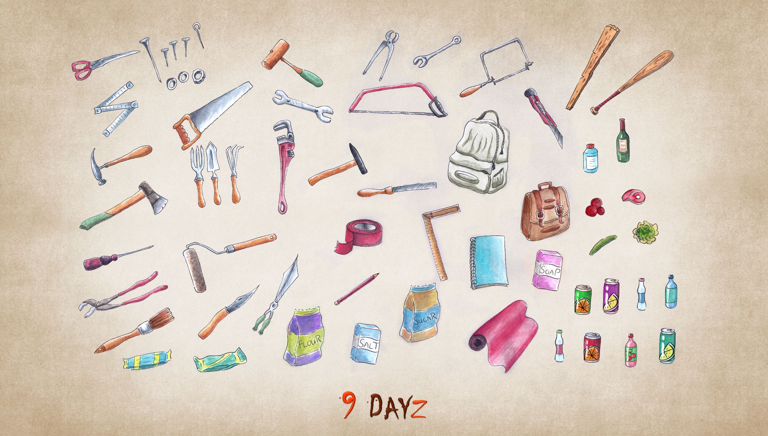
Inventory and Crafting menu now close when you click into the map as you seggested. This is so much better and intuitive now! Closing it like this all the time now.
The "Map" button is working now. Replaced the "Explore" button - the movement mechanic changed and it it became obsolete. For now my "Game Editor" can be used with that button instead, later settings will be found here.
These were the quick wins, your other points will take some time.
This is a really solid game.
It is a little unforgiving in the start since time keeps passing despite you not knowing what the heck is going on and what you should be doing. But once you start soaking in the information, and look around for a bit, you then begin to understand all of the game's systems.
I don't really have any meaningful criticisms, except that you could probably make it clearer on the map where you're currently at. The map dot is too subtle.
Besides that... would it be possible to get a downloadable version of the game?
My browser wasn't able to handle it very well, and I'd really like to dive deeper into the game. It looks really interesting, and I really liked it.
Heelo Jay, thank your for your feedback! Made me really happy and proud to read it :-)
For the little dot and the question "Where am I?: Got this feedback before and tried to quick-fix it. When you hover over the first Tutorial Card "Waking up" the dot grows bigger and a "YOU" is added - but from your feedback, I get this is not enough and too sublte.

However ;-) One of the next points on my to do list is: "Bring back the fog!" - The map was alredy hidden in the past, only the area around your character was reveald (wich brings the "dot" and where you are much more into focus). But the implementation had a horrific negative performance impact - so I had to remove it. But the time for me giving it another try is coming soon...
Was researching how to pack my HTML/CCS/JS-based game into an app some days ago. The Electron project looks to me like a great condidate - will give it a try in the future (not too soon, as it makes my publish process more complicated)...
Here a preview for the hidden map (screenshot from back then - target picture hasn't changed, just the way I have to implement it): 
Oh yeah, the fog definitely would help a lot with the initial information overload. That seems like a winner idea. So I hope you manage to make it work without that much of a performance penalty.
Btw, any chance we could get a bit of "zoom-in" function to help with focus?
That along with the fog would probably help ease players into the game's systems at a more digestible pace.
I saw the "YOU" text out of the corner of my eye. But since I was so overwhelmed taking in all the information, figuring out where I was supposed to go, and what the cards were, it kinda went over my head.
Also, suddenly noticing that meanwhile the clock had kept ticking sent me into a bit of panic, haha. So I started rushing a little and eventually got myself killed on the western-most settlement after having spent a ton of my resources fighting rats while searching a house.
Gosh, it's tons of fun.
Let me know if you figure out how to package it into a downloadable file. I'd love to play it again.
Maybe I'll give it a try on Edge and see if it's more stable/smoother.
Thanks for developing it!
Your feedback is gold! The zooming feature was in my head at one point, I have to check my list if I noted it already, just to make sure it doesn't get lost.
In which browser you are playing? Chrome might be your best choice performance-wise. On my MS Surface I can see my browsers fighting with all the transitions. Is this also so moment (when Cards "spawn", zoom and resort) where it gets hairy on your machine? Tbh, I think packing it won't change performance so much in my case - game code is all based on the native browser tech stack, so running it in a browser is already the best option you have. But maybe I can offer a version where I leave out all the CPU-intensive transitions - so cards would "just" appear without flying around. It takes away some of the information (where does the Card come from) but would lower the performance impact significantly.
Thank you for your expressing all your impressions and ideas - it's all highly welcome!
I run Opera GX. But I think the performance issues are a lot more on my end. The browser sometimes gets visual glitches even when rendering normal pages (I get white squares that hide sections of the screen). It isn't related to your game, it's just something I have to deal with from time to time.
I also tend to run like a million open tabs at the same time, so perhaps that has to do with the visual glitches (maybe the browser runs out of memory or something).
That's why I'm thinking of running it on Edge, as a single tab, so that all of my machine's resources can be focused on that.
Was breaking into a house yesterday and all these rats spawned. I even had a fireplace up and running already! But I wasnt brave enough to attack them. They all had so much health, and I had a good amount of snacks in my pocket. They would have grown stronger so quickly by stealing - at the end, I would have been the snack for them... :-D

The gameplay is very fun and I really like the art. I keep dying to that zombies at the start but I might just be bad at this game.
I was able to get to the ship in 6 days! I was getting nervous since I kept getting thirsty and was praying I get water for a while, luckily I got a few right before I made it to the ship so phew!
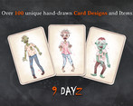
I love your beautiful hand-painted artwork~! Not just the ones in the game but on your homepage too! So talented!
Just a small thing I noticed but when the rats was attacking me it still said "Zombie's turn" but other than that, it was a very fun experience!
Wow! You did it?! You can't image how happy that makes me - you are the first one giving me such feedback. Many have played - but all got stuck somewhere in between. Thanks for the notice - I will fix that.
Just out of curiousity: Have crafted a Fireplace and did some cooking? That's the big improvement (next to the rats) I did during that Jam.
my final days (i went into the game blind and didn't read any instructions):
after a few days climbing trees and eating what I found I realised I could walk around.
went north and came to some cars and a train wreck full of zombies, tries searching for things but I didn't have the right tools to do so
saw a pier on my map so I headed over there. couldn't get into any of the houses as I didn't have an axe so I continued on, climbing a few trees along the way
got to the pier and was met by a couple of zombies. threw all my food at one of them in sheer panic, I think it had a peanut allergy or something because it dropped dead after I threw the snickers bar
realised I had a knife and wondered why I didn't use that earlier to make a weapon or break into a house
Threw my knife at the remaining zombie. In hindsight maybe I should have tried stabbing first
was slowly eaten alive.
10/10 would die again
- maybe on my next play through I'll understand the mechanics better and figure out how to get an axe / do crafting
- love the card system, haven't seen that before
- procedural generation for the map would be nice for replayability?
- a streamlined approach to adding new cards to the game? maybe set up a discord where people could submit new cards?
Thank you so much for this entertaining story-based review! You made me laugh with the peanut part :-D
Going in blind - uff, I think game tutorial isn't quite there yet, have you chosen "Start with tutorial" ? Or you went in blindly blind?
Yeah, the axe is your best friend in almost all situations - it is for sure the most versatile tool/weapon you can craft atm. Have you found the Crafting menu? Just by looking at it, would it be clear to you what is needed to craft an axe? One of the improvements I did: Tape now can be found early, it was too rare before that.
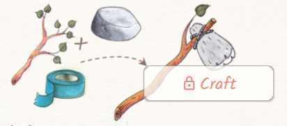
Hope your next run will be more successful - the game page is giving a good overview, might be worth a quick reading ;-)
For the streamlined approach I would like to contact you again, if that's okay with you. It is a great idea! Making all decisions by my own doesn't feel optimal at all.
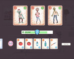
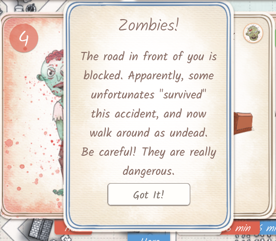
You can attack zombies by dragging your inventory cards (bottom row) over them. The red numbers indicate attack value. You should be prepared for that, so having a crafted weapon before attacking any of them is advised (or at least a good amount of items). Do not attack zombies too early. Once battle started, you will get away only by defeating all of them.
Okay, so you try to attack them right in the beginning? I recommend ignoring them and passing by, taking a swing to the West and explore whats over there. Come back later when you are more prepared to fight both of them. You can also try to lure only one, but even then, doing this in the beginning is is pretty risky and you will loose too many items.
It was not the case. I have missed another hint from Tutorial - in "Gather", for some reason it was not clear for me that I should "click" on the gathered item to actually collect it. It was intuitive that I received the items instead of watching on them and go away. Maybe it is needed to implement an "auto-collect" the items upon reveal.




Leave a comment
Log in with itch.io to leave a comment.