Really cool that you even managed to get something in such short amount of time! I feel like this kind of swiping behaviour could also work for pulling the fish towards you after hooking it almost like you were fighting it! Cool! ^^
KeepTrying
Creator of
Recent community posts
Hey, thanks for the feedback! :) If the caught fish fits the raw request (the one in the top screen) it will automatically fulfill that one and increase the score. Otherwise it will end up in the basket if it is useful for the lower request, where it can then be prepared. Ideally there would be a way to select what request to fulfill, but alas, limitations of doing a game in such a short amount of time!
EDIT: Changed the first time experience to include some key hints, and to show each type of requests at the time to ease players figuring out what to do :) Hopefully will help!
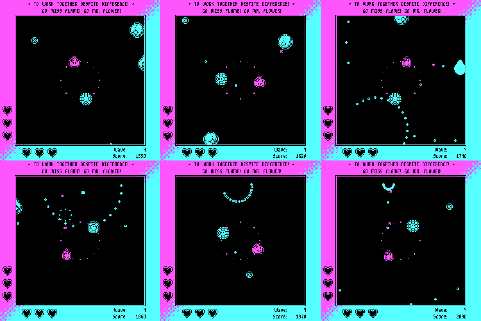
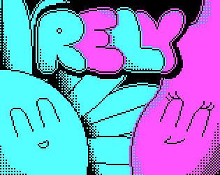
My game is Rely (https://keeptrying.itch.io/rely), a cute-themed CGA colored Shooter and it was actually the second concept i went through during the jam!
I started by making a puzzle game, but after 4 hours I had to get the guts to scrap it as the main mechanic was too complicated to be reasonably done in 72 hours, cause it involved too much AI with an element being escorted in each puzzle.
So then, after being pretty bummed out due to this, I thought that a complete change of genre was going to help clear the air, so I went through and thought how could a theme such as "Take Care" fit in a Shoot 'Em Up, which was a theme that even though I like a lot and am familiar with, never played much with as a developer.
It felt natural to make a game where you controlled two elements simultaneously and one defended another. The tough part was figuring out how to make the movement intuitive because controlling and shooting with both would just be impossible. So after trying lots and lots of movement types out, such as only in straight lines, mirrored, one at a time with a key for shifting, the circular one felt really really good cause one of them naturally protected the back of the one shooting, in every possible position. From there "Take Care" took an immediate meaning as having a playable character taking care of another by acting as a barrier.
I started since the beginning with the intention of doing the Extra Retro challenge, cause it's just an art style that I can't get enough of!
It's really amazing how much limitation breeds our creativity during these events. In no other circunstance would I think of this same concept if I didn't have the conditions given here!
Thank you for the kind words! Originally, Mr. Flower was only a barrier that protected the player from backfire in the circular movement pattern, but when I realized that I wouldn't actually need to aim a shield and I could make it part of the controls, the pieces fit naturally!
I'm actually considering expanding it over the next months! I still love the concept a whole lot and don't feel I explored it as much as I wished to!
Really cool aesthetics! I love the way the player looks and jumps, and the ghost's cute looks! The contrast with 2d and 3d elements also works really well alongside the warm colors for some reason! The mechanics are top notch but as already said, leaving the player up to the task of finding out about the charge can lead to them taking too much time until they realize! I found it a bit awkward to try to aim horizontally as well in the rooms surrounded by water. Some sound effects would also do a lot in terms of giving feedback to the player's actions!
Really cool concept! The Lemming-inspired mechanic fits the theme like a glove, and the simple CGA pixel art lends itself perfectly to the theme with the warm earth and yellow ducklings. I did found the game area shown to be a bit small, which makes me need to constantly go back and forth to check on the duckies most left behind! Besides that, really cool!
Glad to see another shooter-loving developer in this jam! Rock solid work right here! The pixel art is top notch, i love the enemies' looks! Controls really well as well. Have you considered making the background scroll speed a little bit slower than the rest? It feels like a parallax effect would fit wonderfully!
Thank you for such compliments <3
There is a bug that skews the aim from far away of where the mouse is pointing as of now for some people ... I already fixed it locally and am trying to get permission to upload ASAP so everyone can play!
Edit: An Hotfix version is now available in the description, for people having issues!
Thank you for the feedback, PZ!
You can actually also push enemies back to give you more time! :) Flower pushes away anything that is blue!
In the later waves, there are some bullet patterns that actually require that you defend them properly, otherwise Miss Flame will not have a path she can go through! I tried to only make the player NEED the block a little bit later so that it wouldn't become too overwhelming for someone not used to shoot 'em ups! (Also on a later wave there are enemies with pink shields, that require a bullet to be reflected onto them first!)
Microgames must be one of my favorite genres ever since the first Warioware game for the GBA! The way the theme is applied is really great, both in everything having a baby-drawn aesthetic and the way you are constantly taking care of the devilish bastard.
The only immediate criticism I found was that perhaps it is a bit rough to have only one life available! The advantage of having a more merciful approach is that you can avoid players feeling like they only lost because they didn't understand the objective of a microgame in the first place, the first time they played it, by giving them some margin for error. Think of the first time you played some of the weirdest Warioware games and how it sometimes takes a little bit longer than usual to associate the short instruction with the actual game objective. (This especially applies when you play tricks on your player such as the well thought Rock! instruction!)
Amazing work nevertheless! Well deserved follow :)
I really like the core concept!
Having to manage resources in order to heal provides a great dimension to games like this, where suddenly, your healing does not depend on the world's conditions and whether some enemy dropped a health pickup or not, but rather on the player and his choice to whether spend their valuable resources on healing or not. Some possible pointers on how to further expand/improve this concept:
- Bolts could be used on stores as well, to create a choice for the player whether to spend them on healing or on useful upgrades! Having the items being bought with hearts makes having all hearts filled a optimal course of action!
- Having a mini-game for healing is a valid design option, yet don't forget how this affects the game's flow! Personally, I found it a bit weird to stop in the middle of the action to do a puzzle mini-game without any time limit or a sense or urgency. Also think about the consequences of failing this mini-game if you do choose to include it: Should you heal less or more depending on how well you did? Maybe Spend less per heal in case you succeed? It provides a lot of possible design choices!
Lastly, some UI design tips. If you choose to limit the shooting aim in the cardinal directions, consider allowing players to use the WASD to move and arrow keys to shoot, in a twin-stick like way! I think it would fit the control scheme perhaps a bit better than the mouse, but that's just an opinion.
Solid work on the concept overall! :)
This is Rely! My first attempt at a genre I never thought I was very good at playing! After finding the unique spin I wanted to go for the jam, I found it to be quite difficult to balance, that was for sure my main difficulty throughout the whole 72 hours. Trying to hit that sweet spot of difficulty versus ease is a key element for these kind of difficult by default games. I would love to hear feedback about it, especially if it is a genre you enjoy! :) Also feel free to leave your submissions here so we can trade some feedback if you would like!
https://keeptrying.itch.io/rely
Oh boy, the Minesweeper fan in me loved this concept! The way the gameplay is twinned with the theme is really really solid! It does feel like finding artefacts and taking care of them! The only thing the UI freak in me noticed immediately was the lack of audio feedback when carving the artefacts. It could give a quick indication if you are damaging the object or not. Great work!
This is my 72 hour baby! I really gave it all i had!
https://keeptrying.itch.io/rely