Great little game! My only complaint is that it never gets harder and you end up being able to just stand and do nothing. So you're more likely to get bored instead of losing. It just needs like a slow speed increase on the falling objects especially since the music seems to get more intense as the game goes on.
Lone_Stranger
Creator of
Recent community posts
What a great little game, It was actually really engaging and managed to pull off so much without having to explain much to me. The puzzle in the cave was actually really fun to play around with and understand on my own. everything inside there has clear purpose and gets across the message of what each thing does. I like the open world feel this game kind of has, where by nature of exploring you figure out what to do. Obviously there are some minor issues with the way the bullets move at the same speed as the player, so they end up not moving forward as fast as they need to. That's such a minor thing though, the gameplay is interesting and thats what matters here. The only real thing I would fix is changing the color of the green enemies maybe, just to a darker green, or just a different one. They kind of get lost in the trees and sometimes might no get noticed, since the red ones are more distracting. Otherwise love the feel of this game!
Love the game so far! I was wondering if there was anyway you could make it so the camera scrolls when the player is at the center of the screen. Sometimes it feels like I can't properly reacting in time to land on a platform. That very much feels the case because of where the camera is and where the player on screen. Also the gravity feels a bit too heavy so when you mix the two together the platforming feels heavy and unfair. I would suggest a bit of lighter gravity. Otherwise I like where its at right now!
Really like the updated art and camera, be careful with your scrolling and try to make it pixel perfect. How your scroll works right now puts you outside of the jam limitations, since when you scroll some pixels rest in between two pixel. That applies to both your X and Y scroll, in order to have pixel sit in between two pixel you'd actually have to go over the pixel limitation. You also want to make sure that your bubble animations stay on pixel, since they do the same thing, as well as the parallax. The little marks left over from scratches are tilted so I would just tilt them to be straight and draw them in a way way where it feels like its turned. Otherwise the art is really great and I'm so glad you listen to peoples feedback, looking forward to see what else you can do with your game!
I think you should try to display your variables as icons on the screen with number next to them instead, it would take up less space. Then maybe allow the player to scroll through the city area with WASD so you don't have to cram everything into the small screen all at once. I would also just round the numbers down too so it takes less space on the screen. I think the compromises are necessary considering that this jam is about seeing what you can do with the limitations. So compromises are needed.
I can last a lot longer and it feels a lot better overall, in terms of making me feel like I can improve, rather than it being the game. I will say it is weird that the health goes down at a consistent pace sometimes, but then after a few ticks drops half instantly. This is without taking hits as well. It seems like when you get hang time in the air your health just drops like crazy, so it's super discouraging almost to use the dive jump system to dodge the lazer. Since it seems to drop the health. I don't know if that was a design choice or not, if it was I guess I would just tune it a bit more.
I think given the gameplay you could for sure design this in a way to convey the mechanics without much text. Since the city is based on tiles you could easily reduce this too to fit the jam constraints. As it stands this far exceeds the amount of pixels allowed to be used, though I think you can fix that.
Easily one of my favorite so far! I think maybe in a full fledged version I'd explain the mechanic timing a bit more otherwise it super solid. I did soft lock the game somehow lol. 
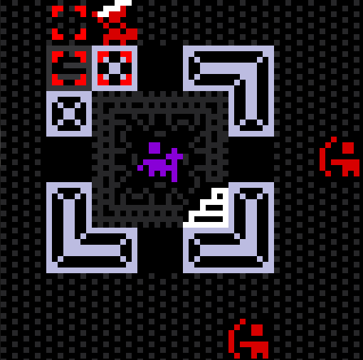
When you're on this screen when you press z on the downstairs icon while being targeted it causes you to vanish, Locking the game. Otherwise amazing game.
I think some feedback i'd make on the game is that the camera makes it hard to do simple platforming, I think the cat should just stay center screen and have the camera fixed on it with the scroll. The way its set up is far too jarring atm. Also Since theres still time to fix this. I think the squash and stretch and rotation on the fish actually make it so the game doesn't fit the 64x64 limit. since doing both those actions actually require there to be more pixels on the screen than allowed. in one of the other games in this jam "Stone" you can see that when the projectiles fire diagonally the actual art of the projecting interpolates to keep it on the pixels allowed. I think there might be a tool in unity that does this for you, but Im not too sure. Otherwise fixing the camera would easily make this one of the better games out right now. The art is also really cool and unique while clearly conveying what everything is meant to be.
It looks great but I think there actually might be too many pixel on screen for the jam, from the center point to either the left or right side its a bit more than 64 pixels wide, so that means the total length of the screen is more than double the allowed amount of 64. you could fix that though by making the screen resolution smaller. You still have plenty of time to fix that otherwise it doesn't fit the jam just yet.


