I appreciate the effort put in for the joke. Gave me a good laugh, thanks!
Lost Connection
Creator of
Recent community posts
Thanks for asking! The Steam version and the itch version are exactly the same, with exception to achievements, which are only available on Steam.
I may also be slower to put out any updates on itch. If I find a bug, the fix is going on Steam first.
Because of this and other Steam features, and the fact that itch takes a lower cut of the sales, I decided to make the itch version cheaper.
Ah, I see what you mean now. I've tried to make the game playable at different aspect ratios, and so making that level just have a plain screen wrap wouldn't really work.
I'll see if I can think of some solution (changing the height isn't a bad idea but would mess with the level design a bit), but as it is I don't feel it's too much of a problem.
I definitely appreciate the feedback, though, and thanks for elaborating!
Thanks! The music is definitely something I'm working on before the full release, I plan to make it more dynamic.
I'm not sure I understand what you mean about scrolling and screen-wrapping, though. Are you just referring to how the camera moves when the player is warped around? Or is there a specific level/part of the game that feels awkward?
In any case, thank you for playing and for leaving feedback!
Brilliant! Reminds me a bit of the game I'm working on, Dimenshift. Though I'll say you executed the whole "direction is meaningless"/non-euclidean concept a lot better than I did.
I love how everything's seamlessly connected, and after exploring and getting lost for over an hour I feel like I've barely scratched the surface of this game.
Great job!
Snake³ (Snake Cubed) takes the classic snake formula and adds a third dimension. There's not much else to say about it. Hopefully soon I'll be adding leaderboards and mobile controls.
It's out for free and I just hope someone will enjoy it.
I'm always open to feedback and suggestions, let me know what you think.
Wow, thanks! Though I doubt it'll be GOTY, I'm happy to know you like it! I'm still working on this game and hope to get it to completion within a reasonable amount of time.
I appreciate the feedback! Could you be more specific on what you found unintuitive? A few aspects of the game are supposed to be mysterious/vague, so knowing what exactly you have in mind would help me make the game better.
Probably one of my favorite entries so far based solely on how much I enjoyed it. But, I do particularly like these sort of platformers.
The main mechanic is clever and very well implemented. The level design makes good use of it.
The lines between pixels and the screen transitions are very nice touches and make it feel like a real Nokia game.
My only critique is that visually some of the elements are confusing at times, just because they're so simple. The player doesn't look very distinct, and at one point it was difficult to tell which way the spikes were facing. Overall, though, it was never a big deal and didn't really affect my enjoyment of the game.
Great job, keep it up!
Thanks, I'm glad you enjoyed it!
I initially thought about using two-digit codes for everything, but I felt like the codes would then be too "close together" and it would be a lot easier to accidentally enter a code you hadn't discovered yet.
In retrospect, it wouldn't have been that hard to use two-digit codes for movement and such while still using three digits otherwise, and that probably would have done a lot to alleviate frustration with the movement. I didn't think of that beforehand, though. Oh well.
Thanks for playing and for your feedback!
This is very impressive, and very polished! I feel like I would play this regularly if I had it on a Nokia phone.
It does give me retro Nintendo vibes (in a very good way). Honestly there's not much I can think to say about this because it's all so good. It feels like a complete game, not something made for a jam. Good job!
The one thing I would say, is that if it were actually a phone game, I'd make the plants take longer to grow to encourage more incremental play. But for the jam the speed worked great, so that's not really a valid critique, lol.
Nicely done, I enjoyed it!
Definitely! The biggest thing I struggle with in game design is probably balancing difficulty.
Honestly it's not that bad, it was really just the only critique I could think of. Like I said, it might just be me, because I like puzzle games, so that sort of stuff might come easier to me. (Maybe.) And if this was a longer game with more levels, it probably wouldn't even matter.
Great little puzzle game! I enjoyed the unique mechanics, and the puzzles were well done, and it's well polished.
Honestly the only critique I have is that it's unclear where leaving the screen takes you to another room. It'd be nice if there was some sort of indicator.
Overall, though, I thoroughly enjoyed this game! Good job!
Nicely done!
The core idea is basic, but well executed. It's well polished for a jam game, and I enjoyed my time with it.
The visuals are nice, and fit the game well. The last level had me scratching my head, and was satisfying to finally figure out. I also appreciated the coins as an extra optional challenge.
My only critique is that a few of the early levels felt too easy, and even the way to get the coins is kind of obvious. But that may just be me.
Overall, good job!
Thanks!
Yeah that's pretty much exactly why I'm not exactly happy with this game, I realized too late that inputting codes for this kind of movement wasn't really "fun" long-term, but using regular inputs for movement sort of ruined the concept.
I think the codes would work better for a different kind of movement (or game entirely), and if I ever revisit the idea I'll start from there.
Thanks so much for playing and for your encouraging comment!
I didn't intend to, but I played the whole thing in one session, I got so into it!
The concept is great and works really well, but the game is also very well polished and thought out, great job.
The difficulty balance is almost perfect. A few of the puzzles had me scratching my head, but I was never frustrated.
My only critique is that the sound that plays when you get to promote a pawn doesn't really work for me. It doesn't go with the music, and is a bit jarring. That's it, though. Other than that I loved it!
I also really appreciate the mobile support, it works well with a touch screen.
This game was really well done! It feels very smooth and polished, and the art style is cute and looks really good.
I like the tongue mechanic, it works well and is a cool idea.
For the most part, the level design was challenging, but didn't feel too unfair. However, a few things did make it feel a little unfair (to me at least):
- The hitboxes on the "poison mushrooms" (I guess?) seem way too big. Very often, I find myself dying when I'm standing on a brown mushroom with a purple one next to it, because I move just slightly before I jump and it's so sensitive it kills me. Making those just a bit smaller so that didn't happen would greatly improve the experience for me.
- While jumping works pretty well, it's kinda weird that if you start going left/right in midair, you can't stop. I'm not sure if this was intentional, and if you were going for totally classic/arcade feel, that's fine, but it's kind of frustrating that you can start moving in midair, but you can't just drop down straight after letting go of the left/right button.
Those two things combined made me more and more frustrated as the game got harder, even though the level design was great.
Also, I think it'd be nice to explain the controls in-game. It's kind of weird to have to go to the game page for that. Having some remappable buttons would be awesome, but I understand if you don't want to do that.
All in all, the game is fun! I enjoyed it, but I think the game would be even better if the frustrations above were addressed. Ultimately, it is your game though, so take my feedback (or any) with a grain of salt.
I really enjoyed this game! It was fun, and feel very polished and well designed, so good job! Here's some of my thoughts:
What I liked:
- The mechanics are interesting and work really well together. I like that the slimes aren't just obstacles, there are cases where you can use them as tools to help solve the puzzle. Things like this keeps the game interesting.
- The art style is cute and fits the game well. The sprites are well done.
- I'm on level 19, and so far, the puzzles are well done overall. Few of them feel unfair, and most of them gave me that "Aha!" moment once I figured them out.
Suggestions/Small Critiques:
- In whichever level you first need to get rid of the slime with the spikes (I think it was 13), it took me forever to figure that out. Maybe it was just me (it seems obvious in retrospect), but I felt like there was no indication that that was even a possibility.
- Also around level 13/14, there was a huge difficulty spike, at least for me. I went from figuring most levels out in 2-3 tries, straight to it taking me a long time to figure each level out. I don't mind the harder levels, but it seemed kind of sudden. I know it's tough to balance, but a more gradual increase in difficulty would likely be better for most players, in my opinion.
- Occasionally, there's a glitch where after picking up a box, I couldn't move to where the box was. If you'd like I can try to figure out the levels where it happened.
- The character movement feels kind of slow to me, and it makes the whole game feel a little slow. Making the character just a little faster would make the game feel much smoother and snappy (again, in my opinion).
- The "Level Failed" screen also feels too long to me. I found myself rushing to click the restart button just to avoid having to sit through that screen for a few seconds. It wasn't horrible because I could press the restart buttons, but the few times I didn't get to it in time were annoying. Just making it slightly shorter or skipping it with a click would be great,
- The door sprites are a bit confusing. When they're blocking your path horizontally, it looks like you should be able to walk behind them. It's not really that bad, but I think something like a simple box/block with a lock on it would make more sense and look less confusing/jarring.
- This would make a great game for mobile! It would work fine with a simple "swipe in the direction you want the character to go" control. I don't know what engine you're using, but if it's something like Unity or Godot where porting it isn't a big deal, then i think adding touch controls would be worth it. I would gladly download this on my phone.
Sorry if this is too long, but I like to give detailed feedback. And don't take the long list of suggestions wrong, I really like the game!
Ultimately this is your game, and you have to decide what to put in it, so don't feel like you have to use even any of my suggestions. I look forward to seeing it improve and will definitely play it more!
Thanks so much for playing it! I actually appreciate the wall of text, lol. I'm just going to address each of your points:
- The character was intentionally a little abstract and vague, going along with the mysterious/cryptic theme of the game. I see your point, though, and will definitely consider changing it if more people feel the same.
- I mainly wanted the enemies in the first level to be basically harmless. There's moments in later levels that are meant to teach you that they're harmless, so I didn't figure it'd be a big deal if new players avoided them for awhile. Again, I'll keep it in consideration with future feedback.
- I hadn't thought of the powerup looking similar being confusing, but you're right. Will definitely change that in the future.
- Glad you liked the secrets! That's a big focus of the game.
- Thanks for mentioning the level that felt unfair. I want it to be challenging, but not brutal and definitely not unfair. I'll look into it.
- Not knowing where the character is exactly is supposed to be a part of the challenge. But, if many players feel the game suffers for it, I'll rethink it.
- "MAP" being illegible is just an oversight on my part, thanks for mentioning it.
- Thanks for bringing out the other map UI bits, I haven't really gotten around to polishing it, so I'll keep them in mind.
- The white "powerup" icon is actually unrelated to the black one. This is related to the same issue with the "pizza icons" and I will probably change that.
- I'll keep the thought about secret levels being more clearly marked in mind.
- In my testing, levels before 4 shouldn't require the double jump, unless you accessed a secret area that required the double jump to get to. I'll be sure to double check, though.
Thanks again for playing and providing such in-depth feedback! It is much appreciated :)
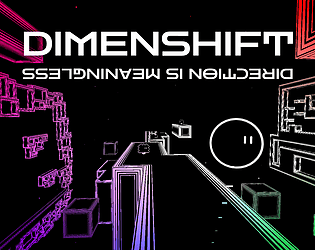
Over the past month or so, I've been working on turning Dimenshift, a project I made for a game jam awhile ago, into a complete, releasable game. I feel like it's coming along pretty good so far.
While I would say it's far from done, I feel like the core mechanics are pretty much done. If they need any tweaking, I'd like to do so now, before I finish fleshing out the levels.
So, I'd really like some alpha testers for this game. Any kind of feedback is appreciated, from tweaks to the core gameplay to critiques of the level design.
About the Game:
Dimenshift is a sci-fi inspired platformer that focuses on the Dimenshift Device, a device that allows the player to shift slightly out of their current dimension, allowing them to walk through walls and evade enemies.
The game features a maze-like level structure that encourages exploration, somewhat inspired by metroidvanias.
The project is here: dsdevs.itch.io/dimenshift


