Glad to hear you had fun. Warms my heart to know folks felt that same nostalgia I had making it.
birdup
Creator of
Recent community posts
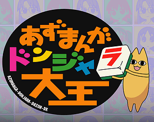
One other note: I tend to associate "x" with negative things UX/UI wise, so when I have a tile matched with it's respective zone color the "x" appearing within the tile to signal the bonus points kind of confused me. I think having an icon of some kind there is definitely helpful, but maybe a checkmark or plus sign instead.
Though come to think of it a "+" might also look like an "x" with the isometric view lol.
This was a lot of fun! I'd love to see more levels in the future or some sort of infinite mode where the game automatically clears certain combinations to give you more room.
A couple of notes from my side:
- I think a very brief, skippable tutorial would be helpful to teach players the mechanics for color matching zones, rotating pieces, etc.
- It took me a while to realize what I though was two tiles in the "Next" queue was actually just one tile. Unless the building design in the top actually matters then I would just show the colored shape outline to limit confusion
- Additionally isn't it just displaying your current tile and not actually the next one? Even without the text I associate that zone/layout of the screen as Next queue.
- Not sure when if ever it make sense for me to overwrite previous pieces, I guess if I can put 3+ squares into the "right" color while only overwriting one square I'd be net +5 but still feels very rare.
- It would be cool if overlapping buildings on the correct color had some sort of upgrade system. Then you can increase target scores for later level.
The movement controls feel really solid. The moment I saw a ledge grab in a Game Boy game I leaned forward in my chair to lock in. I do agree there's to tidying that can be done to help with iframes and some of the other edgecase mechanics like boxes on springs, but for a game jam this feels pretty polished.
I am bad at platformers but I was bailed out by the checkpoint system, which was a big relief.
I appreciate that you made your main character a little bit freakish, and in my mind the debug states above her head were actually just her talking to herself to stay focused, which added to the freakishness.
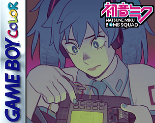
I thought this was fun, though I struggled to fully clear Thriller. The chiptune cover sounded spot on and the art was cute even if I could only look at it briefly in short lulls in the music.
As a piece of feedback for if you continued to build this out, I think some way to sort of earn back your health to give a bit more flexibility around mistakes, or having a window in which you have invincibility shortly after making a mistake would be much appreciated. I had a few instances where I seemingly too 2-3 bites from misinputting around a certain note.
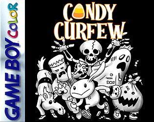
I thought the concept here was really neat and not a mechanic I've really seen before in a game like this. Also a nice variety of enemies for only having a few days to work on it.
I think a piece of feedback I'd give is just adding some acceleration/deceleration to the skull to give it a little extra juice. It always moving at a standard speed felt a little odd. Also a bit of invincibility frames after getting hit would help. I kept getting killed by the gaggle of ghosts all hitting me at once.
I though the presentation package with the audio and visuals was really polished and cool. Doubly so that you have it working on the original hardware!
However, I did run into some of the same struggles in combat as some of the comments below. My biggest frustration in that regard was the inability to turn around without moving a square and the long delay after an attack in which I could not begin to move again.
I had fun playing this! I though the art was super cute and really felt like something you could accomplish on actual Game Boy hardware.
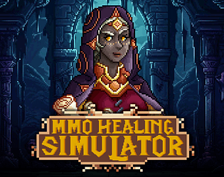
Sadly I think I reached a state where the customers all wanted something I didn't have. They just kept insulting my poor little mouse, who was very Earth aligned but not quite smart enough.


