Much appreciated!
Mohagged
Creator of
Recent community posts
Hey Zee! Happy New Year!
I wasn't happy with the state of the "game" parts of the game, so I had to rework some core design bits, which took some time to figure out. But I finally got to the point where I can focus on pushing towards release again.
I had hoped to get an EarlyAccess build out before December, but that was a little bit too ambitious. But (again without making promises) I'm currently aiming for EarlyAccess within Q2 the latest.
So, yeah, I'm happy with the current state of the game and I'm pushing towards a release asap.
Thanks for your interest, really means a lot <3
>all of them
Noted!
>shift the level design to be doable with player's current momentum and position
That was originally the case, while the speed was constant, lol. I'm working to get there again. Thought of a L4D style director too, that would make the game more or less intense periodically based on how you play.
>As in the car making sound while player inputs direction change
I think I get what you mean.
Sweet! Thanks for the feedback and the video!
It's just meant to mean 出口 Exit, but the extra bars were meant to make the 口 look like a garage door.
Looking at your video, the cones at the beginning shouldn't be like that, lol. Neither should the traffic be so tight. Somehow the time is sped up by factor 2 or 3... Thanks for the video, that's veeeery important feedback lmao. Oh my...
Yes, it's completely exaggerated on purpose to see how much is too much.
And the UI... blergh, yes. I just put everything on there I could think of. Half the stuff doesn't even have a purpose yet.
Appreciate the indepth commentary!
For now I'm just happy that the health system actually allows to finish a level. Without it's even more of a mess.
And nice that you tried it without the effects. That was my first goal of the entire project, to see how effects can affect gameplay and how much is too much. You mean all of the flashing freeze frames or specific ones on your own car or on other objects?
I'm not sure yet about the burnout effect. At first I just wanted to see if I could. I'm thinking about turning it into an ability (haven't worked on that part yet) that would deal damage or cause confusion or something, but only available to drift-style cars. The bike and porsche don't have the effect if I'm right. But yes, right now it's just of a punishment for hectic steering.
The lag issue has been on my mind. Definitely a big problem.
Kansei Thefto was a port from a previous game that a friend asked me to implement because he likes to driver over pedestrians, lol. I haven't yet implement more police/heat variations that would appear.
I appreciate the commitment to beating it! The vertical slice right now is more or less a "throw everything in there" type of deal. Your experience matches my expectations. It's far too messy and too much "meh, can't do anything about it". I'm not sure yet in which direction to go, I might just split it into multiple different games.
Rapid panic clicking could make the lateral momentum stabilize for a short while as a crutch and for squeezing between cars.
Interesting. I've been experimenting with a slowmotion effect already for a way to deal with this.
Could be cool to have a drift change sound to vibe to the music through the drift rhythm.
I'm not sure what you mean with drift change sound? But having the music somehow interact with the game in multiple ways was on my mind as well, similar to Eternal Climax. No idea how to work with music though.
What if driving into other cars from the side was more generous and you could push them aside to actually be able to intentionally affect elements in the level with explosions or road blocking?
Yes, that's something on my mind as well. For now I have a small mass system integrated, which determines (extra) damage based on speed, and speed loss. For instance, the truck has enough mass that you won't loss speed when hitting pedestrians.
Thank you very much for the feedback and ideas!
- thought the experience bar/half-orb/half-ring was missing health that I couldn't recover
- the characters should have nice round butts
- fighting animations look like rock-paper-scissors (which is funny)
- couldn't get the wand to work
- Escape keeps throwing me out of fullscreen when I want to just pause
- too many shortened words without enough explanation, like SpR I thought was spell resistance not SP(?)-regeneration?
- I keep pressing escape to close windows (inventory, attribute window etc)
- only saw the ability tab at the end of my play session, still haven't quite figured out how to unlock any ability
Overall the combat and movement could be faster, maybe 10-20%. Great foundation. Not sure why I got melted the first time around. Forgot I had to save. But there's decent amount of progression already, got me hooked a little.
Nice foundation.
No commentary video. I could've sworn I played much longer than just a few minutes, but I had to go.
Oh my, haha. If you want to go down that route, I probably wouldn't start the tutorial level with such a tough approach. I mean, I didn't even know how anything works yet, what my options are, etc... After dying there was not much of a learning aspect. I just thought "Ok, I died fast. No idea why or how... guess I'll just skip everything then." Then I died again. And I was out of options, lol.
I did make use of some power up ring that would empower my next attack I think. And the health potion. The ring of frost spell I didn't even had a chance to use. At least not in combat, because I died so fast.
The bats I thought would be easy, because they were the second enemy type I encountered and generally bats aren't something I'd expect to be tough opponents.
I guess high stakes can make sense, when you know what you're doing. But it can be equally annoying depending on what you want your game to be. For instance, I like games like Dungeon Siege, Divinity or the WC3 Rexxar Campaign. But I'd save often because losing a lot of progress would be a chore. However, repeating a single encounter could be enjoyable. Then again, sometimes I'd want to play hardcore for the higher stakes and permanent decisions. It all depends.
FYI: Never played these games before. Gave up in the first level after I fell down quite a bit (the umbthteenth time).
- initial tutorial window has no prompt to close the window
- Sometimes I couldn't associate the input on the game pad stick with what's on screen. Not always, but sometimes. It felt weird, hard to describe.
- I don't like the look of the eye. It looks boring for something that's at the center for all of the time.
- many many many times I would swing-jump in one direction when I only wanted to bring myself into position, so I had to be extra slow with my input to not trigger a swing-jump
Other than that it plays smoothly.
No commentary video.
I had some criticism but didn't write it down (was too busy playing)... so from what I can remember:
- When there's a lot of action and I want to click fast, I misclick the wires. Example: there are 3 dudes, I want to connect all of them to each other, so I click on them 1 2 3. Obviously that doesn't work because I have to click: 1 2 - 2 3. Maybe it's in the game but I missed it, but it'd be nice if it would auto-connect to the last "socket" if possible.
- The generators don't look like generators. Was pretty weird in the beginning to understand how a yellow cube represented a generator. Also, shooting the generator was not obivous.
- I hope there will be more gadgets to interact with like phones, lamps, AC, etc..
- Who's the guy in the toilet?
No commentary video.
I still suck at the bullet mechanic.
- the pipes leading the way in the tutorial are nice
- Still would love to have more horizontal space to get the hang of it. Right now I'm basically learning how to play the wrong way by being thrown right into the action, so I'll resort to what works.
- new enemies are nice
- platforms are now easier to see
- Was struggling with the rope mechanic, having to press W/up to attach. Gave me some cramps.
- I'm still spamming space when jumping
- no idea how to properly fight the first boss without having the bullet mechanic down
- on the final boss, I had sometimes trouble seeing the projectiles, they need more contrast against bright backgrounds
- Can you only ever activate 1 of the upgrades? Or are they all active once unlocked?
I think it's still too tight and cluttered for beginners. With unorthodox mechanics I think it's extra important to give the players space to get used to it. Makes me think of how Portal did it step by step over several levels before you can use both portals.
No commentary video.
Oh Lord... Finally beat the Rise and Shine bonus level. Took me almost 15 minutes to figure out the trick. I thought I had to somehow put the fairy down without throwing...
Also finished the test levels. Works well. Not sure about Ice Trap bonus level. I'd assume it's an acutaly trap with the frozen button block? Anyways, that level was somewhat hectic and I failed once or twice because I forgot to press when standing at the flag.
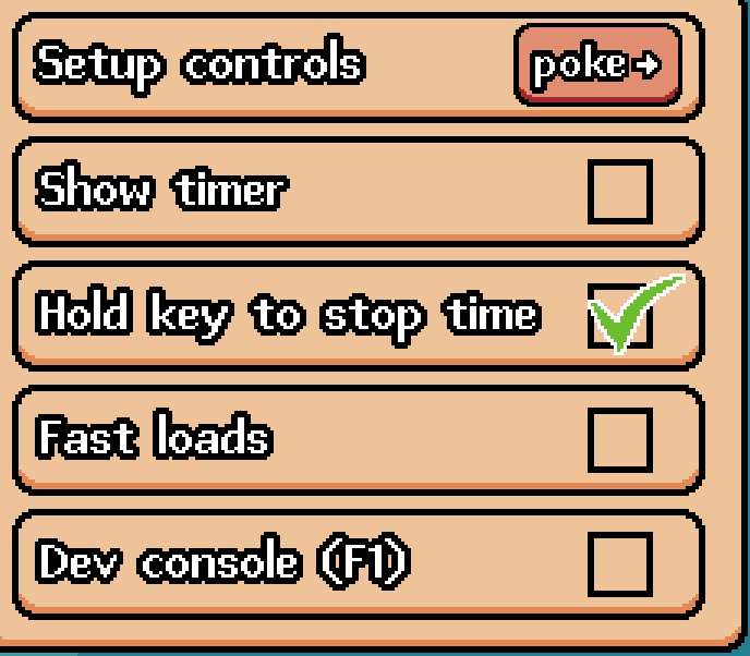
Aaaaaaaaaaaah, ok. I totally missed the "Setup controls" option. I was sure I had checked for it at the beginning. Now looking at it again I remembered why and I missed it again, because I thought it's the header of the menu and not a button, since the text is centered and the form of the button is the same as the menu box. Also, the other options underneath have the checkbox which make it clear that these are clickable. And also, the controls menu is buried a layer deeper than the other options.
Compared to the Screen option which has a drop down arrow. I'd either separate controls into it's own window (4th option), or set the text left bound and add a button graphic (like the back button) with a right arrow -> to make it clear that there's a submenu.

Got stuck in a menu screen, when researching a skill or something. So, only played the tutorial.
When getting the third character, it wasn't clear at first that I had to do a combo kill. The introduction was too early imo as I didn't even know how the combat works at all.
After that, I think it was necessary to kill all demons in a single turn? That wasn't clear either. I just had to reset because I couldn't proceed while the objective wasn't completed yet. I was looking for a way to end my turn.
Then I played the mission till the end, but it wasn't clear that undoing a turn would result in "time loss". Not sure if I missed it or if it wasn't communicated properly. Anyways, that was annoying.
No commentary video.
Unity would launch the game on my second screen only. Found a quick fix (shift+win+arrow key), otherwise I wouldn't have bothered without ingame options.
- Characters look neat. Though there's something weird about the... flatness? Could use a tiny bit more detail on the enemies.
- holding down to fire is annoying
- The perspective is weird, to low/isometric? Not sure. But gauging collision was impossible.
- glow effects (especially lightning) are far too bright
- upgrades don't do much yet on the bomb elf? thus seem mostly pointless
- I thought there was no sound, but so far there's only sfx on the gems?
Overall, nice foundation.
No commentary video.
No idea about the equipment screen. I just used whatever was default. The right arrow was the boost, but the solar panel next to it looks like an active ability as well, since there is no visual distinction. Compare that to abilities on cooldown which are greyed out.
Having "Y" as an additional key can work. Not sure if that would cover all the different keyboard layouts. 1234 as ATK1, ATK2, AB1, AB2 can also work as an additional set. Or simply X.
Personally, I don't like ZXCV as main input, as they're quite close to space (weird hand position) and easy to mix up without some sort of anchor (like the knob on the F key or the default hand position when the pinky rests on Shift). Rebinding is king.
Only played the first mission once. At one point I was so bored, I started daydreaming and forgot about the game.
- movement sound is terrible, I had to mute the game
- "Z" ability requires specific keyboard layout to make sense without rebinding
- The default ability on C is a passive? I was looking for it to do something but no idea where to look. If it's an active ability it didn't seem to do anything. If it's a passive, the UI doesn't give any indication.
- Combat feedback is almost non-existent. Had no idea how to position myself (do melee attacks connect when the enemies are on top of me?), nor would I know if I actually hit the enemy.
- vertical movement is so slooooooooooooooooooooooooooooooooooooooooooooooooooooow
Can't say more about the mechanics.
The rest looks coherent and good.
No commentary video.
Played for about 30 minutes. I failed hard at the Rebel Angel.
Thought it was more useful (and interesting) to wait for skills than to simply attack. Attacking seems like hitting with wet noodles. I guess it makes more sense to attack tho.
I hate the combat music. Doesn't fit the rest of the game. The non-combat music is fantastic. Also love the armor design of Finnegan. And the story is cute.
It's not my genre, but it's fun.
No commentary video.
Interesting concept.
- the way ammo is displayed is nice
- bullets feel too slow for such a fast game
- friendly fire is funny
- aiming and recoil aren't too satisfying, can't exactly pin point
- didn't make much use of slow motion or combos
- the movement set seems to complicated for my taste, I'd merge crouch/duck and sliding
- the pixelized look doesn't look nice
- How to play-text is hard to read
Getting minor Max Payne/The Opera/The Specialists vibe.
No commentary video.
Interesting. Sadly I got stuck early on between a box and a wall. So only played a few minutes.
Not sure how dark it's meant to be. Going by the instructions it felt too dark.
I don't think there was an instruction to sprint?
Wanted to go to the menu to reload from a save but the game quit entirely. I might play some more. Has a nice mood and interesting setting.
No commentary video.
Edit: I'm looking for feedback on two things: the loading screens and the new levels.
Only saw that now. Nothing I can comment on.
Holy smugness. That's hilarious and adorable.
Only played to level 10 (Base of operations) of the second map. Very fun. Has that Nintendo vibe.
Towards the end I'd end up confusing the controls "switch character" and "pick up/poke". If there's no rebinding, it'd be nice to have additional inputs on the keyboard: TAB/S to switch, E/Space to interact, CTRL/P/Enter for time stop; alternatively interact on Enter and time stop on Space... With QWERTZ it's a pain. Even so, ZXC (on a QWERTY board) are too close together to mentally separate the key from the action, especially since X and C both are about switching.
Also, the menu is interactable with the mouse, the level selection map is not.
No commentary video.
The game makes me want to quit instead of pocketing balls.
Why is everything so slow and weak? Even at full force the hit balls hardly move at all. Completely unsatisfying to play. I don't even get to the point of caring about the rogue-like stuff. The flow of the game is extremely annoying, too, with the interruptions after pocketing a single ball.
The graphics and effects are underwhelming. Same for the music. Feels like playing with a dying fish.
I'd focus on making the game satisfying to play first before anything else.
Also, the game would randomly crash.
- Combat worked, but was kinda clunky. It's not entirely clear what is just flavour and what's actually interactable. When doing the fake command I just spammed clicking things.
- At Trader's Rest I almost missed the interaction with the girl, because her face wasn't prominent enough up in the corner. Should be better positioned.
- "Demo is over for now", the game kept going afterwards and raider approached.
- Didn't have a way to quit the game.
- Katerine(?) has never seen an inner or inner clothing but sells stuff to inners
- fuck the inners
Some typos etc.
- "?." has an additional "." around the 10 minute mark on the way to Trader's Rest
- "embush" => "ambush"
- "an useles" => "a useless" around 16 minutes. Is that one intentional?
No commentary video.


