Check this guys profile its just the exact same comment on like 30 diffrent games including mine.
Just report it for spam.
Also cool tech demo.
Mrkarton
Creator of
Recent community posts
Thanks for the feedback, it means a lot.
I already made some adjustments to the movement that will be included in the next update:
-Jump reaches apex faster.
-Quick climbing ledges instead of just jumping up. (Only if there is a place to stand on)
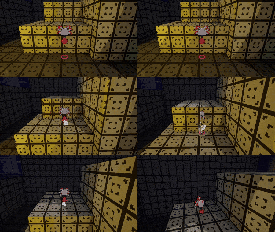
(You can also just hold space as you grab it to immediately climb it)
-Dash can put you on top of a platform if you hit near the ledge.
When it comes to the grapple I'm still thinking, I was thinking either first attack from it dealing more damage or just a unique attack for it.
I personally find it useful to quickly close the gap to an enemy or a boss especially when stating it right at the end of the attack, but I will still think about it changing it a bit. I understand that it might feel like too much risk for to little reward.
If you have any more ideas I would love to hear them.
It's pretty cool, definitely more effort than most games here, but that doesn't mean there are no problems.
- After fighting 3 enemies I lost any interest in fighting them as there seem to be no reward for it and it kinda just wastes time (Maybe add some xp and leveling up or coins). Even before playing I was a bit skeptical about a turn-based combat in a 3D platformer. Neither are bad but they don't complement each other, kind of like switching between playing 2 different games.
- Some things that would maybe make platforming a bit better. If the jump is so floaty, I would at least make it so you need to hold space for a full jump and releasing it earlier would result in a shorter jump.
- Another thing I noticed is there is no coyote time (aka player can't jump the millisecond they leave the ledge) which can be a bit frustrating (Make it so the player can still jump for 0,1s after walking of the ledge). I would also move the camera a bit up. There is no need for the player to be in the middle of the screen as it makes us see unnecessary floor from behind us and less in front. Move the camera a bit up so the center is slightly above the player.
- Combat is fine but a bit too basic. It kind of amounts to just using one light attack, one heavy attack, and so on. Heavy attack doesn't feel any stronger and there don't seem to be any reason to save stamina for later by using light attacks instead.
- Game crashed with a fatal error when I defeated the hand in the first boss fight. (I mean it's a bit obvious to try to attack the weaker enemies first in a boss fight so it's easier to fight the main boss)
- The platforms that appear and disappear when you press the jump button are not explained nor look any different from the timed ones, and that makes them very confusing at first.
- The final boss was alright but I think it needs more than 2 attacks and it was kind of disappointing to see it use the same rock attack that the previous boss was using too. I think the game overall would benefit from more different attack patterns as it's mostly just attacks forward that you can jump over or you can't. Also, the boss summons minions so frequently there is no point attacking them. Maybe if they were only summoned after the boss reaches an HP threshold or maybe you only every 4th turn and you can oneshot them with heavy attack so there would be a point to saving stamina. And please add the boss attack that makes it shoot a laser out of its left hand, it feels like a great missed opportunity.
Overall it's still a pretty cool game, I would love to see the issues addressed and the game in an even better state.
Alright I get your vision and respect it.
I'm always up for harder games but at least in my eyes, heard games need to be fair in order to enjoyable, so any quality of life features are welcome at least as long as they dont make game too easy. (At least I didnt get that fair and hard feeling while playing this as I got with cuphead or hollow knight)
I would still highly recomend to try make game a bit more readable (more clear what attack and or if enemies are trying to counter, I was kinda unable to tell on my laptop screen at least, adding sounds to enemy attacks and counters beggining would help) but ultimetly is up to you. (I previous comment I was talking about enemy counter not players)
Good luck if you want to continue this project or in future ones. :D
(Also sorry for an essay of a response, I might be a bit too passionate about making games :\ )
Alright, I played a bit more and have more feedback:
Let's start with some standard 3D platformer stuff.
Adding drop shadow and coyote time would improve the platforming.
Some concerns regarding the fighting . When fighting those punching and sword-wielding mushrooms, it feels like they attack continuously, and the only time I can try to damage them is after a perfect parry. I would suggest to make them have at least a bit of a stop after attacking.
I would suggest adding a form of "aim assist." By this, I mean that if the player is almost rotated in the direction of the enemy, the player should be rotated directly toward the enemy. I have implemented this in my game, and I believe it was a valuable addition.
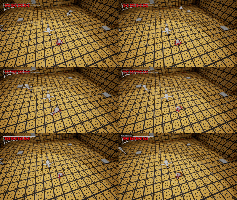
"example of adjusting players rotation towards enemy when attacking from my game"
It would be usefull to make it a bit more noticeable when the enemy is damaged, perhaps by having the enemy flash white or red when taking damage.
Also I would make it more noticable when enemy would parry your attack like a sound and some particles when enemy starts a perry.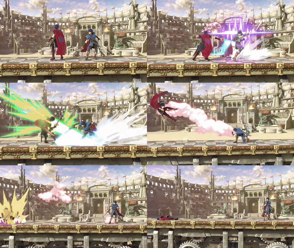
"like here for instance you can clearly see when counter starts (gif from SSBU)"
I haven't finished it yet (at least not as of now). I've collected 3 keys and I couldn't platform to the location where I believe the 4th key was located.
If you are looking for a similar game to get some inspiration or check what quality of life features you can add to your game I would reccomend these two 3d action platformers with melee combat "Pseudoregalia" or "Blue Fire" ( but Blue fire I would only reccomend if you can get it on sale)
I played some of it, and I liked it. I had been searching for a 3D platformer with close melee combat (because I'm also making one), but there are some things that could be improved:
-The attack while moving is almost impossible to land, and it's kind of annoying. What I mean by that is the hitbox activates too late or is too small, and it moves you forward so much that when I use it in front of an enemy, I just move past them without dealing any damage.
-For some platforming sections, I feel like the player is moving too fast by default, especially on smaller platforms. I would suggest reducing the player's walking speed but keeping the rolling speed the same.
I've only played for about 10 minutes so far (I might be late because of writing this review). I will finish it later.
Pretty cool game. My best time was 55.28 with using the bug I accidentally found on my first playthrough
https://www.veed.io/view/3d6dd449-9dcc-4eeb-b1fa-33141405a0b2?sharingWidget=true...
Edit
I got 50:53
Pretty cool game, I enjoyed it a lot more than I though I would.
Game run in 20/30 fps but I still had fun. The slowmo effects were cool. and enemy variety was good for this little section of the game.
The only thing that took me a bit to grasp were those spheres that allow you to dash again because clicking right after collecting one not always starts a dash but after some time I realized I was supposed to start holding space before collecting it.
Overall pretty good job.
Really cool demo I had fun playing it, the only issue I had was that It wasn't always clear what I was supposed to do, (especially next to the waterfall It would help maybe making that sing indicator a bit more noticeable, I know there were these fish pointing up but I only noticed them after I got up there , I would change fish color to stand out a bit more from the water)
Maybe I would also suggest to move camera a bit up so player sees more ahead .
Other than that keep it up and good luck on finishing the game :)
Im quite pleasantly surprised. I've seen a lot worse first games on this site. Weight of the character is perfect and animations and ui are really nice but there are things that can be improved on.
-It annoyes me a bit that camera movement up and down is inverted and Im really not used to it. I would suggest to make it an option in the menu. Also camera sensitivity is way to big when playing with a mouse, It would be nice to be able to adjust it in options too.
-I would suggest to make it easier to hit enemies or at least make it more clear visualy how big your paunch hitbox is. Good trick is to make player attack hitboxes bigger and enemie attacks hitboxes smaller.
-Any platformer 3d or 2d needs coyote time. Aka make it that player can still jump like after 0.2 second of falling off the ledge.
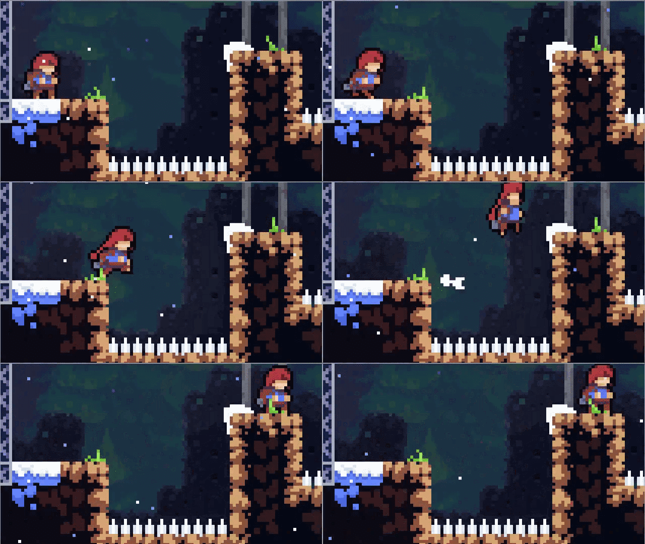
(coyote time in celeste)
-I definitely suggest adding drop shadow to make landing on platforms easier.
-Add sound affects to any action that happens landing ,jumping collecting, even if something on the ui moves.
-In a lot of 3d platofrmers player is not actually in the center of the screen but more slightly lower, It makes player see more in front and less behind.
-I was unable to get the last crystal (the one with pushing off boxes) timing triple jump on that box that is slightly lower without any landing sound is a bit to hard.
Overall really good job for a first t
some bugs :P
-once I pause the game I cant unpause it
-walking off the ledge while holding anything softlocks you, also I was sometimes getting stuck when slideing off ledge and in places like here once
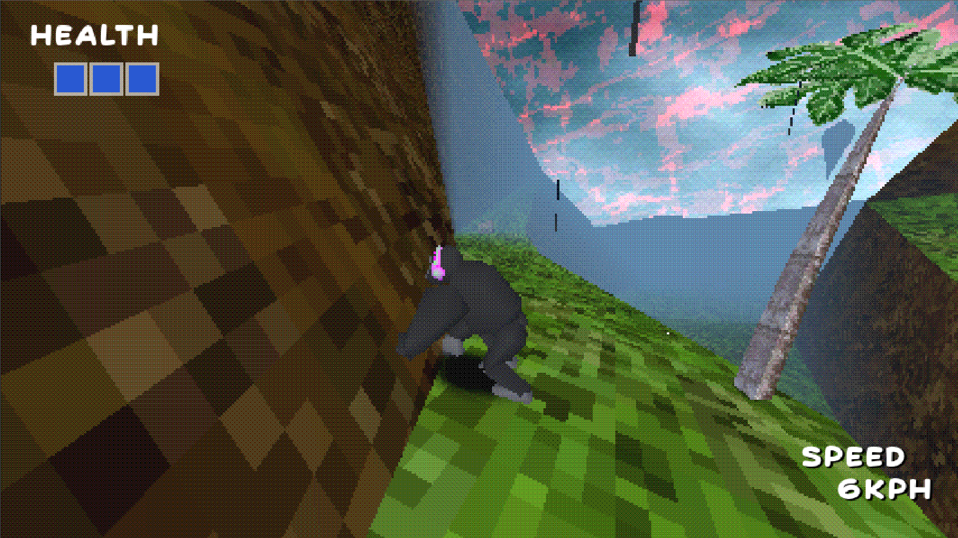
Some other things
-music is really good :)
-It's really distracting that you can start dialog with clicking mouse but to progress it you need to click ctrl. at first I even thought I got softlocked.
-I like the movement on the ground and flying at high speeds but platforming is not very pleasant mostly because of almost non existent air control, I would also make jumping and falling a bit faster.
-I would also suggest to move camera up a lot of platformers do that and that's because it makes player see more ahead on cost of seeing a little bit less floor behind
Overall I like the game so far and I hope this comment will help you improve the game at least a little bit :)
if anyone has problem running this game you can click ~ and put this in the console "r.DynamicGlobalIlluminationMethod 0" it helps a little bit (around 5-10 fps increase)
Also I cant progress past start of the game, there are two blue doors that as soon as I walk to them turn red and I can't walk through them. :(
Here are some notes I took while playing
-Level design leaves a lot to be desired, a lot of the time I had no idea where to go.
-The places where you can pull yourself with grappling hook are really unclear, a lot of the time when I didn't know where to go It turned out I was supposed to use grappling hook somewhere. also having them sometimes grab onto air or too high out of view does not help with it, it just caused me to make blind jumps into the fire hoping there is a point to grapple onto.
The icon indicating that you can use grappling hook somewhere blends too much with the background in my opinion. It would help if places to grapple onto were marked in some way even when further away like idk some sparkling particle effect.
-This one is not that important but you left the unreal engine console, It can be opened with ~
-Font is a bit hard to read for me at least.
-I don't know why there is options button if it does nothing
-One time after blowing up the door, It shattered but I still was unable to walk through it. Thankfully the wall left to it didn't have collision so I didn't have to start over.
-Combat is a bit boring and luck of sound when hitting the enemy makes it unsatisfying.
Still pretty cool game. I see a lot that can be improved on and I hope feedback I provided will be at least some help to you.
Here are notes I took while playing
-music was quite nice , maybe the begging of the one with more advanced platforming is a bit annoying to listen to the same two notes for like 15 seconds.
-Any text in the game changes way too quickly especially the one in the ending, I have no idea what happened there because of that.
-When I started the game camera was inside a wall
-After moving I fell into the floor and was unable to get out. I probably used ball form which is very buggy. Just when I'm in it , it moves me into the floor and changing back to robot form causes me to feel out of the map.
-Its kind of annoying that camera is inverted by default, maybe there should be some option for that, Im really not used to inverted camera and I died a lot because of that.
I assume its your first 3d game and I know from personal experience that starting making games in 3d can be a bit hard. I hope you learned a lot form making this game and I also hope that you will continue making games in the future.
some notes I took while playing:
-I would move camera slightly up. If you take a look at any 3d platformer you would notice that player is not in the center of the screen but slightly lower and there is a good reason for that, It makes it that player sees more in front and for small cost of seeing less floor.
-its kind of hard to get out of the pit once you fall into it (first time I fell into it it took me around a minute to get out)
- on my first time I softloked myself my not eating anything and just bringing it to the house, in result I was unable to climb anything.
-when climbing its really annoying that it automatically lets go when reaching the end of how far its possible to climb.
-its also kind of annoying when in certain jump I need to walk there for a half a minute to try it again after failing to grab the seed
-Game is really silent right now and could use sound effects:
walking, jumping, climbing, eating , landing , some short music when bringing the seed to the house etc...
Overall it's a pretty nice, I hope things I pointed out here will help you making games in the future. :)
-Game softlocked after touching the orb, I could move, screen keep shaking but nothing was happening, I went to menu and stated again to then no dialog would appear and I was unable to even touch the orb, then I realized I need to click reset progress and It reset it, But the game softlocked again after collecting the orb I walked around and when jumping to water in certain places the level would just reset and I couldn't do anything again.
-The only other thing is that game could use more sound effects like walking or landing or characters speaking
It's kind of sad I was unable to play it.
I really like it.
What I like:
-I like that you can hold button and it will grapple when you are close enough.
-Rolling feels really nice reminded me a bit of super sami roll.
-That planting seeds reminded me bugs life ps1 game maybe you guys could take some inspiration from that.
-Game looks really nice even on the lowest graphics.
Some things to improve/bugs I found:
-it fells like there is a delay when attacking (like 0.2 s after i click the animations starts
-I don't exactly understand why groundpound is activated with different button that attack.
-Bug, if you roll while charging an attack and continue to hold it while rolling and stop rolling you will attack without an animation.
-By the end of the game I just rolled past the enemies and didn't even care to fight them
-Like I always write under any 3d platformer I play here, I would add drop shadow and a button to rotate camera to where player is facing. Maybe add some camera lag to make it bit less stiff.
-I feel like falling into the spikes should teleport player to checkpoint just like falling into water.
Overall really good game definitely one of the better ones I played here, I would most likely pay for a full game.
I played it and it was alright.
Here are some notes I took while playing:
-Game looks quite nice.
-I like that you can break the cups when throwing them off the table
-If you attack once while moving player will just slide around
-In that section with the cat at first I didn't notice that seed and went further ahead and was confused why I can't go further. It should be more clear that player cant go any further before sprinkling the cat (For instance make cats paw or tail block it. Also making seeds stand out from the background more would help) Also detection of being seen by the cat feels unintuitive.
How it felt
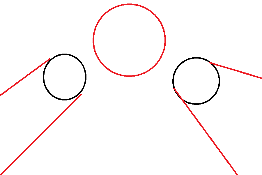
How it would be more intuitive with blocked camera to 2d perspective
In the boss fight I felt a bit confused at the start what to do, I thought maybe I need to put those eggs on the spoon, but after realizing I cant do that then I realized that I needed to get that glowing things on the spoon.
Overall Its pretty nice short game.
I'm 90% sure performance is not good because of lumen. When I tried lumen myself in ue5 it was as bad, I know I don't have newest PC but I don't know if lumen is really worth it especially for cell shaded game because it's almost not noticable with it , I would suggest to try baked lightning instead (yes it's still possible to use it in ue5) It will look quite similar with a lot better performance.
Here are some problems I found.
-Game runs really badly, I constantly had around 20 fps I would suggest to optimize the game a bit (But I am 90% sure game runs badly because of lumen), and there was a "video memory over budget" message in the top left corner( in unreal engine put DISABLEALLSCREENMESSAGES in console before building the project so it will not show up.forum link
https://forums.unrealengine.com/t/disable-all-screen-messages/84528/7)
-In that place with first giant broccoli I did not see at all that I should walk past it, I would suggest to maybe make the passage there wider so you can see right away that you can go through there.
-Also you left the ability to open console with ~ button which I used to disable global illumination what make game run in slightly over 35fps
-On those launchpads there is something that looks like debug arrows
-On I think 3 level there was there was part I couldn't progress because I was too big.
I didn't finish the game yet, I fell a bit exhausted by the time I couldn't progress. I will try again tomorrow maybe.
Overall I see care put into this game so keep it up guys. Sorry if I sounded overly negative.
Hi.
I played the game again and Im glad to see the issues improved.
although all settings sliders are still set to 0 so game is silent and cant move camera before adjusting it myself.
Keep It up guys, Im a gamedev as a hobby myself, but Im bit busy with my exams at the moment. So I hope you guys all best. :)
Game look good, Artstyle is nice for the eye.
I liked the bauble mechanic I could see it being expanded on even more.
Game is really badly optimized, when I look in a certain direction frames drop from 60 to 15. Changing resolution doesn't help at all.
Where there is first time that enemy that just get stunned and that button I thought I needed to shot the enemy when its on the button so the platform would activate, and I was surprised and disappointed that I just needed to stand on a button once for platform to start working.
Game lucks sound effects like:
Collecting shells, that electrical things could make some buzzing sound and also sound when you successfully connect two, walking on a button should make a sound, opening door should make a sound etc. I always think that adding sound particle effects to as may things as possible is a good idea.(as long as sounds are not annoying)
I would add some camera lag, because camera is very stiff at the moment,
I also really appreciate Funny cat pictures in the credits :D
Overall quite good job, keep it up.
I finished the game
Maybe Im a little bit disappointed there was no boss fight at the end but I still enjoyed the game quite a lot.
It turns out my controlled died yesterday just second to last room.( Also the corner to the left to the entrance of that room was the one I fallen under the map)
When it comes to last room It took me way too long to realize that in room to get left I was supposed to wall jump between two walls and wait to for right time, It might have been just me but I think It could have been a bit more clear.
When it comes to fighting I died at it significantly less today(only like 1-2 times at fighting and like 7 on platforming all in the last room) I probably just got used more to the combat.
I once again want to emphasize how much I don't like respawning with only half heath, It just makes that after respawning you need to round around the room for like 15-30 s to breaking pots hoping there will be health there. I don't know why you think that losing some progress was not enough of penalty for dying.
Also a little thing that annoyed me a bit , when you land you maintain speed which is cool for running fast but when you want to precisely land on something I would end up running off it.
Sorry If I come off as overly negative but I want to point out all the problems I had so hopefully it would allow to make this game better.
Its pretty good so far.
I haven't finish it yet because my controller died and after plugging it with cable I could move nor do anything so I tried to reset not knowing there is no save and I lost all my progress :\
I will try again tomorrow.
But I like it quite a lot so far.
I like art style, and vfx and sfx are great, I also like the death animation and those back and white effects.
Movement is pretty solid, only thing that annoyed me was that when dashing off the ledge I couldn't perform that higher jump and I would ended up falling quite a lot because of that.
Story its interesting so far, I definitely want to see rest of it.
Game is more difficult than I anticipated maybe it's just me never playing hack-'n'-slash game before but I died quite a lot, also it's kind of annoying to respawn with only half health. With how often I died checkpoints being so rarely made it a bit annoying to redo parts of the level over and over again.
Idk if its a bug or not but pickups from enemies are way smaller than normal pickups and have very small collect hitbox, which makes them a bit annoying to collect.
I ended up falling off a map once when attacking enemy in the corner.
It also annoyed me a bit that attack is on the right face button instead of left, mostly because most of the games I played had attack on the left face button, and I sometimes ended up dashing instead of attacking.
Overall I see a lot of passion and care put into this project I don't know how long it is yet, but with game doesn't having save I assume I was almost at the end. I if it was longer and had more content It would be a game I would definitely buy if I saw it on steam.
Take care and good luck on your future game projects. :)
Pretty cool game.
My best time was 1:54
I like the humor , characters and Gameplay is pretty solid. I always appreciate when people don't forget to implement coyote time and drop shadow when making a 3d platformer.
But having button to reset camera would be nice.
I liked that you can jump again after dashing.
Here some Issues I found when playing:
-Music and Sounds volume as well as sensitivity were set to 0 when I opened the game, so there was no sound and I couldn't move camera.
-Music doesn't loop so once its over it's just silent.
-It's kind of annoying that you can't skip cutscenes, also cutscenes could use some sound effects or music. (at least for me there was no sound during cutscenes)
-It would be nice to have an option to reset level, there are times when I think that I wasted too much time and would like to start over but can't and it kind of discourages from trying to get better time.
Game could use some more polish here and there but overall pretty well made. :)
Its ok.
I can tell that its propably your first game so I will give you some tips.
Game lacks some features that are a industry standard for 3d platformers like:
-drop shadow
-coyote time
- button to reset camera to face player rotation (look at 26 sec)
-Giving some freedom to camera
I also think that air control is waaaayyy to low, and that makes platforming very unpleasant.
Hope that helps and good luck on future projects.
Pretty cool demo.
Here's some feedback:
-I would definitely add coyote time, I sometimes pressed jump slightly too late and use double jump instead of jumping.
-Adding drop shadow would help with platforming too.
-Move camera a bit up and make it only move up and down when player moves certain distance up and down
Here's a video talking about it if I explained it poorly.
also I would add reset camera button that would rotate camera to the same rotation player is facing.
-Timer should stop if you finish the timed action, it's kind of annoying to still hear it after you finish.-Also the first time I jumped on the leaf I though it would collapse after a few seconds (It just felt less stable than previous platforms I jumped on.
-I would make the sound of the singing monkeys a bit louder, I didn't realized what the buttons were doing at first. Also I had to go three times to listen to the song before I managed to do it.
-Adding more sound effects like waling, landing etc... would improve the experience.
-Monocle is barely visible and too me way too long to find. I would add it some glow texture behind it or something to make it a bit more visible. Also its a bit weird to having to interact with it to collect it instead just walking into it like rest of collectibles.
-Maybe adding something that indicates to the player that its possible to interact with it would be useful.
-Swimming feels horrible but I don't know if that's intentional or not.
-I collected 10 marmosets. I don't know if that's all of them but I couldn't find any more.
-Also Im a bit disappointed that the blue egg does nothing. I tried interacting with it, attacking it with both attacks, throwing fruit at it and nothing :(
Overall I see potential, Hope my feedback will help you improve you game, good luck on development :)


