Indie game storeFree gamesFun gamesHorror games
Game developmentAssetsComics
SalesBundles
Jobs
TagsGame Engines

Olivenaut

50
Posts
33
Followers
A member registered Dec 19, 2018 · View creator page →

Creator of

Recent community posts

Big fan! Love the aesthetic. Love the China. Love the DOOM.

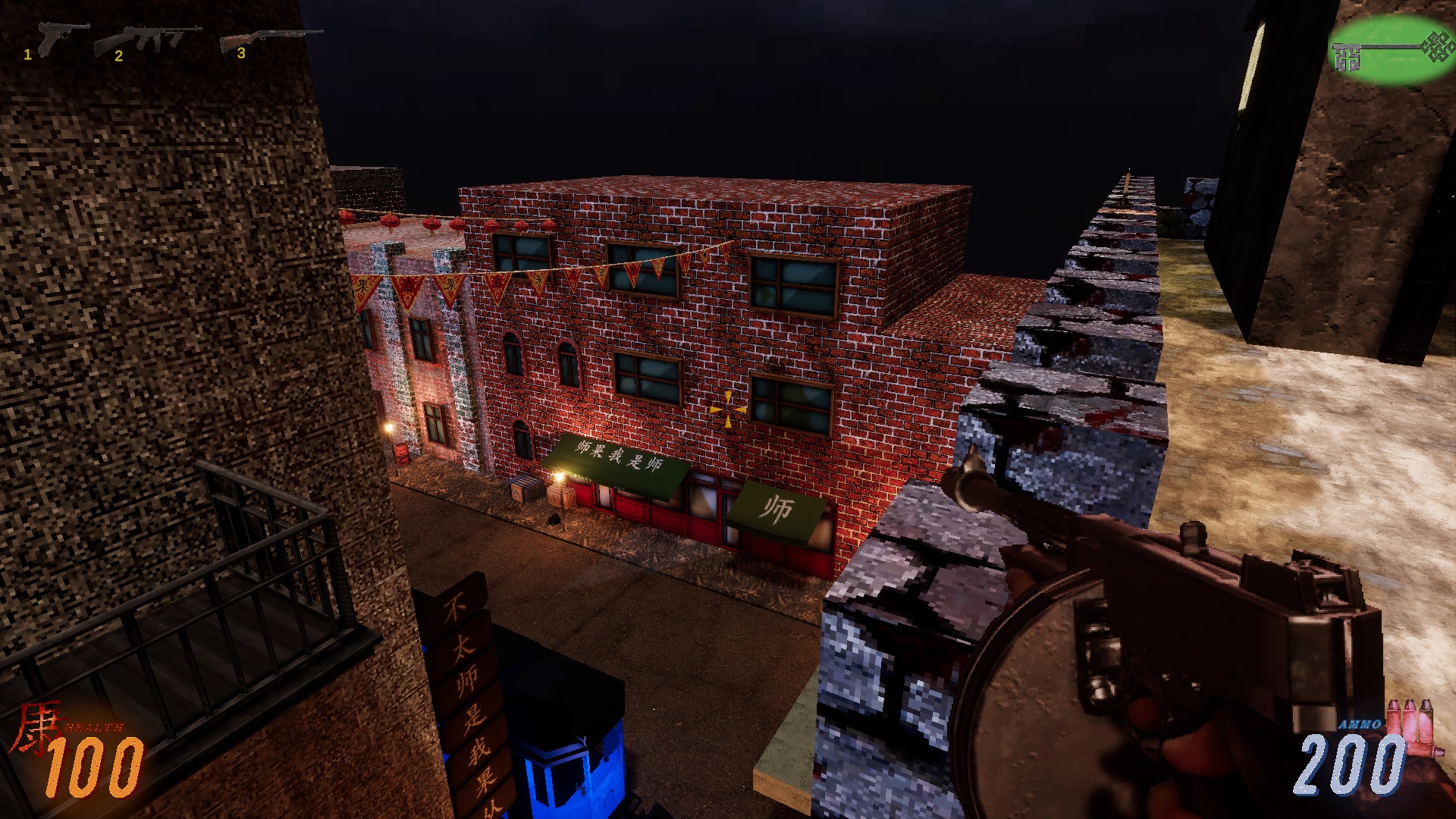
It's extremely, extremely similar to DOOM, actually. Strafing and holding LMB was all I needed to succeed. I would say my biggest critique is the same problem I have with DOOM; I get lost really easy. I saw you use coloured lighting to guide me to where to use keys in the ship level, which is smart! I am notoriously bad at looking for things, but I really couldn't find the green door in the streets level.

The core loop of running around and gunning dudes down is great. Your level design is solid, and I love set pieces like the cars driving in or the dumbwaiter. To my personal tastes? I think it could use a few more enemy types. Games like this live and die on enemy variety for me.

The twin dragons at the end of the ship level seems very placeholder, but the idea excites me. If you can execute on that concept in a way that's mechanically engaging and fun, I think it would be super hype. Even something simple like giving their segments separate health, and having them change colour when depleted as the dragon flies around the room. I just really love the boomer shooter in China concept, and I wanna see the idea taken to the height it deserves. "These mafia guys are transporting fucking dragons" is too good. 

Minor bugs, I was able to jump out of bounds off this balcony right here, see below. Also you can still see the prompt to open doors from the wrong side after you've already opened them up on the right side. I also experienced the performance issues when shooting at walls close to the camera, I was experiencing some performance hiccups and hitching in the tutorial level as well? I think I got a hitch every time it loaded something new, since it had the "hitch when I fire my gun for the first time" issue.

It's cute, and I like shmups. But losing time as health doesn't really lead to a lot of mechanical depth. You can barely save any time at all by staying close to the enemy and focusing, there isn't nearly enough potential benefit to outweigh the cost of a 20 second penalty for getting hit. The risk reward is all outta wack.

I could've swore I noticed a graze mechanic on the third boss at some point? I think I gained more time somehow? I have no idea how that works or how it happened, and it's impossible to look at the UI while playing.

I love the art and music, but fighting the same two guys over and over just felt like a test of my patience primarily and my skill second. The third boss is super cool, and really fun, but the second one is way harder and also simple in a boring way. It's too frustrating playing through the first two repeatedly to reach the third boss so I never beat him.

I'm astonished I haven't seen this idea before. With hand made levels and some more complex mechanical structure, this could be a very fun premise for a puzzle game. Brilliantly illustrates the way people would think while doing this. Good shit.

No I did not, and I just returned to the game briefly today, only to discover I have triggered a tiny military invasion. This game is badass. Every discovery puts a smile on my face. Keep up the good work

That is extremely high praise! Thank you so much!

I explained in another comment why I don't let people use checkpoints as bonfires, some players will take damage, and then run back to heal themselves over and over, instead of just getting in there and having fun. To your other comment there's a sword in the full game that not only destroys projectiles, but reflects them back at enemies.


Thank you so much for playing and I hope you look forward to the full release! ^^

(1 edit)

Adore the art, the music kick ass, a delight to play.

This seems like a fairly early demo, and I had a lot of trouble telling what was a fully implemented system and what was not. I'm not sure if filling the XP meter does anything for example?

I love the unique jump handling. It's committal, but with a small degree of freedom.

If I were to offer a significant piece of feedback, I think anything you can interact with by hitting down should be highlighted / have a prompt appear. It took me a while to figure out how to get in houses. 

The game is BRUTAL! But I love it. I think you're going for La Mulana, and it blends that quality with early video game silliness wonderfully. Love the dialogue, love the art direction, love the animation and sound design.

I played for a while, exploring to the best of my ability. I pretty much only found spike balls and shurikens, a lot of seemingly dead ends, and the tank head boss fight guy. That boss whooped my ass for like 20 minutes straight but I did eventually beat him.

I might play more, I think I remember there being something I could afford with the upgraded wallet in the skeleton cave? And I never figured out how to survive the big drop into the acid pit below the knight either. I think the ultimate takeaway is that I was engaged enough to get that far, because your game is really hard.

Hi! Thank you for playing!

I'm noticing a lot of players aren't taking notice of the potion; I anticipated that listing the button for it the controls would be enough, but it's a common point of friction for people. I'm considering adding a button prompt to the HUD or something similar to help with this issue.

I've also decided to implement a few "One time use" healing fountains at some objectives to make it feel less hopeless venturing out immediately after barely surviving a gauntlet of enemies.

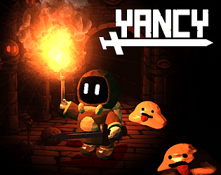
As for the game's title, I spent a long time deliberating on a title that was more relevant to the mechanics, but everybody called the game Yancy Game because it was the main character's name, and the name stuck. The game's narrative does eventually focus more on him as a character, so I hope it becomes more appropriate in the full release.

Thank you so much for your feedback, I look forward to trying your game as well :)

(1 edit)

Hello!

First of all, thank you for playing my game. I appreciate anybody taking the time to play, and I think your stream set up for playing all the different games is super cool.

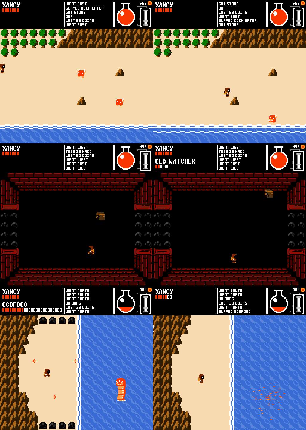
And I really appreciate that you enjoy the game's art style! I tried to make the game how people remembered the NES, without the things we've grown out of.

I did take the time to watch your video, and I saw that you were beating yourself up a lot about not performing very well, but I think you were playing very adequately. I'd say you were in about the 40th or 50th percentile of skill, you were progressing through the first dungeon at a good pace, learning how enemies and traps behaved and applying what you learned. 

Part of YANCY is that death is your teacher. You die rapidly, and you also have the potential to kill enemies rapidly. But enemies behave in largely predictable patterns, and through observation these patterns can be exploited. In your video, I saw you acquire the tongue sword, and then discover that by getting on the Rock Eater's y axis you could stunlock them for an easy kill. This is the kind of thought and execution I want to incentivize and reward in the game. While the enemy doesn't have a wind up animation for their attack, it happens predictably, they always shoot the moment that they are on the same x axis as you. Them walking up and down is a de facto wind up animation, and they behave entire predictably.

I think that you're better at the game than you give yourself credit, but I can understand if the game's design doesn't land for you. Thank you for playing and giving your feedback :)

Hi! Believe it or not the death message is in fact random. I have considered adding context based death tips, but if I do I think it'll be a later addition.

I'm glad that you enjoyed the game overall! My general attitude is that something is only too hard if people can't beat it. You don't have to lampshade that you beat bosses using stronger swords, that's an element of the game! Some people will take the challenge of fighting bosses with less power, and some people will come back later with more health and better swords. I want people to be able to use twitch skill or observation and patience to beat the game,

It's also very intentional that Yancy is woefully under equipped off the bat. I think the Oak Sword's pitiful range makes the player really appreciate upgrades like metal swords or the Sharp Tongue; they're life changing upgrades that really matter to the player.

As for the art style, I understand! My art is fairly unambitious to put it lightly. This project is all me and this the best art I can produce ;_; I can only hope that the charm and creativity makes up for the unimpressive visuals.

Thank you so much for playing!!

Thank you for playing!

The tongue sword is definitely popular among a certain type of player, lol. It was designed to be an early upgrade that really helps out beginners so I don’t mind that at all. There are more long range options later in the game, and I saw you got a lot of mileage out of the Slabsword. 

I agree that several weapons feel redundant, and this is intentional. The game’s non linearity is best expressed by the different weapons players find and use as they progress. Mokudev built the Tin Sword early, and used it for most of the early game. Some players underestimate the bone sword, but others use it to clear out the forest. I saw one player who built the Wolfkin in their first five minutes, and used it for the majority of their playthrough. While combat variety is something I do pursue, I’m most interested in letting players make decisions unique to their playthroughs and stick with play styles they personally find fun or effective :)

Lastly, unless there’s a bug I’m unaware of, you can’t heal while in hitstun. Petrification is meant to be a do or die status effect, so I don’t mind this.

Thank you enormously for the video. I liked watching you kill the Rock Lord in 4 hits with the Slabsword >:)

(1 edit)

Thank you so much for playing!

This is going to make me sound like a jackass, but I think fast respawn times and transitions can rob the game of its emotional depth. It starts to feel more arcadey if Yancy respawns too rapidly. Arcadey isn't a bad thing, it's just not really what I'm going for.

As for the coins lost on death, you always lose 10% of your money. Which seems not too bad, it creates a sort of "Money Equilibrium" where dying in a dungeon over and over will eventually equalize your money as the fraction gets larger. Things that cost 50-100 coins are always easily affordable, but things that cost 300 - 999 later in the game require explicit focus to save up for.

Thank you for your feedback :)

(2 edits)

working right now but excited to watch this. Videos with commentary are invaluable. Thank you!
***
Have now finished work and watched in entirety. I'm really glad you had pretty much the experience I set out to create; you struggled at first, wandered around, made some cool swords, and then found your footing and by the end you were excitedly pursuing objectives you set for yourself. Very pleased with this. Thank you so much for playing and thank you very much for your feedback :)

Just rewatching again, and noticed you said the Swap Sword button wasn't working. What controller were you using? Was it a Dualshock 4 perchance?

You’ve revealed my greatest fears and edited the save file! 

If I release a new version with all the non demo content deleted we will know who to blame!!

(It sounds like you must have enjoyed yourself a lot to have explored the games content so thoroughly. Thank you so much for all of your input, UI related feedback is invaluable.)

As for Yancy getting sleepy, everything’s working as intended. 

I will continue game dev at pace. In the future, you can delete your save by hitting CTRL + SHIFT + F4 or on controller hitting… I think it was Triangle / Y, Start / Options, and Select / Share. I set it up as a debug feature for live demos, but underestimated people’s interest in deleting their saves.

Thank you again!

Thank you so much for playing!

I’m fairly adamant on my decision not to let players rest at checkpoints like a Dark Souls bonfire. I found in play testing that lower skill players would frequently wander out, get hit once or twice, and then return to heal themselves, over and over again. I decided not to let them heal, to sort of “push them down the water slide” and force them to have fun.

I am considering adding one time use healing fountains / reservoirs in certain spots, to help players feel less doomed after achieving an objective. I hope something like that remedies the issue. Your feedback is appreciated ^^

Love the renditions of the soundtrack.

you've done gods work.

You obviously have great taste, because a ton of your feedback is already implemented! The overworld theme is done, energy ball projectiles are always blocked by walls, getting out of petrify is easier (you're intended to mash the movement keys but I've made it less strenuous) and coins have a new more satisfying collection animation in the game on my end. I'm planning on releasing a 1.1 version of the demo with all of this and a new boss ASAP :)

I'll post some more thoughts on the thread.

Thank you so much for playing!

Saw your Gimmick video. Clicked on your Tumblr. Clicked on this. Good game. Happy. Great series of links

I never considered foreign keyboards. Yipes. That sounds painful. I'm glad you had the patience to play through regardless.
I think if you beat everything in this demo you're probably better at video games than you're giving yourself credit :). Thank you again!

Thank you for giving my game so much of your time, both playing and sharing your thoughts!

I think you made a lot of solid points. Most of all your control woes, I see you made a game in RPG Maker so you're probably familiar with how common ZXC control schemes are. I grew up on them and am super used to them, but obviously they're more strenuous for most people than I anticipated. I intend to implement controller support ASAP, and along with it rebindable controls.

I never considered the character advancing slightly on attack. At first, I thought this was a pretty clever idea, but enemies universally have contact damage and this is something I don't intend on changing. At the moment players are rewarded heavily for positioning, managing to pin an enemy to a wall can end in an easy defeat, and if the player advanced when they attacked they would waltz directly into the enemy's hurtbox. I agree that this works in many games, but I've never seen Link advance in any of the top down Zelda titles, and I imagine it was for the same reason.

I've had a few complaints on  the death screen. I don't want the player to be able to instantly jump back into gameplay, I think some of the game's emotional weight can be damaged by treating a game over in too arcadey of a manner. That said, I am considering ways to mitigate the frustration of players being stuck on the screen. I was considering either letting players skip through loading screen tips, or adding an actual game over screen, with options to continue or exit. I think the ability to advance the screen quicker with player input would help a lot.

As for invincibility frames on getting hit; you do actually get some. some. The issue is that the player isn't the only one who's frail in this game. I could introduce giving the player a healthy second or so of invincibility frames, but it would have to come with additional draw backs. If the player is simply invincible for longer, they can rush enemies, ignoring damage, taking advantage of their invincibility and taking the enemy down with DPS alone. If it isn't clear, I'm more concerned about the game being too easy than too hard. This necessitates a solution, here's a few simple ones.

A: Not letting the player attack while invincible
B: Stunning the player outright
C: Increasing boss's HP, probably by a lot

I'm not saying I would never make these changes, but I like the way the game is now. Consequent to the current way player damage is handled, positioning is very important. Being in a bad position means you take damage, and being in a terrible position means you die instantly. And the main grievance of getting annihilated instantly by enemies wanes as the player's maximum health increases.

It's worth mentioning that some of the swords you described as useless, I was told by other players were overpowered. The bone sword in particular. This is exactly what I intend, for swords to be comparable in damage and application such that different swords lend themselves to different situations and playstyles. It's also worth mentioning many of these swords will be acquired in completely different orders for different players, meaning swords that seem redundant will sometimes be relied upon by players taking an unorthodox route :)

I think the complaint I most resonate with however is your obvious disdain for grinding. I agree with you. Grinding is awful. This is part of why the maximum number of materials you'll ever need for a sword is 8, often obtainable purely as a byproduct of progressing through the game. The grinding for the soul material is lame and bad! I wanted to include something else west of that bridge but unfortunately ran out of time for the demo and was forced to include several enemies that drop it at all. I promise in the full game I will work as hard as I can to disincentivize grinding for materials. It's lame and bad.

I don't want it to come off like I'm shrugging off your feedback. I consider everything, and the more I hear a complaint the more likely I am to address it in game. I immensely appreciate tear downs like this. Thank you again for your time.

Your game feel is excellent, shooting enemies feels awesome and you've nailed the appeal of culling the horde. Many games try it, some nail it, some miss. You're nailing it.

I played four runs, and on three of them I got to the last level before what I can only assume is a boss fight. Most rogue likes first levels are pretty harsh, because they know you're going to find yourself on those first levels a lot. You hone your skills going through these levels repeatedly, mastering your play so that you'll be better equipped later in the run. I don't find this appeal in your game. I find that your early levels are so easy that they don't require a lot of effort, which makes me tune out. Even when I do take damage, I quickly find a health pack and I'm back to maximum HP, leaving no incentive to put in effort. A bonus for not taking damage on a level or some more challenge in the early game could remedy this.

There's also just a lot of levels between me and your boss. It's impossible for me not to compare your game to Nuclear Throne, which was far more punishing, but threw unique content and challenges like boss fights at me in much less time.

All that negativity aside, I was compelled to keep playing, and I plan on trying again. You're already fostering that "one more time" mentality these games live off of.  Getting a super strong boomstick or a powerful assault rifle just feels right. I look forward to seeing how you innovate on these ideas going forward and introduce more depth to the gameplay :)

I look forward to adding more and getting everyone’s feedback!

(1 edit)

I think the base mechanics of your game are strong, you put a lot of work into your combat and it shows. The quality of animation, the way you convey motion in your animations is great. There's definitely depth to the weighty, slow nature of combat, and the abstract presentation of the enemies allows for a lot of possibilities for enemy variety. But the context that combat is surrounded by doesn't work to its advantage.

Levels are very large, and it's very aggravating walking through these massive levels between deaths only to be deleted in one or two hits. Especially in your dungeon where the magma can instantly annihilate the player for slipping off the thin bridges. I personally assumed the magma would be treated the same as the cliffs, and I'd just pop up safe after taking some damage. Was very surprised when my lil guy was fiendishly immolated.

I'm just extrapolating here but I imagine you made the levels so massive to accommodate player's varying movement speeds, they can level up their stats to go faster, and eventually they'll be able to dart around these levels really quickly. I feel like this can only end in one of two ways, either you never get enough move speed for it to feel meaningful, or you eventually become so quick that it enormously affects the balance of your combat. Consistent movement speed in single player action games is fairly standard for this reason, it's very difficult to account for large gaps in move speed, and I can imagine a lot of these enemies being trivialized by some simple strafing eventually. 

That's a pretty fundamental critique, and if you intend for these levels to be large and you care a lot about keeping the movement speed leveling, I can respect judging your game for what it is rather than what I'd like it to be. Here's a simpler observation. Why on earth do I need to sleep in the tent to equip weapons? Finding that sword was very exciting, but the wind was taken out of my sails after 10 minutes of trying to figure out how to equip it, pressing every button on my keyboard before using the tent out of desperation. It doesn't make sense mechanically to not allow me to collect items as I'm traveling, and it certainly makes no sense narratively that the item vanishes from my character's inventory into their base camp. Your game gets a full point better the instant I can equip a weapon on the spot.

The last thing I want to express after all that negativity; I love your setting. "What's the setting for this slow soulsy action RPG? Cyberpunk? Victorian? Medieval?" "No. Modern day Hawaii." Completely left field, but opens the door to SO many exciting ideas. Beaches, volcanoes, hotels, slums, the Dole plantation, ABC stores. The culture clash of the mythology and the tourist reality. BRILLIANT decision. I think you should seriously consider putting a lot of your thought and resources into selling this setting, teaching people about the area, because it's a fantastic premise. You obviously have an eye for the aesthetics with your statues and your kick ass logo.

Keep the brochures I love them. "Go to Hawaii idiot."

Love this guy. Love this teapot. Love the things he says about my game. :)

(1 edit)

Waking up this morning to see this enormous and detailed run down of my game was exactly what I needed after going to bed horrified I’d forgotten some game breaking bug. This kind of in depth tear down is exactly what I need. Seeing someone recognize a lot of my intentional design choices feels fantastic. Thank you. Also, based on your screenshot I believe you found everything :)

I agree with you that I’m too close to Zelda 1 aesthetically and I intend to make later zones more visually unique. That said I think the simplicity of the art style lends itself well to the difficult gameplay so it’ll likely be small things like different tile sets (you caught me. I’m artistically limited.)

You’re not the first person to think the wand would have the gem on the bottom so there’s definitely a type of player who expects it. I may reword the journal to make it more clear it goes on top, the wandblade is intended to look kind of dopey.

Skipping through death tips is an excellent idea, no notes.

It only occurs to me now that I didn’t tell players they can equip two swords at a time using Z and X on the menu screen and swap between them with the shift key. So that should definitely go in the controls. I don’t intend for players to switch which swords they have equipped during combat, only between the two they have on.

I agree items and swords should at least have inspectable names, maybe descriptions.

Hitboxes used to be more representative of 3D space but they were actually far more confusing. They function better when I put them where players “feel” they should be, but if it felt wrong to you I should go back and look at some of them closer.

I was thinking that coins should fly to the player as well. The coins were one of the first things I added a long long time ago.

I could respond in detail to every single thing you’ve said but I’ll spare you. I agree with a lot of it.

Thank you so much for playing and sharing feedback!

Thank you so much for playing!

Being able to change controls is a must I know. One of my friends couldn’t play because he doesn’t have arrow keys. I’ll get around to it for sure.

I’ve noticed items dropping into unobtainable spots happens more than I expected, I think I’ll make items drift towards the player when you get close :)

If you’re referring to the little puddles dropped by the wolves or the skreks, those are liquids so you need a bottle to collect them (not available in the demo)

We definitely do need more music, my musician / sound guy gives this game a LOT of its atmosphere. 

Thank you again!!

Thank you so much for playing my game!

It must've been brutal playing the game at default resolution. You can change the scale of the window in the Options menu ;_;

I will update the game's description to reflect that. Thank you again!

Thank you so much for playing! I appreciate all of your feedback and the bug regarding enemies not respawning has already been fixed on my end ;) I'm sorry you gave so much time and weren't able to complete the demo, hopefully the next demo is more accessible.

(2 edits)

This video was enormously enlightening for me, in that I now understand how important it is to show the controls in the actual game! I can't imagine how many people's experiences were similar to yours because they didn't see the description on the game page (which I had no idea you don't have to visit to download the game, my bad) and didn't know they could heal with C. You were super polite for the whole video considering how unforgiving an experience the game must have been without the health potions. Considering you were playing on a single healthbar you did really well!

I'm glad nothing completely walled you, and I think you'd have had a much smoother experience getting to play from the very beginning of the game rather than being dumped into this dungeon. Again, hugely thankful for this video. Thank you.

I had more fun than I expected. At first I'll admit I wasn't really enjoying myself, but after dying once and switching to a cowardly Vagabond I started to get into it. The ranged attacks as a main weapon with melee as a fallback was an engaging loop, I love the option to throw out a shitty punch when you're feeling pressured.

I think what this game needs is more enemy variety. A large majority of encounters feel very samey, when I walked into this one treasure room with like 20 gobloids that was awesome. Unique encounters like that which give you the opportunity to make full use of your unique gear and abilities are what will make this game memorable.

It was also really memorable to come down from the tower to do some quests and discover there are some handmade dungeons to do! That was really cool.

You've got some really strong systems here! Load this bad boy up with some content and you'll have a strong game that people could spend hours playing.

I put the controls on the game page, I didn’t realize you wouldn’t see them if you downloaded from the Jam, doy. I’ll include a screen on launch next time.

I’m glad you mentioned Ys! My friend is always noting the resemblance in my boss design, and I kinda wanna include a Dark Fact inspired fight for giggles. Thanks so much for playing :)

thank you so much for playing! I’ll be sure to give your game a try, and thank you for the enemy compliment! I always go out of my way to try and make unique goons. 

Thank you so much for giving my game your time regardless! Maybe you’ll be able to enjoy it more with the full learning curve from the beginning of the game rather than being kicked in the catacombs :)

the feeling of a ladybug camping right in front of your face is not dissimilar to bugs doing the exact same thing in real life

Fun to play a game that knows exactly what it wants to be. I look through the small scope, and I see a fun little game :)

I love the concept of your game, but it is way too difficult to read what things do at a glance. I love the Emoji as mana idea, but the fact that the default hand spread covers up mana costs and symbols when they're all the same color is UX gore. Rather than showing all of the resources I have at the bottom right next to my trash, it'd probably be better to just show all my counts at all times; even if I have 0. And to grey out my cards that aren't usable. Because I find myself constantly trying to use posts that I can't.
But the idea and general aesthetic execution here is phenomenal. This is a few smart design decisions away from being gold.

This was my favorite game in a lot of areas this demo day. Your level design is good! You should be proud of what you've put together here.
I agree with whoever mentioned the game has ESA vibes: it very much does. And that is a great thing.

I don't know if anyone else mentioned this but you mixing the retro sfx with the more grounded foley like the cave ambience works surprisingly well, and grants a lot of life to the station that wouldn't otherwise be there, audio will be your friend on this project for making the world feel alive since you're sticking to monochrome graphics.

I didn't find it immediately clear that the big gateway things are save points. That might just be me being stupid, but a lil text pop up when you interact with one would go a long way to making that more obvious for oblivious folks like me :)

Your first boss is good! I would maybe force him to use his moves in alternation, because on my first attempt due to some wild rng I didn't even know he had more than one move. 

Overall the whole thing was a joy to play, and I love the main weapon. Your gravity gun is a lot of fun too. Hitting a lot of very base satisfaction receptors with this.

Those fine motor skills are definitely honed once you’ve played longer. Games like the Binding of Isaac solve this issue by drawing shadows under enemies, which represent their “true” location on the screen. I do occasionally draw shadows under flying enemies for example, but under every enemy is too messy visually. Thank you very much for playing!!

I'm a big fan of this conceptually. 3D platformers are a criminally underexplored genre, and your character models and writing are adorable. That said, I think your games actual controls are pretty primitive. The game isn't a third person shooter, so there's not much reason for third person shooter controls. Picture this on a controller, where most people would feel comfortable playing a 3D platformer. Ideally, you'd just want to fire in front of you to hit anything immediate, for example the breakable wall at the beginning, and you only need to fire precisely very seldom, like during the ladder puzzle. It also took a little while for me to put together that the most effective way to get air is to simply aim the gun straight downwards without actually looking straight downwards, which I was doing most of the time until I figured that out. I feel like on a controller I'd just want to say, hold Left Trigger to aim straight down and hit the fire button to do this in a more ergonomic way, without having to drag my mouse / hold the right stick down.

If my wall of text makes me feel like I'm nitpicking or being negative, I'd like to be clear; I love this. I love your character, I love your cave ghetto. I want to see where you take this! It was a pleasure to play.

All music and sfx were done by the extremely skilled DEADi, fellow game dev legend.