


The Spiral is the clear best because it also includes the designer’s intent.
The rework is way cleaner too!
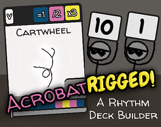
That said you are missing a very important piece of UI information; the tri cost of each object (sorry if that’s not the actual name, I haven’t gotten to playing yet).
As it stands I can’t see any neat way of including it, either.
Maybe you could have the chosen on floating in a bubble in the middle (after a short delay so that it doesn’t flicker while spinning) with the cost etc on it. This would also make it visually clearer what you have selected (since objects on the far right of the spiral are covered by the title bar)
Additionally, it’d be great to see the sorting come back in. I can picture a really cool effect where the spiral does a complete rotation into the new layout to hide the change.