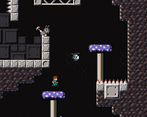
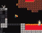
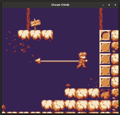
start button should work in the options as well, took me a sec to figure out i can only A out of it.
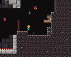
the controls are heavy and the collisions are very unforgiving. you need to just as much as brush against the objects by a hair for things to register, it gets punishing especially when the game expects you to squeeze into tight corridors behind the enemies you just bounced off from. this happens a few times on level 4 and is highlighted by the single tile of spikes at the beginning of that map.
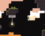
level 3 also had a spot in which i had no idea how to progress other than damage boosting from an enemy, wasn't a fan of that.
it took me a moment to get used to the fact the double jump you can do with the grapple has to direct you forward and i still think it's weird how useless clinging to the wall right next to you is. i think making things less punishing and introducing more margins of error (smaller hitboxes, snapping to the ground tiles, etc) and options for the player (hanging on to walls? directional double jumps?) to lean on would go a long way to make this game more enjoyable and less frustrating to play, along with giving the level design a lot more tools and toys to challenge the players with. i don't know how much you want this game to be hardcore stuff for people who cut their teeth on the bang-your-head-against-the-wall-until-you-win breed of platformers, but i think it's worth a consideration at the least.
that said i appreciated the health recovery pickups that were placed at exactly the right places and the autosave. the graphics and audio were slick for what they are as well.
'k, ended up playing. It's still good, wish it was longer.
My biggest concern is that I'm still missing jump inputs. You seemed to fix the general case of not jumping if you hit a direction at the same time, but I could still reproduce it. If you see the video, at 9:04 I start jumping because I suspect I'm missing some inputs, and at 9:13 I just walk to the left even though I hit jump+left. I think it has to do with jumping to the opposite side, which is what I tried. So, you walk to the left, and then suddenly hit Right and Jump at the same time. It could be something from my end too, though, I guess.
The camera is way better in this build, and you fixed the leaps of faith, which is cool. I feel like it moves a bit to much when you change directions, though. Like if you spam left and right the camera wobbles a bunch. But I don't know, it's not like it really bothered me, but camera movement was noticeable, it wasn't quite seamlessly blending in into the gameplay.
I'd normally say that one part where you have to get hit to keep going is clever...But I don't think it's a good idea. The reason being, there was a part in a later level where I thought you had to get hit to continue too, when in reality I just had to look a little closer. Having the thought 'is this one of those parts too' for the rest of the game is kind of annoying, I'd rather have the certainty of knowing that I can clear everything without getting hit, and if I'm not finding a way to do, I'm missing something.
Finally, since people complain about difficutly, in regards to controls, the biggest aid I would like is being able to jump even after a couple of frames of collisioning with the wall when you're hooking onto it. It'd make the game a bit easier, but it would feel better progressing through the levels I think.
But yeah, pretty fun, I'd buy it if it was longer.
This game is nice throwback to old school platformers. You got a very nice gameboy style going with the art, the UI and level design. Even the options menu feel characteristic from that era. But I find its gimmick very frustrating. The air jump must be made between the hook impacting on something and the character being too close to a wall, which is a very small fraction of a second, this timing is too tight for me. Not being able to refire the hook makes it even more difficult. At least it is satisfying when making a hook jump work though.
Controls, movement feel and camera could use some tweaking.
Reached level 4. I cannot imagine how level 5 looks like, but by reading the comments I assume it is very, very hard. It is nice to finally play this game after seeing so many webms and pictures of it in the thread.
- zip the game folder, not the files (correct: Game.zip/Game/Game.exe, wrong: Game.zip/Game.exe) - I appreciate the 4mb download - add [Alt+Enter] as a fullscreen toggle - would be nice for the analog stick to work for movement too - [Down] to read is unusual, most games do [Up] - camera pan is way too slow, make it no more than 0.3s, ideally 0.1s or customizable - I think for a skillcheck game, the camera being so limited is unexcusable, missing shots and losing is fair, but having to memorize out of sight walls for optimal play feels terrible and removes value from physical skill - hat dropping as health is cute - "press up or down to look around" even you admit tiny boxed vision is a hindrance, just increase the view sight by 4x and have the game improve dramatically - toggling line enemies should reset after you die / wait enough time, otherwise you're forcing manual resetting for optimal play - air movement is pure hell with this camera, clearing sections feels more lucky than rewarding - don't know if it's intended, but the optimal play on the enemy next to spikes and metal wall is to hit yourself against it, I hope it's not intended, otherwise the only "life" you have being used as a mechanic makes you have no lives and too scary for casual play - I think it would be nice if you had some leeway, an extra time delay, after the rope pull ends that allows to still jump - I am not a fan of mob priming (setting up their correct position for a jump) - I also despise mountain-climber sections (failing a jump lands you few jumps backwards), but I recognize it's a popular setup - same wall multi jumps with odd-metal plates is just bullshit and you know it with how tight the rope jump timings are
I enjoyed the game quite a bit, but I think I would have enjoyed it much more if not for the artificial resolution and camera limitations, which felt cheap. The frustrations I had weren't the "damn I wish I could clear this" type, more like "damn, I can't wait for consoles to improve, so I can see more of the screen". I cleared the game in about 50min, most of it spent on 4 and 5 bullshit parts. Instead of feeling good about doing it, I hate you as a person.
toggling line enemies should reset after you die / wait enough time, otherwise you're forcing manual resetting for optimal play
Yeah, I didn't have that in mind. Until I added that enemy the levels were completely static so I just reset then player when he dies. Resetting the level makes far more sense of course.
don't know if it's intended, but the optimal play on the enemy next to spikes and metal wall is to hit yourself against it
The intended way was to first hook onto the enemy and the onto the ground behind the metal wall while falling. Way to unintuitive mechanic and as you discovered, damage boosting is actually easier in that spot. I'll make it non-mandatory.
same wall multi jumps with odd-metal plates is just bullshit and you know it
Instead of feeling good about doing it, I hate you as a person.
Jk, I already have plans to remedy the low resolution and camera issues.
> Why though? 1. when I click download on your zip, the zip shows up at the bottom of the browser 2. when I click the bottom browser zip, 7-zip shows me the contents of the zip 3a. if it's a single folder (correct), I can drag that to wherever I put demo day games 3b. if it's a bunch of garbage files (wrong), I have to now create a new folder for your game so the files don't mix with other demos, which is (click target folder, right click > new folder, give name, click back on the zip window, drag your garbage to the folder) much more inconvenient, and a waste of time that adds up over many bad zips. If you think that's very little work, then do it for me by zipping it right. Or you can keep doing it wrong and I'll just not bother with the game the next time, since now you're doing with full awareness.
Neat little platformer. Great level design, teaching you how to use the mechanics intuitively while still not wasting too much time to get to the challenging parts. I got stuck on level 5, no idea how to get up a steel wall next to a pit.
I would opine against the need for smoothening the difficulty curve. It's fine as is -- this is a simple game with simple rules and stretching it across too many levels would get boring. There are a bazillion simple retro indie platformers out there. If you don't engage me immediately I will just quit.
If you intend to make this longer I think if you had an input buffer for jumping right as the hook hits it would open more design possibilities than it would close, though at the cost of making these first levels a bit easier.
Controls under Options does nothing, probably not implemented yet. I can move left/right on the back button for the soundeffect but nothing else to happen.
Controller support works fine, but moving with DPad instead of joystick feels off. Cute looking up/down tho.
Some of the Jumps are rather hard with the Blocks right above you blocking you. And you have no control over your movement if you hook fully to a wall, causing you to always fall super far down.
Gave up on the Second level with the Guy in the middle of the small hallway you have to get across. That jump was just too tight for me. I'm not good with those kind of Games, I don't enjoy those kind of Games, so please keep that in mind.
The Graphics are cute tho, and the mechanics work I guess. Would've wished some Checkpoints on longer levels tho.
Menu: I like everything. The only problem is knowing beforehand that A is the confirm button . Just put a note in a corner of the menu and you'll be fine .
Signposts: I discovered I had to press down by trial and error. Is not the end of the word, but or you add an "how to play" in the menu or you add a notification on the signs (like a simple blinking arrow)
Like Rezydent said, I had some problems with jump after a hook (playing with a pad), and from lv3 forward the success window for many jumps was so narrow that I had to smash jump after blindly hooking.
I enjoyed the game, but I have to join the choir "the game is very hard". Now, how much of it is intentional? Even level 4-5 are easy for you now? You have an hypothetical lv 20 of this learning curve?
My idea for the difficulty curve was to basically condense the full curve into only five levels. So level 5 is supposed to be endgame hard, you just get there a lot quicker in the demo. Probably not the greatest idea but seeing people struggle with the last demo was too enjoyable to just make five early game levels lol
Alright, first of I would like to say I am really happy with how much feedback you used from the last DD, both your submission comments, and stream chats.
level 5 - I played for over 8 minutes, but I gave up. I'm sorry
If you watch the videos, you''re going to see sometimes I was able to hook on floor of non metal blocks that were behind metal blocks. I am not sure if it is intended.
I would like to see a level selection for levels that were already beaten. I planned to have another person play from level 1 later, but the game puts me back to level 5, which I gave up on completing.
I could write some suggestions, but I think they would make the game too easy.
One thing I would like to suggest thou is some kind of visual indicator that what you are trying to hook on is not going to work e.g. if I shoot my hook at a metal block from distance, you could maybe have an "!" above player's head before the hook gets destroyed. Small addition like that would help me see if I missed a bit earlier.
The mechanic of hooking onto a floor (or ceiling) is semi-intentional. I wasn't originally planning on it being a thing but one I discovered it myself I thought I'd try it. That one jump in level 3 Qwott got stuck on basically requires it. That or damage boosting. Bit of a troll that one. I'll probably keep it in but remove any parts of the game that require it to progress.
Level selection will be a thing. But as you discovered you can reset the game by deleting the save file for now.
As for the indicator, do you mean have it appear the moment the player launches the hook? I suppose that could help. I do plan to make things more lenient if you miss though. Right now the only way to reset your hook is to fall to the ground or jump off the hook. I'll eventually make it so you can also re-hook if you get hit or after a failed attempt once the hook has fully returned. Not being able to do that and just waiting to hit the ground is frustrating I found myself.
As for the indicator, do you mean have it appear the moment the player launches the hook?
Yeah, I imagine in your logic whenever you shoot out a hook, the game already knows if it is going to succeed, or not, so an indicator like that could be useful.
I'll eventually make it so you can also re-hook if you get hit or after a failed attempt once the hook has fully returned.
That's actually one of the things I decided not to mention, because I thought it would probably make the game too easy. If you think it would be a good change, then I welcome it.
I did put up those signs to explain the mechanics but never got around to add a prompt to indicate that you can read them so seemingly no one does. Woops.
One thing I noticed with your gameplay and others' is that even when they figure out the "double jump" mechanic they keep trying to use it very up close to a platform whereas the trick is to get some distance and I still have no clue how to communicate that to the player. I don't wanna put it on a sign because those should just explain what the mechanics are, not how to use them efficiently. That should be done by level design but I just haven't found the right design for the first level I guess.
Maybe I'm spoiled by my own game, but the controls don't exactly feel right. Jump after hook isn't quite consistent for me, so I find myself mashing the jump button. Adding some input buffer would solve most problems for me, and especially some coyote time when hooking close to wall would be nice.
There are some other controls aspects, but I guess it comes down to design and preference. The damage boosting is neat.
-The camera switching sides in mid-air is incredibly annoying and makes the movement feel slippery.
-Needs a restart button.
-Those fish(?) enemies need a bigger trigger zone. Getting past the first one without getting hit is nearly impossible.
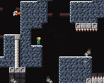
No idea how you're supposed to get past the metal wall on level 3. The only solution I can see is jumping inbetween the enemy and the spikes, turning around, and then hooking onto the enemy, but there isn't enough space.
The camera will definitely be changed. I might ignore the whole Game Boy thing with only two buttons and have the player pan it manually just like they can look up or down.
Not sure what you mean by restart button. Restart the level? killing yourself is usually quick and easy so I don't see why that would help. Restart the game from level 1? Yeah, that's necessary and will be added, along with level selection.
The charging enemy is pretty tough, I agree. It's just using a raycast right now for checking line of sight. I'll expand that to a thin trigger zone in front of it. Should defuse it a little.
The metal wall in level 3 is a bit of a troll to try out a mechanic. You're supposed to first hook onto the enemy from the left, change direction and hook onto the ground behind the wall. I'll remove that, I don't think that mechanic should be mandatory.
Comments
start button should work in the options as well, took me a sec to figure out i can only A out of it.
the controls are heavy and the collisions are very unforgiving. you need to just as much as brush against the objects by a hair for things to register, it gets punishing especially when the game expects you to squeeze into tight corridors behind the enemies you just bounced off from. this happens a few times on level 4 and is highlighted by the single tile of spikes at the beginning of that map.
level 3 also had a spot in which i had no idea how to progress other than damage boosting from an enemy, wasn't a fan of that.
it took me a moment to get used to the fact the double jump you can do with the grapple has to direct you forward and i still think it's weird how useless clinging to the wall right next to you is. i think making things less punishing and introducing more margins of error (smaller hitboxes, snapping to the ground tiles, etc) and options for the player (hanging on to walls? directional double jumps?) to lean on would go a long way to make this game more enjoyable and less frustrating to play, along with giving the level design a lot more tools and toys to challenge the players with. i don't know how much you want this game to be hardcore stuff for people who cut their teeth on the bang-your-head-against-the-wall-until-you-win breed of platformers, but i think it's worth a consideration at the least.
that said i appreciated the health recovery pickups that were placed at exactly the right places and the autosave. the graphics and audio were slick for what they are as well.
Would you mind publishing a web version? I want to play it, but Lua games don't work on my system for some reason.
'k, ended up playing. It's still good, wish it was longer.
My biggest concern is that I'm still missing jump inputs. You seemed to fix the general case of not jumping if you hit a direction at the same time, but I could still reproduce it. If you see the video, at 9:04 I start jumping because I suspect I'm missing some inputs, and at 9:13 I just walk to the left even though I hit jump+left. I think it has to do with jumping to the opposite side, which is what I tried. So, you walk to the left, and then suddenly hit Right and Jump at the same time. It could be something from my end too, though, I guess.
The camera is way better in this build, and you fixed the leaps of faith, which is cool. I feel like it moves a bit to much when you change directions, though. Like if you spam left and right the camera wobbles a bunch. But I don't know, it's not like it really bothered me, but camera movement was noticeable, it wasn't quite seamlessly blending in into the gameplay.
I'd normally say that one part where you have to get hit to keep going is clever...But I don't think it's a good idea. The reason being, there was a part in a later level where I thought you had to get hit to continue too, when in reality I just had to look a little closer. Having the thought 'is this one of those parts too' for the rest of the game is kind of annoying, I'd rather have the certainty of knowing that I can clear everything without getting hit, and if I'm not finding a way to do, I'm missing something.
Finally, since people complain about difficutly, in regards to controls, the biggest aid I would like is being able to jump even after a couple of frames of collisioning with the wall when you're hooking onto it. It'd make the game a bit easier, but it would feel better progressing through the levels I think.
But yeah, pretty fun, I'd buy it if it was longer.
This game is nice throwback to old school platformers. You got a very nice gameboy style going with the art, the UI and level design. Even the options menu feel characteristic from that era. But I find its gimmick very frustrating. The air jump must be made between the hook impacting on something and the character being too close to a wall, which is a very small fraction of a second, this timing is too tight for me. Not being able to refire the hook makes it even more difficult. At least it is satisfying when making a hook jump work though.
Controls, movement feel and camera could use some tweaking.
Reached level 4. I cannot imagine how level 5 looks like, but by reading the comments I assume it is very, very hard. It is nice to finally play this game after seeing so many webms and pictures of it in the thread.
somewhat frustrating yet cute little game.
I like the limited color palette and the game is generally very pleasing to look at.
Character feels a little too floaty, specially for a plateformer. I feel a lot of the difficulty comes from the floatiness.
I don't think you should be able to get damaged when you hit a spike sideways.
changing controls doesn't seem to be working. I would have like to be able to flip the hook and jump button around.
pressing Enter for the options is counter intuitive. I feel like it should be ESC.
Cannot run the game on Linux. getting permission denied no matter what I do.
Issue might be on my side but just letting you know.
have you made the appimage executable?
try this in a terminal
>have you made the appimage executable?
I did. nothing works. but like I said, it might be on my side.
note that it says :
when the file name is : ChasmClimb-demo-0.2.1.appimage
That tells me it's most likely not a file permissions issue. since where would it find the name "ChasmClimb" if it wasn't running the file.
Holy fuck I'm retarded. It's not on your end, I just forgot to chmod +x the actual "ChasmClimb" executable inside the appimage myself.
Should be fixed now. Good thing you noticed.
I'm still getting the same error with the new version :(
This time I blame itch.
Uploaded again, tried downloading and running the actual itch version on three different machines and it works.
If it doesn't work now I'm out of ideas.
heyo, that did it!
Yeah sorry the controls are way too awkward on keyboard, also would be nice to be able to hook in other directions.
But I do like the aesthetic.
- zip the game folder, not the files (correct: Game.zip/Game/Game.exe, wrong: Game.zip/Game.exe)
- I appreciate the 4mb download
- add [Alt+Enter] as a fullscreen toggle
- would be nice for the analog stick to work for movement too
- [Down] to read is unusual, most games do [Up]
- camera pan is way too slow, make it no more than 0.3s, ideally 0.1s or customizable
- I think for a skillcheck game, the camera being so limited is unexcusable, missing shots and losing is fair, but having to memorize out of sight walls for optimal play feels terrible and removes value from physical skill
- hat dropping as health is cute
- "press up or down to look around" even you admit tiny boxed vision is a hindrance, just increase the view sight by 4x and have the game improve dramatically
- toggling line enemies should reset after you die / wait enough time, otherwise you're forcing manual resetting for optimal play
- air movement is pure hell with this camera, clearing sections feels more lucky than rewarding
- don't know if it's intended, but the optimal play on the enemy next to spikes and metal wall is to hit yourself against it, I hope it's not intended, otherwise the only "life" you have being used as a mechanic makes you have no lives and too scary for casual play
- I think it would be nice if you had some leeway, an extra time delay, after the rope pull ends that allows to still jump
- I am not a fan of mob priming (setting up their correct position for a jump)
- I also despise mountain-climber sections (failing a jump lands you few jumps backwards), but I recognize it's a popular setup
- same wall multi jumps with odd-metal plates is just bullshit and you know it with how tight the rope jump timings are
I enjoyed the game quite a bit, but I think I would have enjoyed it much more if not for the artificial resolution and camera limitations, which felt cheap. The frustrations I had weren't the "damn I wish I could clear this" type, more like "damn, I can't wait for consoles to improve, so I can see more of the screen". I cleared the game in about 50min, most of it spent on 4 and 5 bullshit parts. Instead of feeling good about doing it, I hate you as a person.
zip the game folder, not the files
Why though?
Yeah, I didn't have that in mind. Until I added that enemy the levels were completely static so I just reset then player when he dies. Resetting the level makes far more sense of course.
The intended way was to first hook onto the enemy and the onto the ground behind the metal wall while falling. Way to unintuitive mechanic and as you discovered, damage boosting is actually easier in that spot. I'll make it non-mandatory.
Jk, I already have plans to remedy the low resolution and camera issues.
> Why though?
1. when I click download on your zip, the zip shows up at the bottom of the browser
2. when I click the bottom browser zip, 7-zip shows me the contents of the zip
3a. if it's a single folder (correct), I can drag that to wherever I put demo day games
3b. if it's a bunch of garbage files (wrong), I have to now create a new folder for your game so the files don't mix with other demos, which is (click target folder, right click > new folder, give name, click back on the zip window, drag your garbage to the folder) much more inconvenient, and a waste of time that adds up over many bad zips. If you think that's very little work, then do it for me by zipping it right. Or you can keep doing it wrong and I'll just not bother with the game the next time, since now you're doing with full awareness.
Sounds like an issue with 7zip. My extraction program can autodetect whether there is a subfolder and create one if there isn't.
But sure, I can work around your subpar software next time.
Which program is that?
Ark
https://apps.kde.org/ark/
Neat little platformer. Great level design, teaching you how to use the mechanics intuitively while still not wasting too much time to get to the challenging parts. I got stuck on level 5, no idea how to get up a steel wall next to a pit.
I would opine against the need for smoothening the difficulty curve. It's fine as is -- this is a simple game with simple rules and stretching it across too many levels would get boring. There are a bazillion simple retro indie platformers out there. If you don't engage me immediately I will just quit.
If you intend to make this longer I think if you had an input buffer for jumping right as the hook hits it would open more design possibilities than it would close, though at the cost of making these first levels a bit easier.
Controls under Options does nothing, probably not implemented yet. I can move left/right on the back button for the soundeffect but nothing else to happen.
Controller support works fine, but moving with DPad instead of joystick feels off. Cute looking up/down tho.
Some of the Jumps are rather hard with the Blocks right above you blocking you. And you have no control over your movement if you hook fully to a wall, causing you to always fall super far down.
Gave up on the Second level with the Guy in the middle of the small hallway you have to get across. That jump was just too tight for me. I'm not good with those kind of Games, I don't enjoy those kind of Games, so please keep that in mind.
The Graphics are cute tho, and the mechanics work I guess. Would've wished some Checkpoints on longer levels tho.
Chasm Climb is a metaphor for not getting good at video games.
I played for 30-40 min i think. Made it to lv5.
Menu: I like everything. The only problem is knowing beforehand that A is the confirm button . Just put a note in a corner of the menu and you'll be fine .
Signposts: I discovered I had to press down by trial and error. Is not the end of the word, but or you add an "how to play" in the menu or you add a notification on the signs (like a simple blinking arrow)
Like Rezydent said, I had some problems with jump after a hook (playing with a pad), and from lv3 forward the success window for many jumps was so narrow that I had to smash jump after blindly hooking.
I enjoyed the game, but I have to join the choir "the game is very hard". Now, how much of it is intentional? Even level 4-5 are easy for you now? You have an hypothetical lv 20 of this learning curve?
Anyway, GJ. It already feels like a "real" game.
My idea for the difficulty curve was to basically condense the full curve into only five levels. So level 5 is supposed to be endgame hard, you just get there a lot quicker in the demo. Probably not the greatest idea but seeing people struggle with the last demo was too enjoyable to just make five early game levels lol
Alright, first of I would like to say I am really happy with how much feedback you used from the last DD, both your submission comments, and stream chats.
I recorded some gameplay (no commentary).
It's multiple videos packed in a zip:
https://litter.catbox.moe/agad74.zip
The link is going to expire in 3 days.
If you watch the videos, you''re going to see sometimes I was able to hook on floor of non metal blocks that were behind metal blocks. I am not sure if it is intended.
I would like to see a level selection for levels that were already beaten. I planned to have another person play from level 1 later, but the game puts me back to level 5, which I gave up on completing.
I could write some suggestions, but I think they would make the game too easy.
One thing I would like to suggest thou is some kind of visual indicator that what you are trying to hook on is not going to work e.g. if I shoot my hook at a metal block from distance, you could maybe have an "!" above player's head before the hook gets destroyed. Small addition like that would help me see if I missed a bit earlier.
Keep up the good work.
I found the save file in .local/share/chasm-climb (linux)
So I can delete it to start from level 1
Hey, thanks for playing!
The mechanic of hooking onto a floor (or ceiling) is semi-intentional. I wasn't originally planning on it being a thing but one I discovered it myself I thought I'd try it. That one jump in level 3 Qwott got stuck on basically requires it. That or damage boosting. Bit of a troll that one. I'll probably keep it in but remove any parts of the game that require it to progress.
Level selection will be a thing. But as you discovered you can reset the game by deleting the save file for now.
As for the indicator, do you mean have it appear the moment the player launches the hook? I suppose that could help. I do plan to make things more lenient if you miss though. Right now the only way to reset your hook is to fall to the ground or jump off the hook. I'll eventually make it so you can also re-hook if you get hit or after a failed attempt once the hook has fully returned. Not being able to do that and just waiting to hit the ground is frustrating I found myself.
"It's not a bug, but a feature" I get it
Just a bit... I spent so much time on that part.
Yeah, I imagine in your logic whenever you shoot out a hook, the game already knows if it is going to succeed, or not, so an indicator like that could be useful.
That's actually one of the things I decided not to mention, because I thought it would probably make the game too easy. If you think it would be a good change, then I welcome it.
I was playing some more, and I am much better now. I can see how playtesting can become tricky for you, because you are far more experienced.
I just wanted to show you:
It's possible to shoot out the hook, and change the direction. Not game breaking, but I thought I would report it to you.
Honestly I can't figure it out at all and I made it to where there are the metal walls and then the place I can't get to on the right
The camera is annoying as others have said.
I didn't immediately understand that grapple connection = additional jump granted. I would communicate that to the player
The difficulty curve is too steep, give the player some easy levels before ramping it up.
Would love to see more, great job!
Thanks for playing.
I did put up those signs to explain the mechanics but never got around to add a prompt to indicate that you can read them so seemingly no one does. Woops.
One thing I noticed with your gameplay and others' is that even when they figure out the "double jump" mechanic they keep trying to use it very up close to a platform whereas the trick is to get some distance and I still have no clue how to communicate that to the player. I don't wanna put it on a sign because those should just explain what the mechanics are, not how to use them efficiently. That should be done by level design but I just haven't found the right design for the first level I guess.
Maybe I'm spoiled by my own game, but the controls don't exactly feel right. Jump after hook isn't quite consistent for me, so I find myself mashing the jump button. Adding some input buffer would solve most problems for me, and especially some coyote time when hooking close to wall would be nice.
There are some other controls aspects, but I guess it comes down to design and preference. The damage boosting is neat.
The concept is solid overall.
-The camera switching sides in mid-air is incredibly annoying and makes the movement feel slippery.
-Needs a restart button.
-Those fish(?) enemies need a bigger trigger zone. Getting past the first one without getting hit is nearly impossible.
No idea how you're supposed to get past the metal wall on level 3. The only solution I can see is jumping inbetween the enemy and the spikes, turning around, and then hooking onto the enemy, but there isn't enough space.
Thanks for the feedback.
The camera will definitely be changed. I might ignore the whole Game Boy thing with only two buttons and have the player pan it manually just like they can look up or down.
Not sure what you mean by restart button. Restart the level? killing yourself is usually quick and easy so I don't see why that would help. Restart the game from level 1? Yeah, that's necessary and will be added, along with level selection.
The charging enemy is pretty tough, I agree. It's just using a raycast right now for checking line of sight. I'll expand that to a thin trigger zone in front of it. Should defuse it a little.
The metal wall in level 3 is a bit of a troll to try out a mechanic. You're supposed to first hook onto the enemy from the left, change direction and hook onto the ground behind the wall. I'll remove that, I don't think that mechanic should be mandatory.
Check out the devlog for a list of changes
https://sndein.itch.io/chasmclimb/devlog/447845/demo-day-47