im sorry i couldn’t play the games posted in the last 20h ! ill play them soon i swear
Rollex
Creator of
Recent community posts
oooh ok i understand what you wanted to do for the dots, in the future, if you dont want to rework your text tool, something you could do is:
choosing a specific “blank” character (like a #), and (assuming you’re using TextMeshPro) you should be able to change every instance of that character to make it have a black color (or opacity 0) pretty easily
{for example i think you could just get the text string, use .Replace(“#”, “<color=black>#</color>”)}
so yeah if you expand on it in the future ill be sure to see what it evolves into :)
again, well played <3
that was really cool !
on one hand im sad that its so short, on the other i feel saved, the horror aspect works very well haha
the mechanic makes me think of the one from an upcoming game named “été”, but Eté is a feel good colorful game so for me it was really interesting to see a similar mechanic used with a wildly different aesthethic
its awesome, well played :D
yep thats a banger i loved it :D
i didnt really have the time to explore the “spacious” aspect of the void in my game so im already really happy to see a game that does exactly that.
staring into the void, walking away from the fridge and seeing it get smaller and smaller gave a sense of wonder mixed with dread.
i loved it, and wouldve appreciated for “something” to be out there, rewarding my curiosity (but it really isnt needed and may be a bad idea on my part haha)
the presentation was perfect for what the game was (probably) trying to accomplish. the lighting is gorgeous. the sound design is great.
the “breathing” mini-game was a great addition, the heartbeats accompanying it made it so much more cool too !
the only things that could be ““improved”” for me are:
==some parts of the writing, i didnt really vibe with the spoonfulls of “…”
==its short, i want more, it was so good, i want to see the MC spiral down into insanity for longer !!! so yeah, i dont have much bad things to say about it, and the few weaker points i can write about arent even important
it was a really good game, im happy the scares werent jumpscare focused, and yeah, great job ! <3
( the edits on the post is just me trying to add [\n] lines to the thing x< )
short and sweet !
it was really nice and surprisingly well polished. kind of gives the vibe of “demo games” preinstalled on console, i mean this in the best way possible. clearly understandable and satisfying with smooth controls.
considering the jam time constraints i dont take the fact that its short into account, but i’d actually like to see a cool first level with less instructions since this feels so much like an introduction/tutorial. well done ! :D
unfortunately, i think my experience was not the one intended :/
the questioning mechanic simply did not work for me, i couldnt click on the bones or any other part which explains why it took so much time for me to understand why i was so bad x)
BUT, it was still pretty fun and addictive so well played :D the things that worked for me were cool, the tension was palpable when waiting for the runnong sound
Hello everyone ! I hope you’re proud of what you made because it’s time to share it !
If like me you crave public validation, share your game and I’ll play it asap <3
and if you’re into Ambiance-Horror you can check out my submission, i think i ate :D
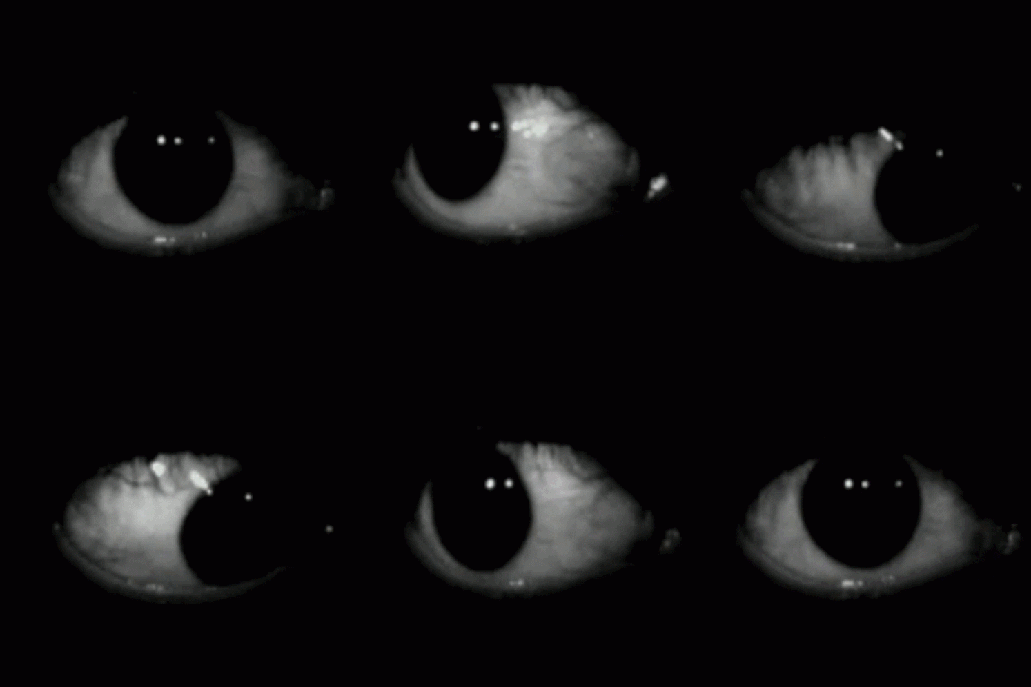
ps: i’ll play as many as i can but will prioritize the people that played mine :^)
hiii, if you’re interested in ambiance horror games you’ll probably like mine :D
https://itch.io/jam/acerola-jam-0/rate/2569618
it has a cool old PC with command lines, i hope you’ll like it <3
i mean if you insist: https://itch.io/jam/acerola-jam-0/rate/2569618
most people liked it, its a ambiance horror game with a computer and command lines. most people liked it and i hope you will too <3
thanks a lot for believing in me from the discord !
and yeah you’re completely right about the “end gif” being a bad quality, i kind of had to rush the end because of the time limit and the approach of a small burnout on this project. i might expand a little on the game in the future to give it a proper ending tho :)
I absolutely love this game,* i’m really happy that you commented on my page because i wouldnt have found it otherwise and it would’ve been a real shame.*
The aesthethic is really great, the animations and overall vibe of the 2D sections is pretty. It doesn’t feel like it was made by a “non-artist”.
I was very much surprised when the first 3D section happened, and they were all absolutely lovely. I truly wish the game was longer so that I could see more of them !
This is for sure my favorite so far, i hope more people will play it <3
The idea is really interesting and fun. Unfortunately the camera is a little too nauseating, my guess is that it was a “Physical Camera” with a collider when it should probably be a Camera purely moved by script with some fading effects.
So yeah, really cool idea, would be an absolute banger if the camera worked as intended
Take a look at the page its kinda important <3 : https://rollextotu.itch.io/the-blind-ones


